
Planning Guides, Style Guide
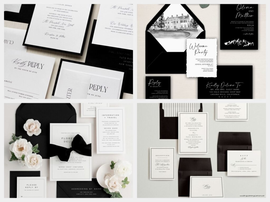
Black and White Wedding Invitation: Monochrome Classic Design
Nov
The Classic Black and White Invitation That Never Gets Old
Okay so black and white wedding invitations are literally the safest bet you can make and also somehow still manage to look stunning every single time. I’ve been doing this for almost two decades now and I cannot tell you how many brides come to me saying they want “something timeless” and then we end up with a monochrome design because honestly, what else screams timeless louder?
The thing about black and white is that it forces you to focus on the actual design elements instead of hiding behind pretty colors. You’ve gotta have good typography, clean layout, maybe some interesting textures or patterns. It’s kinda like when my cat knocks over a vase and I realize I didn’t actually like that vase anyway—the simplicity reveals what actually matters.
Why Black and White Works (And Why It Annoys Me Sometimes)
Here’s what drives me nuts though: people think black and white is the “easy” choice or the “boring” choice. I had this couple in spring 2023 who kept apologizing for wanting a black and white suite like they were being unoriginal or something. Meanwhile I’m sitting there looking at their mockups thinking these are gonna be the most elegant invitations I’ve designed all year. Black and white isn’t a cop-out, it’s a commitment to classic design principles.
The monochrome palette works because:
- It photographs beautifully (your photographer will thank you)
- It matches literally any wedding color scheme you choose later
- It doesn’t go out of style—like ever
- It makes your words and design choices the star
- Printing costs are usually lower since you’re not doing full color
Picking Your Paper Stock
This is where you can get fancy without adding color. I always tell couples to splurge on the paper if they’re saving money by going monochrome. The texture and weight of your paper is gonna do SO much heavy lifting in a black and white design.
Your options:
- Cotton paper – feels substantial, has that slight texture, usually comes in cream or bright white
- Linen texture – adds visual interest without being too much
- Smooth premium cardstock – modern and clean, works great for minimalist designs
- Matte vs glossy – matte feels more sophisticated to me but glossy can work for art deco vibes
I once had a bride who insisted on the cheapest printer paper because “it’s just black and white” and I… look, I tried to talk her out of it. The invitations looked like office memos. Don’t do that to yourself.
Typography Is Everything Here
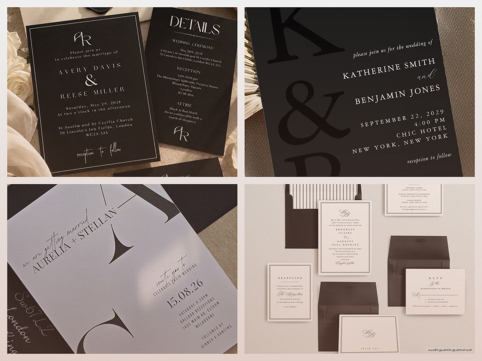
When you strip away color, your font choices become the main event. You need at least two fonts that complement each other—one for headers and one for body text. Sometimes three if you want to get fancy with accents.
Some combinations I use all the time:
- Serif header (like Playfair Display or Garamond) + sans serif body (like Montserrat or Futura)
- Script font for names + clean serif for details
- Bold geometric sans serif + delicate thin serif
What you’re going for is contrast and hierarchy. Your names should be immediately visible, then the date and time, then the location, then the smaller details. If everything is the same size and weight, it just becomes a wall of text that nobody wants to read.
Oh and please, for the love of all that is holy, don’t use more than three different fonts. I see this mistake constantly and it makes me wanna scream into a pillow. Stick to two or three max.
Design Styles That Work in Monochrome
Minimalist Modern
This is your clean lines, lots of white space, simple sans serif fonts situation. Think less is more. Maybe a thin border or a single line separating sections. This works great if your wedding has a modern or industrial vibe.
Classic Formal
Traditional layout, elegant serif fonts, maybe some flourishes or a formal crest. This is the style that screams “black tie event” without you having to say it. I did a whole suite like this in summer 2021 for a couple getting married at this historic estate and the invitations were so formal that guests actually asked if they needed to wear gloves. (They didn’t, but the invitations set that tone perfectly.)
Art Deco Glam
Geometric patterns, bold fonts, maybe some metallic accents (okay fine, you’re adding gold or silver foil, but the base is still black and white). Very Great Gatsby. Very glamorous. This style is sorta making a comeback and I’m here for it.
Botanical Illustrations
Black line drawings of flowers, leaves, or branches on white paper. Super elegant and gives you that organic touch without needing actual color. You can do delicate and whimsical or bold and graphic depending on the line weight.
Typography-Only
No graphics, no illustrations, just beautiful typography doing all the work. This is harder to pull off than it looks but when it works, it WORKS.
Adding Visual Interest Without Color
Since you’re working in monochrome, you need to think about texture, pattern, and contrast to keep things interesting.
Patterns and backgrounds: Stripes, dots, geometric shapes, damask prints—all of these can work in black and white. Just don’t go overboard. A subtle pattern as a background or border is usually enough.
White ink on black paper: This is one of my favorite tricks and it’s so underutilized. Flip the script—literally—and print white text on black cardstock. It’s dramatic and unexpected and still totally classic.
Letterpress: The impression left in the paper adds a tactile dimension that’s gorgeous in monochrome designs. You can feel the text, which is such a luxury detail.
Foil stamping: Okay yes this technically adds another color, but black foil on white or silver foil on black stays within the monochrome spirit while adding shine and dimension.
Layers and vellum: A vellum overlay with black text over a white card creates depth and visual interest. Or use a belly band to wrap everything together.
Layout and Composition Tips
The way you arrange elements on the page matters more when you don’t have color to guide the eye. I usually start with the focal point—typically the couple’s names—and build everything else around that.
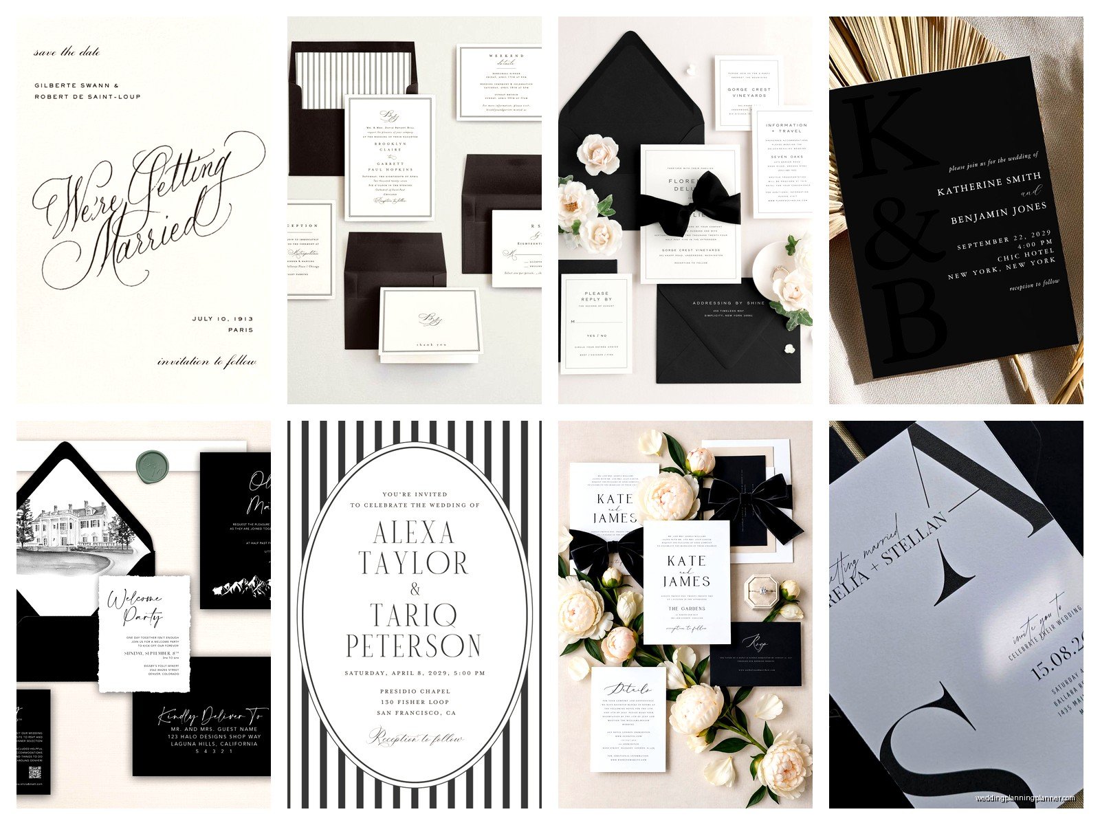
Some layout approaches:
- Centered and symmetrical – traditional, formal, always works
- Asymmetrical modern – text aligned left or right, creates movement
- Framed design – border around the edge with text centered inside
- Top-heavy – names and main info at top, details below in smaller text
White space is your friend. Don’t feel like you need to fill every inch of the invitation. Sometimes the emptiness around your text makes it feel more luxurious and—wait, I just remembered I need to email a client about their proof, hold on, where was I…
What to Include in Your Suite
A full black and white invitation suite typically includes:
- Main invitation card
- RSVP card with envelope
- Details card (accommodations, website, dress code)
- Outer envelope
- Inner envelope (optional but fancy)
- Belly band, ribbon, or vellum wrap (if you want to get extra)
Everything should feel cohesive. Use the same fonts across all pieces. If your main invitation has a botanical border, maybe echo that with a small element on your RSVP card. You don’t have to match exactly, but there should be a clear family resemblance.
Printing Methods
Your printing method affects both the look and the cost, so think about what matters most to you.
Digital printing: Most affordable, works great for simple designs, good quality on modern printers. This is gonna be your best bet if you’re on a budget.
Letterpress: That pressed-in look is SO beautiful with black and white designs. More expensive but worth it if you want that tactile luxury feel. The impression in the paper catches light differently and it’s just chef’s kiss.
Thermography: Creates raised text, costs less than letterpress, gives you that dimensional effect. Some people find it a bit dated but I think it still has its place.
Engraving: The most formal and expensive option. Text is actually carved into metal plates. Very traditional, very elegant, very pricey.
Envelope Considerations
Don’t sleep on your envelopes. They’re the first thing guests see and they set the tone before the invitation is even opened.
Options I love:
- Black envelopes with white ink addressing
- White envelopes with black calligraphy
- Lined envelopes (black and white stripe lining is classic)
- Printed return address vs calligraphy vs labels
For addressing, you can do traditional calligraphy, modern calligraphy, printed addresses, or even hand-write them if your handwriting is decent. I had a groom in a really stressful situation once who insisted on hand-writing all 200 envelopes himself to save money and then realized halfway through that his handwriting looked like a doctor’s prescription pad. We ended up printing labels. Sometimes saving money isn’t worth the stress.
Common Mistakes to Avoid
After doing this for years, I’ve seen the same issues pop up repeatedly:
Too much black: An all-black invitation can feel heavy or even morbid. You need balance. Usually more white space with black accents works better than the reverse.
Poor contrast: If you’re doing grey text on white, make sure it’s dark enough to read easily. Light grey can look elegant in mockups but prints too faint.
Ignoring readability: That super thin delicate script font might look pretty but if your 80-year-old grandmother can’t read it, what’s the point? Make sure your body text is legible.
Forgetting about your printer: Not all printers handle black ink the same way. Some blacks are warmer, some cooler. Request a proof before you print 150 invitations.
Overdesigning: Just because you CAN add another border or pattern or font doesn’t mean you should. Monochrome designs need restraint.
Mixing in Textures and Materials
You can add dimension to your black and white suite with different materials. Ribbon, twine, wax seals, vellum overlays, deckled edges—all of these work beautifully in monochrome.
A black wax seal on a white envelope? Stunning. A white silk ribbon around black cardstock? Gorgeous. You’re creating interest through texture and materiality instead of color, which honestly feels more sophisticated anyway.
Coordinating With Your Wedding Design
The beauty of black and white invitations is they work with literally any wedding color palette. Getting married in a garden with blush and sage colors? Black and white invites still work. Having a bold jewel-tone celebration? Yep, black and white invites are perfect. All-white wedding? Obviously.
You can hint at your wedding colors in subtle ways if you want—maybe a colored envelope liner or a small watercolor wash behind the text—but honestly the stark monochrome look is strong enough to stand alone.
Budget-Friendly Approaches
If you love the black and white look but need to keep costs down:
- Skip the letterpress and go with quality digital printing
- DIY your envelope addressing with a nice printer and template
- Order blank cards and print at home (only works if you have a good printer)
- Reduce your suite to just invitation and RSVP, put other details on your website
- Use online printing services instead of boutique stationers
- Choose standard sizes to avoid custom cutting fees
Just don’t cheap out on the paper quality. That’s the one place where cutting costs will really show.
Working With a Designer vs DIY
You can absolutely DIY black and white invitations using Canva or similar platforms. The simplicity of the color palette makes it easier than designing with multiple colors. But—and this is a big but—you still need a good eye for typography and layout.
If you’re hiring a designer, bring examples of what you like. We can’t read minds (shocking, I know). Show us invitations you’ve seen on Pinterest or Instagram, point out specific fonts or layouts you’re drawn to. The more specific you are, the better we can nail your vision.
I work with couples both ways—some want full custom design, some just want me to review their DIY attempt and fix the typography issues. Both are totally valid approaches depending on your budget and how much you care about the details.

Canva
Wedding Memories Hardcover Template Canva Editable For Notebook, Journal, Novel, Hard Covers, Canva template For KDP Cover 6×9″ 120 pages
Canva
The Ultimate Wedding Planning Bundle, Canva Editable.
Canva
Customizable Wedding Video Invitations templates, Canva Editable Digital Wedding invitation Minimalist, Animated Custom Invitation
Digital Planning Templates
Wine Wedding Planner Bundle – 200-Page Printable PDF + 10 Editable Wedding Invitations | Instant Digital Download
Canva
Orange Wedding Planner Bundle – 200-Page Editable Canva Templates + 10 Editable Wedding Invitations | Instant Digital Download
Digital Planning Templates
Champagne Wedding Planner Bundle – 200-Page Printable PDF + 10 Editable Wedding Invitations | Instant Digital Download
Canva
Wedding Memories Hardcover Template Canva Editable For Notebook, Journal, Novel, Hard Covers, Canva template For KDP Cover 6×9″ 120 pages
Digital Planning Templates
Yellow Wedding Planner Bundle – 200-Page Printable PDF + 10 Editable Wedding Invitations | Instant Digital Download
Canva
Dusty Blue Wedding Planner Bundle – 200-Page Editable Canva Templates + 10 Editable Wedding Invitations | Instant Digital Download