
Planning Guides, Style Guide
Burgundy Wedding Invitations: Deep Wine Red Designs
Nov
Okay so burgundy invitations are having a MOMENT
Look, I’ve been doing wedding invitations for over a decade and burgundy has gone from “kinda dated” to absolutely everywhere in the past few years. Specifically around fall 2022, I had THREE brides in one week ask for deep wine red designs and I remember thinking oh here we go, this is the new navy blue.
The thing with burgundy invitations is they’re way more versatile than people think. You’re not locked into a fall wedding or a vineyard theme or whatever. I’ve done burgundy invites for spring garden weddings, winter formal events, even a summer evening reception that worked perfectly because the bride wanted moody romantic vibes.
Why burgundy actually works (and when it doesn’t)
Burgundy sits in this perfect spot where it’s rich enough to feel formal but not as heavy as straight black or navy. It photographs beautifully—like seriously, it pops against white or cream cardstock in a way that makes your stationery suite look expensive even if you’re on a budget.
But here’s what annoys me: people calling every red “burgundy” when they actually want maroon or wine or cranberry. These are different colors! Burgundy has purple undertones. Maroon leans brown. Wine is more true red with depth. When you’re ordering printing, you gotta be specific because Pantone 209C is NOT the same as Pantone 7643C and your printer will give you whatever’s on the file.
I learned this the hard way in spring 2023 when a bride approved “burgundy” digitally and then lost her mind when the printed invites arrived more purple than she expected. Screens display colors differently than paper, and…
Getting the actual color right
If you’re doing digital printing, ask for a physical proof. Yes it costs extra. Yes it’s worth it. I always tell clients to look at the proof in natural daylight AND indoor lighting because burgundy can shift dramatically.
For letterpress (which is gorgeous with burgundy btw), you’ll want to see ink drawdowns. Most letterpress studios can mix custom colors, and deep wine reds letterpress beautifully because the impression adds dimension to an already rich color.
Foil stamping in burgundy though? Umm, be careful. Burgundy foil can look muddy or too brown depending on the cardstock. I usually steer people toward rose gold or copper foil WITH burgundy ink instead. Or if you want metallic, go with actual gold foil—the contrast is chef’s kiss.
Design styles that work with burgundy
So you’ve got your color sorted, now what actually looks good?
Classic formal
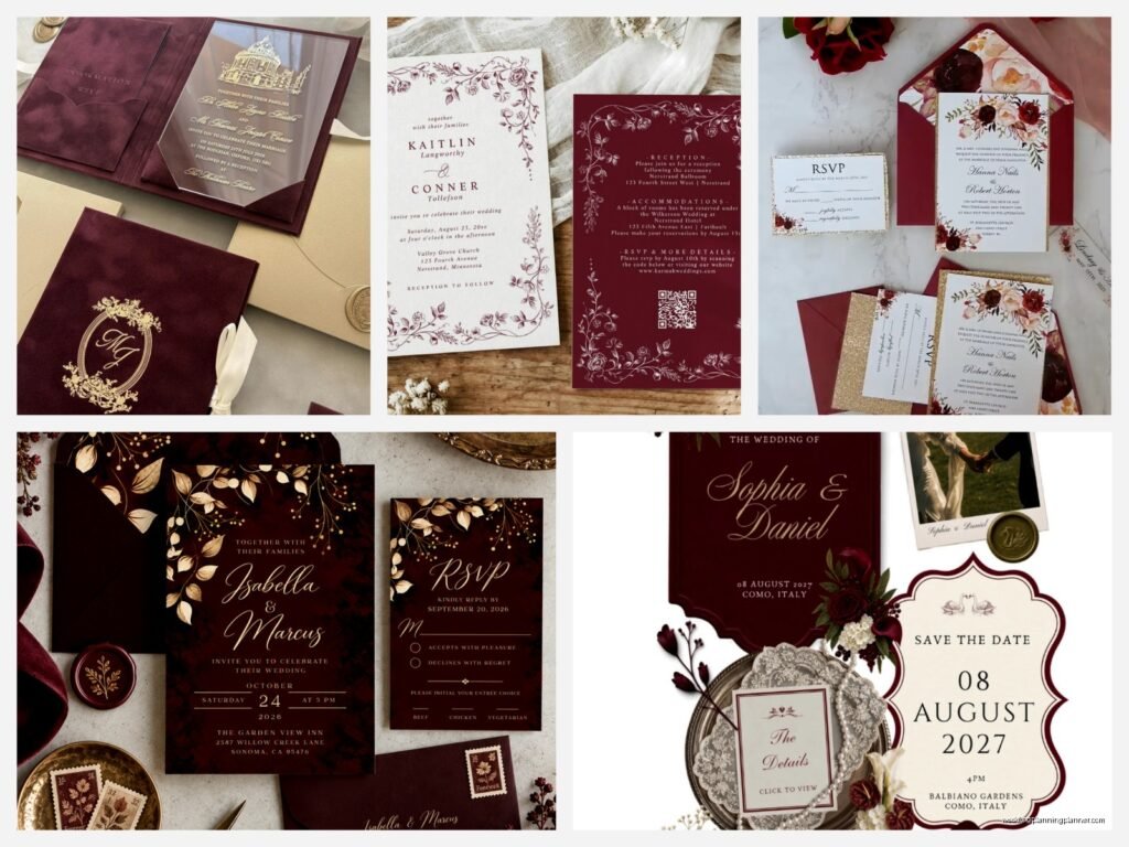
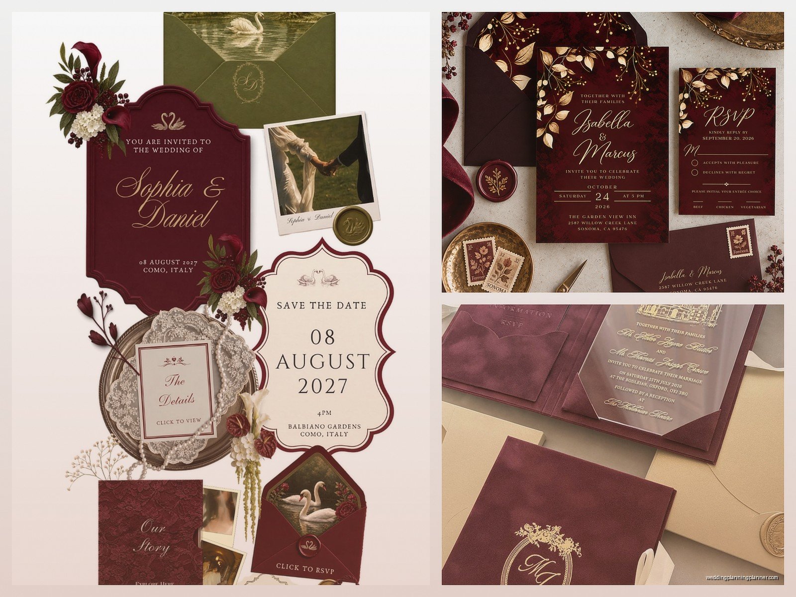
Burgundy with gold is traditional and elegant. Think burgundy ink on ivory or ecru cardstock, gold borders or monograms. This works for church weddings, ballroom receptions, black-tie events. You can add a burgundy envelope liner with a gold pattern and it feels very established-family-wealth even if you’re just regular people.
For fonts, go with traditional serif fonts like Garamond or Didot. Keep the layout centered and symmetrical. Add a belly band in burgundy with a gold wax seal if you wanna get fancy.
Modern minimalist
This is where burgundy really shines honestly. Clean sans-serif fonts, lots of white space, burgundy used as an accent rather than covering the whole invite. Maybe just your names in burgundy, or a single burgundy line separating sections.
I did a suite last year that was just black text on white cardstock with ONE burgundy envelope and a burgundy address stamp. So simple but it looked like it cost three times what they actually paid.
Romantic floral
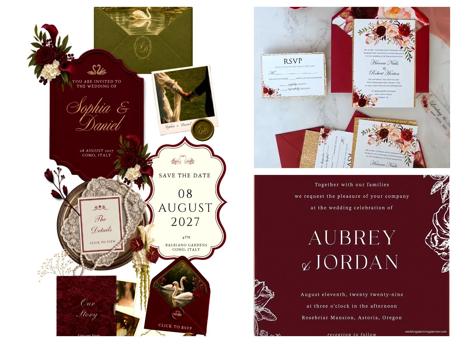
Okay this is probably what you’re picturing if you searched for burgundy invitations. Watercolor flowers in burgundy and blush, greenery, all that. It’s pretty! It’s been done a million times! But if that’s your vibe, own it.
The key to making floral burgundy invitations not look like everyone else’s is in the flower choice. Skip the roses and peonies for once. Try burgundy dahlias, ranunculus, or even magnolia leaves in deep red tones. Pair with eucalyptus or olive branches instead of the standard greenery.
Vintage or rustic
Burgundy works with kraft paper surprisingly well. Like a deep wine red on kraft cardstock gives you rustic but elevated. Add some hand-drawn elements or a woodgrain texture and you’ve got barn-wedding-but-make-it-chic.
Vintage-style burgundy invitations can incorporate art deco patterns, antique frames, or 1920s-inspired fonts. I’m personally kinda over the gatsby theme but if that’s what you want, burgundy and gold in an art deco layout still works.
What to pair burgundy with (color combos that don’t suck)
Burgundy and gold—classic, safe, always works
Burgundy and navy—surprisingly good, very sophisticated, reads masculine without being boring
Burgundy and blush—romantic, soft, balances the depth of the burgundy
Burgundy and sage green—this is having a moment, very organic and garden-y
Burgundy and ivory/cream—elegant, won’t compete with your color
Burgundy and copper—warmer than gold, great for fall
Burgundy and grey—modern and neutral
What doesn’t work: burgundy and bright pink (too much), burgundy and orange (unless you’re doing a very specific fall thing), burgundy and purple (they fight each other)
Paper and printing methods
The cardstock you choose affects how burgundy reads. On bright white, it looks more vibrant and modern. On ivory or ecru, it feels warmer and more traditional. On grey cardstock, it gets moody and dramatic.
Textured cardstock like linen or felt adds dimension. I love burgundy on cotton cardstock because it has this subtle softness that… okay I’m gonna sound pretentious but it feels expensive to touch and weddings are tactile experiences.
Printing options
Digital printing is your budget-friendly option and honestly looks great for most designs. You can get deep saturated burgundy colors and it’s cost-effective for smaller guest counts.
Letterpress gives you that beautiful impression and texture. Burgundy letterpress ink has this richness that’s hard to beat. But it’s pricey—usually starting around $800-1000 for a full suite for 100 guests.
Foil stamping in rose gold or actual gold paired with burgundy elements looks luxury. You can do combination printing too—digital burgundy ink with gold foil accents.
Thermography is that raised printing that feels like engraving but costs less. It works fine with burgundy but can look a bit dated depending on your design style.
Engraving is the most formal and expensive option. Burgundy engraved invitations are stunning but you’re looking at serious money. Most people don’t need this unless you’re doing a very traditional formal wedding.
The actual invitation suite components
You don’t need every single piece, but here’s what works with burgundy:
Main invitation—obviously. This is where your burgundy makes the biggest statement
RSVP card—can be all burgundy, or burgundy text on ivory, or ivory with a burgundy accent
Details card—I usually keep this simpler, maybe just burgundy text
Envelope liner—THIS is where you can go wild with burgundy patterns or watercolors
Belly band or vellum wrap—burgundy belly bands with a wax seal are gorgeous
Wax seal—burgundy wax is beautiful but also consider gold or copper wax as an accent
Envelope addressing—burgundy calligraphy or a burgundy address stamp
Envelope situations
Your envelope color matters more than you think. White envelopes with burgundy invites inside is clean and classic. Burgundy envelopes make a statement when your guests open their mailbox—my cat actually knocked over a stack of burgundy envelopes once and I had to reorder like 30 of them which was a whole thing but anyway.
Ivory or cream envelopes feel softer and more romantic. Grey envelopes with burgundy invites is very modern. Kraft envelopes work for rustic themes.
Double envelopes (inner and outer) are traditional for formal weddings. You can do burgundy outer with ivory inner, or vice versa.
DIY vs professional printing
Look, I’m gonna be real with you. Burgundy is not the easiest color to DIY print at home. Home printers don’t handle deep saturated colors consistently. You’ll get color variations between prints, the ink might look purple-ish or brown-ish depending on your printer and paper.
If you’re set on DIY, use a professional printing service like Catprint or PrintPlace where you upload your design and they print it. You’ll get way better color consistency than printing at home.
For assembly though? You can definitely DIY that part. Putting together invitation suites is time-consuming but not hard. Get your invites professionally printed, then you can add belly bands, envelope liners, wax seals yourself and save money.
Templates and design resources
Etsy has approximately one million burgundy invitation templates. Quality varies wildly. Look for designers who show actual printed photos, not just digital mockups. Read reviews about whether the colors printed true.
Minted and Paperless Post both have burgundy options with good color accuracy since they control the printing process.
If you’re hiring a stationery designer (hi, that’s literally what I do), bring color swatches of your bridesmaid dresses or florals so we can match the burgundy exactly to your wedding colors.
Timing and ordering
Order invitations 4-6 months before your wedding. This gives you time for design, proofs, printing, assembly, and mailing with enough buffer for disasters.
Save-the-dates can go out 6-8 months before (or earlier for destination weddings). You can do burgundy save-the-dates too, or switch it up with a different color and bring burgundy in for the formal invites.
Order 10-15 extra invitations beyond your guest count. You’ll want extras for keepsakes, last-minute additions, or replacements if something gets damaged. During a stressful client situation last November, a bride spilled red wine on her own invitation the night before she was gonna frame it and she was SO grateful she had extras.
Postage and mailing
Heavy invitation suites need extra postage. Take a fully assembled invite to the post office and have them weigh it before you buy stamps. Square envelopes cost more to mail than rectangular ones—it’s annoying but that’s USPS rules.
Burgundy pairs beautifully with vintage stamps if you’re into that. Love stamps, botanical stamps, or even the classic forever stamps work fine.
Hand-canceling prevents your invites from getting chewed up by sorting machines. Ask at the post office—some locations do it, some don’t, it’s kinda random.
Wording and etiquette stuff
The color of your invitation doesn’t change traditional wording, but burgundy invitations do tend to skew more formal in tone. If you’re doing casual wording, make sure your design style matches that vibe or it’ll feel off.
For super formal weddings, burgundy ink on ecru with traditional centered wording is appropriate. For modern or casual weddings, you can play with left-aligned text, conversational wording, and simpler layouts.
Real talk about trends
Burgundy is trendy right now which means in 10 years you might look at your invitations and think “wow that’s so 2020s.” But honestly? Every wedding has trend markers from its era. That’s not necessarily bad. Your wedding exists in a specific moment in time and there’s something kinda nice about that.
If you genuinely love burgundy, use it. If you’re only choosing it because it’s popular on Pinterest, maybe reconsider. Your invitations are the first impression of your wedding and they should feel like YOU, not like everyone else’s fall 2024 wedding

Canva
Wedding Memories Hardcover Template Canva Editable For Notebook, Journal, Novel, Hard Covers, Canva template For KDP Cover 6×9″ 120 pages
Canva
The Ultimate Wedding Planning Bundle, Canva Editable.
Canva
Customizable Wedding Video Invitations templates, Canva Editable Digital Wedding invitation Minimalist, Animated Custom Invitation
Digital Planning Templates
Wine Wedding Planner Bundle – 200-Page Printable PDF + 10 Editable Wedding Invitations | Instant Digital Download
Canva
Orange Wedding Planner Bundle – 200-Page Editable Canva Templates + 10 Editable Wedding Invitations | Instant Digital Download
Digital Planning Templates
Champagne Wedding Planner Bundle – 200-Page Printable PDF + 10 Editable Wedding Invitations | Instant Digital Download
Canva
Wedding Memories Hardcover Template Canva Editable For Notebook, Journal, Novel, Hard Covers, Canva template For KDP Cover 6×9″ 120 pages
Digital Planning Templates
Yellow Wedding Planner Bundle – 200-Page Printable PDF + 10 Editable Wedding Invitations | Instant Digital Download
Canva
Dusty Blue Wedding Planner Bundle – 200-Page Editable Canva Templates + 10 Editable Wedding Invitations | Instant Digital Download