
Planning Guides, Style Guide
Elegant Invitations: Sophisticated Formal Design Guide
Nov
The Paper Stock Thing Everyone Gets Wrong
So the first thing you gotta know about elegant formal invitations is that your paper choice matters way more than the actual design elements. I learned this the hard way back in spring 2023 when a bride insisted on this gorgeous letterpress design but wanted to print it on regular cardstock from an office supply store and… yeah, it looked like a fancy flyer for a corporate seminar. The weight needs to be at least 110lb cover stock, but honestly I push clients toward 130lb or higher for truly formal events.
Cotton paper is your friend here. Like, 100% cotton if the budget allows it, but even 25% cotton content makes a massive difference in how the invitation feels in your hand. People notice texture before they even read the words, which is kinda wild when you think about it. The subtle deckled edge on cotton paper gives you that expensive look without being too precious about it.
Color Palettes That Actually Work
Here’s what drives me absolutely crazy about formal invitation design – everyone thinks elegant means black and white only. Nah. Some of the most sophisticated invitations I’ve done used deep jewel tones or even blush tones, but the key is restraint. You’re working with two colors max, maybe three if one of them is metallic.
Navy and gold is classic for a reason. Deep burgundy with cream. Charcoal gray with rose gold. Forest green with ivory. The trick is choosing colors that have depth to them, not those bright saturated shades you see everywhere. When I’m picking colors, I literally hold the paper samples up to different lighting – natural light, indoor light, evening light – because formal events usually happen in the evening and you want the colors to look rich under warm lighting.
Metallics deserve their own mention because foil stamping or metallic ink elevates everything immediately. But you can’t just slap gold everywhere and call it elegant. Use it strategically – maybe just on the couple’s names, or as a thin border, or for the monogram. My cat knocked over my entire metallic ink sample collection last month and I’m still finding gold specks on random things, but anyway…
Typography Is Where Most People Mess Up
You need exactly two fonts. Maybe three if you’re really confident, but I usually stick with two. One serif font for the main text and formal wording, one script or sans-serif for names or accent text. The serif font should be something with good readability – think Garamond, Baskerville, Didot, or Caslon. These have that timeless quality that photographs well and reads easily.
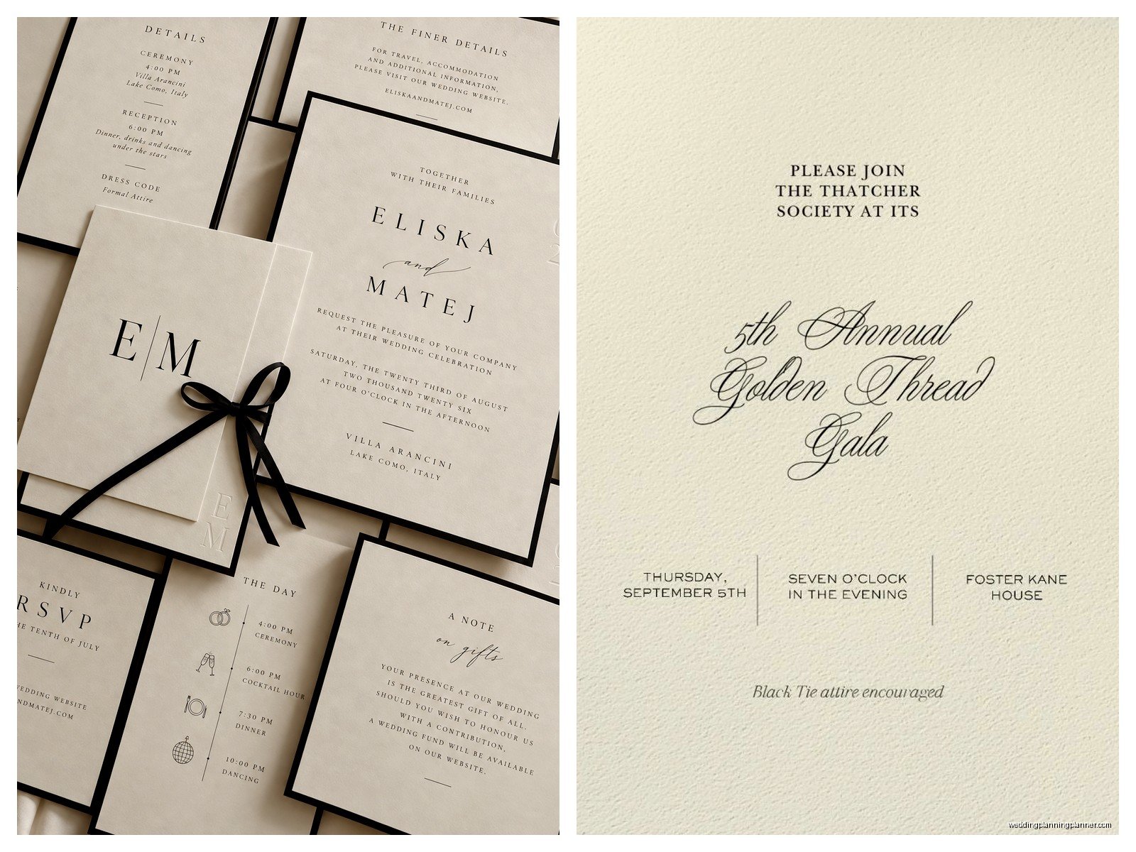
For script fonts, this is where people get into trouble. Those super swirly calligraphy fonts that are basically illegible? Not elegant, just annoying. Your script should be readable at first glance. I like fonts that have calligraphic qualities but maintain clarity – something like Edwardian Script, Shelley Allegro, or even a well-done modern calligraphy font. The names need to be the stars of the invitation, so if you’re using script, that’s usually where.
Font sizing matters more than you’d think. The couple’s names should be the largest element, usually 18-24pt depending on name length. Event details can be smaller, around 11-14pt, but nothing should ever be smaller than 10pt because your guests shouldn’t need reading glasses just to find out what time the ceremony starts. Hierarchy is everything – what do you want people to see first, second, third?
Layout and Spacing (The Unsexy But Critical Stuff)
White space is your best friend in formal design. I see so many invitations that cram every possible detail onto one card and it just looks… cluttered. Formal invitations breathe. There should be generous margins – at least half an inch on all sides, but I prefer 3/4 inch to a full inch for really formal pieces.
Center alignment is traditional for formal invitations, and there’s a reason it’s stuck around. It creates symmetry and balance that feels classic. Left alignment can work for more modern formal styles, but center alignment is safer if you’re going for traditional elegance. The text should be arranged in a logical hierarchy with clear spacing between different sections of information.
Line spacing needs attention too. You don’t want lines cramped together, but you also don’t want so much space that the information feels disconnected. I usually do 1.2 to 1.5 line spacing for the main text block, with extra space between different information sections.
Wording That Sounds Actually Formal
The language you use completely changes the tone. Formal invitations use third person – “Mr. and Mrs. John Smith request the honour of your presence” not “John and Jane invite you.” That “honour” spelling with a ‘u’ is traditional for ceremony invitations (it’s the British spelling and adds formality), while “honor” without the ‘u’ is fine for receptions.
Spell everything out. No abbreviations except for Mr., Mrs., Ms., and Dr. So “Saturday, the twenty-eighth of June, two thousand twenty-five” not “Saturday, June 28, 2025.” Street names get spelled out, state names get spelled out, even the time is spelled out – “half after six o’clock in the evening” instead of “6:30 PM.”
There’s this whole traditional structure to formal invitation wording that I won’t go into every detail here, but the basic format is: host line, request line, couple’s names, ceremony details, reception details. Each section gets its own visual space. During this one wedding in summer 2021, the mother of the bride wanted to include like fifteen family members in the host line because of a complicated family situation and we literally ran out of room on the invitation, which is when I learned that sometimes you need to have those difficult conversations about keeping things simple or…
Printing Methods That Matter
Digital printing is fine for a lot of things, but for truly elegant formal invitations, you’re gonna want to look at letterpress, engraving, or thermography. Each has a different look and price point.
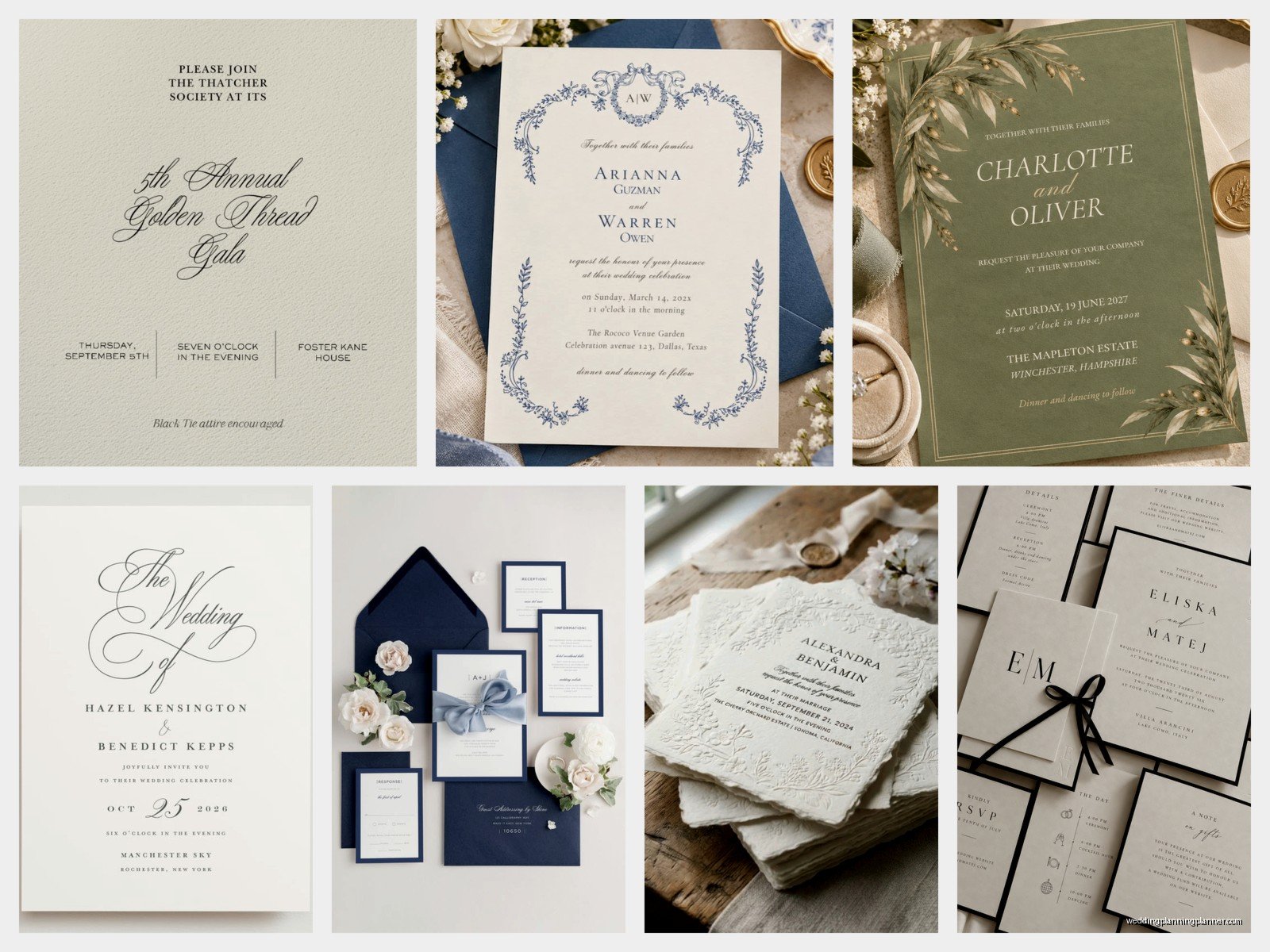
Letterpress creates this beautiful debossed impression in the paper where the text is actually pressed into the surface. It’s tactile and gorgeous and very traditional. The setup costs are high though, so it makes more sense for larger quantities. The ink sits on the surface with slight dimension, and you can feel the impression on the back of the paper.
Engraving is the opposite – it creates raised text that you can feel on the front. This is the most formal and expensive option, and it’s what you see on super high-end wedding invitations and diplomatic correspondence. The text is actually raised off the paper surface and has a slight shine to it. When people run their fingers over engraved text, they immediately know it’s special.
Thermography is like the budget-friendly cousin of engraving. It creates raised text too, but through a different process that’s less expensive. It looks really similar to engraving to most people, though purists will tell you they can tell the difference. For most formal invitations, thermography gives you that elevated look without the engraving price tag.
The Whole Suite Thing
A formal invitation isn’t just one card. You’ve typically got the main invitation, an inner envelope (yes, really), a reception card if the reception is at a different location or time, a response card with its own envelope, and maybe additional cards for accommodation info, directions, or weekend events.
All these pieces need to coordinate but they don’t need to be identical. The main invitation is the star – that’s where you use your fanciest printing technique and best paper. The enclosure cards can be simpler but should match the overall aesthetic. Same fonts, same color palette, but maybe just flat printed instead of letterpress.
The response card is its own thing that annoys me because people constantly mess up the addressing. The response card envelope should be pre-addressed to whoever is collecting RSVPs (usually the couple or their parents) and pre-stamped. Don’t make your guests hunt down a stamp and figure out where to send it. That’s not elegant, that’s just making more work for people.
Envelope Addressing Is An Art Form
Your envelopes are the first thing people see, so they set the tone for everything inside. For formal invitations, you’re looking at either calligraphy or high-quality digital calligraphy printing. Hand calligraphy is obviously the most impressive, but it’s expensive and time-consuming. Digital calligraphy has gotten really good though – there are services that use actual calligraphers’ handwriting turned into fonts.
The outer envelope should have the guests’ full formal names and address. Inner envelopes (which sit inside the outer envelope) have just the guests’ titles and last names, or first names for close family. I know the double envelope thing seems extra, but it serves a practical purpose historically and adds to that formal presentation.
Return addresses can go on the back flap of the envelope, and for formal invitations, this should be printed or calligraphed too, not a sticker. Some people do blind embossing (just the impression with no ink) for return addresses which looks incredibly sophisticated.
Embellishments That Enhance Instead of Overwhelm
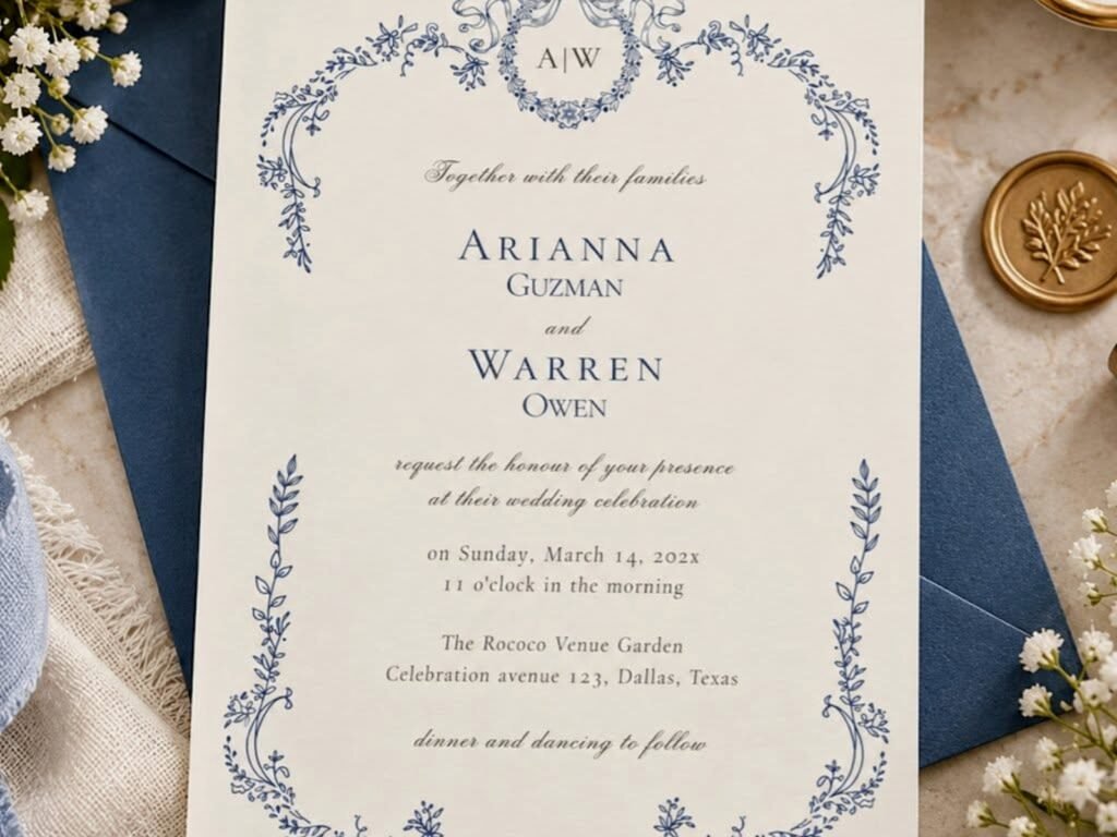
When you’re adding decorative elements, less is definitely more. A simple border can be elegant – think thin gold lines or a delicate frame around the text. Monograms work well at the top of the invitation or on the envelope liner. Crests or family emblems if that’s relevant to the couple’s heritage.
Envelope liners are an underrated detail that adds so much. They’re the inside lining of the envelope that shows when someone opens it. You can use patterned paper, metallic paper, or even custom printed designs. It’s this little surprise element that makes opening the invitation feel special.
Wax seals are having a moment again and they do look gorgeous on formal invitations. Real wax seals, not the sticker kind. But here’s the thing – they add thickness to the envelope which means extra postage, and they can break during mailing. I usually recommend them for hand-delivered invitations or suggest using them on the inner envelope instead of the outer.
Ribbon belly bands can be pretty if done right – a simple silk or grosgrain ribbon wrapped around the invitation suite, maybe with a small wax seal holding it closed. But colored ribbon, not that craft store ribbon that looks cheap. The ribbon should complement your color palette and be actual silk or a quality synthetic.
Paper Weights and Technical Stuff You Need To Know
I mentioned 110lb cover stock earlier but let me break down paper weights because it’s confusing. Cover stock is measured differently than text weight. 110lb cover is roughly equivalent to 300gsm if you’re looking at international paper. For the main invitation, you want 110-130lb cover minimum. For enclosure cards, 80-100lb cover is fine.
The finish matters too. Smooth finish is most traditional for formal invitations – it takes printing beautifully and feels refined. Textured finishes like linen or laid can work but they’re slightly less formal. Avoid glossy finishes entirely for formal invitations; they look more like marketing materials than elegant stationery.
You also gotta think about postage. These fancy invitations with multiple enclosures and heavy paper stock are gonna need extra postage. Take a fully assembled invitation to the post office and have them weigh it before you buy stamps. Hand-canceling is worth requesting too – it means the post office processes your invitations by hand instead of through machines, which prevents damage.
Timing and Practical Considerations
Formal invitations should be mailed 8-12 weeks before the event. This gives guests enough time to make travel arrangements and respond appropriately. For destination events, you might even send them 3-4 months out. Save-the-dates usually go 6-8 months before, and those can be less formal than the actual invitation.
The response deadline should be at least 3-4 weeks before the event. This gives you time to get final counts to your caterer and make seating charts. People are terrible about responding on time though, just accept that you’ll be chasing down RSVPs no matter what.
Order extra invitations – at least 10-15 more than your guest count. You’ll want them for keepsakes, last-minute additions, mistakes in addressing, and replacements if some get damaged in the mail. I always keep a few extras from weddings I’ve planned because they’re beautiful pieces of design work and also because sometimes I need to show clients examples of what different printing techniques actually look like in person.
Proofread everything multiple times. Then have someone else proofread it. Then proofread it again. Typos on formal invitations are mortifying and expensive to fix. Check spelling of names, dates, times, addresses, everything. Make sure the day of the week matches the date. Verify AM vs PM. This seems obvious but I’ve caught so many errors right before printing that would’ve been disasters.

Canva
Wedding Memories Hardcover Template Canva Editable For Notebook, Journal, Novel, Hard Covers, Canva template For KDP Cover 6×9″ 120 pages
Canva
The Ultimate Wedding Planning Bundle, Canva Editable.
Canva
Customizable Wedding Video Invitations templates, Canva Editable Digital Wedding invitation Minimalist, Animated Custom Invitation
Digital Planning Templates
Wine Wedding Planner Bundle – 200-Page Printable PDF + 10 Editable Wedding Invitations | Instant Digital Download
Canva
Orange Wedding Planner Bundle – 200-Page Editable Canva Templates + 10 Editable Wedding Invitations | Instant Digital Download
Digital Planning Templates
Champagne Wedding Planner Bundle – 200-Page Printable PDF + 10 Editable Wedding Invitations | Instant Digital Download
Canva
Wedding Memories Hardcover Template Canva Editable For Notebook, Journal, Novel, Hard Covers, Canva template For KDP Cover 6×9″ 120 pages
Digital Planning Templates
Yellow Wedding Planner Bundle – 200-Page Printable PDF + 10 Editable Wedding Invitations | Instant Digital Download
Canva
Dusty Blue Wedding Planner Bundle – 200-Page Editable Canva Templates + 10 Editable Wedding Invitations | Instant Digital Download