
Planning Guides, Style Guide
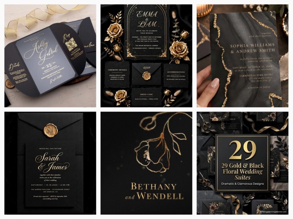
Black and Gold Wedding Invitations: Elegant Metallic Contrast
Nov
Why Black and Gold Just Works
Okay so black and gold wedding invitations are honestly one of those design choices that never really fails. I’ve been doing this for like fifteen years now and every time a couple comes to me wanting that elegant metallic contrast, I know we’re gonna create something that photographs beautifully and sets the right tone. The thing is, you gotta understand that this color combo isn’t just trendy—it’s been around forever because it’s based on actual design principles about contrast and luxury signaling.
The metallic aspect is what elevates it from just being black and yellow (which would be… not great). Gold foiling, gold ink, metallic cardstock—these are what make the difference between an invitation that looks expensive and one that looks like you printed it at home on your inkjet.
Choosing Your Gold Finish
This is where most people get overwhelmed and honestly where I spend the most time with clients. You’ve got several options and they all give different vibes:
- Gold foil stamping – This is the real deal, the one that costs more but looks incredible. The foil catches light differently depending on the angle and it has this dimensional quality that you can’t replicate with printing
- Metallic gold ink – Less expensive than foiling, still looks really nice, but it’s flatter. Works great for larger gold areas
- Gold cardstock – Sometimes I’ll use this as a backing layer or for envelope liners. It’s subtle but adds that shimmer
- Digital metallic printing – The budget option. It’s gotten way better in recent years but you can still kinda tell it’s printed if you look closely
Back in spring 2023 I had this bride who insisted she wanted “the most gold possible” on her invitations and we ended up doing gold foil on gold metallic cardstock with gold ink accents and honestly? It was too much. Like, there was no contrast anymore. We had to scale back because—and this is important—the black is what makes the gold pop. Without enough black or dark elements, the gold just becomes… yellow-ish and loses its impact.
Paper Stock Matters More Than You Think
I’m gonna be real with you, the paper you choose affects everything else about the design. For black and gold invitations, I almost always recommend:
Thick cardstock – at least 110lb cover weight, preferably 130lb. You want people to pick it up and immediately feel that it’s substantial. Flimsy paper destroys the elegant vibe you’re going for.
Texture options – Smooth vs. textured is a whole thing. Smooth paper (like a nice cotton paper) makes the gold foil look more modern and sharp. Textured paper (like linen or felt) gives it a more traditional, formal feeling. I usually ask couples about their venue first because that helps determine which direction to go.
One thing that really annoys me is when couples see a black and gold invitation online that they love, but then they want to use the cheapest paper possible to save money. Look, I get budgets are real, but the paper is literally the foundation of the entire piece. If you’re gonna cut costs, cut them somewhere else—do a simpler design, skip the belly band, whatever. But don’t cheap out on the actual cardstock because it shows immediately.
Design Layout Approaches
There are basically a few tried-and-true layouts that work really well for this color scheme. You can go:
Classic Formal
Black cardstock base with gold foil text in a traditional font like Copperplate or Garamond. This is very art deco, very Great Gatsby. Works perfectly for ballroom weddings or historic venues. The invitation is usually a single panel or a traditional bifold, and you keep the design elements minimal—maybe a gold border or a simple gold monogram.
Modern Geometric
This is where you bring in gold geometric shapes, lines, or patterns. Think hexagons, chevrons, or abstract line art. The text is usually in a clean sans-serif font. I love this approach for couples getting married in modern spaces like art galleries or industrial lofts. You can play with asymmetry here in ways you can’t with the formal approach.
Romantic Ornate
Gold floral illustrations or damask patterns on black background. Script fonts, maybe with some gold edge painting on the cardstock. This one is tricky because it can tip into looking too busy or—I hate to say it—kinda cheap if you’re not careful with the balance. Less is more with this style.
My cat just knocked over my coffee while I’m writing this so… anyway, the point is that whichever layout you choose, you need to maintain that contrast. The gold elements shouldn’t cover more than about 40% of the invitation surface or you lose the dramatic effect.
Typography Considerations
Font choice is huge here. HUGE. I’ve seen gorgeous designs ruined by poor font selections and I’ve seen simple designs elevated by perfect typography.
For black and gold invitations, you’re usually safe with:
- Serif fonts for formal traditional weddings (but avoid anything too thick—you want the letterforms to feel elegant not heavy)
- Script fonts for romantic vibes (but please, please test them at actual size because some scripts become unreadable when foiled)
- Clean sans-serif fonts for modern looks (something like Montserrat or Futura can look incredibly sophisticated)
One thing I learned the hard way—and this was probably back in like 2019 with a particularly difficult client—is that you need to test your fonts with the actual printing method you’re using. Gold foil requires fonts with strokes that aren’t too thin because thin lines don’t hold the foil well. We had to completely redo a suite because the delicate script font she loved just didn’t work with the foiling process. The thin upstrokes basically disappeared.
Coordinating Your Suite Elements
Okay so you’ve got your main invitation figured out, but there’s all these other pieces to think about:
RSVP cards – I usually flip the color scheme here. If your main invite is black with gold text, do the RSVP as white or cream with black and gold accents. It’s part of the same family but gives visual variety.
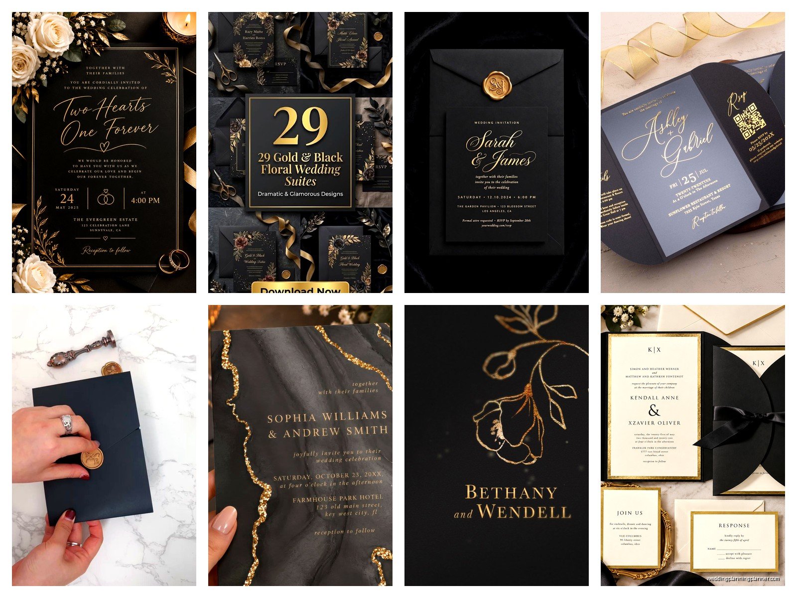
Details cards – Same paper as the main invite, but you can simplify the design. Maybe just gold text on black, no fancy borders or illustrations needed.
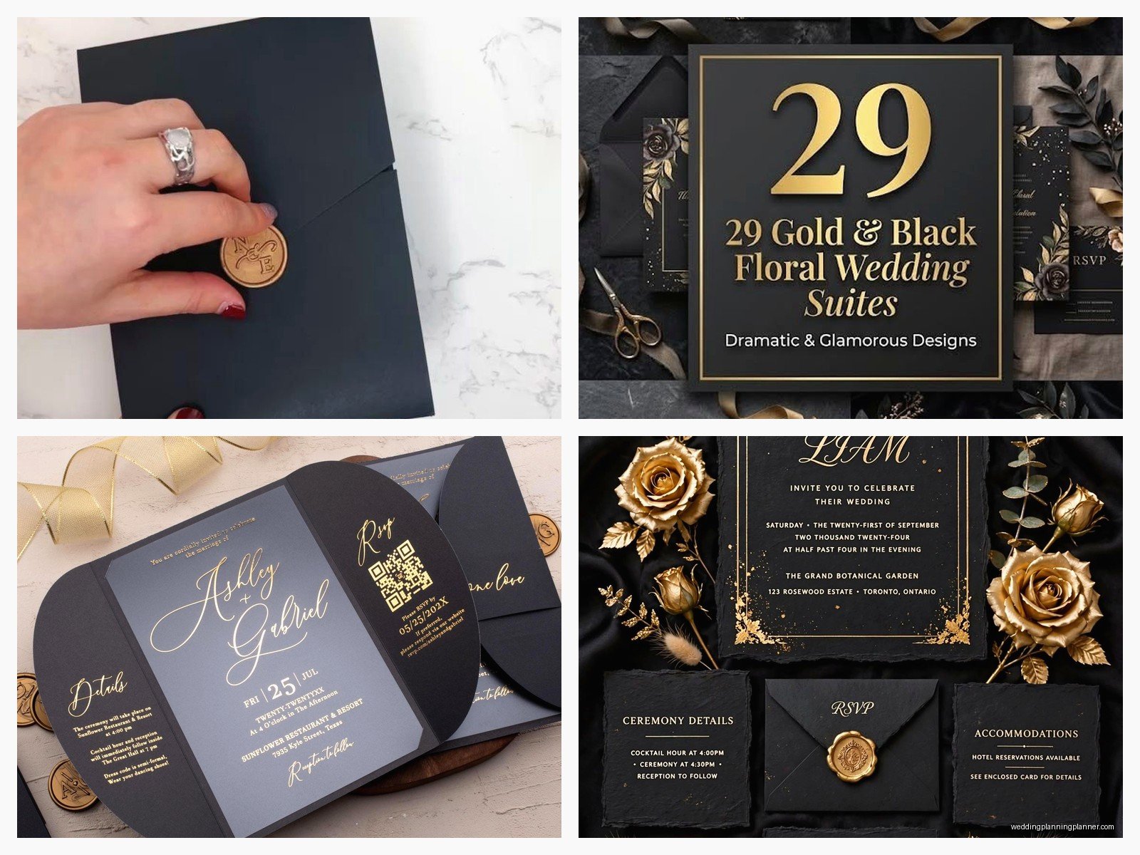
Envelopes – This is where you can have some fun. Black envelopes with gold addressing look amazing but they’re harder to write on and some calligraphers charge more for them. Gold envelopes are another option, or you could do black envelopes with gold liners. The liner thing is probably my favorite because when someone opens the envelope they get that gorgeous gold shimmer as a preview of what’s inside.
Belly bands or vellum wraps – These are optional but they can tie everything together nicely. A gold belly band around a black invitation suite looks really polished, or you could do a vellum overlay with gold text.
Printing Methods Breakdown
Let me just break down what each printing method actually involves because I think there’s a lot of confusion about this:
Foil stamping requires a custom die (a metal plate) and a foil stamping machine. The die is pressed into the paper with the metallic foil in between, and heat activates the adhesive on the foil. It’s a time-consuming process which is why it costs more, but the results are unmatched. You get that letterpress-like impression plus the metallic shine.
Thermography is sometimes used for gold effects—it creates raised text using powder and heat. It’s less expensive than foiling but the gold doesn’t have the same metallic quality. It’s more of a shiny raised effect.
Digital printing with metallic inks has gotten surprisingly good. It won’t fool anyone who knows paper goods, but for budget-conscious couples it can work. Just don’t expect it to photograph as well.
Letterpress can be done with metallic inks and it gives you that beautiful impression into the paper. It’s expensive though, sometimes more than foiling depending on the design complexity.
Common Mistakes I See All The Time
Using too many different gold shades in one suite. Like, if you’ve got gold foil on the invitation, gold metallic ink on the RSVP, and gold digital printing on the details card, they’re probably not gonna match and it’ll look disjointed. Stick with one or two methods max.
Not considering readability. Black on gold can be hard to read depending on the font and size. Gold on black is usually easier but you still need good contrast, which means your gold needs to be a true metallic gold, not a muted champagne color.
Forgetting about the postal service requirements. Black envelopes are fine but you need to use a light-colored ink or label for the addresses or they won’t be readable by the sorting machines. I usually recommend white ink or gold ink for addressing black envelopes, or you could use white labels.
Skipping the proofs. Always, always get a physical proof before you order 150 invitations. Colors look different on screen and you need to see the actual gold finish in person to know if it’s what you want.
Budget Planning Real Talk
Here’s roughly what you’re looking at price-wise (these are 2024 estimates and they vary by region):
Basic digital printing on nice cardstock with some gold elements: $3-6 per suite
Letterpress or thermography with metallic inks: $8-15 per suite
Gold foil stamping with premium paper: $12-25+ per suite
Fully custom design with multiple foiling, edge painting, special die cuts, etc: $25-50+ per suite
These prices usually include the main invitation, RSVP card, details card, and envelopes. Add-ons like belly bands, envelope liners, wax seals, or custom postage will increase the cost.
If you’re working with a tight budget, here’s what I tell clients: Choose one element to splurge on. Maybe that’s gold foil just for the couple’s names on an otherwise simple design. Or maybe it’s amazing thick black cardstock with simple gold digital printing. One standout element is better than trying to do everything halfway.
Timing and Ordering
You need more time for black and gold invitations than you would for basic printed invites. Here’s a realistic timeline:
Design finalization: 2-4 weeks (includes revisions)
Proof production and approval: 1-2 weeks
Printing production: 3-6 weeks depending on the method (foiling takes longer)
Assembly if needed: 1 week
Addressing: 1-3 weeks depending on whether you’re DIYing or hiring a calligrapher
So you’re looking at 8-16 weeks total from start to having them in the mail. I usually tell couples to start the invitation process 6-7 months before the wedding date to be safe.
DIY vs Professional
Can you DIY black and gold invitations? Sure, but… it’s gonna be limited. You can definitely do digital printing at home or through an online service. There are templates available that look pretty good. But you can’t really DIY foil stamping without spending a fortune on equipment, and even then the results probably won’t be professional quality.
There are these foil transfer systems you can buy for home use, and I’ve seen some couples try them, but they’re finicky and time-consuming. If you’re doing like 50 invitations maybe it’s worth it, but for 150+ I’d just hire it out.
What you CAN DIY successfully: envelope addressing if you have decent handwriting, assembly of the suite pieces, adding ribbon or wax seals, creating envelope liners using a template and gold paper.
What you probably shouldn’t DIY: the actual printing of the main invitation pieces, especially if you want real gold foiling. Just don’t. I’ve had couples come to me in tears because they tried to save money doing it themselves and ended up wasting more money on supplies and mistakes than they would’ve spent just hiring a professional.
Matching Your Wedding Theme
Your invitations should obviously connect to your overall wedding aesthetic. Black and gold works for SO many different themes though:
Art Deco / Great Gatsby – this is the most obvious one. Geometric patterns, lots of gold, black backgrounds, very 1920s glamour
Modern Minimalist – clean lines, maybe just a touch of gold foil on black cardstock, simple sans-serif fonts
Formal Traditional – classic layouts with gold borders and traditional typography
New Years Eve – obviously perfect for this, very celebratory and sparkly
Hollywood Glam – think old Hollywood elegance, dramatic and sophisticated
Even rustic weddings can work with black and gold if you soften it with kraft paper elements or pair it with greenery illustrations. It’s actually pretty versatile.
Special Touches Worth Considering
Edge painting – getting the edges of your cardstock painted gold looks incredibly luxe. It’s an extra cost but the effect when someone picks up the invitation is really special
Gold wax seals – these are having a moment and they photograph beautifully. You can get custom monogram seals made
Vellum overlays with gold printing – adds a layer of sophistication and protects the main invitation
Gold envelope liners – I mentioned this before but seriously, it’s such a good detail
Black velvet ribbon – sounds weird maybe but it looks amazing with gold and black invitations
There was this wedding I did invitations for last summer (2023) where we did black invitations with gold foil and then tied each suite with this thin gold ribbon and added a small sprig of dried gold-painted leaves. It was simple but the effect was stunning and it only added like $1.50 per invitation to include those natural elements
The key with any special touches is making sure they don’t make your invitations too bulky for mailing—you’ll end up paying extra postage if the suite is too thick or has weird dimensions

Canva
Wedding Memories Hardcover Template Canva Editable For Notebook, Journal, Novel, Hard Covers, Canva template For KDP Cover 6×9″ 120 pages
Canva
The Ultimate Wedding Planning Bundle, Canva Editable.
Canva
Customizable Wedding Video Invitations templates, Canva Editable Digital Wedding invitation Minimalist, Animated Custom Invitation
Digital Planning Templates
Wine Wedding Planner Bundle – 200-Page Printable PDF + 10 Editable Wedding Invitations | Instant Digital Download
Canva
Orange Wedding Planner Bundle – 200-Page Editable Canva Templates + 10 Editable Wedding Invitations | Instant Digital Download
Digital Planning Templates
Champagne Wedding Planner Bundle – 200-Page Printable PDF + 10 Editable Wedding Invitations | Instant Digital Download
Canva
Wedding Memories Hardcover Template Canva Editable For Notebook, Journal, Novel, Hard Covers, Canva template For KDP Cover 6×9″ 120 pages
Digital Planning Templates
Yellow Wedding Planner Bundle – 200-Page Printable PDF + 10 Editable Wedding Invitations | Instant Digital Download
Canva
Dusty Blue Wedding Planner Bundle – 200-Page Editable Canva Templates + 10 Editable Wedding Invitations | Instant Digital Download