
Planning Guides, Style Guide
Emerald Green Wedding Invitations: Jewel Tone Designs
Nov
Why Emerald Green Actually Works (Even Though Everyone’s Scared of It)
Okay so emerald green wedding invitations are having this massive moment right now and honestly I get why people hesitate. It’s bold, it’s dark, and if you mess it up, your invitations can look like Christmas cards in July. But here’s the thing—when you nail emerald green, you’ve got something that feels expensive and different without trying too hard.
I had this bride back in spring 2023 who was absolutely terrified of emerald. She kept saying “but Olivia, won’t it look too heavy?” and I had to literally show her like fifteen examples before she trusted me. Her invitations ended up being the most complimented part of her whole wedding, and guests were taking photos of them at the reception. So yeah, it works, you just gotta know what you’re doing.
The Base Options You’re Working With
First decision is what’s actually gonna be emerald green—the cardstock, the ink, the envelope, or some combination. I usually tell people to pick ONE main element to be the emerald and then build around it because going full emerald everything can feel overwhelming.
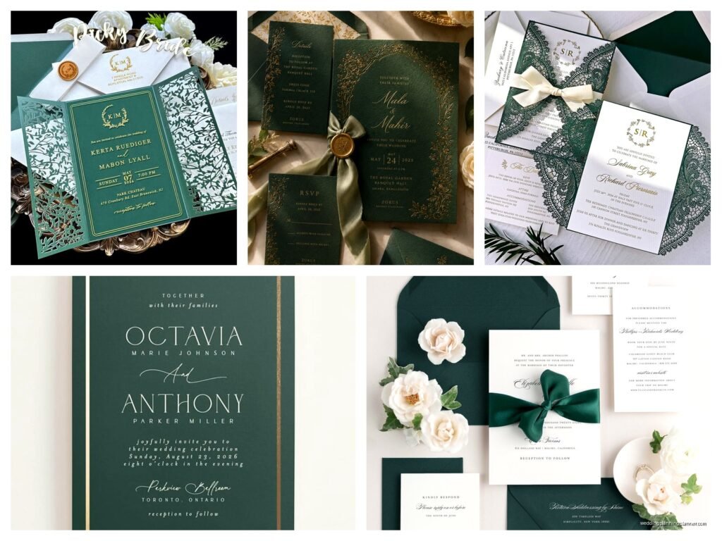
Emerald cardstock with gold foil text: This is probably the most dramatic option. You’re printing on deep green paper, and the invitation itself becomes this jewel-like thing. The trick here is that your text needs to be metallic or white because regular black ink disappears into the green. Gold foil is chef’s kiss for this, but it’s pricey. Rose gold also works if you want something a bit softer.
White or cream cardstock with emerald ink: This is safer and honestly more versatile. You can do emerald text, emerald borders, emerald flourishes, whatever. It photographs better too, which matters more than people think. Your aunt’s gonna post this on Facebook and you want it to actually look good in her terrible phone camera lighting.
Emerald envelopes with contrasting invites: Sometimes I suggest doing the emerald as just the envelope liner or the whole envelope, then keeping the actual invitation lighter. This gives you that jewel tone pop when people open it without committing to dark cardstock.
Paper Weight Actually Matters Here
One thing that annoys me SO much is when people cheap out on paper weight for jewel tone invitations. Like, if you’re going emerald, you need substantial paper—at least 110lb cardstock, preferably 130lb. Thin paper with dark colors looks flimsy and weird. The whole point of jewel tones is that luxe feeling, and that falls apart if your invitation feels like it came from a home printer.
I always tell clients to order samples first because emerald green looks completely different on matte versus glossy versus textured paper. Matte gives you that sophisticated museum feeling. Glossy makes it more vibrant but can read as less formal. Textured—like linen or cotton paper—adds depth and makes it feel handcrafted.
Color Combinations That Don’t Look Like a Mess
Alright so you’ve picked emerald as your main color, now what goes with it? This is where people panic and start adding too many colors because they think emerald needs “balancing” or whatever.
Emerald + gold: Classic, elegant, works every time. I’m talking about metallic gold, not mustard yellow. This combo feels expensive automatically. You can do gold foil printing, gold wax seals, gold envelope liners with patterns. It’s kinda hard to mess this up honestly.
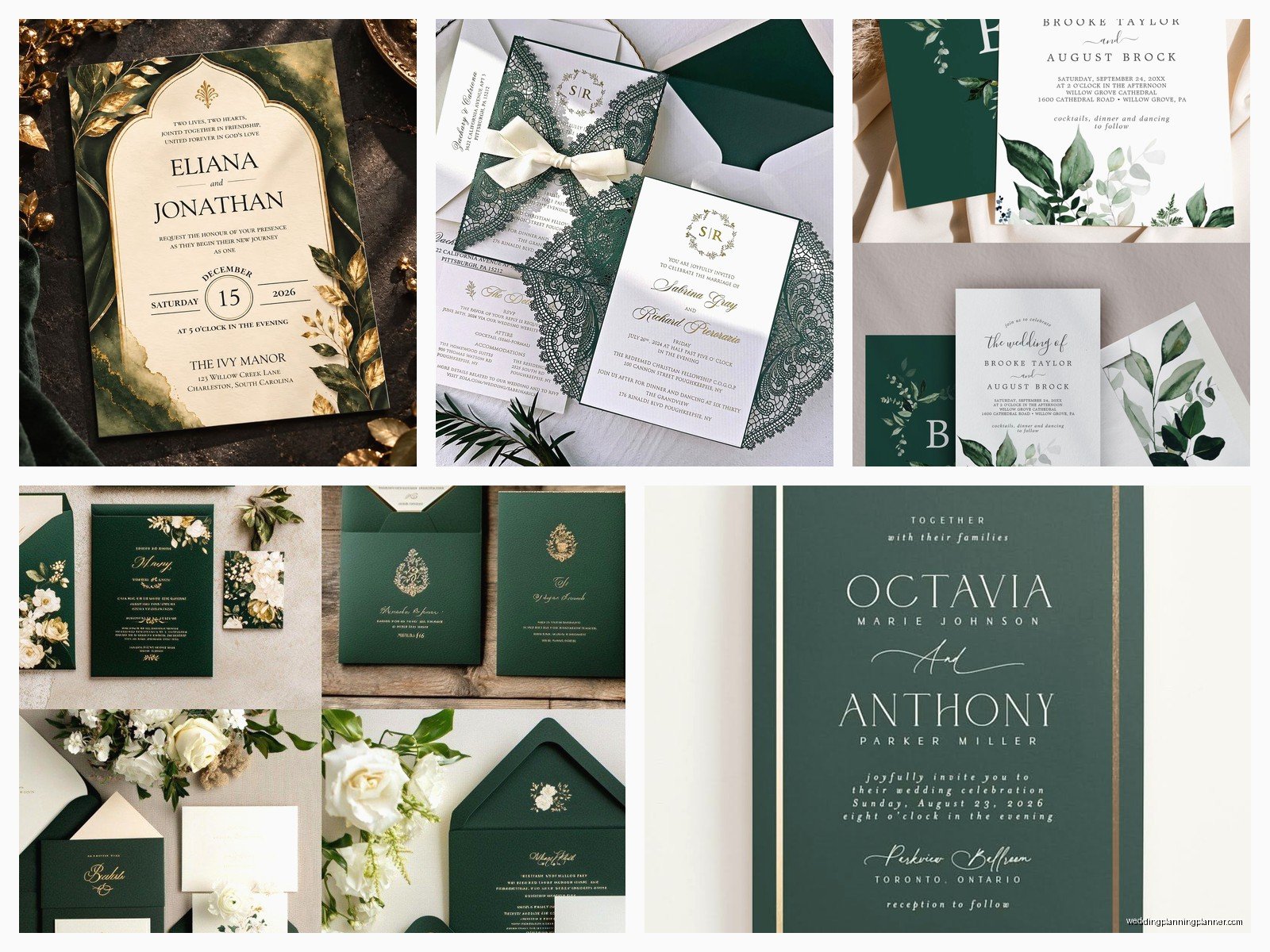
Emerald + ivory/cream: Softer than stark white, and it lets the emerald breathe. This is my go-to recommendation for outdoor or garden weddings. Add some greenery illustrations in a lighter green and you’ve got something really pretty without being too matchy-matchy with your actual wedding flowers.
Emerald + blush/rose gold: This is more romantic and less formal. The warmth of blush tones down the intensity of emerald. I did a set of invitations with emerald ink, rose gold foil accents, and blush envelopes and they were gorgeous. Very spring garden party vibes.
Emerald + navy: For a more dramatic, moody look. This works really well for fall or winter weddings. Both colors are deep, so you need to add a metallic (gold or copper) to break it up, otherwise it gets too dark and… okay this is gonna sound weird but my cat knocked over my coffee while I was designing a navy and emerald suite once and I had to redo the whole thing, and honestly the second version was better because I added more white space. Sometimes you need those accidents to see what’s missing.
Emerald + burgundy/wine: Very jewel-box, very opulent. This is for people who want their invitations to make a statement. Add gold and you’ve got something that looks like it belongs in a castle.
Design Elements That Actually Work
So you’ve got your colors figured out, now let’s talk about what goes ON the invitation. Emerald green is bold enough that you don’t need a ton of design elements competing for attention.
Borders and Frames
A simple gold geometric border on emerald cardstock is stunning. I’m talking thin lines, nothing chunky. Art deco-style frames work really well with jewel tones because they have that vintage glamour thing going on. You can also do a subtle emerald watercolor border on white cardstock if you want something more organic.
Botanical Illustrations
Greenery is sort of obvious with emerald but it works. Eucalyptus, ferns, olive branches—these look natural with emerald ink or on emerald backgrounds. Just make sure the illustration style matches your wedding vibe. Delicate line drawings for formal weddings, more painterly watercolors for casual or outdoor weddings.
Geometric Patterns
Emerald green in geometric shapes feels modern and sophisticated. Think hexagons, diamonds, chevrons. You can do an emerald geometric pattern as an envelope liner or as a subtle background element. This works especially well if your wedding has any art deco or modern industrial elements.
Marble and Agate
Okay so this trend is kinda everywhere but emerald green marble or agate designs are actually really pretty. It ties into that jewel/gemstone theme obviously. You can find emerald marble textures or even do a design that looks like an actual emerald crystal. Just don’t go overboard—use it as an accent, not the entire background.
Printing Methods and What They Cost
This is where budget becomes a real conversation because different printing methods give you totally different looks and price points.
Digital printing: Most affordable, good quality, works fine for emerald ink on light cardstock. You won’t get that luxe raised texture but for most weddings this is perfectly acceptable. Colors can be vibrant and accurate.
Letterpress: This is where emerald really shines (literally). Letterpress creates an impression in the paper and the ink sits beautifully. Emerald letterpress on cream paper is absolutely gorgeous. It’s expensive though—you’re looking at probably $8-15 per invitation depending on complexity.
Foil stamping: If you’re doing emerald cardstock, you basically need foil or white ink for text. Gold foil on emerald is the most popular combo I work with. Foil adds serious cost—usually $3-5 per invitation just for the foil element—but the impact is worth it if it’s in your budget.
Thermography: This gives you raised printing that looks similar to engraving but costs way less. Emerald thermography on white cardstock looks rich and formal. It’s a good middle-ground option.
The Envelope Situation
Don’t sleep on envelopes because they’re the first thing people see. With emerald invitations, you’ve got options.
You can do emerald envelopes—either solid emerald or white/cream with an emerald liner. Envelope liners in emerald with a gold pattern are really popular right now. If your actual invitation is emerald, I usually suggest a lighter envelope so you’re not hiding the invitation inside a dark envelope. Cream, ivory, or even a light gold/champagne color works.
For addressing, gold or white ink on emerald envelopes looks amazing but you’re gonna need to hire a calligrapher or use a service that does envelope printing because regular printers hate dark envelopes. I learned this the hard way during a really stressful situation in summer 2021 where a client waited until the last minute and we had to hand-address 150 emerald envelopes in three days because the printing service screwed up the first batch. My hand cramped for like a week.
Wax Seals Are Your Friend
Okay I know wax seals are extra but with emerald invitations they really add to that luxe jewel-tone vibe. Gold wax seals on emerald envelopes look incredible. You can get custom stamps with your initials or wedding date. They do add postage cost because they make the envelope lumpy, but if you’re already going for emerald invitations you’re probably not pinching pennies anyway.
What Else Goes in the Suite
Your invitation suite is more than just the main invitation. You’ve probably got RSVP cards, details cards, maybe a weekend itinerary if you’re doing a destination thing.
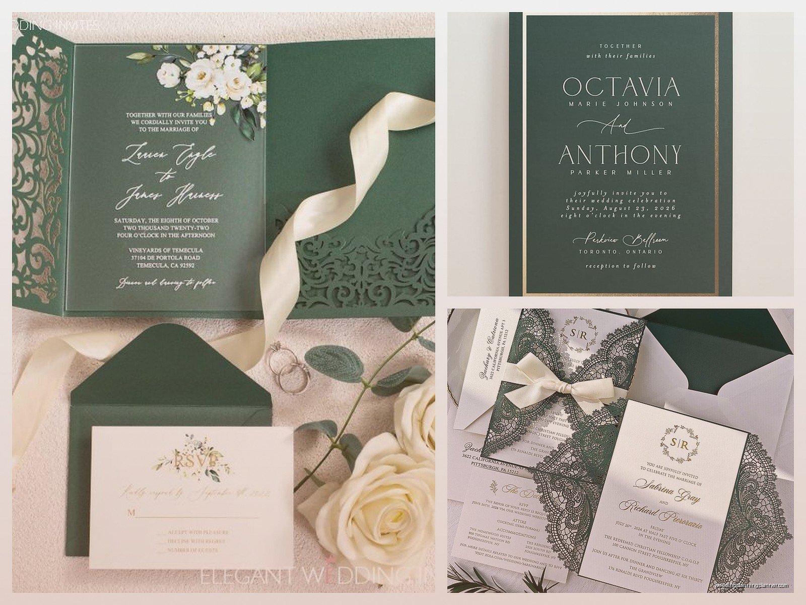
I usually suggest keeping the emerald consistent but varying the intensity. So like, main invitation is emerald cardstock with gold foil, RSVP card is cream with emerald ink, details card is cream with an emerald border. This keeps everything cohesive without being repetitive.
Belly bands or ribbon wraps in emerald or gold can tie everything together literally. Vellum overlays with emerald printing are also really pretty and add a layer of sophistication.
Timing and Ordering
Order samples like way earlier than you think you need to. Emerald green varies SO much between printers and paper types. What looks perfect on your screen might print completely different. I always tell people to order at least 3-4 samples from different companies before committing.
For the actual order, give yourself at least 8-10 weeks before you need to mail them if you’re doing any custom printing or foil work. Digital printing is faster—maybe 3-4 weeks—but don’t cut it close because mistakes happen and reprints take time.
Seasonal Considerations
Emerald works year-round but it hits different depending on season. Spring and summer weddings can do emerald with lighter colors—blush, ivory, lots of white space. It feels fresh and garden-like. Fall and winter weddings can go darker and moodier—emerald with burgundy, navy, deep gold. It feels cozy and rich.
For winter weddings, emerald with silver instead of gold gives you that icy elegant thing without looking like Christmas… well, okay it might still look a bit like Christmas but in a chic way not a tacky way. Add some white and keep the design minimal.
Common Mistakes People Make
Using too many fonts. Emerald is already a statement, so keep typography simple. Two fonts max—one for names/headers, one for body text.
Making everything the same shade of emerald. Vary your tones. Use a deeper emerald for main elements and a lighter sage or seafoam as accent colors.
Forgetting about readability. Dark text on emerald cardstock needs to be big enough and the right color. Gold foil is beautiful but can be hard to read in small sizes. Test your text size before printing 150 invitations.
Ignoring the rest of your wedding aesthetic. Your invitations should connect to your overall wedding design. If your wedding is rustic and emerald invitations feel too formal, maybe reconsider or adjust the design style to be more organic.
Real Talk About Budget
Emerald invitations can get expensive fast, especially with foil or letterpress. If budget is tight, do emerald ink on nice cream cardstock with simple digital printing. Add one splurge element—maybe gold foil just for your names, or an emerald envelope liner. You don’t need every single element to be fancy for it to look good.
DIY is possible with emerald but be realistic about your skills and time. Printing at home on dark cardstock is really hard and usually looks obviously homemade. If you’re gonna DIY, do emerald ink on white cardstock and buy pre-made emerald envelopes.

Canva
Wedding Memories Hardcover Template Canva Editable For Notebook, Journal, Novel, Hard Covers, Canva template For KDP Cover 6×9″ 120 pages
Canva
The Ultimate Wedding Planning Bundle, Canva Editable.
Canva
Customizable Wedding Video Invitations templates, Canva Editable Digital Wedding invitation Minimalist, Animated Custom Invitation
Digital Planning Templates
Wine Wedding Planner Bundle – 200-Page Printable PDF + 10 Editable Wedding Invitations | Instant Digital Download
Canva
Orange Wedding Planner Bundle – 200-Page Editable Canva Templates + 10 Editable Wedding Invitations | Instant Digital Download
Digital Planning Templates
Champagne Wedding Planner Bundle – 200-Page Printable PDF + 10 Editable Wedding Invitations | Instant Digital Download
Canva
Wedding Memories Hardcover Template Canva Editable For Notebook, Journal, Novel, Hard Covers, Canva template For KDP Cover 6×9″ 120 pages
Digital Planning Templates
Yellow Wedding Planner Bundle – 200-Page Printable PDF + 10 Editable Wedding Invitations | Instant Digital Download
Canva
Dusty Blue Wedding Planner Bundle – 200-Page Editable Canva Templates + 10 Editable Wedding Invitations | Instant Digital Download