
Planning Guides, Style Guide
Purple Wedding Invitations: Lavender to Plum Designs
Nov
Purple Invitations Are Having a Moment and Here’s What You Need to Know
So purple wedding invitations aren’t just one thing, right? Like when clients come to me saying “we want purple invitations” I literally have to pull out my entire color wheel because purple ranges from barely-there lilac that reads almost white in certain lighting to this deep eggplant that’s practically black. I learned this the hard way back in summer 2021 when a bride said she wanted “light purple” and I sent her lavender samples and she actually meant periwinkle which is… a whole different situation.
The main thing you gotta understand is that purple sits in this weird space where it can be ultra-romantic, modern, regal, whimsical, or even gothic depending on the shade and how you pair it. I’ve done invitations in every purple shade you can imagine and they all hit differently.
Breaking Down the Purple Spectrum for Invitations
Lavender is your softest option and honestly it’s having such a moment right now. It pairs beautifully with cream, white, sage green, or even dusty rose. When you’re working with lavender you want to think about it as a neutral-ish color because it’s so light. I usually recommend doing lavender as an accent color on white cardstock rather than printing on lavender paper because lavender paper can look cheap if you don’t get the right weight. Like 110lb cover minimum or it’s gonna feel flimsy.
Lilac is slightly deeper than lavender and it reads more distinctly purple. This is where you can start playing with metallics – lilac with gold foiling looks expensive, lilac with silver feels more modern and clean. One bride I worked with in spring 2023 did lilac envelopes with white invitations and a lilac wax seal and it was *chef’s kiss* levels of gorgeous.
Violet and amethyst are your mid-range purples. These are bold enough to make a statement but not so dark that they limit your printing options. This is actually my favorite range to work in because you have the most flexibility. You can do white ink on violet paper, you can do violet ink on cream paper, you can mix it with blush or navy or even emerald green if you’re feeling adventurous.
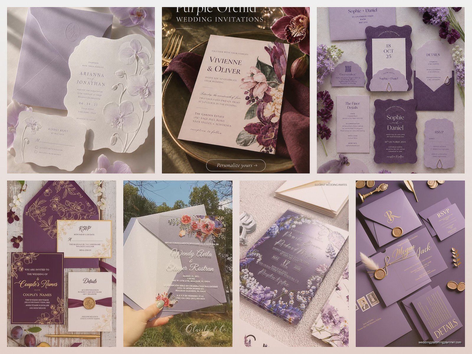
Plum and eggplant are your deep, moody purples. These invitations scream elegance and they’re perfect for evening weddings or fall/winter celebrations. But here’s what annoys me about deep purple invitations – everyone wants to print dark ink on dark paper and then they’re shocked when you can’t read anything. Like yes, burgundy ink on plum paper sounds beautiful in theory but in practice you need serious contrast or… what’s the point? White ink, gold foiling, or embossing are your friends here.
Paper Stock Matters More Than You Think
Okay so I’m gonna sound like a broken record here but paper quality is everything with purple invitations. Cheap purple cardstock has this tendency to look very arts-and-crafts, very DIY-in-a-bad-way. You want thick, luxurious paper that has some texture to it.
Cotton paper is my go-to for purple invitations because it has this natural texture that elevates the whole look. Crane Lettra, Neenah Cotton, or if you’ve got budget, handmade cotton rag paper. The texture catches light differently and makes even a simple design look custom and expensive.
For lighter purples like lavender and lilac, you can also consider translucent vellum overlays. I did this set once where the main invitation was cream with lavender calligraphy and we added a frosted vellum overlay with the couple’s monogram in deeper purple – it added dimension without being too much.
Linen textured paper also works beautifully with purple, especially mid-tones. It gives this slightly vintage, slightly organic feel that balances out the boldness of the color.
Printing Methods and What Actually Works
Digital printing is fine for lighter purples and it’s definitely the most budget-friendly option. You can get really vibrant lavenders and lilacs with digital printing and it looks professional. Just make sure you’re working with a printer who calibrates their colors properly because purple can shift really easily – I’ve seen lavender print as straight-up pink before and that’s not a fun conversation to have with a bride two months before her wedding.
Letterpress is stunning with purple but you need to think carefully about your color combinations. Letterpress creates an impression in the paper so you want enough contrast to see both the color and the debossing. Deep purple letterpress on cream or white paper? Beautiful. Lavender letterpress on white? Can look washed out unless you do a really saturated ink or… actually I usually recommend doing a different printing method for very light purples because letterpress doesn’t always give you the color intensity you want.
Foil stamping in metallics over purple is probably my favorite look. Rose gold foil on lavender, gold foil on plum, silver foil on violet – these combinations just work. The foil catches light and adds this luxe element that makes even a simple design feel special. It’s more expensive than digital printing but if you’re doing foil just for names or a monogram rather than the whole invitation, it’s usually manageable budget-wise.
Design Styles That Work With Purple
Modern minimalist designs love purple. Think clean lines, lots of white space, maybe a purple geometric border or a simple purple block with white text. Sans serif fonts work really well here – I’m obsessed with using purple with modern typography lately. It feels fresh and unexpected.
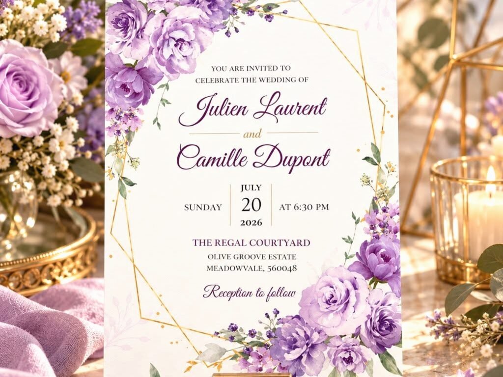
Romantic floral designs are obviously a natural fit. Watercolor purple flowers, botanical line drawings in purple ink, pressed flower details in purple blooms. You can go full garden vibes or keep it more refined with just a small floral accent. My cat knocked over a whole thing of purple watercolor paint on a floral invitation proof once and honestly… it kinda looked intentional? I didn’t tell the client that though.
Art deco and vintage-inspired designs work surprisingly well with purple, especially the deeper shades. Think gold geometric patterns with plum accents, or 1920s-style typography with amethyst details. There’s something about purple that lends itself to that glamorous, slightly theatrical aesthetic.
Color Combinations That Don’t Suck
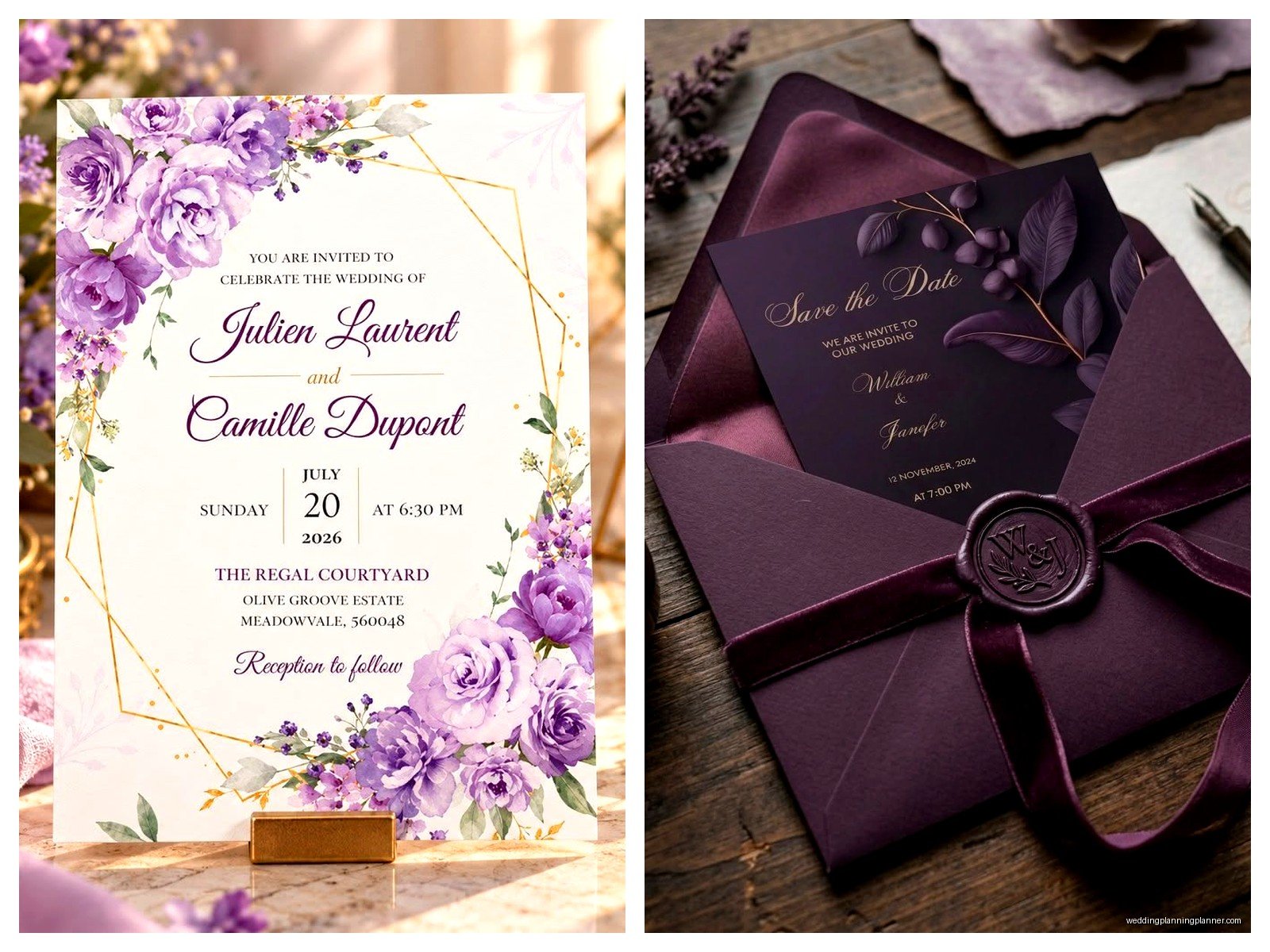
Purple and gold is classic for a reason. It’s regal without being stuffy if you do it right. I usually recommend using gold as an accent rather than going 50/50 with the colors because too much gold can veer into tacky territory.
Purple and greenery is having such a moment. Sage green with lavender, eucalyptus green with lilac, deep forest green with plum – these combinations feel organic and romantic. They work especially well for outdoor weddings or garden venues.
Purple and blush is ultra-romantic and feminine. Lighter purples with blush pink create this dreamy, soft palette that’s popular for spring and summer weddings. You can add in ivory or champagne tones to ground it a bit.
Purple and navy is more unexpected but I love it for modern weddings. Deep purple with navy blue feels sophisticated and bold. Add in some white or cream to keep it from getting too dark and moody… unless dark and moody is what you’re going for, then lean into it.
Purple and cream is safer than purple and stark white. Cream warms up purple tones and creates a softer, more romantic feel. This works across the whole purple spectrum from lavender to plum.
Envelope Situations
Your envelope choice matters just as much as the invitation itself. Purple envelopes make a statement before anyone even opens the invitation, which is kinda the whole point.
For lighter purples, I usually go with colored envelopes and white or cream invitations inside. It creates nice contrast and the pop of color when it arrives in the mail is gorgeous. Lavender envelopes with white invitations and maybe a lavender liner or belly band to tie it together.
For deeper purples, you have options. Deep purple envelopes can be stunning but they’re bold – make sure your guest addressing is either professionally calligraphed in white or metallic ink, or use printed labels that actually show up. I’ve seen too many plum envelopes with black addressing that you literally cannot read.
Envelope liners are where you can have fun. A patterned liner in coordinating purples, a metallic liner, or even a floral liner that picks up your invitation design. Euro flap envelopes show off liners better than regular A7 envelopes just FYI.
Wording and Typography Considerations
Script fonts work beautifully with purple invitations but don’t go too ornate or it starts looking like a medieval manuscript. I like pairing a simple script for names with a clean serif or sans serif for the details. The contrast makes everything more readable and feels more modern.
All caps typography in a light purple can look really chic and modern, especially if you’re doing a minimalist design. It’s clean and easy to read and feels current.
When you’re choosing ink colors for purple invitations, think about contrast. Black ink on light purple paper works fine. White ink on dark purple paper is dramatic and beautiful. Purple ink on white or cream paper gives you the most flexibility with shade variations.
Embellishments and Special Touches
Wax seals in purple are having a huge moment. You can get custom seals with your monogram or just use a simple decorative seal. Purple wax on cream or white envelopes looks so good. I’m personally obsessed with using multiple shades of purple wax on the same invitation suite – like a lavender seal on the RSVP envelope and a plum seal on the main invitation envelope.
Ribbon and belly bands in purple add dimension. Silk ribbon in coordinating purple shades, velvet ribbon for winter weddings, or even organza ribbon for a lighter touch. Just make sure if you’re mailing invitations with ribbon that you account for extra postage because they won’t go through the sorting machines.
Dried flowers or pressed flowers in purple tones can be incorporated if you’re going for a botanical vibe. Lavender sprigs, purple statice, or violet petals pressed into handmade paper or attached with washi tape.
Budget-Friendly Purple Invitation Options
If you’re working with a tight budget, you can still do beautiful purple invitations. Print your own using a good home printer and quality cardstock – just do test prints first because purple ink can be tricky. I always tell DIY brides to order extra paper because you’re gonna mess up at least a few and it’s better to have extras than to run out.
Online printing services like Minted, Zazzle, or Vistaprint have come a long way with their purple options. You can customize templates and get professional-looking results for way less than custom printing. Just be aware that colors on screen don’t always match what prints, so order samples first.
DIY embellishments like adding your own ribbon or wax seals to otherwise simple invitations can elevate the whole look without breaking the bank. You can buy blank purple cardstock invitations and customize them yourself with stamps, stickers, or hand-lettering.
Timing and Practical Stuff
Order samples before you commit to anything. Purple is one of those colors that looks completely different in person than on screen. I can’t tell you how many times I’ve had clients fall in love with a purple online and then hate it when they see the actual printed version.
Leave yourself extra time for custom printing, especially if you’re doing foiling or letterpress. These methods take longer and if there are any issues with color matching or quality, you need time to fix them. I generally recommend starting the invitation process at least 4-5 months before you need to mail them.
Account for postage – textured paper, thick cardstock, embellishments, and oversized envelopes all affect postage costs. Take a fully assembled invitation to the post office and have them weigh it before you buy stamps. Nothing worse than having invitations returned because of insufficient postage.
The thing about purple invitations is they’re memorable. People remember getting a purple invitation in the mail because it’s not the standard white or cream that most people do. It sets a tone for your wedding and gives guests a preview of your style. Whether you go soft and romantic with lavender or bold and dramatic with plum, purple invitations make a statement and that’s kinda the whole point of a wedding invitation anyway

Canva
Wedding Memories Hardcover Template Canva Editable For Notebook, Journal, Novel, Hard Covers, Canva template For KDP Cover 6×9″ 120 pages
Canva
The Ultimate Wedding Planning Bundle, Canva Editable.
Canva
Customizable Wedding Video Invitations templates, Canva Editable Digital Wedding invitation Minimalist, Animated Custom Invitation
Digital Planning Templates
Wine Wedding Planner Bundle – 200-Page Printable PDF + 10 Editable Wedding Invitations | Instant Digital Download
Canva
Orange Wedding Planner Bundle – 200-Page Editable Canva Templates + 10 Editable Wedding Invitations | Instant Digital Download
Digital Planning Templates
Champagne Wedding Planner Bundle – 200-Page Printable PDF + 10 Editable Wedding Invitations | Instant Digital Download
Canva
Wedding Memories Hardcover Template Canva Editable For Notebook, Journal, Novel, Hard Covers, Canva template For KDP Cover 6×9″ 120 pages
Digital Planning Templates
Yellow Wedding Planner Bundle – 200-Page Printable PDF + 10 Editable Wedding Invitations | Instant Digital Download
Canva
Dusty Blue Wedding Planner Bundle – 200-Page Editable Canva Templates + 10 Editable Wedding Invitations | Instant Digital Download