
Planning Guides, Style Guide
Country Wedding Invitations: Rustic Farmhouse Designs
Nov
Picking Your Rustic Farmhouse Wedding Invitation Style
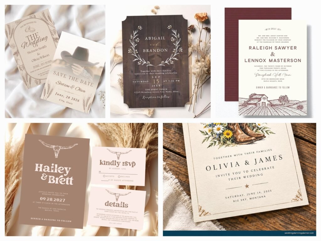
Okay so country wedding invitations are having this huge moment right now and honestly it’s been going strong for like five years. The rustic farmhouse vibe is what most of my couples ask for when they’re doing a barn wedding or anything outdoors. You’ve gotta figure out first if you want actual rustic (think wood grain, burlap texture, very raw) or farmhouse (which is more refined, like white shiplap and greenery).
I had this bride in spring 2023 who kept sending me Pinterest boards with both styles mixed together and she couldn’t understand why her invitations looked messy when we tried to combine them. The thing is, rustic leans heavy, dark, textured. Farmhouse is airy, white, clean lines. You can blend them but you need one to be the dominant vibe.
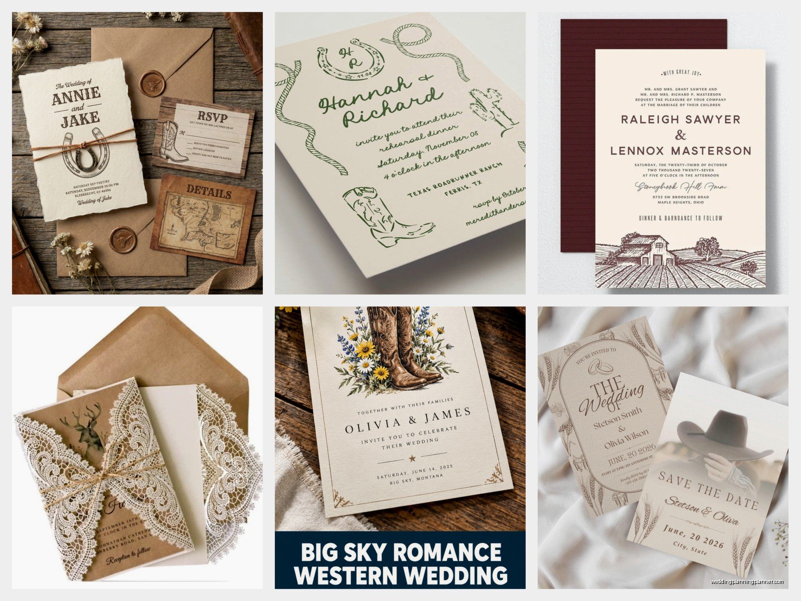
For rustic designs, you’re looking at kraft paper backgrounds, woodgrain patterns, maybe some lace details or twine elements. Think deep browns, forest greens, burgundy, maybe some burnt orange. The fonts are usually either super chunky and hand-drawn or delicate script to create contrast.
Farmhouse invitations tend to use more white or cream cardstock, simple greenery illustrations (eucalyptus is everywhere), and cleaner typography. You might see sage green, dusty blue, soft blush, or just stick with neutrals and let the greenery do the work.
Paper Stock and Texture Options
This is where people get overwhelmed because there are SO many choices. For country weddings, texture matters way more than it does for formal invitations. I always tell clients to order samples before committing because what looks good on a screen doesn’t always feel right in your hand.
Kraft paper is the most obvious choice and it’s cheap which is nice. It comes in different weights though – you want at least 100lb cover stock or it feels flimsy. The brown kraft works perfectly for rustic vibes but it can make some ink colors look muddy, so test your color palette first.
Textured cardstock that mimics linen or canvas is really popular right now. It’s more expensive than regular cardstock but not crazy expensive. It gives you that handmade feeling without actually being handmade (because hand-making 150 invitations is gonna make you lose your mind, trust me).
Wood veneer invitations are a thing and they look incredible but they’re pricey and you need to budget for extra postage because they’re thick. I did a wedding last year where the couple insisted on wood veneer and then freaked out about the postage cost… like yes, mailing tiny pieces of wood costs more than paper, this shouldn’t be surprising.
Cotton paper has this beautiful soft texture and it’s eco-friendly which matters to a lot of couples doing farm weddings. It takes ink really well and feels substantial. The downside is it’s one of the more expensive options per sheet.
Design Elements That Actually Work
Okay so everyone wants to throw every country element onto their invitation and that’s where things go wrong. You don’t need barn doors AND sunflowers AND mason jars AND horseshoes AND wheat stalks all on one five-by-seven inch card. Pick like two or three elements max.
Greenery illustrations are your best friend. A simple eucalyptus wreath or some olive branches can frame your text beautifully without overwhelming everything. I use these on probably 60% of my farmhouse designs because they’re versatile and they don’t compete with your wording.
Wildflower designs work great if your wedding has a garden or meadow component. Just make sure the illustration style matches your overall vibe – watercolor flowers read more romantic and soft, line-drawn flowers feel more modern farmhouse.
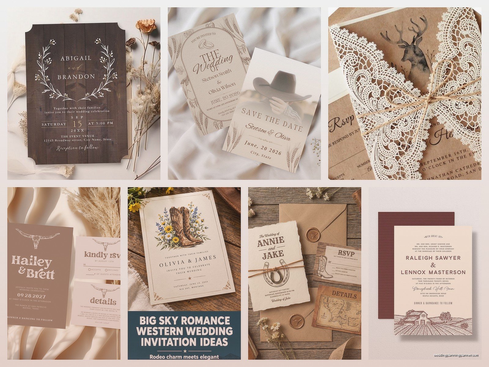
Woodgrain backgrounds or borders add texture without being literal. You can find tons of woodgrain patterns that print beautifully and give you that rustic feel. Sometimes I’ll do a subtle woodgrain texture as the background and then print the text in white or cream – it looks really sophisticated.
Burlap and lace are tricky because they can look dated fast. If you’re gonna use them, do it as an actual physical element (like a burlap belly band around the invitation) rather than printing a burlap texture. The printed version almost always looks cheap and kinda… 2014?
Mason jar illustrations are cute if your venue actually uses mason jars, but otherwise they feel really generic. Same with horseshoes – unless you’re having an actual horse at your wedding or one of you is seriously into riding, it just reads as “country clipart.”
Typography Choices That Don’t Look Cheap
Font selection makes or breaks these invitations, I’m serious. You want a mix of fonts but not too many – usually a script or hand-lettered font for names or key phrases, and a clean serif or sans-serif for the details.
For rustic farmhouse, avoid anything too ornate or swirly. You’re not doing a castle wedding. Look for fonts that have character but are still readable – your grandma needs to be able to read the ceremony time without a magnifying glass.
I really like pairing a bold, slightly rough sans-serif with a simple script. Or a clean serif (like a modern take on a traditional font) with hand-lettered elements. The contrast is what makes it interesting.
One thing that annoys me SO MUCH is when people use that one font – you know the one, it’s on every farmhouse sign at Target – for everything on their invitation. It’s called something like Farmhouse Script or whatever and it’s SO overused. Your invitation should feel personal, not like you bought it at Hobby Lobby.
Color Palettes for Country Invitations
Most rustic farmhouse weddings stick to pretty neutral color schemes with maybe one or two accent colors. This actually makes invitation design easier because you’re not trying to match eight different colors.
Classic combinations: kraft brown with white or cream text, maybe a pop of forest green. White or cream base with sage green and gold accents. Cream with dusty blue and greenery. Kraft with burgundy and blush.
You can go darker and moodier if your wedding is in fall or winter – deep navy, burgundy, burnt orange, forest green, lots of brown tones. These look gorgeous printed on kraft paper or dark cardstock.
For spring and summer farmhouse weddings, lighter palettes work better. Lots of white space, soft greens, maybe lavender or soft yellow. Keep it airy.
Metallics can work but use them sparingly. A touch of gold foiling on a rustic invitation can look really elevated, but too much and it fights with the casual vibe. Rose gold works nicely with blush and sage color schemes.
Layout and Information Hierarchy
Your invitation needs to communicate information clearly even while looking pretty. I see people sacrifice readability for aesthetics and then guests show up at the wrong time or… actually, I had a wedding in summer 2021 where the invitation was so covered in floral illustrations that people missed the date entirely and like six people showed up a week early. The venue wasn’t even set up yet.
Start with your names – these should be the most prominent thing on the invitation. Then the request line (like “invite you to celebrate their marriage” or whatever wording you choose). Then date, time, location in that order because that’s how people process information.
For farmhouse designs, centered alignment usually works best. It feels formal enough for a wedding but the casual fonts and rustic elements keep it from being stuffy. You can do left-aligned for a more modern farmhouse look.
Leave white space. Or kraft space. Whatever your background is, don’t fill every inch with text or design elements. Your eyes need somewhere to rest.
Physical Details and Assembly
Okay so you’ve designed the invitation, now you gotta think about the actual physical pieces and how they go together. Most wedding invitations are a suite – you’ve got the main invitation, maybe an RSVP card, details card, and sometimes other inserts.
For rustic weddings, I usually recommend keeping the suite simple. Main invitation and RSVP card are essential, then add a details card if you have a lot of extra information (like shuttle times, dress code, accommodation options).
Belly bands are really popular for farmhouse invitations – it’s a strip of paper or cardstock that wraps around the whole suite to keep it together. You can do these in kraft paper, vellum, or even actual fabric like burlap ribbon. They look polished and they’re functional.
Vellum overlays are another option I love for farmhouse designs. You print your main invitation on cardstock, then have a sheet of translucent vellum over the top with just your names or a simple design. It adds a layer of sophistication and it’s not expensive.
Wax seals are having a moment and they work great with country weddings if you choose the right design and color. A simple initial or botanical design in deep green, burgundy, or gold wax looks beautiful on kraft envelopes. Just know they add thickness so more postage.
Twine, ribbon, or raffia can tie elements together literally. I usually wrap it around the belly band or use it to attach a tag. Natural jute twine is very rustic, cream ribbon is more farmhouse, silk ribbon gets fancier.
Envelope Options and Addressing
Your envelope is the first thing people see so don’t just grab whatever white envelope came with your cardstock order. For rustic farmhouse invitations, kraft envelopes are perfect and they’re easy to find. You can also do cream, white, or even a colored envelope if it matches your palette – I’ve done sage green envelopes that looked incredible.
Envelope liners add a nice touch and they’re not hard to DIY if you have a template. You can use patterned paper that coordinates with your invitation – maybe a subtle woodgrain, a floral pattern, or even just a solid color that pulls from your palette.
For addressing, hand-lettering looks beautiful but it’s time-consuming and honestly most people’s handwriting isn’t as nice as they think it is (sorry but it’s true). You can hire a calligrapher which is gorgeous but expensive, or you can print addresses directly on the envelopes which is what most people do now.
If you’re printing addresses, make sure your font choice matches your invitation style. Use the same fonts or complementary ones. And for the love of all that is holy, proofread your address list multiple times because reprinting envelopes is annoying.
I also always tell couples to order extra envelopes – like 25-50 more than you need – because you will mess some up. You’ll print them crooked, or someone will spill coffee (that was me last week, oops), or you’ll have to add people to your guest list last minute.
DIY vs. Professional Printing
Real talk: you can DIY rustic farmhouse invitations and have them look good. The designs are forgiving enough that you don’t need perfect printing. But you need to be realistic about your time, skill level, and sanity.
If you’re crafty and you have fewer than like 75 invitations, DIY can work. You’ll need a good printer (home inkjet printers are gonna struggle with heavy cardstock), quality paper, and a lot of patience. There are tons of templates on Etsy and other sites that you can customize yourself.
For larger quantities or if you want special finishes (foiling, letterpress, fancy die-cuts), go professional. The cost difference isn’t as huge as you’d think once you factor in your time and materials for DIY.
Online printing services are the middle ground – you design it yourself or customize a template, then they print it on nice paper and ship it to you. This is what most of my couples do honestly. Places like Minted, Zola, Artifact Uprising… there are tons of options and the quality is pretty good.
One thing to watch with online services is paper quality – sometimes what they call “premium” is still kinda thin. Read reviews and order samples if possible.
Matching Pieces and Day-Of Stationery
If you’re doing rustic farmhouse invitations, you probably want your other wedding stationery to match. This includes programs, menus, place cards, table numbers, signage… it can get overwhelming fast and also expensive.
You don’t have to match everything exactly. Pick the same color palette and use one or two of the same design elements (like if your invitation has eucalyptus, put eucalyptus on your menus too). But your table numbers don’t need to be identical replicas of your invitation – that actually looks weird.
For programs, simple is better. A single sheet of cardstock, maybe folded in half, with your ceremony outline. You can tie these with twine or ribbon to coordinate with your invitations.
Menus can be printed on matching cardstock or you can do something different like a small wooden board or a kraft paper menu tucked into the napkin. I did a wedding last fall where we printed menus on—wait my cat is knocking something over—okay where was I, right, menus on kraft paper and rolled them up with a sprig of dried lavender and it was simple but looked really intentional.
Place cards and escort cards are easy to DIY for rustic weddings. You can write names on small kraft tags, clothespin them to a display, use slices of wood rounds, attach them to small potted plants… there are a million options that don’t require professional printing.
Postage and Mailing Logistics
Nobody thinks about postage until the last minute and then they panic. For rustic farmhouse invitations, you’re probably dealing with thicker paper, multiple inserts, maybe some dimensional elements – all of this affects postage cost.
Take a fully assembled invitation to the post office and have them weigh it BEFORE you buy stamps. A standard wedding invitation usually needs more than one stamp, and if you’ve added a wax seal or ribbon or wood veneer, you might need even more postage or it might not be machinable (which means it has to be hand-processed and costs extra).
Vintage stamps are really popular for rustic weddings and you can buy them online – they’re real postage, just older designs. You can mix different denominations to get the right postage amount and it looks way cooler than a single standard stamp. Just make sure you’re calculating the total value correctly.
Mail yourself a test invitation first. Seriously, assemble one exactly how you plan to send them, put it in the mail to your own address, and see if it arrives intact. This will tell you if anything is gonna get damaged or if the post office is gonna have issues with it.
Give yourself way more time than you think you need for mailing. Addressing, stuffing, sealing, stamping 150 invitations takes HOURS. I always recommend spacing it out over a few days unless you want to hate your fiancé by the end of the process.
Common Mistakes to Avoid
Too many fonts. I said this already but I’m saying it again because people don’t listen. Three fonts maximum, and that’s pushing it. Two is better.
Forgetting to include actual important information. I’ve seen invitations that were so focused on being pretty that they forgot to put the venue address or the ceremony start time. Your invitation is functional before it’s decorative.
Not proofreading. Have like five different people read your invitation before you print 150 of them. Typos happen and they’re permanent once printed.
Ordering invitations too late. You should mail invitations 6-8 weeks before the wedding, which means you need them printed at least 2-3 weeks before that to allow time for addressing and assembly, which means you need to order them at least 3-4 weeks before THAT to account for printing and shipping time. So you’re looking at ordering invitations like 3 months before your wedding at minimum.
Skimping on paper quality to save money. Cheap paper looks cheap and feels cheap and everyone will notice. This is not where you cut your budget. Cut your centerpiece budget or something instead.
Not considering readability. Your invitation can be gorgeous but if people can’t read it easily, it’s not doing its job. Make sure there’s enough contrast between text and background, fonts are big enough, and spacing is adequate.

Canva
Wedding Memories Hardcover Template Canva Editable For Notebook, Journal, Novel, Hard Covers, Canva template For KDP Cover 6×9″ 120 pages
Canva
The Ultimate Wedding Planning Bundle, Canva Editable.
Canva
Customizable Wedding Video Invitations templates, Canva Editable Digital Wedding invitation Minimalist, Animated Custom Invitation
Digital Planning Templates
Wine Wedding Planner Bundle – 200-Page Printable PDF + 10 Editable Wedding Invitations | Instant Digital Download
Canva
Orange Wedding Planner Bundle – 200-Page Editable Canva Templates + 10 Editable Wedding Invitations | Instant Digital Download
Digital Planning Templates
Champagne Wedding Planner Bundle – 200-Page Printable PDF + 10 Editable Wedding Invitations | Instant Digital Download
Canva
Wedding Memories Hardcover Template Canva Editable For Notebook, Journal, Novel, Hard Covers, Canva template For KDP Cover 6×9″ 120 pages
Digital Planning Templates
Yellow Wedding Planner Bundle – 200-Page Printable PDF + 10 Editable Wedding Invitations | Instant Digital Download
Canva
Dusty Blue Wedding Planner Bundle – 200-Page Editable Canva Templates + 10 Editable Wedding Invitations | Instant Digital Download