
Planning Guides, Style Guide
Lavender Wedding Invitations: Purple Soft Pastel Designs
Nov
Okay So Lavender Invitations Are Having a Moment
Look, lavender wedding invitations aren’t just about slapping some purple on cardstock and calling it a day. There’s this whole spectrum of soft pastels you can work with and honestly it gets complicated fast because what one printer calls “lavender” another calls “lilac” and then someone else is over there with “wisteria” and you’re just like… can we all agree on a Pantone number please?
I had this bride in spring 2023 who brought me a Pinterest board with like 47 different shades of purple and she kept saying they were all lavender. They ranged from basically gray-purple to straight up violet and I had to gently explain that we needed to narrow this down or her invitations were gonna look like a confused mess. We spent two hours with printed color swatches and I’m pretty sure my eyes were crossed by the end.
The Color Palette Thing You Gotta Figure Out First
So when you’re working with lavender as your base, you need to decide if you’re going cool-toned or warm-toned because yes, even lavender has temperature and it matters more than you’d think. Cool lavender leans slightly blue or gray – super modern, very elegant, pairs well with silver foiling. Warm lavender has more pink undertones and feels softer, works better with gold or rose gold accents.
Here’s what actually works for pairing colors:
- Lavender + cream or ivory (not white, trust me, white makes lavender look dingy)
- Lavender + sage green (this combo is everywhere right now and for good reason)
- Lavender + dusty rose or blush pink
- Lavender + soft gray
- Lavender + champagne or gold tones
What annoys me is when people try to do lavender + navy because they think it’s sophisticated but it just ends up looking like a bruise unless you really know what you’re doing with the proportions. I’ve seen it work maybe twice in my entire career and both times it required a designer who actually understood color theory.
Paper Stock Makes or Breaks This Whole Thing
You can’t just pick any paper and expect lavender to look good on it. The texture and weight changes how the color reads completely. I usually recommend these options:
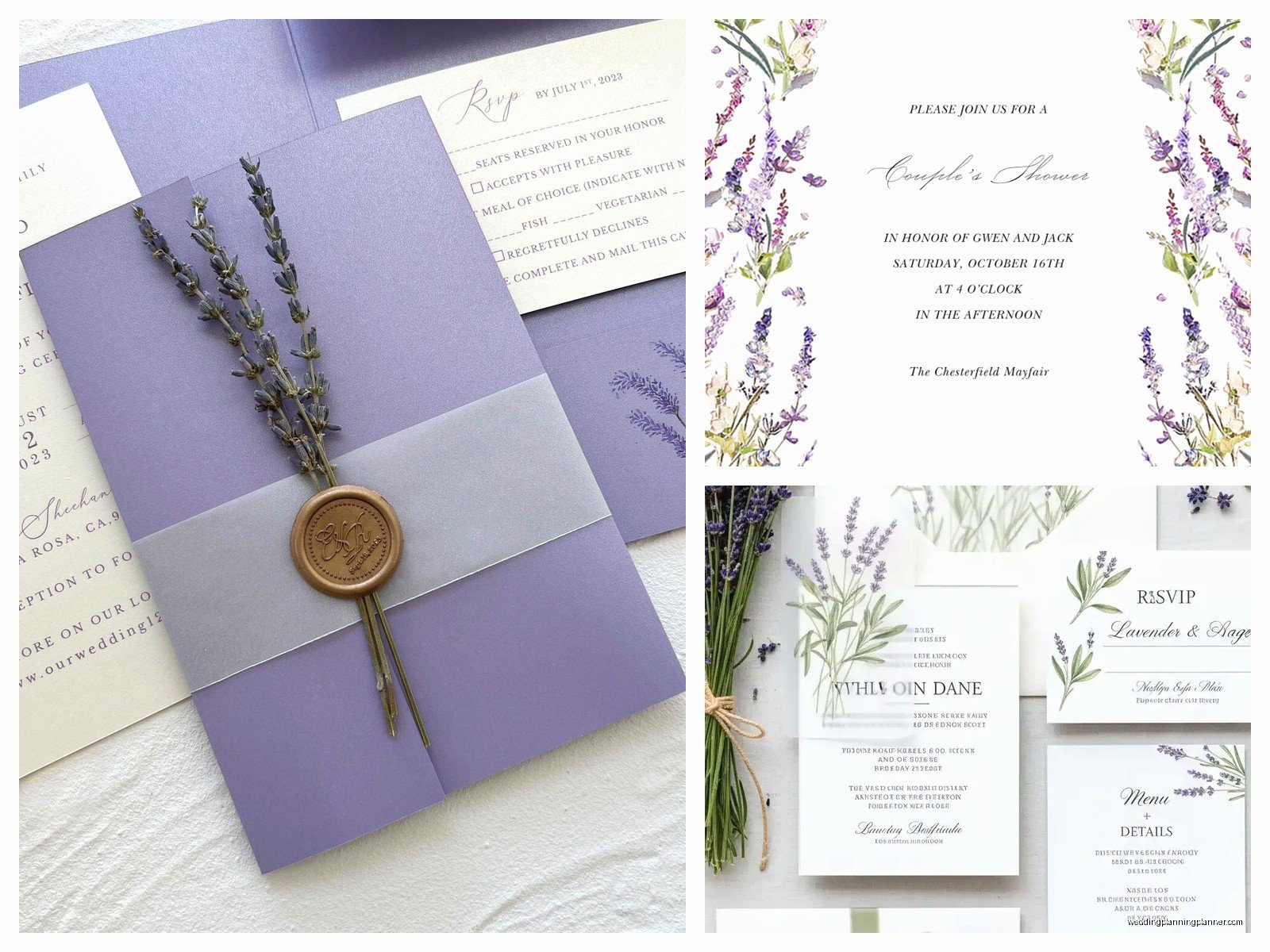
Textured cardstock in 110lb or higher gives you that luxury feel without being too heavy for mailing. Linen texture is classic, cotton paper feels expensive, and laid finish has these subtle lines that catch the light.
Smooth cardstock works better if you’re doing a lot of printing detail or if you want colors to pop more vibrantly. It’s also better for digital printing methods.
Vellum overlays are kinda perfect for lavender designs because you can print on the vellum itself in a soft lavender and then have your main invitation underneath in cream or white. Creates this dreamy layered effect that photographs really well.
I had one couple who insisted on this super thin paper because it was cheaper and the lavender just looked washed out and sad, like a shirt that had been through the wash too many times. Sometimes you gotta spend a bit more on paper quality or the whole design falls apart.
Printing Methods That Actually Work
Digital printing is the most budget-friendly and honestly the quality has gotten so good that most people can’t tell the difference anymore. You can get really precise color matching with digital, which matters when you’re trying to hit that specific lavender shade. Plus turnaround is faster.
Letterpress in lavender ink is gorgeous but – and this is important – it works best on thicker paper and you need to understand that the impression is the star here, not necessarily the color intensity. The color will be softer than digital printing. I love letterpress for lavender designs that are going for that vintage garden party vibe.
Foil stamping in rose gold or silver over lavender paper is chef’s kiss but your budget needs to be ready for that because foil ain’t cheap. It does photograph incredibly well though if that matters to you for save-the-dates or detail shots.
What About Printing at Home
Nah. Well, okay, you can but here’s the thing – home printers are notoriously bad at color consistency, especially with pastels. What looks perfect on your screen will print differently on your home printer versus a professional printer versus your friend’s printer. I’ve seen brides try this to save money and end up reprinting three times, which costs more in the end plus all that wasted time and paper and… just go with a pro for the actual invitations, okay? You can print your own envelopes or belly bands or whatever if you want a DIY element.
Design Elements That Make Lavender Invitations Work
The design itself needs to complement the soft pastel nature of lavender without getting too busy. Here’s what I typically recommend:
Botanical illustrations are the obvious choice and they work because lavender is literally a plant, so you can incorporate actual lavender sprigs, or go with complementary florals like roses, peonies, or eucalyptus. Watercolor style illustrations look especially good with soft lavender tones.
Geometric frames in gold or rose gold give you that modern elegant look. Think hexagons, art deco inspired corners, simple line borders. This keeps lavender from feeling too cottagecore if that’s not your vibe.
Script fonts pair beautifully with lavender but don’t go overboard – one script font for names or the word “wedding” and then a clean sans-serif or serif for the details. I once had a bride who wanted everything in script and it was literally unreadable, like trying to decode someone’s grocery list.
Minimalist designs with lots of white space let the lavender color be the statement. Sometimes just your names in a beautiful font with a lavender envelope liner is all you need.
The Envelope Situation
This is where you can really play with lavender without committing to a fully purple invitation if that feels like too much. Options that work:
- White or cream envelopes with lavender envelope liners (classic, always looks good)
- Full lavender envelopes with white or cream printing
- Lavender envelopes with a darker purple or plum wax seal
- Ombre effect where the envelope flap is lavender and fades to cream
Pro tip: if you’re doing lavender envelopes, get samples from your printer first because envelope paper takes ink differently than cardstock and you might be surprised by how the color turns out. I learned this the hard way with a client order in summer 2021 where the envelopes came back looking more mauve than lavender and we had to rush reorder everything.
Addressing Options
For addressing lavender envelopes, I usually suggest white ink, champagne gold ink, or a dark charcoal gray. Black can look too harsh against soft lavender unless you’re going for high contrast modern vibes. Digital calligraphy printing has gotten really good and is way more affordable than hiring a calligrapher, though if you have the budget, hand calligraphy in white ink on lavender envelopes is absolutely stunning.
Coordinating Your Paper Suite
So you’ve got your invitation figured out but then there’s all the other pieces and they need to sorta coordinate without being matchy-matchy which is harder than it sounds. Your suite might include:
- Main invitation card
- RSVP card and envelope
- Details card (accommodations, website, etc.)
- Envelope liner
- Belly band or ribbon
- Wax seal
You don’t need lavender on every single piece. Actually that would be overwhelming. I usually do lavender as the dominant color on maybe two elements max, then use your accent colors on the others. Like maybe your invitation is cream with lavender text and botanical elements, your RSVP card is lavender with cream text, and your details card is cream with sage green accents. Everything coordinates but nothing is screaming purple at you.
My cat knocked over my coffee right onto a sample suite last week and honestly the lavender paper showed the stain way less than the white pieces did, so there’s that random bonus I guess.
Seasonal Considerations
Lavender invitations work year-round but they hit different depending on season. Spring lavender leans into that fresh garden vibe with lots of florals and greenery. Summer lavender can go more vibrant with brighter accent colors. Fall lavender I like to pair with deeper tones like plum or burgundy or even terracotta. Winter lavender gets paired with silver, lots of white space, maybe some subtle shimmer.
The design elements you choose should reflect the season too – you wouldn’t do heavy velvet ribbon on a summer lavender invitation just like you probably wouldn’t do bright yellow sunflowers with a winter lavender theme.
Budget Breakdown Real Talk
Okay so let’s talk actual numbers because this matters. For lavender invitations you’re looking at:
Budget option ($2-4 per suite): Digital printing on standard cardstock, basic white envelopes with a printed lavender liner, simple design. Totally fine, gets the job done, nobody’s gonna judge you.
Mid-range ($5-8 per suite): Digital printing on premium paper, custom envelope liner, maybe one special element like a vellum overlay or belly band, more complex design with custom illustrations.
Luxury ($10-20+ per suite): Letterpress or foil stamping, multiple layers, hand-torn deckled edges, silk ribbon, wax seals, the whole nine yards. This is where you see those invitations that people frame afterward.
These prices usually assume you’re ordering 100+ invitations. Smaller quantities cost more per piece because of setup fees and stuff.
Common Mistakes I Keep Seeing
People picking lavender that’s too light and it basically disappears on cream paper – you need enough contrast or what’s the point. Going too matchy with every element all the same shade of lavender which just looks flat and boring. Not considering how lavender photographs because if you’re doing detail shots for your photographer, really pale lavender can wash out completely in certain lighting.
Also, and I cannot stress this enough, not ordering samples before committing to a full print run. Colors on your computer screen lie to you constantly. What looks like a beautiful soft lavender on your monitor might print as straight up purple or worse, grayish-mauve. Always always always get physical samples.
Working With Your Printer
When you’re talking to printers about lavender invitations, you need to be specific. Send them color swatches, Pantone numbers if you have them, reference photos of what you want. “Lavender” alone tells them basically nothing useful. I usually create a little mood board with the exact colors, show examples of other invitations in similar tones, and provide the specific Pantone or hex codes.
Ask about their color matching process and whether they can do a printed proof before the full run. Some printers charge for this but it’s worth it to avoid that sinking feeling when 150 invitations arrive in the wrong color and your wedding is in two months and… yeah, get the proof.
DIY Elements You Can Actually Pull Off
If you wanna save money or add personal touches, there are some DIY elements that work well with lavender invitations without requiring professional skills. Envelope liners are surprisingly easy to make with a template and double-sided paper. Belly bands from lavender cardstock or vellum that you cut with a paper cutter and wrap around your suite. Tying silk ribbon – just practice your bow-tying skills first because wonky bows look messy not charming.
Wax seals are fun and easy with those USB melting tools now, you can get custom stamps with your initials. Just use a lavender or complementary color wax. Dried lavender stems tucked into the envelope (though check with your venue about loose items in mail). Handwritten notes or thank you cards on lavender cardstock to include with invitations.
What you probably shouldn’t DIY: the actual invitation printing unless you really know what you’re doing, cutting intricate designs, anything involving perfect alignment of multiple layers. Leave that stuff to people with the right equipment.
The Timeline Thing
Order your invitations at least 4 months before you need to mail them, which means 5-6 months before your wedding. This gives you time for design, proofs, printing, any fixes if something goes wrong, addressing, and assembly. Rush fees are expensive and stressful and your lavender might not turn out right if the printer is rushing.
I had this whole situation where a couple waited until 8 weeks before their wedding to order and their first choice printer couldn’t accommodate the timeline, second choice printer could but charged rush fees AND the color matching wasn’t quite right but there wasn’t time to reprint so they just had to live with invitations that were more purple-gray than lavender and the bride was unhappy every time she looked at them in photos later and like… just order early, save yourself the stress

Canva
Wedding Memories Hardcover Template Canva Editable For Notebook, Journal, Novel, Hard Covers, Canva template For KDP Cover 6×9″ 120 pages
Canva
The Ultimate Wedding Planning Bundle, Canva Editable.
Canva
Customizable Wedding Video Invitations templates, Canva Editable Digital Wedding invitation Minimalist, Animated Custom Invitation
Digital Planning Templates
Wine Wedding Planner Bundle – 200-Page Printable PDF + 10 Editable Wedding Invitations | Instant Digital Download
Canva
Orange Wedding Planner Bundle – 200-Page Editable Canva Templates + 10 Editable Wedding Invitations | Instant Digital Download
Digital Planning Templates
Champagne Wedding Planner Bundle – 200-Page Printable PDF + 10 Editable Wedding Invitations | Instant Digital Download
Canva
Wedding Memories Hardcover Template Canva Editable For Notebook, Journal, Novel, Hard Covers, Canva template For KDP Cover 6×9″ 120 pages
Digital Planning Templates
Yellow Wedding Planner Bundle – 200-Page Printable PDF + 10 Editable Wedding Invitations | Instant Digital Download
Canva
Dusty Blue Wedding Planner Bundle – 200-Page Editable Canva Templates + 10 Editable Wedding Invitations | Instant Digital Download