
Planning Guides, Style Guide
Modern Save the Dates: Contemporary Clean Announcements
Nov
So You Want Modern Clean Save the Dates
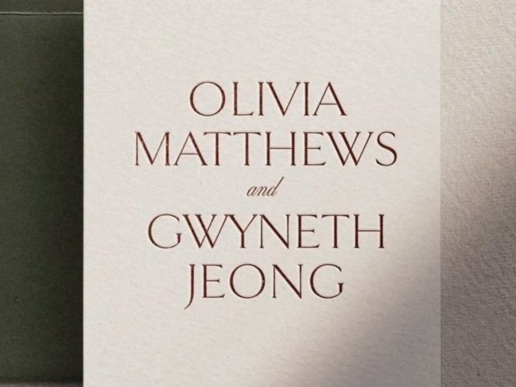
Okay so modern save the dates are basically the opposite of what your mom probably did in the 90s with those elaborate embossed cards that had like seventeen fonts. We’re talking clean lines, lots of white space, maybe one really good font pairing, and absolutely zero clip art of intertwined wedding rings.
The whole point is minimal but intentional. You want people to look at it and immediately get the info without having to decipher some swirly script through a vellum overlay or whatever. I had this bride in spring 2023 who kept wanting to add more elements to her save the date and I literally had to hide her mood board because she kept pulling inspiration from like five different decades and it was gonna be a mess.
What Actually Makes Something “Modern” vs Just Boring
There’s a fine line here and I see people cross it all the time. Modern doesn’t mean plain white card with black text in Arial. That’s just… nothing. Modern means you’re making deliberate design choices that feel current.
Think about it like this: lots of negative space is modern. Random empty space because you didn’t know what else to do is not modern. Big bold typography as the main design element is modern. Using Papyrus font large is a crime.
The contemporary clean aesthetic usually includes things like:
- Sans serif fonts or really elegant serif fonts, but not both together unless you really know what you’re doing
- A limited color palette – like maybe two colors max, or just black and white with one accent
- Asymmetrical layouts that still feel balanced
- High quality paper stock because when you strip away all the embellishments, the paper quality really shows
- Maybe one unexpected element like a wax seal or edge painting, but just one
Typography Is Doing All The Heavy Lifting
When you don’t have florals and borders and watercolor backgrounds doing the work, your font choices become super critical. I usually tell clients to pick one font family and use different weights of it, or pick two fonts that have really different personalities but somehow work together.
Like you might pair a geometric sans serif for names with a refined serif for the details. Or go all sans serif but play with scale – your names huge, date medium, location small. The hierarchy tells people what to look at first.
What annoys me SO MUCH is when people use trendy fonts that’ll look dated in two years. There was this phase around 2019-2020 where everyone was using these really thin, tall sans serifs and now when I look at those save the dates they already feel kinda tired. Stick with classics or fonts that have some staying power.
Layout Choices That Actually Work
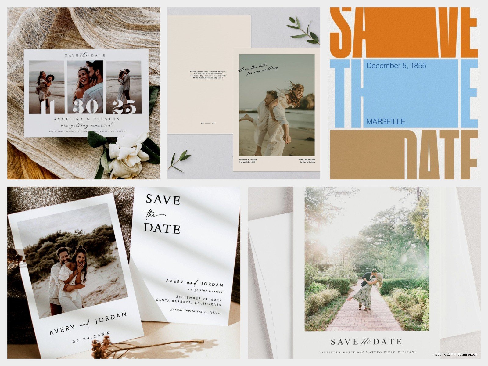
The centered layout is classic for a reason but it can feel a bit… expected? For modern save the dates I usually suggest trying asymmetrical alignment. Everything flush left, or even better, creating a layout where the text blocks are positioned in unexpected places on the card.
You can do a postcard format where all the text is in the bottom third and the top two-thirds is just white space or a subtle color block. Or put everything in one corner. Sounds weird but when you see it executed well it’s really striking.
Grid-based layouts are another option – think about dividing your card into sections and filling some but not others. Very architectural, very now.
My cat jumped on my desk while I was working on a layout like this last month and stepped on my keyboard and somehow made the design better by moving a text box to a random spot, so sometimes chaos works I guess.
Color Palettes For The Contemporary Look
Black and white is obviously the most modern combination and honestly it never looks bad if you execute it well. But you can branch out while keeping things clean.
Monochromatic schemes work great – like different shades of one color with white. Navy and white. Terracotta and cream. Forest green and ivory. The single color family keeps things cohesive and unfussy.
Or try unexpected neutrals together. Charcoal and warm gray. Chocolate brown and blush. Sage and stone. These feel sophisticated without being boring.
What you’re avoiding is rainbow situations or too many competing colors. I had a groom once who wanted to include his favorite sports team colors and his fiancée wanted her sorority colors and it was… no. Just no. We compromised on navy which appeared in both palettes and called it a day.
Paper Stock Makes Or Breaks This Look
Okay so when you strip away all the decorative elements, people notice the paper quality immediately. You can’t hide behind embellishments anymore. This is where you gotta invest a bit.
For modern clean save the dates, I usually recommend:
- 100lb or heavier cover stock at minimum – you want substantial
- Matte finish usually reads more contemporary than glossy (glossy can look cheap unless it’s a specific choice)
- Textured papers like cotton or linen stock add interest without adding visual clutter
- Colored stock can be gorgeous – a rich black card with white ink, or a warm cream with charcoal text
The paper is communicating quality when the design is minimal. People pick it up and they should think “oh this is nice” just from the feel of it.
What To Actually Include On A Modern Save The Date
You need less than you think. Really. The whole point of a save the date is just to tell people to hold the date, not to give them every single detail about your wedding weekend.
Essential info:
- Your names (first names are fine, you don’t need full names unless you want them)
- The date
- The city and state
- Maybe “invitation to follow” or “formal invitation to follow”
- Your wedding website if you have one
That’s literally it. You don’t need the venue name, the time, dress code, where people should stay… save that for the actual invitation. The save the date is the teaser, not the whole movie.
I see people trying to cram so much information onto these cards and it completely ruins the clean aesthetic they’re going for. Like you wanted modern and minimal but now you’ve got eight lines of text in different sizes and it looks like a ransom note.
Photo vs No Photo
This is a big decision point. Traditional modern save the dates often skip the photo entirely and let the typography be the star. Very chic, very unfussy.
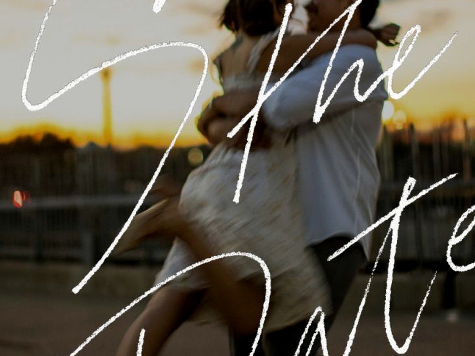
But if you want to include a photo, you can do it in a contemporary way. Think about using it as a postcard – full bleed photo on one side, clean text on the other. Or a large photo with minimal text overlaid in a corner. Or a small photo used almost like a logo element.
What you’re avoiding is the awkward engagement photo floating in the middle of the card with text wrapped around it. That’s not modern, that’s… I don’t even know what that is.
If you use a photo, make sure it’s high quality and fits the vibe. A casual iPhone selfie doesn’t match with an otherwise elegant minimal design. You want professional photos or at least really well-composed ones.
Digital vs Print For Modern Announcements
Real talk – modern clean designs translate really well to digital save the dates. The simple layouts look great on screens, and you can do things like animated text or subtle movements that you obviously can’t do with paper.
Digital is also way more budget-friendly and faster to send. You can track who opened them which is kinda handy for planning purposes.
But there’s something about receiving actual mail that still feels special, especially for a wedding. I’m not gonna lie, I’m biased toward paper because that’s my whole job, but I think for your close family and friends, a physical save the date hits different. You can do digital for extended guests and paper for your VIPs if you’re trying to balance budget and impact.
During summer 2021 when everything was still weird and uncertain, I had so many couples doing digital save the dates because they weren’t sure if their weddings would even happen as planned. Made sense then, but now I’m seeing people go back to paper because they want that tangible moment.
Printing Methods That Work With This Aesthetic
For modern clean designs, your printing method matters more than you’d think.
Digital printing is totally fine for most situations and it’s cost-effective. The quality has gotten really good and for simple designs without a ton of color variation, you can’t usually tell the difference from other methods.
Letterpress is gorgeous for modern designs, especially if you do a blind impression (no ink, just the debossed texture). Super tactile, super elegant, but also super expensive. It’s a splurge option.
Flat printing with one specialty element can be a nice middle ground – like digital printing with one spot color or with edge painting or foil in just one place. Gives you that custom touch without going fully custom pricing.
What I wouldn’t do for a modern aesthetic is thermography (that raised shiny printing). It reads more traditional and formal rather than contemporary.
Envelope Choices Because Yes This Matters Too
Your envelope is the first thing people see so it should match your vibe. For modern save the dates, skip the decorative liners unless they’re really subtle – like a solid color liner in your accent color is fine, but a floral pattern liner is gonna clash with your minimal card.
Consider:
- Colored envelopes that complement your design – black envelopes with white ink addressing is dramatic and modern
- Oversized square envelopes instead of standard rectangles
- Clean addressing – printed labels are fine, or simple hand lettering, but not elaborate calligraphy (save that for the formal invites if you want it)
- Interesting stamps – you can order custom stamps or find modern-looking regular stamps
Timing This Whole Thing
Send save the dates 6-8 months before your wedding, or 8-12 months if it’s a destination wedding or a holiday weekend when people need extra planning time. Earlier than that is sorta excessive unless you have specific reasons.
Give yourself at least 4-6 weeks for design, proofing, printing, and addressing before you want them to go out. Rush orders are possible but they cost more and stress you out and you’ll probably miss a typo because you’re hurrying.
I had a bride who waited until 4 months before her wedding to even think about save the dates and we had to do digital ones because there literally wasn’t enough time to design and print and mail them. She was stressed, I was stressed, it wasn’t fun.
Common Mistakes People Make With Modern Designs
Trying to be too trendy – like I mentioned earlier, chasing whatever’s super popular right now means your save the dates might look dated quickly. Classic modern is better than trendy modern.
Not enough contrast – if you’re doing minimal design, you need enough contrast between your text and background for it to be readable. Light gray text on white might look elegant in theory but it’s just hard to read.
Forgetting about scale – when everything is minimal, the size relationships between elements become super important. Your names should be noticeably larger than other text. The date should have prominence. Create hierarchy through size, not through adding more design elements.
Using too many different elements – I see this all the time where someone starts with a clean design but then adds a border, and then a small graphic, and then a different font, and then… and suddenly it’s not modern anymore, it’s cluttered. Pick one or two special elements max and let the rest be simple.
Where To Get These Designed And Printed
You’ve got options depending on your budget and how custom you want to go.
Online services like Minted, Paperless Post (for digital), Artifact Uprising, and Zola have templates you can customize. They’re affordable and convenient and honestly some of their modern templates are really well-designed. You’re limited to their options but if you find one you like, it’s the easiest route.
Working with an independent stationer or designer (hi, that’s me) means you get something custom that no one else has. More expensive, but you have complete control over every detail. Good option if you have specific vision or if the template options aren’t working for you.
DIY is possible for modern designs since they’re less fussy than traditional ones. You can design something simple in Canva and print through a service like Catprint or Overnight Prints. Just make sure you understand bleed, resolution, and color modes before you upload files because print problems are expensive to fix.
Coordinating With Your Overall Wedding Stationery
Your save the date sets the tone for your wedding paper goods, so think about whether you want to carry this modern aesthetic through everything – invitations, programs, menus, etc. You don’t have to match exactly, but there should be a visual connection.
Maybe you use the same font pairing throughout, or the same color palette, or similar layout principles. This creates a cohesive brand for your wedding which sounds corporate but actually makes everything feel more intentional and pulled together.
That said, your save the date can be slightly more casual or creative than your invitation. Like you might do a postcard-style save the date but a more traditional flat card invitation. As long as they’re in the same aesthetic family, it works.
Alright I think that covers most of what you need to know about modern save the dates without getting into like, extremely technical design theory that nobody actually needs for this. The main thing is keep it simple, make intentional choices about the few elements you include, and invest in good paper and printing since that’s what people will notice when there’s not a lot of decoration happening.

Canva
Wedding Memories Hardcover Template Canva Editable For Notebook, Journal, Novel, Hard Covers, Canva template For KDP Cover 6×9″ 120 pages
Canva
The Ultimate Wedding Planning Bundle, Canva Editable.
Canva
Customizable Wedding Video Invitations templates, Canva Editable Digital Wedding invitation Minimalist, Animated Custom Invitation
Digital Planning Templates
Wine Wedding Planner Bundle – 200-Page Printable PDF + 10 Editable Wedding Invitations | Instant Digital Download
Canva
Orange Wedding Planner Bundle – 200-Page Editable Canva Templates + 10 Editable Wedding Invitations | Instant Digital Download
Digital Planning Templates
Champagne Wedding Planner Bundle – 200-Page Printable PDF + 10 Editable Wedding Invitations | Instant Digital Download
Canva
Wedding Memories Hardcover Template Canva Editable For Notebook, Journal, Novel, Hard Covers, Canva template For KDP Cover 6×9″ 120 pages
Digital Planning Templates
Yellow Wedding Planner Bundle – 200-Page Printable PDF + 10 Editable Wedding Invitations | Instant Digital Download
Canva
Dusty Blue Wedding Planner Bundle – 200-Page Editable Canva Templates + 10 Editable Wedding Invitations | Instant Digital Download