
Planning Guides, Style Guide
Greenery Wedding Invitations: Botanical Leaf Designs
Nov
Okay So Botanical Leaf Invitations Are Having a Moment
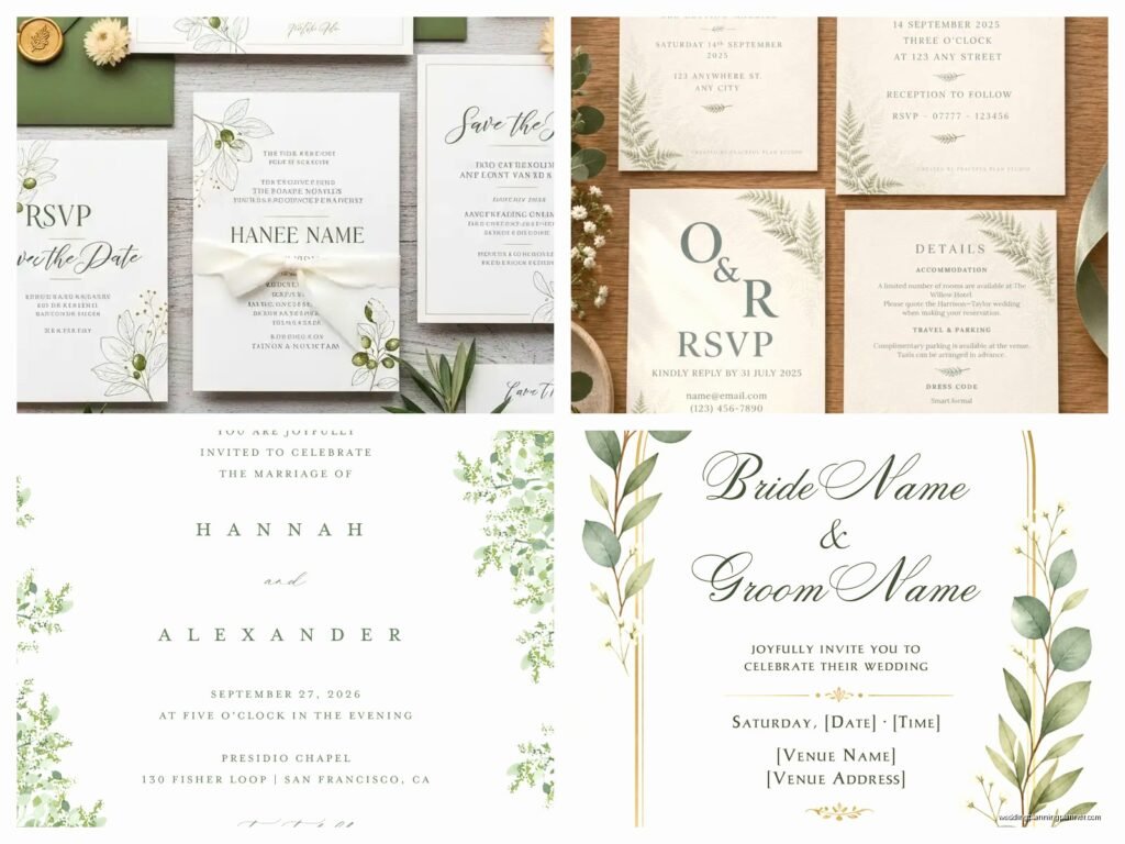
Greenery wedding invitations are literally everywhere right now and honestly they’ve been popular since like 2017 when Pantone declared greenery the color of the year. I had this bride back in summer 2021 who was absolutely obsessed with eucalyptus—wanted it on everything, the invites, the table runners, even asked if we could somehow incorporate it into the cake design (we did, it looked amazing). But here’s the thing about botanical leaf designs: they can go from elegant and sophisticated to looking like a garden center flyer real quick if you don’t know what you’re doing.
The beauty of greenery invitations is that they work for literally any wedding style. Rustic barn wedding? Yep. Modern minimalist? Absolutely. Garden party? Obviously. Black tie formal? You’d be surprised how elegant a simple olive branch design can look on cream cardstock with gold foiling.
Picking Your Greenery Style
So first things first, you gotta decide what kind of botanical vibe you’re going for. There’s like a million different leaf types and they all give off different energies. Eucalyptus is probably the most popular—it’s got that soft, romantic, slightly bohemian feel. Olive branches read more Mediterranean and refined. Ferns are super lush and kinda tropical or woodland depending on how you style them. Monstera leaves are bold and modern, perfect if you want something more graphic.
I usually tell my clients to think about their venue first. Getting married in a conservatory? Go with lush, layered botanicals. Beach wedding? Maybe palm fronds or more delicate greenery. The invitation should sorta hint at what guests can expect.
What really annoys me though is when couples pick greenery that has absolutely nothing to do with their wedding and then wonder why everything feels disconnected. Like, you’re getting married in December in Colorado and you want tropical monstera leaves? I mean you CAN do it, but it’s gonna feel random unless you really commit to that theme throughout.
The Different Design Approaches
There are basically a few main ways to incorporate botanical elements into your invitations:
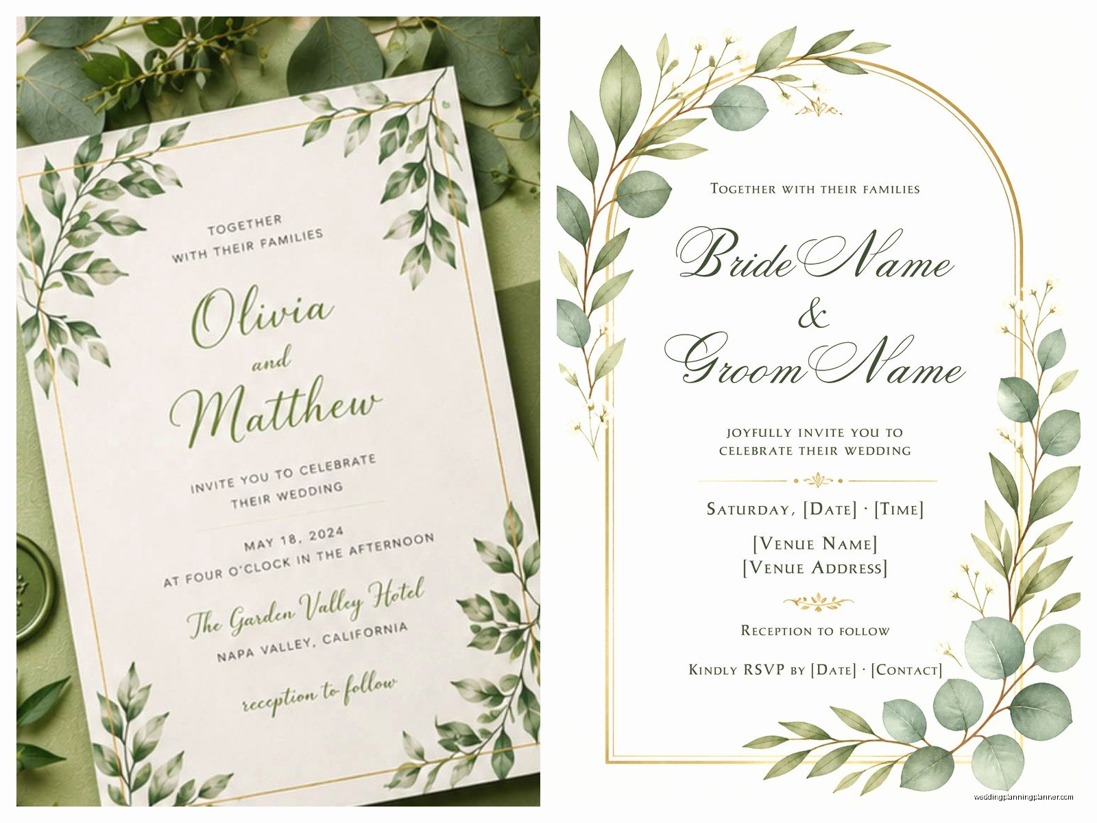
- Border designs: Leaves framing the text, either symmetrical or asymmetrical
- Wreath style: Text centered inside a circular arrangement of greenery
- Scattered elements: Individual leaves placed strategically around the invite
- Watercolor backgrounds: Soft painted greenery as a backdrop
- Pressed botanical: Actual dried leaves or the appearance of them
- Line drawings: Simple, minimalist botanical illustrations
- Photo realistic: Detailed, lifelike renderings of specific plants
The border and wreath styles are the most traditional and tend to work well if you’re going for classic elegance. Scattered elements feel more modern and relaxed. I had this couple in spring 2023 who wanted their invites to look like actual pressed botanicals—we ended up doing this gorgeous thing where we printed realistic fern images and then actually included a small piece of preserved eucalyptus in each envelope and it smelled incredible when people opened them.
Color Palettes That Actually Work
Okay so greenery invitations don’t have to be just green and white, though that combo is beautiful and clean. You can pair botanical designs with basically any color scheme. Sage green and terracotta is having a huge moment. Deep forest green with gold accents looks super luxe. Greenery with blush pink is romantic without being too sweet.
For a more dramatic look, try pairing your botanical elements with navy blue or even black. I know it sounds weird but a black invitation with gold foil greenery and white text? Chef’s kiss. So elegant.
If you’re doing watercolor greenery, you have even more options because you can blend in other colors. Eucalyptus watercolors often have hints of blue-grey. Olive branches can have those beautiful silvery tones. Don’t be afraid to let your designer play with subtle color variations—it makes everything look more natural and less… I dunno, clipart-ish?
Paper and Printing Methods Matter More Than You Think
The type of paper you choose is gonna make a huge difference in how your botanical invitations look. Textured papers like cotton or linen give a more organic, natural feel that complements greenery designs perfectly. Smooth papers work better if you’re going for modern and sleek.
Printing methods are where things get really interesting:
Digital printing is the most affordable and works fine for most designs. It’s great for watercolor effects and detailed illustrations. But it won’t have the same tactile quality as other methods.
Letterpress creates this beautiful debossed effect that you can actually feel. It’s perfect for simple line drawings of leaves or minimalist botanical designs. The texture adds so much elegance. It’s pricier though, just so you know.
Foil stamping is my secret weapon for making greenery invitations look expensive. Gold foil on eucalyptus leaves? Stunning. Rose gold on ferns? Gorgeous. You can even do green foil which sounds redundant but actually creates this really beautiful tonal effect.
Thermography raises the ink slightly and has a shiny finish. It’s like a middle ground between digital and letterpress in terms of cost and effect.
I usually recommend combining methods if budget allows. Like digital printing for the watercolor background and foil stamping for specific leaf accents or text. That layered approach makes everything look more custom and thought-out.
Working With Designers vs DIY
Look, I’m gonna be honest—DIY botanical invitations can look amazing if you have design skills or use really good templates. There are tons of options on Etsy and sites like Minted where you can customize pre-made designs. Just make sure you’re actually customizing them enough that they don’t look exactly like fifty other weddings happening that same weekend.
If you’re working with a stationery designer (which I obviously recommend because it’s literally my job), bring them inspiration images but also be open to their suggestions. I can’t tell you how many times a client comes in with a Pinterest board full of ideas that would actually look terrible together in real life. A good designer will take your vision and make it cohesive.
One thing that drives me crazy is when people try to DIY and then panic three weeks before the wedding when their printer runs out of ink or the paper jams or whatever and then expect me to fix it immediately. Not saying don’t DIY, just saying give yourself way more time than you think you need.
The Whole Suite Thing
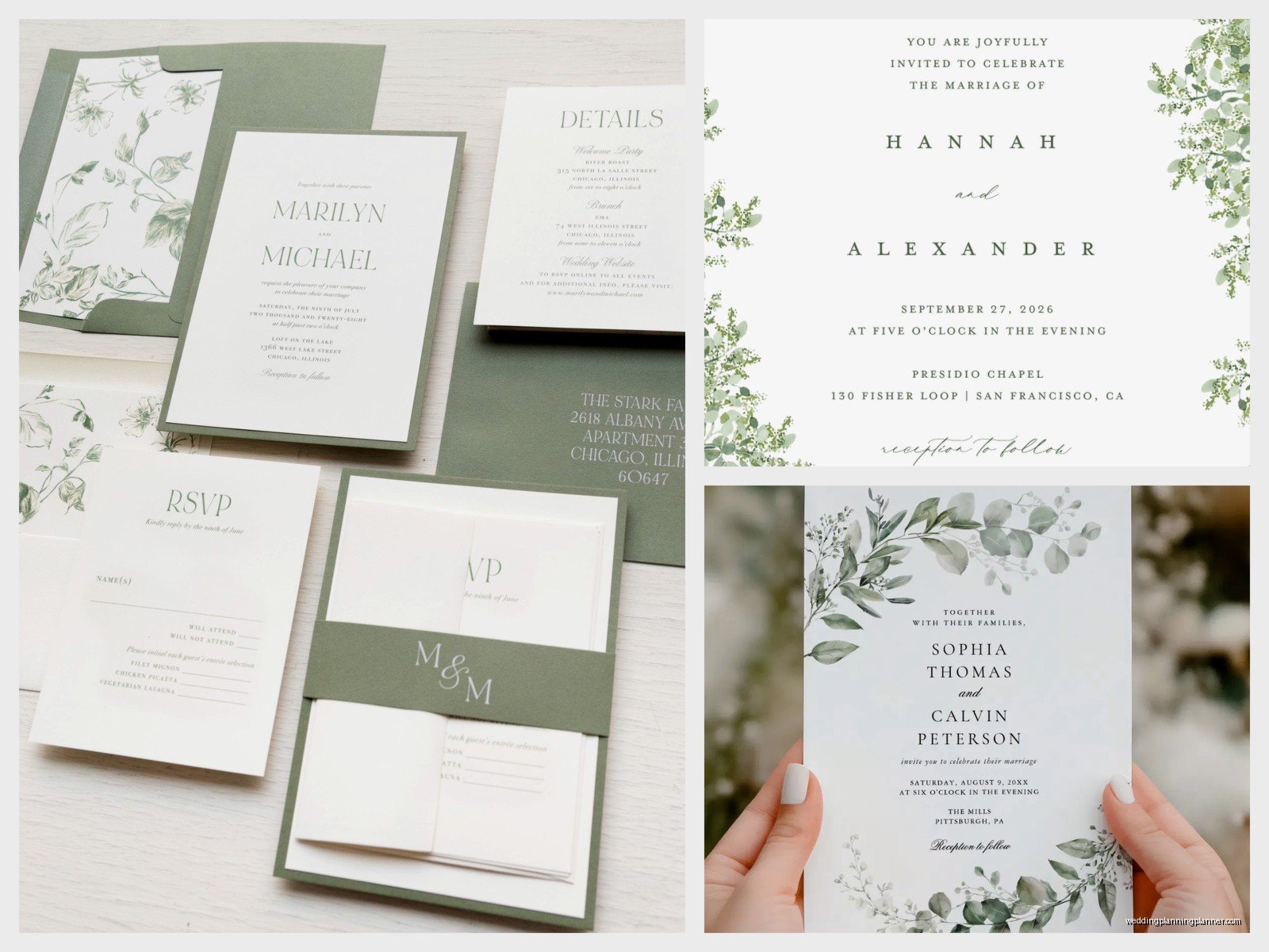
Your invitation is just one piece of the puzzle. A full stationery suite usually includes:
- The main invitation
- RSVP card
- Details card (accommodations, website, etc.)
- Envelope
- Envelope liner (optional but really pretty)
- Belly band or vellum wrap (also optional)
- Wax seal (if you’re feeling fancy)
With botanical designs, you want consistency but not repetition across all these pieces. Maybe the main invite has a full greenery wreath, but the RSVP card just has a small sprig in the corner. Or the envelope liner has a watercolor botanical pattern while the invite itself is more minimal with line drawings.
Vellum overlays are really popular with greenery invitations right now. You print the botanical design on translucent vellum and layer it over the invitation—it creates this really soft, romantic effect. My cat knocked over an entire stack of vellum sheets once and I nearly cried because that stuff is not cheap and it creases if you look at it wrong.
Practical Stuff Nobody Tells You
Okay so here are some things you need to actually think about that aren’t just about making things pretty:
Readability: Make sure your text is actually legible against your botanical background. I see so many invitations where the greenery is so heavy or the colors are too similar and you literally cannot read the venue address. Not helpful.
Print tests: Always order a sample before printing 150 invitations. Colors look different on screen vs paper. That sage green might print way more yellow than you expected. Trust me on this.
Envelope addressing: If you’ve got dark green envelopes (which look amazing), you’ll need white or metallic ink for addressing. Plan accordingly. Or get envelope liners instead and stick with white or cream envelopes which are easier to address.
Weight and postage: All those beautiful layers—the vellum wrap, the wax seal, the thick cardstock—add weight. You might need extra postage. Take a fully assembled invite to the post office and have them weigh it before you buy stamps. I had a client who used regular stamps and half her invitations got returned for insufficient postage which was a nightmare.
Assembly time: If you’re doing any DIY assembly with multiple layers, belly bands, or wax seals, you’re gonna need help and time. Like, a lot of time. I usually tell people to plan for at least 2-3 minutes per invitation for assembly. Do the math on 150 invitations and suddenly that’s like 7 hours of work.
Matching Your Invitations to Your Wedding
So once you’ve got your beautiful botanical invitations sorted, you probably want other stationery pieces to match. Think about:
- Ceremony programs
- Escort cards or seating chart
- Menu cards
- Table numbers
- Thank you cards
- Signage (welcome sign, bar menu, etc.)
You don’t need to use the exact same design for everything—that can actually look kinda boring or like you’re trying too hard. But pulling through similar elements creates cohesion. Maybe your invitations have eucalyptus and your table numbers have olive branches, but they’re both in the same style and color palette.
During that stressful summer 2021 wedding I mentioned earlier, the eucalyptus-obsessed bride also wanted fresh eucalyptus in every single floral arrangement, which was fine except we were planning this during a eucalyptus shortage (yes, that’s a real thing that happened). We ended up having to pivot to using seeded eucalyptus and silver dollar eucalyptus instead of the baby blue she originally wanted, but because we’d kept the invitation design more general “greenery” rather than hyper-specific, it all still worked together perfectly.
Trends vs Timeless
Greenery invitations have been popular for years now and honestly I don’t see them going anywhere soon. But there are ways to make yours feel current without being so trendy that you’ll cringe looking at your wedding photos in ten years.
Right now, the super trendy version is like… maximalist greenery with tons of different leaf types all layered together, maybe with some pampas grass thrown in, on colored envelopes with wax seals and vintage stamps. It’s gorgeous but very of this moment.
The more timeless approach? Simple, elegant botanical line drawings on white or cream cardstock. Maybe one or two types of greenery max. Classic fonts. Minimal embellishments. This will look just as good in 2035 as it does now.
Neither approach is wrong—it just depends on whether you want your stationery to capture a specific aesthetic moment or be more universally elegant. I usually ask my clients to think about their personal style in general, not just wedding style. Are you someone who redecorates their house every few years to stay current, or do you invest in classic pieces? That usually tells me which direction to push them.
Budget Real Talk
Okay so let’s talk money because botanical invitations can range from like $2 per suite to $25+ per suite depending on what you’re doing.
Basic digital printing on standard cardstock with a simple greenery design? Pretty affordable, probably $3-5 per invitation including envelopes and RSVP cards.
Add letterpress or foil stamping? You’re looking at $8-15 per invite.
Custom illustrated botanicals, multiple printing methods, handmade paper, envelope liners, wax seals, and calligraphy addressing? Yeah, that can easily hit $20-30 per suite.
Figure out what’s actually important to you. If you love the look of letterpress but can’t afford it for everything, maybe just do it for the main invitation and do digital printing for the other cards. Or skip the expensive envelope liner and put that money toward foil stamping instead.
Also, smaller guest lists obviously mean you can splurge more per invitation. If you’re only inviting 50 people, spending $15 per suite might be totally reasonable. If you’re inviting 300 people… that adds up real quick.
Wording and Layout Considerations
The actual text on your invitation matters just as much as the pretty leaves around it. Botanical designs work with both formal and casual wording, but you wanna make sure they match in tone.
Formal wording with super ornate, detailed botanical illustrations? Perfect. Casual wording (“Join us for a party!”) with simple line drawings? Also great. But mixing formal traditional wording with like, wild messy watercolor splatters of greenery can feel off.
Layout-wise, botanical invitations work with both centered text and left-aligned text. Centered is more traditional and formal. Left-aligned feels more modern and relaxed. The greenery can frame either style—you just need to design it intentionally rather than slapping some leaf clipart around whatever and hoping it looks good.
One layout trick I love: asymmetrical botanical elements with centered text. So maybe you’ve got eucalyptus branches coming in from the bottom left corner and top right corner, creating visual interest while keeping the text classic and centered. It’s that perfect balance of traditional and contemporary that works for so many couples.
Font choices matter too but that’s like… a whole other conversation and this is getting long so I’ll just say: don’t use more than two or three fonts max, make sure they’re readable, and for the love of everything do not use Papyrus or Comic Sans on your wedding invitations no matter how much you love botanical designs.
