
Planning Guides, Style Guide
Rose Gold Wedding Invitations: Copper Pink Metallic
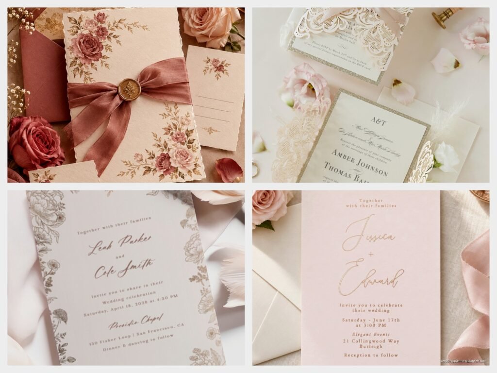
Nov
Getting the Rose Gold Thing Right Without Looking Cheap
Okay so rose gold invitations are still ridiculously popular and honestly I’m not mad about it because when done right they look expensive and elegant but when done wrong they look like… well, like you bought them from a party supply store that also sells plastic flamingos. The metallic copper pink tone is tricky because it can read as tacky really fast if you don’t balance it properly.
First thing you gotta know is that “rose gold” on wedding invitations doesn’t actually mean one specific color. I’ve seen samples from vendors that range from a barely-there blush with gold shimmer to straight-up copper to this weird orangey thing that nobody asked for. In spring 2023 I had a bride who ordered samples from four different companies and when they all arrived she literally lined them up on my desk and they looked like a gradient chart. None of them matched each other even though they were all labeled “rose gold.” So before you order 150 invitations, get physical samples. Not digital mockups, actual printed samples that you can hold under different lighting.
The lighting thing matters because rose gold shifts depending on whether you’re looking at it in natural light versus indoor lighting. What looks soft and romantic in daylight can look kinda brassy under warm bulbs. I always tell clients to check their samples in the actual venue if possible, or at least in similar lighting conditions.
Foil vs. Printing vs. Actual Metallic Paper
There are basically three ways to get that rose gold look and they’re all different price points with different vibes:
- Rose gold foil stamping: This is the fancy one where actual metallic foil gets pressed into the paper using heat and pressure. It’s shiny, it’s reflective, it catches light beautifully. Also the most expensive option, usually adding $3-8 per invitation depending on how much foil coverage you want. If you’re doing names in rose gold foil on ivory paper, gorgeous. If you’re trying to foil stamp an entire background, your budget is gonna cry.
- Rose gold ink/printing: This is when the rose gold color is printed using metallic ink. It doesn’t have the same mirror-like reflection as foil but it can still look really nice and it’s way more affordable. The thing that annoys me about this method is that the metallic effect can vary wildly between printers. Some metallic inks look rich and dimensional, others look flat and sad.
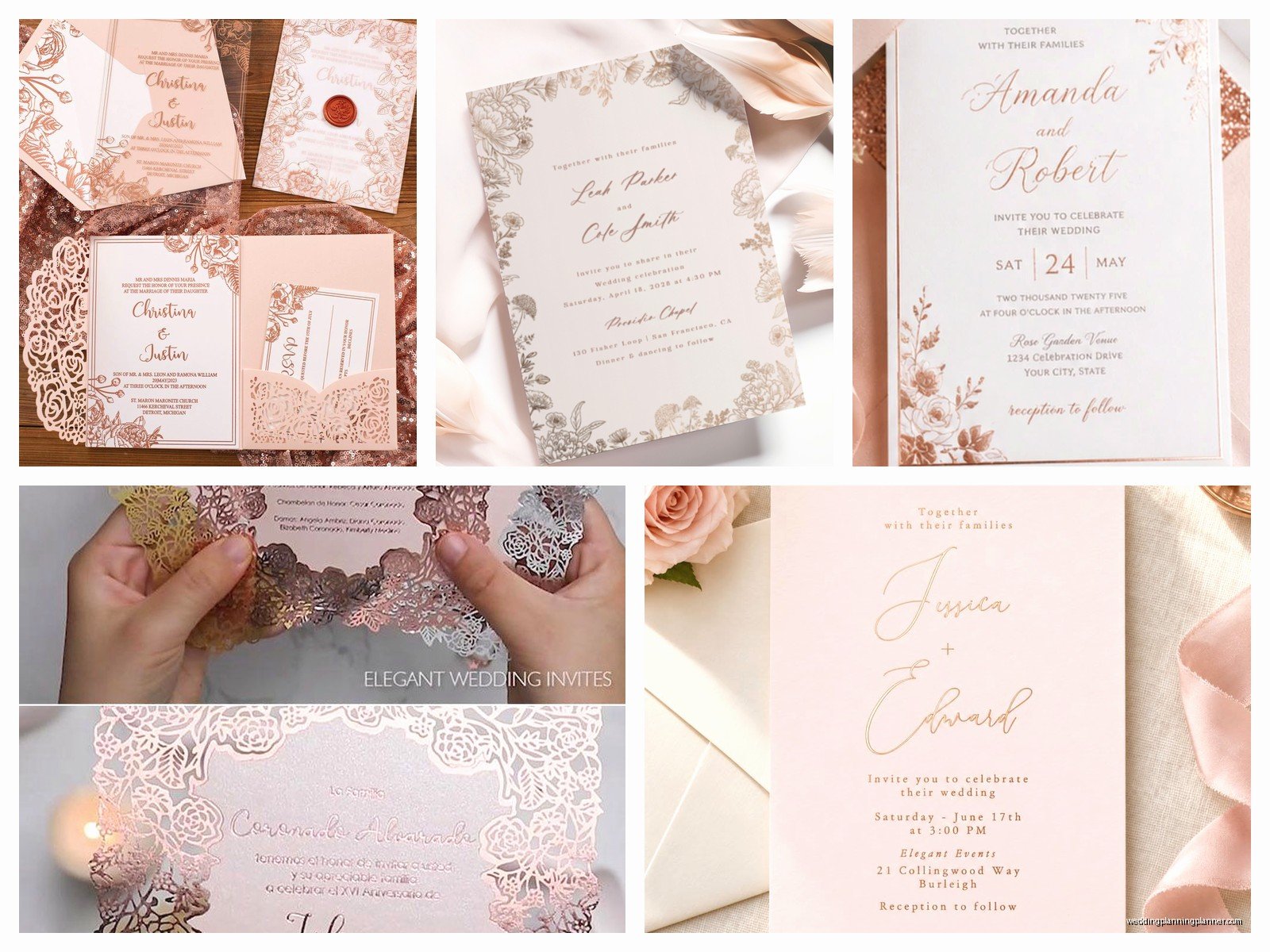
- Rose gold metallic paper: Using actual metallic cardstock as your base. This gives you that shimmer throughout the entire invitation. Works great as a backing layer or envelope liner. I personally love a white or cream invitation with a rose gold metallic backer showing around the edges.
You can also combine these methods which is what I usually recommend. Like, rose gold foil for your names, regular black ink for the details, and a rose gold metallic envelope liner. Gives you that luxury look without foiling every single word which honestly can be overwhelming to read anyway.
Color Combinations That Actually Work
Rose gold plays well with certain colors and fights with others. Here’s what I’ve seen work in real weddings:
Rose gold + white or ivory: Classic, clean, always works. The rose gold pops against the neutral background without competing. This is your safe bet if you want elegant and timeless.
Rose gold + navy: Super popular combo and I get why. The deep blue makes the rose gold feel more sophisticated and less… I don’t know, less “Pinterest 2016” if that makes sense. Works especially well for evening weddings.
Rose gold + blush pink: Tricky because you’re essentially doing pink on pink. Can look really romantic and soft if you get the tones right, but if the blush is too close to the rose gold everything muddles together. You want enough contrast that people can actually read your invitation without squinting.
Rose gold + burgundy or wine: Rich, fall/winter vibes, very romantic. The deeper red tones complement the copper undertones in rose gold really nicely.
Rose gold + greenery/sage: This got trendy in like 2022 and it’s still going strong. The botanical element balances the metallic shimmer so it doesn’t feel too glitzy.
What doesn’t work as well: rose gold with bright colors like fuchsia or coral. I mean you can do it if that’s your vibe but it starts feeling more birthday party than wedding. Also rose gold with yellow gold gets confusing unless you’re deliberately going for a mixed metals look.
Paper Weight and Texture Considerations
Nobody talks about this enough but the paper quality makes a huge difference in how expensive your rose gold invitations look. A thin flimsy cardstock with rose gold printing looks cheap even if the design is beautiful. You want at least 100lb cardstock, preferably 110lb or higher for the main invitation card.
Texture options I’ve worked with:
- Smooth/matte: Modern, clean, lets the rose gold be the star. Good for contemporary designs with lots of white space.
- Linen or laid texture: Adds subtle dimension, feels more traditional and formal. The texture catches light differently which can make metallic elements more interesting.
- Cotton paper: Thick, luxe, has that beautiful deckled edge option. Feels substantial when people hold it. Rose gold foil on cotton paper is *chef’s kiss* but also expensive.
- Vellum overlays: A translucent vellum sheet with rose gold printing laid over the main invitation. Very romantic, very elegant, also very annoying to assemble if you’re doing it yourself. My cat knocked over a stack of 80 vellum overlays once and they went everywhere, stuck to each other with static… anyway.
Design Elements and Layout Tips
The design itself matters just as much as the rose gold application. I’ve seen people get so excited about the metallic element that they forget about basic design principles and end up with something that’s just… a lot.
Less is usually more with rose gold. If you’re using rose gold foil, pick one or two elements to highlight—your names, a monogram, a delicate border. Don’t foil every word or you’ll give your guests a headache trying to read shiny text.
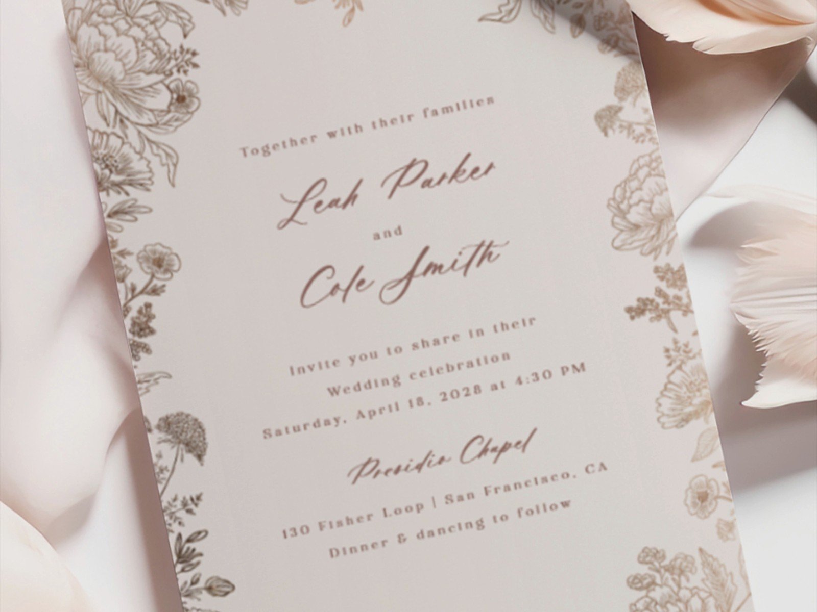
Typography choices: rose gold pairs beautifully with romantic script fonts but you gotta make sure they’re still readable. I had a bride in summer 2021 who fell in love with this super ornate calligraphy font in rose gold foil and when the proofs came back nobody could read half the words. We ended up using that fancy script just for the couple’s names and switching to a clean serif for all the details. Way better.
If you’re doing a formal traditional invitation, rose gold can work but keep it minimal. Like a thin rose gold border or just the couple’s names in rose gold. The formal wording and layout does the heavy lifting for elegance, the rose gold is just an accent.
For modern or minimalist designs, rose gold geometric shapes are really popular. Hexagons, triangular borders, that kinda thing. Just don’t go overboard with the geometry or it starts looking like a math textbook.
Envelope Situations
Your envelope is the first thing people see so it sets the tone. Options for rose gold envelope situations:
Rose gold metallic envelopes: Bold choice, definitely makes a statement sitting in someone’s mailbox. Can look stunning but might be too much depending on your overall aesthetic. Also they show fingerprints and scratches easily which drives me crazy during assembly.
White/ivory envelopes with rose gold liner: This is my go-to recommendation. You get that pop of rose gold when people open the envelope but it’s not screaming at them from the outside. Envelope liners can be solid rose gold metallic paper or a printed pattern with rose gold elements.
White/ivory envelopes with rose gold calligraphy: Addressing in rose gold ink is gorgeous but will add to your costs if you’re hiring a calligrapher. Some people do rose gold for the names and regular black for addresses which… works I guess but feels a bit disjointed to me.
Wax seals: Rose gold wax seals are having a moment. They look incredible but be aware that they can get damaged in mail sorting machines. If you’re doing wax seals, hand-cancel your invitations at the post office or they might arrive broken.
The Whole Suite Coordination
So you’ve got your rose gold invitation figured out but what about all the other pieces? Save the dates, RSVP cards, detail cards, programs, menus, place cards… it adds up fast and you need a game plan.
You don’t have to use rose gold on every single item. Actually you probably shouldn’t because it’ll feel repetitive and cost a fortune. I usually suggest using rose gold most prominently on the invitation itself since that’s the main piece, then echoing it in smaller doses throughout the other items.
Like maybe your save the dates have just a hint of rose gold in a small detail, your RSVP cards have a rose gold envelope liner, your programs have rose gold text for headers. You’re creating cohesion without going monochrome metallic on everything.
One approach I love is using rose gold for the “pretty” pieces that guests keep (invitation, maybe a printed menu) and regular printing for functional pieces they’ll toss (RSVP cards, detail cards). Saves money and still looks coordinated.
Digital Printing vs. Letterpress vs. Thermography
The printing method affects how your rose gold looks and how much you’ll spend:
Digital printing with metallic ink: Most affordable, quickest turnaround, good quality from reputable printers. The rose gold won’t be as reflective as foil but for most people it’s perfectly fine. This is where most of my budget-conscious clients land.
Letterpress: Creates that beautiful debossed impression in the paper. You can letterpress in rose gold ink or do a blind deboss (just the impression) with rose gold foil stamping on top. Looks incredibly high-end but you’re gonna pay for it. Also requires thicker paper to show the impression properly.
Thermography: Creates raised printing that you can feel. Can be done with metallic rose gold powder for a shiny raised effect. More affordable than letterpress, more tactile than flat digital printing. The raised texture does make the rose gold more noticeable.
Foil stamping: Already mentioned this but it deserves repeating because it’s really the gold standard (pun intended) for metallic invitations. True foil has that mirror-like quality that just photographs beautifully.
DIY Considerations and Assembly
Look, I’m gonna be honest with you—if you’re thinking about DIY-ing rose gold invitations to save money, really think it through. Rose gold foiling at home is nearly impossible without professional equipment. Those foil transfer sheets you can buy… they’re not gonna give you the same result and you’ll probably waste a bunch trying to get it right.
What you CAN DIY successfully: printing on rose gold metallic cardstock, adding rose gold ribbon or twine, creating rose gold envelope liners using metallic paper and a template, rose gold wax seals with a seal stamp kit.
What you probably should NOT DIY: foil stamping, letterpress, anything requiring precise metallic ink application.
Assembly is time-consuming regardless of whether you DIY the printing. If you’re doing belly bands, vellum overlays, ribbon, wax seals, envelope liners… set aside way more time than you think you’ll need. I had a client who thought she’d assemble 120 invitations in one weekend and she ended up recruiting her bridesmaids and it still took two full weekends. Have a Netflix show queued up or something because it’s repetitive work.
Vendor Questions to Ask
When you’re shopping for rose gold invitation vendors, here’s what you need to ask:
- Can I see a physical sample of your rose gold (not just photos)?
- What’s your rose gold option—foil, metallic ink, or metallic paper?
- How does your rose gold photograph? (Some metallic finishes look great in person but photograph poorly)
- What’s the turnaround time including proofing?
- Do you offer envelope addressing and if so what are the rose gold options?
- What’s included in the price and what costs extra?
- Can I mix rose gold with other metallic finishes in the design?
- What paper weights and textures are available?
Don’t just look at their online gallery because sometimes those photos are heavily edited to make the rose gold look more vibrant than it actually is in person. Physical samples are non-negotiable.
Timing and Ordering
Rose gold invitations, especially if they involve foil stamping or letterpress, need more production time than standard printing. I usually tell clients to order 4-5 months before they need to mail them out. That gives time for: designing, proofing (you’ll probably do 2-3 rounds of proofs), printing, shipping to you, assembly, addressing, and mailing.
Order extras. Always. I recommend 15-20 extra invitations beyond your guest count. People will change addresses, you’ll mess up during assembly, something will get damaged, you’ll want keepsakes. It’s cheaper to order extras upfront than to do a small reprint later.
Speaking of reprints—if you’re doing custom rose gold foil, getting an exact match on a reprint batch can be challenging because foil colors can vary slightly between production runs. Another reason to order extras initially.
Postage and Mailing
Metallic envelopes, wax seals, ribbon, thick cardstock, multiple inserts—all this affects your postage costs. Don’t just slap a regular stamp on there and hope for the best. Take a fully assembled invitation to the post office and have them weigh it and check if it’s non-machinable (wax seals, ribbon, and thick or irregular shapes usually are).
Non-machinable mail costs extra, currently 40 cents additional on top of regular postage. Also consider getting your envelopes hand-cancelled so they don’t go through the sorting machines that might damage your pretty rose gold details.
Rose gold postage stamps exist and they’re adorable and very on-theme but they sell out fast during wedding season so don’t wait until the last minute to buy them.
The overall vibe you’re going for matters too—like if you’re doing a casual backyard wedding, super formal rose gold foil invitations might feel mismatched. But for a ballroom reception or garden wedding or basically anything semi-formal to black-tie, rose gold invitations work beautifully. Just make sure all your paper elements feel cohesive with your actual wedding style and you’ll be fine.
