
Planning Guides, Style Guide
Navy Blue Wedding Invitations: Deep Blue Nautical Designs
Nov
Okay So Navy Blue Wedding Invitations
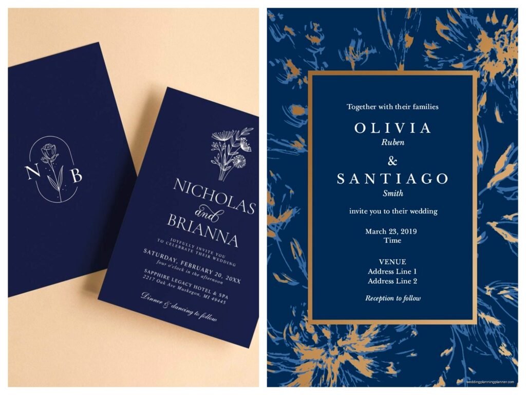
Navy blue is honestly one of those colors that couples sleep on until they actually see it in person, and then they’re like oh THIS is what we want. I had this couple back in spring 2023 who came to me with a Pinterest board full of blush pink and gold, and I showed them one navy sample with gold foil accents and they completely switched their entire color scheme. Like, we’re talking bridesmaid dresses already ordered in dusty rose and everything.
The thing about navy blue invitations, especially when you’re going for that nautical vibe, is that it walks this really fine line between elegant and theme-y. You gotta be careful or you end up with something that looks like a kid’s birthday party at a seafood restaurant, you know?
Why Navy Works for Weddings
Navy is basically the grown-up version of blue. It photographs incredibly well, which matters more than people think because everyone’s gonna be posting your invitation on Instagram before they even RSVP. It pairs with literally everything – gold, silver, copper, white, cream, blush, burgundy, even that trendy sage green everyone’s obsessed with right now.
For nautical designs specifically, navy gives you that classic maritime feel without being too literal. You can do anchor motifs, rope details, compass roses, whatever, and the navy keeps it sophisticated instead of costume-y. I’ve seen people try to do nautical with bright royal blue and it just… doesn’t hit the same.
Paper Stock Matters More Than You Think
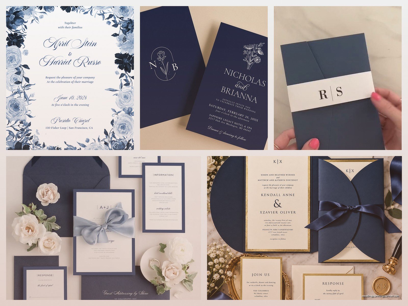
Alright so this is where I get kinda specific because the paper stock you choose literally changes how the navy blue looks. On a bright white cardstock, navy looks crisp and modern. On an ecru or cream stock, it looks vintage and romantic. On a textured linen paper, it reads more casual and beachy.
I usually steer people toward:
- 110lb cardstock minimum – anything lighter feels cheap when you’re doing a deep color like navy
- Smooth finishes if you’re doing foil stamping or letterpress
- Textured finishes if you’re doing digital printing and want to hide any slight color variations
- Cotton paper if budget allows because it just FEELS expensive
One thing that annoyed me recently was this printer who kept insisting that navy wouldn’t look good on kraft paper, and I had to literally send them three examples from past clients before they’d even try it. Spoiler: it looked amazing. The contrast between the deep navy and that natural brown kraft creates this really organic, coastal vibe.
Nautical Design Elements That Actually Work
You don’t need to go full sailor uniform with your invitations. Actually please don’t do that. The best nautical navy invitations I’ve designed used subtle elements:
Rope borders: Just a thin rope illustration around the edge of your text. Clean, classic, not overwhelming.
Anchor motifs as dividers: Instead of those standard ornamental dividers between your ceremony and reception details, a small anchor illustration works perfectly. Keep it small though – like maybe half an inch max.
Compass rose corners: These can go in just one corner or all four, depending on how much you want to commit to the theme. I usually suggest just top corners to keep it balanced.
Wave patterns: This is where people sometimes go overboard (ha), but a subtle wave pattern as a bottom border or even as a barely-visible background pattern can be really elegant.
Ship wheel elements: Use sparingly. Like, maybe on your RSVP card but not on your main invitation.
Color Combinations That Elevate Navy
Navy by itself can feel heavy, so you’re gonna want to pair it with something. Here’s what I’ve seen work really well:
Navy + Gold: This is classic for a reason. The warmth of gold (especially metallic gold foil) against navy is just *chef’s kiss*. Works for formal weddings, beach weddings, everything in between.
Navy + White + Copper: More modern, slightly industrial but still nautical. The copper adds warmth without being too traditional.
Navy + Coral: Perfect for summer weddings. The coral keeps it from feeling too serious. I did a set with navy letterpress and coral envelope liners and the couple literally cried when they saw them.
Navy + Cream + Sage: This combination is having a moment right now. It’s softer, more organic, works great for coastal garden weddings or beach ceremonies.
Printing Methods for Navy Invitations
Okay so this gets technical but also it matters for your budget and timeline, so bear with me.
Digital printing: Most affordable, quickest turnaround. Navy prints really well digitally on most papers. The color can vary slightly between printers though, so always request a printed sample before approving your full order. I learned this the hard way with a order in summer 2021 where the “navy” came out looking almost purple and we had to reprint everything two weeks before the wedding.
Letterpress: Gorgeous for navy because you get that deep impression in the paper. It’s tactile and fancy and guests definitely notice. More expensive, longer lead time (usually 4-6 weeks), and you need thicker paper stock to handle the impression. Worth it if you’ve got the budget.
Foil stamping: This is where you can do navy paper with metallic foil text and details. Or navy foil on white/cream paper. Both look incredible. Foil adds significant cost but the wow factor is real.
Thermography: That raised print technique that’s cheaper than letterpress. Navy works well for this but make sure your printer knows what they’re doing because the raising process can sometimes affect dark colors.
Envelope Game Is Important
Your envelope is the first thing people see, so don’t just throw your beautiful navy invitation in a basic white envelope. Options:
- Navy envelopes with white or gold addressing – super dramatic when it arrives in the mail
- White envelopes with navy liner – more traditional but still impactful when they open it
- Kraft envelopes with navy details – casual, beachy, organic vibe
- Cream envelopes with navy wax seal – elegant and vintage-feeling
I’m personally obsessed with navy envelopes with copper metallic addressing right now. My cat knocked over an entire box of them last month and I’m still finding navy envelopes under my couch, but they’re so pretty I can’t even be mad.
Typography Choices for Nautical Navy
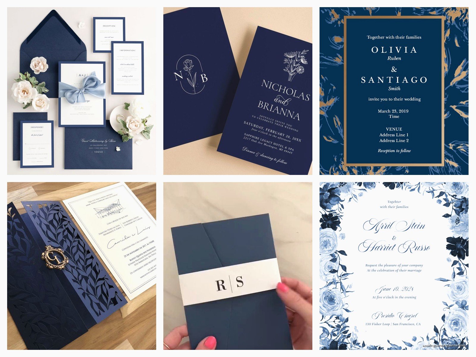
Font selection can make or break your invitation design. For nautical navy invitations, I usually suggest:
Serif fonts: These read as more traditional and formal. Garamond, Didot, Playfair Display – these work beautifully with navy and nautical elements. They balance out the casual beach vibe.
Clean sans-serifs: If you want modern nautical (which is totally a thing), go with something like Montserrat or Avenir. Crisp, clean, contemporary.
Script fonts – but carefully: A delicate script for names can work, but don’t do full script for all your text. It gets hard to read and can feel too fussy with nautical elements.
Mix and match – maybe a serif for your names, sans-serif for details, and keep everything really readable. I’ve seen too many invitations where people can’t figure out what time the ceremony starts because the font was too decorative.
Wording and Layout Considerations
The actual text on your invitation should match the formality level of your design. If you’re doing elegant navy with gold foil, stick with traditional wording. If you’re doing casual navy on kraft with rope details, you can be more relaxed with your wording.
For nautical themes, some couples like to incorporate subtle maritime language, but honestly? I usually talk them out of it. Things like “anchors aweigh” or “set sail with us” can feel forced. Your design already communicates the nautical theme – your wording should just clearly tell people when and where to show up.
Layout-wise, center alignment is classic and works well with symmetrical nautical elements. Left-aligned can feel more modern and casual. Just make sure whatever nautical illustrations you’re using don’t compete with your text for attention.
Suite Pieces Beyond the Main Invitation
A full invitation suite gives you more opportunities to play with navy and nautical elements:
RSVP cards: You can flip the color scheme here – maybe white with navy text if your main invitation is navy with white text. Or introduce a secondary color from your palette.
Details cards: Information about accommodations, directions, dress code, whatever. Keep the nautical elements minimal here since this is functional more than decorative.
Weekend itinerary cards: If you’re doing a destination wedding or multi-day event, this is where you can have fun with additional nautical illustrations. Maybe a different maritime element on each day’s section.
Belly bands or ribbons: Navy ribbon wrapped around your suite looks polished. You could also do rope-style twine for a more casual look, or even actual thin nautical rope if you’re really committing.
Digital vs. Printed Considerations
Some couples are doing digital invitations now, which… okay I’m a stationery person so I’m biased, but for navy nautical designs, print really showcases the color better. Navy on a screen can look different on everyone’s phone depending on their brightness settings and screen quality.
That said, if you’re doing digital for budget or environmental reasons, make sure you’re designing in RGB color mode (not CMYK like you would for print) and test how it looks on multiple devices before sending.
You could also do a hybrid approach – digital save-the-dates with printed formal invitations. Or printed invitations with a wedding website that carries through the navy nautical design.
Timing and Ordering
Navy invitations don’t take longer to produce than any other color, but here’s a realistic timeline:
- Design and proofing: 2-3 weeks (assuming you’re not super indecisive)
- Printing: 2-4 weeks depending on method
- Addressing and assembly: 1-2 weeks
- Mailing: Plan for invitations to arrive 8-10 weeks before your wedding
So you’re looking at starting the invitation process about 4-5 months before your wedding date. Earlier if you’re doing complicated printing methods or custom illustrations.
Order extras. Always. I usually tell couples to order 10-15% more than their guest count because people lose them, addresses change, you’ll want to keep some for yourselves, and inevitably someone’s cousin will ask for another one because they spilled coffee on theirs.
Budget Real Talk
Navy invitations can range from $2 per suite to $20+ per suite depending on what you’re doing. Here’s roughly what to expect:
Basic digital printing on standard cardstock with matching envelopes: $2-4 per suite. Totally fine, gets the job done, looks nice.
Upgraded paper stock, envelope liners, maybe some metallic accents: $5-8 per suite. This is the sweet spot for most couples.
Letterpress, foil stamping, cotton paper, custom illustrations, fancy envelope addressing: $10-20+ per suite. Worth it if stationery is important to you and you’ve got the budget.
For 100 invitations, you’re looking at anywhere from $200 to $2000+. I know that’s a huge range, but it really depends on what elements matter to you. Maybe you do simple printing but splurge on navy wax seals for every envelope. Or basic envelopes but invest in letterpress for the main card. You can mix and match to fit your budget.
Common Mistakes to Avoid
Too many nautical elements. I’ve seen invitations with anchors AND rope AND ships AND compasses AND waves AND lighthouse illustrations and it’s just… it’s too much. Pick 1-2 elements and execute them well.
Navy that’s too light. If your navy looks like regular blue, it’s not navy. It should be deep and rich, almost black in some lighting.
Ignoring readability. White text on navy can be hard to read if the font is too thin or too small. Make sure there’s enough contrast and size.
Forgetting about your venue. If you’re getting married at a yacht club, nautical navy invitations make perfect sense. If you’re getting married in a barn… maybe reconsider or tone down the maritime elements.
Not ordering samples. Never ever order your full invitation suite without seeing and touching a printed sample first. Colors look different in person, paper feels different, you need to see the actual thing.
Working with a Designer or DIY
You can definitely DIY navy nautical invitations if you’re crafty and have design software skills. Templates are available on Etsy, Canva has options, Minted and similar sites have customizable designs. Just make sure you’re using high-resolution images and that your nautical elements are actual illustrations, not clipart that’s gonna look pixelated when printed.
Working with a stationery designer (hi) means you get custom work that’s exactly what you want, someone to handle the proofing and printing coordination, and usually better quality control. It costs more but saves you the headache of figuring out bleed lines and CMYK conversion and all that technical stuff… wait I’m supposed to be watching that new show everyone’s talking about, what’s it called, The Last of—anyway, where was I.
If you’re DIYing, give yourself way more time than you think you need. Designing is the easy part. Printing, cutting, assembling, addressing 150 envelopes – that takes forever and is surprisingly exhausting.
Matching Your Invitations to Your Wedding
Your invitations set the tone, so they should reflect your actual wedding vibe. Navy nautical invitations suggest: coastal location, possibly outdoor ceremony, elegant but not stuffy, probably some seafood at the reception (just kidding but also maybe).
Carry the navy through to other paper goods – programs, menus, place cards, thank you cards. You don’t have to use the exact same design, but keeping the color palette and general aesthetic consistent makes everything feel cohesive. Which apparently matters a lot based on how many Pinterest boards I’ve seen dedicated to “cohesive wedding aesthetics.”
You can also pull nautical elements into your decor, but again, subtlety is your friend. Navy linens, rope details on centerpieces, anchor escort card display – these work. A life-size ship’s wheel and fishing nets everywhere – probably not.
