
Planning Guides, Style Guide
Beautiful Wedding Invitations: Stunning Elegant Designs
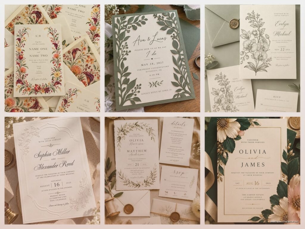
Nov
Okay so wedding invitations are basically the first impression your guests get
The invitation sets the whole vibe and honestly I’ve seen couples stress about this MORE than they stress about the actual venue sometimes. Like back in spring 2023 I had this bride who changed her invitation design four times because she couldn’t decide between classic elegant or modern elegant and I was like… they’re both elegant, just pick one.
But here’s the thing – creating a stunning elegant invitation isn’t actually as complicated as people make it. You just gotta understand what makes something look expensive and refined versus what makes it look like you downloaded a template from 2009.
The basics of elegant design
Elegant doesn’t mean covered in sparkles and seventeen different fonts. Actually that’s the opposite of elegant. When I think elegant wedding invitations, I’m thinking clean lines, quality paper stock, and restraint. Like, serious restraint.
The most elegant invitations I’ve worked with used maybe two fonts maximum. Usually one serif font for the main text and maybe a script for names or a single decorative element. That’s it. When couples come to me with designs that have four or five different typefaces I have to gently redirect because it ends up looking like a ransom note instead of a wedding invitation.
Color palette matters so much
You want elegant? Stick with neutrals as your base. Cream, ivory, white, soft grey, champagne, blush – these are your friends. You can absolutely add a pop of color but keep it sophisticated. Deep burgundy, navy, emerald green, or even black can look incredible when done right.
I had a couple do black invitations with gold foil lettering and it was STUNNING. But they kept the design simple – just their names, the date, and the venue details. No extra flourishes or borders or whatever.
Paper quality is where you actually feel the elegance
This is gonna sound snobby but I don’t care – you can tell the difference between 80lb cardstock and proper invitation paper. You just can. When someone picks up a 120lb cotton paper invitation with a soft deckled edge, they know it’s special before they even read it.
Cotton paper has this texture that regular cardstock doesn’t have. It feels substantial. Crane’s, William Arthur, Bella Figura – these companies know what they’re doing with paper. But honestly there are also smaller boutique paper suppliers that make gorgeous stuff for less money if you’re willing to do some digging.
Texture adds dimension
Letterpress is probably the most elegant printing method out there. You get that gorgeous debossed impression in the paper where the text is actually pressed into it. It’s tactile and beautiful and yeah it costs more but if elegant is what you’re going for, letterpress delivers.
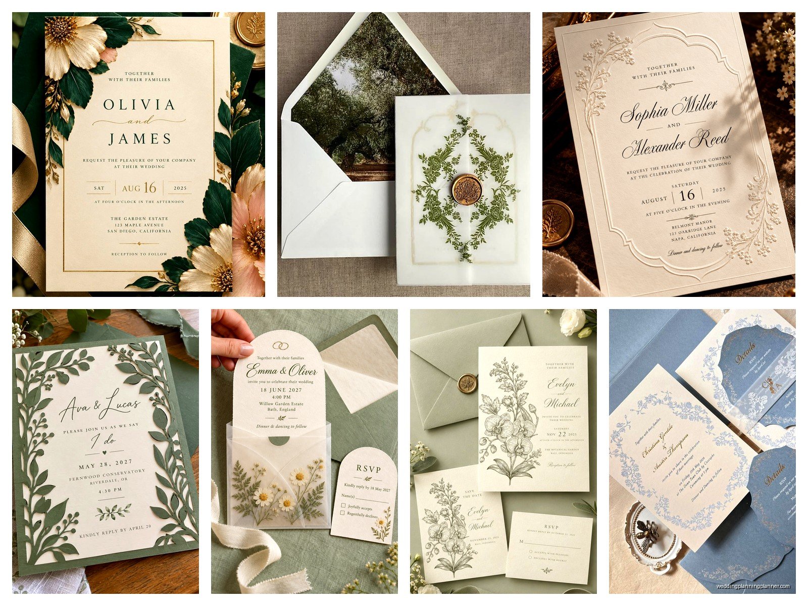
Foil stamping is another good option – metallic foil applied to the paper. Gold, rose gold, silver, copper, even white foil on colored paper. It catches the light and adds this luxurious feel without being over the top.
Embossing (where the design is raised) also works but I think it’s slightly less… I dunno, it can look a bit dated if you’re not careful. Depends on the design.
Layout and composition
White space is your best friend. Or cream space. Whatever your paper color is – leave lots of it empty. Don’t feel like you need to fill every inch with decorative elements or text or borders.
The most elegant invitations often have the text centered with generous margins on all sides. Sometimes asymmetrical layouts work too but they’re trickier to pull off. You need a really good designer for asymmetrical elegance.
One thing that really annoys me is when people use justified text alignment on invitations. It creates these weird spacing issues and makes everything harder to read. Center alignment or left alignment – pick one. Justified text is for newspapers, not wedding invitations.
Typography choices that actually work
For serif fonts: Garamond, Didot, Bodoni, Baskerville, Caslon – these are classic for a reason. They’re readable and timeless. For script fonts (use sparingly): Edwardian Script, Copperplate, or honestly just find a good calligrapher to hand-letter the names because that always looks better than a script font anyway.
Sans serif can work for modern elegant designs. Something like Futura or Helvetica Neue in all caps with generous letter spacing can look incredibly chic. But you gotta commit to the modern aesthetic – don’t mix modern sans serif fonts with traditional elements or it gets confusing.
My cat just knocked over my coffee while I’m writing this, great timing buddy. Anyway.
Envelope game is important too
People sometimes forget about the envelope but it’s literally the first thing your guests see. A beautiful lined envelope immediately elevates the whole presentation. You can get patterned liners, solid color liners, metallic liners – whatever matches your invitation design.
Addressing matters too. Hand calligraphy is the gold standard for elegant invitations. If that’s not in your budget, there are really good digital calligraphy options now where they create a custom font from a calligrapher’s handwriting. It’s not quite the same but it’s pretty close and way more affordable.
DO NOT use printed labels. Just don’t. If you want elegant, you cannot use those clear Avery labels with printed addresses. Either do calligraphy, digital calligraphy printing, or honestly just neat handwriting is better than labels.
Wax seals are having a moment
I’m seeing wax seals everywhere right now and when done right they look amazing. You can get custom wax seals made with your initials or monogram. Traditional sealing wax or the newer glue gun style wax – both work. Colors like deep red, gold, navy, or even white wax on colored envelopes.
Just be aware that wax seals can get damaged in the mail and they might require extra postage because they make the envelope thicker. Take a fully assembled invitation to the post office and have them weigh it before you buy stamps for all of them. Trust me on this.
Design elements that read as elegant
Monograms are classic. A simple, well-designed monogram at the top of the invitation or on the envelope flap adds a personal elegant touch. Don’t go crazy with elaborate monograms that take up half the page though.
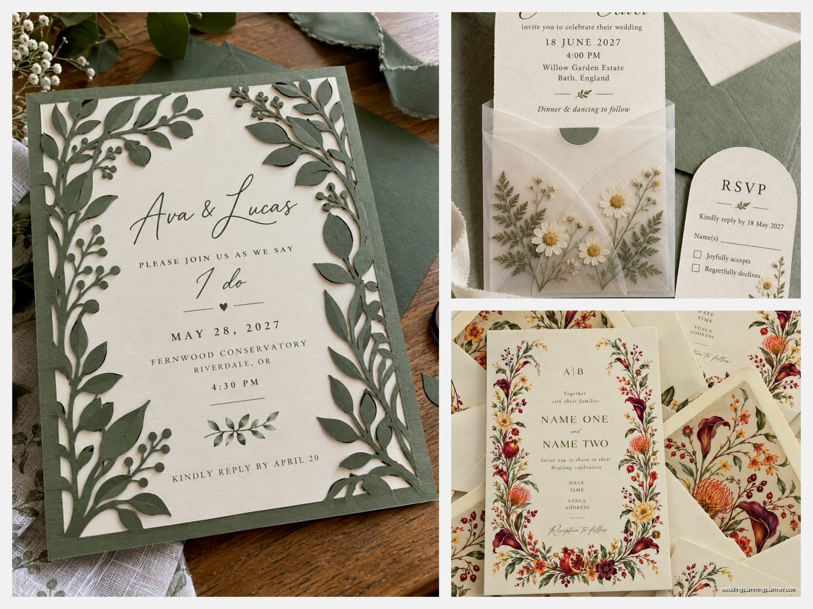
Delicate botanical illustrations work beautifully – think simple line drawings of olive branches, eucalyptus, or single flowers. Not big bold florals, but subtle refined illustrations. Watercolor can work too but it needs to be soft and sophisticated, not bright and busy.
Borders and frames – use them minimally. A thin single-line border can be lovely. A thick ornate border with corners and flourishes can quickly look dated or overdone. Less is more here.
Suite coordination
An elegant invitation suite usually includes the main invitation, an RSVP card with envelope, details card (accommodations, directions, dress code), and maybe a reception card if the ceremony and reception are at different locations or… wait, different times at the same location? You know what I mean.
Everything should coordinate but doesn’t have to match exactly. Maybe your main invitation is letterpress on thick cotton paper, but your details card is printed on thinner coordinating paper. That’s fine. Just keep the fonts, colors, and overall aesthetic consistent.
Some people do belly bands (paper or ribbon wrapped around the suite) or vellum overlays or silk ribbon ties. These can be elegant but they add cost and assembly time. During summer 2021 I had a bride who insisted on hand-tying 200 invitations with silk ribbon and she literally called me crying three days before they needed to mail because she wasn’t even halfway done. We ended up having an emergency assembly party with her bridesmaids and my assistant and it was chaos.
Printing methods ranked by elegance level
From most to least elegant in my opinion: Engraving (traditional but expensive and less common now), Letterpress, Foil stamping, Thermography (raised ink, looks kinda like engraving but cheaper), Digital printing (can look great with good design and paper), Offset printing (fine for details cards and such).
You don’t have to use the same printing method for everything. Letterpress your main invitation and digitally print your details card – totally acceptable and saves money.
What to actually say on an elegant invitation
The wording matters. Traditional formal wording reads as more elegant than casual wording. That doesn’t mean you have to be stuffy, but there’s a tone that works better.
Traditional format goes: Host line (whoever’s hosting/paying traditionally), request line (request the honour of your presence), couple’s names, date and time, location, reception details if needed.
Spell out everything – no abbreviations. “Saturday, the twenty-eighth of September, two thousand twenty-four” not “Saturday, Sept. 28th, 2024.” Time is “half after six o’clock in the evening” not “6:30 PM.”
I know this seems fussy but it really does look more elegant when everything is spelled out properly. Although honestly, some modern elegant designs break these rules and still look amazing, so take this as a guideline not a commandment.
Common mistakes that ruin elegant invitations
Using too many design elements. Seriously, I see this all the time – couples want elegant but then they add a floral border AND a monogram AND a wax seal AND ribbon AND a photo of them AND three different metallic colors and it becomes too much. Pick a few elegant elements and let them shine.
Cheap paper with expensive printing. Don’t do letterpress on flimsy cardstock. The paper quality needs to match the printing quality or it looks off.
Wrong size envelopes. Your invitation should fit in the envelope with a little breathing room. Not crammed in, not swimming in there. Standard sizes are easier to mail and cheaper, but non-standard sizes can look more elegant if you do it right.
Forgetting about postage. Those vintage botanical stamps or custom photo stamps are beautiful but make sure you have enough postage. Elegant invitations are often heavy and need extra stamps.
Working with a stationer versus DIY
Look, I’m a stationery consultant so obviously I’m biased, but there’s a reason professional designers exist. We know what works, what doesn’t, what will print well, what won’t. We have relationships with printers and paper suppliers. We can show you real samples, not just pictures online.
That said, if you’re crafty and have good design sense, you can DIY elegant invitations. You’ll need to invest time in learning design software, researching printing methods, ordering samples, doing test prints… it’s doable but it’s more work than people think.
Semi-custom templates from places like Minted or Paperless Post can be a good middle ground. They have elegant designs created by real designers that you can customize with your details. Not as unique as fully custom but way easier than starting from scratch.
Timing and ordering
Order invitations at least four months before your wedding. Five or six months is better, especially if you’re doing letterpress or engraving because those take longer. You need time for design, proofs, printing, addressing, and mailing (send invitations 6-8 weeks before the wedding).
Always order extras. I usually tell couples to order 10-15% more than they need. You’ll mess up some addresses, you’ll forget someone, you’ll want to keep one for your own records. Extra invitations are cheaper when ordered with the main batch than trying to reorder later.
Get a proof. Always. I don’t care if the designer is your best friend or a top professional – get a physical printed proof before approving the full print run. Colors look different on screen versus paper. You need to see the actual thing.
Budget reality check
Elegant invitations aren’t cheap. You can expect to spend anywhere from $8-15 per invitation suite for nice quality with decent printing, up to $30-50+ per suite for letterpress on luxury cotton paper with custom calligraphy and all the bells and whistles.
For 100 invitations, budget at least $1000-1500 for truly elegant stationery. Yes, you can spend less with DIY or digital options, but if you want that luxury look and feel, it costs money. Paper quality, printing methods, and design work all add up.
You can save money by: simplifying the design, using digital printing instead of letterpress, printing your own envelope liners, doing your own assembly, limiting the number of insert cards, choosing standard sizes, or doing digital calligraphy instead of hand calligraphy.
But some things are worth spending on – the paper quality and the main invitation printing method are where I’d invest if you have to choose. You can cheap out on the details card printing but keep the main invitation luxurious.
