
Planning Guides, Style Guide
Sage Wedding Invitations: Soft Green Herbal Designs
Nov
Okay So Sage Green Invitations Are Having a Moment
Sage wedding invitations are everywhere right now and honestly I’m not mad about it. The whole soft green herbal vibe is way more interesting than another navy and gold situation, and I’ve been designing these for clients non-stop since like spring 2023 when this trend really took off. The color works with literally everything which is probably why brides keep requesting it.
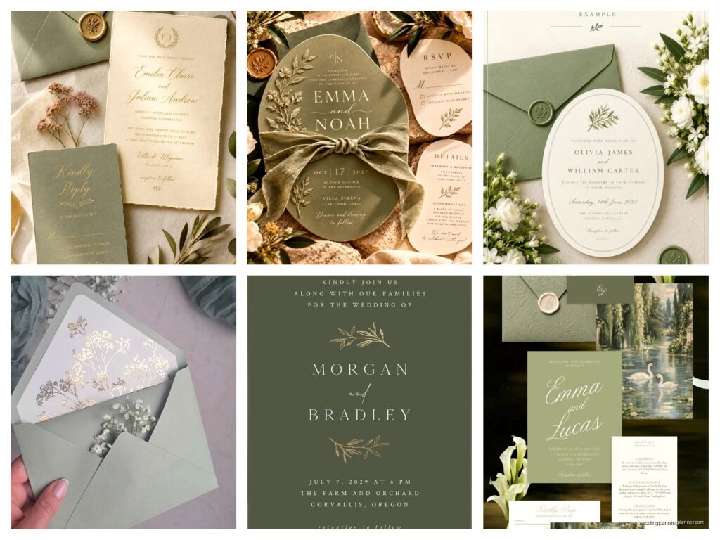
So sage is this muted greenish-gray color that looks like dried herbs or eucalyptus leaves. It’s not bright, it’s not forest green, it’s just this really calm neutral that photographs beautifully and doesn’t scream “look at me” but still feels intentional. When you’re working with sage for invitations, you’re usually incorporating actual herbal elements or at least the aesthetic of them—think sprigs of rosemary, lavender illustrations, olive branches, that whole garden-inspired thing.
Picking Your Shade of Sage
Here’s what annoys me though—everyone calls their green “sage” when it’s actually mint or seafoam or straight up olive. True sage has gray undertones, not blue or yellow. When you’re ordering from a printer or looking at paper samples, make sure you’re seeing the actual color because “sage” means different things to different vendors and I’ve had clients cry (actually cry) when their invitations arrived in a completely different shade than they expected.
The main sage variations you’ll see are dusty sage which is more gray, true sage which is balanced, and brighter sage which leans more green. I usually steer clients toward dusty or true sage because they’re more sophisticated and won’t look dated in five years. But that’s just me being opinionated about color theory at 10pm on a Tuesday.
Paper Stock Options
You’ve gotta think about paper texture when you’re doing herbal designs. Smooth cardstock can work but textured paper makes the whole thing feel more organic and garden-inspired. I love cotton paper for sage invitations—it has this subtle texture that feels expensive without being too fancy. Linen texture is another good option, or if you really wanna go for it, handmade paper with actual flower petals embedded in it.
Kraft paper backing or envelopes paired with sage is *chef’s kiss* perfect. The brown-beige of kraft makes sage look even softer and more natural. You can do sage invitations on white or cream cardstock with kraft envelopes, or flip it and do kraft invitations with sage envelopes. Both work.
Design Elements That Actually Work
Okay so for the herbal design part. You have options here and some are gonna look better than others depending on your overall wedding vibe.
Watercolor herbs: This is probably the most popular approach right now. You get illustrations of rosemary, sage leaves, eucalyptus, maybe some lavender sprigs, all done in soft watercolor style. These usually go around the borders or in the corners of the invitation. They’re pretty but they can look really similar to everyone else’s invitations if you’re not careful about customization.
Line drawings: Simple botanical line art in sage green ink on white or cream paper. This is more minimalist and modern. I did a full suite like this in summer 2021 for a bride who was having a micro-wedding at a botanical garden and she wanted everything super clean and unfussy. The line drawings were just outlines of herb stems and it looked so elegant.
Pressed herb look: Designs that mimic actual pressed flowers and herbs, kinda flat and detailed. This works really well if you’re going for a cottagecore or naturalist vibe.
Painted leaves: Bigger, bolder watercolor or gouache-style painted leaves, usually eucalyptus or olive branches. These make more of a statement than delicate herb sprigs.
Typography Choices
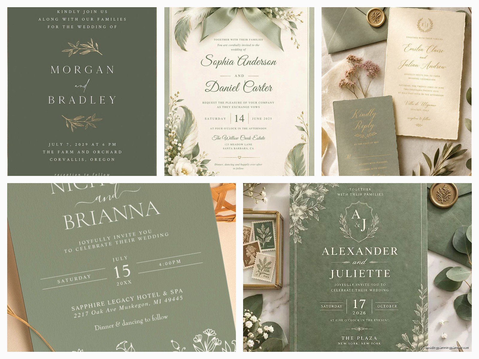
Your font matters SO much with sage invitations. You want something that complements the softness of the color and the organic feel of the herbs. I usually recommend pairing a romantic serif or script for names with a clean sans-serif for the details.
Good combinations: a flowing script like Playlist or Adelicia with a simple sans-serif like Montserrat or Futura for the venue info and timing. Or if you want something more classic, a serif like Garamond or Libre Baskerville works beautifully. Just don’t use too many fonts—two is perfect, three is pushing it, four makes you look like you discovered the font menu for the first time.
The color of your text matters too. Sage green text on white paper can be hard to read if the shade is too light, so I often do darker green or even charcoal gray for the main text and save the sage for accents or borders. Or you can do all the text in a deep forest green or black and use sage as a background color or for decorative elements.
Actual Herbs vs Illustrations
Some couples want to include actual dried herbs with their invitations which sounds beautiful until you think about the logistics. Real herbs add bulk to your envelopes which means extra postage, and they can get crushed in the mail, and also my cat knocked over a whole box of lavender sprigs once while I was assembling invitations and I’m still finding purple bits in my office.
If you really want real herbs, here’s what works: tie a small sprig of dried lavender or rosemary to the invitation with twine or ribbon, or tuck it into the envelope. Make sure it’s completely dried so it doesn’t create moisture issues. Bring a finished sample to the post office and have them weigh it because you’ll probably need extra postage.
Honestly though? Illustrations are easier and they photograph just as well. You can get the herbal aesthetic without the hassle of sourcing and drying actual plants.
Building Your Full Suite
A complete invitation suite usually includes the main invitation, RSVP card, details card, and maybe accommodations info or a weekend itinerary if you’re doing a destination wedding or multi-day event. Everything should coordinate but doesn’t have to match exactly.
For sage herbal suites, I usually do the main invitation with the most elaborate botanical design, then simplify the design elements for the other pieces. Like maybe the invitation has a full wreath of herbs around the text, the RSVP has just a small sprig in the corner, and the details card has a simple sage border.
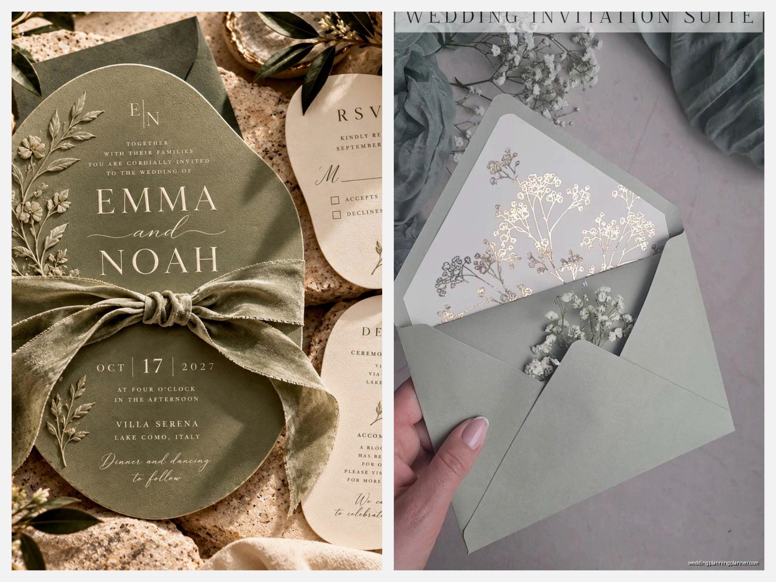
Envelope liners are where you can really have fun. A sage and white striped liner, or a pattern of tiny herb illustrations, or even a solid sage liner all look amazing. Envelope liners seem like an extra expense but they make such a difference when someone opens the envelope—it’s that little moment of “oh this is fancy.”
Belly Bands and Extras
Belly bands are those paper strips that wrap around your invitation suite to hold everything together. For sage herbal invitations, you can do a sage belly band with a wax seal, or a cream band with an herb illustration, or even use actual ribbon in sage green or cream. Silk ribbon looks expensive, grosgrain is more casual, and velvet ribbon is very romantic but also very 2019 so… proceed with caution there.
Wax seals in sage or gold or cream are perfect for this aesthetic. You can get custom stamps with your initials or just use a simple botanical design. Fair warning though, wax seals sometimes get crushed in mail sorting machines, so if you’re using them, hand-cancel your invitations at the post office or at least warn your guests that the seal might arrive a little damaged.
Printing Methods
The way your invitations are printed affects both the look and the cost. Digital printing is the most affordable and works great for most designs. The colors are vibrant and you can do full-color botanical illustrations easily.
Letterpress is more expensive but creates this beautiful impression in the paper that you can actually feel. It works really well for sage invitations if you’re doing simpler designs—like text with minimal botanical elements. The sage ink pressed into cream cotton paper is just… it’s gorgeous. But complicated watercolor designs don’t translate well to letterpress.
Foil stamping in gold or rose gold on sage paper is another option that looks super elegant. I had a bride in a really stressful situation last fall who changed her whole color scheme six weeks before the wedding from blush to sage, and we salvaged her already-ordered invitations by adding gold foil herb details over the existing design and somehow it worked and she didn’t completely lose it.
Thermography is like a middle ground—it creates raised text that’s shinier than digital printing but less expensive than letterpress. It works fine for sage invitations but doesn’t have the same tactile quality as letterpress.
Coordinating With Your Wedding Design
Your invitations should give guests a preview of your wedding vibe. If you’re doing sage invitations with herbal designs, your wedding probably has some combination of: greenery, garden elements, organic textures, romantic-but-not-fussy aesthetic, maybe outdoor or botanical venue.
Think about how the invitation design can hint at other wedding elements. If you’re using a lot of eucalyptus in your centerpieces, include eucalyptus in the invitation design. If your venue is a greenhouse or garden, botanical illustrations make perfect sense. If you’re incorporating herbs into your favors or menu, reference that in the invitation somehow.
The sage color should appear in other wedding details too—bridesmaid dresses, table linens, ribbons, candles, whatever. You don’t need sage everything (please don’t do sage everything), but carrying the color through in a few key places creates cohesion.
What Works With Sage
Color combinations that look amazing with sage: cream, ivory, white, gold, terracotta, dusty rose, mauve, taupe, rust, burgundy, navy (if you want more contrast), and other muted greens. Basically any soft, natural, slightly vintage-looking color.
What doesn’t work: bright colors, neon anything, pure black (too harsh—use charcoal instead), bright pink (too much contrast with the mutedness of sage). I mean you can do whatever you want, it’s your wedding, but some combos are gonna look more cohesive than others.
DIY vs Professional Printing
You can absolutely DIY sage herbal invitations if you’re crafty and have time. Sites like Etsy have templates you can customize and print at home or through an online print service. This works fine if your guest list is small and you’re okay with the invitations looking handmade.
For home printing, you’ll need good quality cardstock—I recommend at least 80lb cover weight, and get actual samples before you order a huge quantity because colors look different on screen versus in person. Print a test batch first because there’s nothing worse than printing 150 invitations and then realizing the sage looks more like mint or the text is too light to read easily.
Professional printing gives you more options for paper quality, finishes, and printing methods. It’s more expensive but the results are usually worth it, especially if you’re inviting like 200 people and want everything to look polished. Most professional printers will send you a proof before printing the full order, which saves you from costly mistakes.
Timing and Ordering
Order your invitations at least 4-5 months before your wedding date. That gives you time for design, proofing, printing, addressing, and mailing. You want invitations in guests’ hands 6-8 weeks before the wedding, or 3 months ahead for destination weddings.
Order extras—I always tell clients to order at least 10-15 extra invitations beyond their guest count. You’ll want some for keepsakes, mistakes happen during addressing, last-minute guest additions come up, whatever. It’s cheaper to order extras upfront than to do a small reprint later.
Addressing Options
How you address the envelopes matters for the overall look. Hand calligraphy in sage or dark green ink looks beautiful but costs extra. Digital calligraphy (printed to look like handwriting) is more affordable and still looks nice. Or you can just print addresses directly on the envelopes in a pretty font, which is the most budget-friendly option and honestly looks fine if your font choice is good.
I’m not gonna lie, I usually discourage clients from hand-addressing their own envelopes unless they have really nice handwriting because it takes forever and inevitably someone messes up on envelope number 87 and has a breakdown. Been there, seen that, would rather avoid the panicked emails.
Return addresses can go on the envelope flap or the upper left corner of the front. For sage invitations, I like putting them on the flap with a small herb illustration—it’s a nice little detail when people flip the envelope over.
Postage Stamps
This is such a small detail but it makes a difference. Botanical or garden-themed stamps look perfect with sage herbal invitations. The USPS usually has floral or nature stamps available. Vintage stamps in complementary colors also work well—you can buy these from stamp collectors or Etsy sellers.
If your invitations are heavy or have a lot of layers or include actual herbs, you’ll need extra postage. Take a fully assembled invitation to the post office and have them weigh it before you buy all your stamps. Square envelopes also require extra postage because they can’t go through the regular sorting machines, which is annoying but something to know.
Alright so that’s basically everything I know about sage wedding invitations after doing these for the past few years. The whole herbal design thing isn’t going anywhere soon, and sage is just such a versatile color that works for different wedding styles from super casual garden parties to more formal events. Just make sure you’re getting actual sage and not some other green, think about paper quality, don’t go overboard with fonts, and you’ll end up with invitations that your guests will actually want to keep instead of immediately recycling.
