
Planning Guides, Style Guide
Beauty and the Beast Wedding Invitations: Disney Fairy Tale
Nov
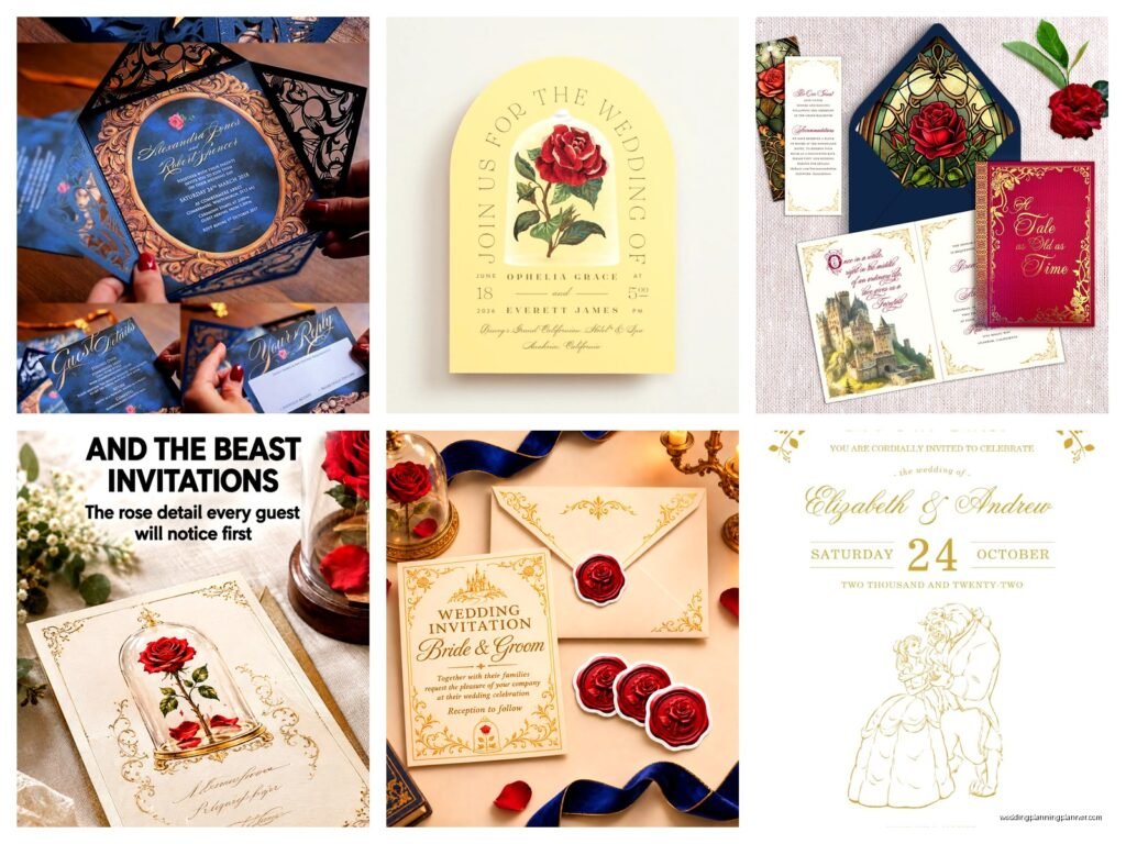
Getting Started With Your Beauty and the Beast Invitations
Okay so Beauty and the Beast wedding invitations are having this huge moment right now and honestly I get it because the movie is just timeless and the colors are gorgeous. You’ve got that gold and royal blue combo that photographs like a dream and there’s so much you can do with roses and enchanted themes without it looking childish.
First thing you gotta figure out is whether you’re going full Disney or more subtle fairy tale vibes. I had this bride back in spring 2023 who wanted Beauty and the Beast but her fiancé was kinda nervous about it being “too much” and we had to find this middle ground where the invitations screamed Belle to people who knew but just looked elegant to everyone else. It’s actually way easier than you’d think.
The Color Palette Situation
The classic Beauty and the Beast colors are that rich gold, royal blue, and deep red with touches of cream or ivory. You can go with just gold and cream if you want something more neutral, or add in that signature yellow from Belle’s ballgown. I usually tell couples to pick two main colors and one accent because otherwise it gets too busy on the invitation itself.
Some popular combinations I’ve seen work really well:
- Navy blue with gold foil accents and cream cardstock
- Burgundy and gold with ivory envelopes
- Yellow and gold (but be careful this doesn’t read as generic yellow wedding)
- Deep purple and gold which gives you that enchanted rose vibe
- All gold on cream for ultra elegant
The thing that annoyed me so much last year was this trend where people were doing like… lime green and hot pink and calling it Beauty and the Beast just because they added a rose clipart. Like no, that’s not how this works, you need to actually reference the color story from the film or it just looks random.
Design Elements You Can Actually Use
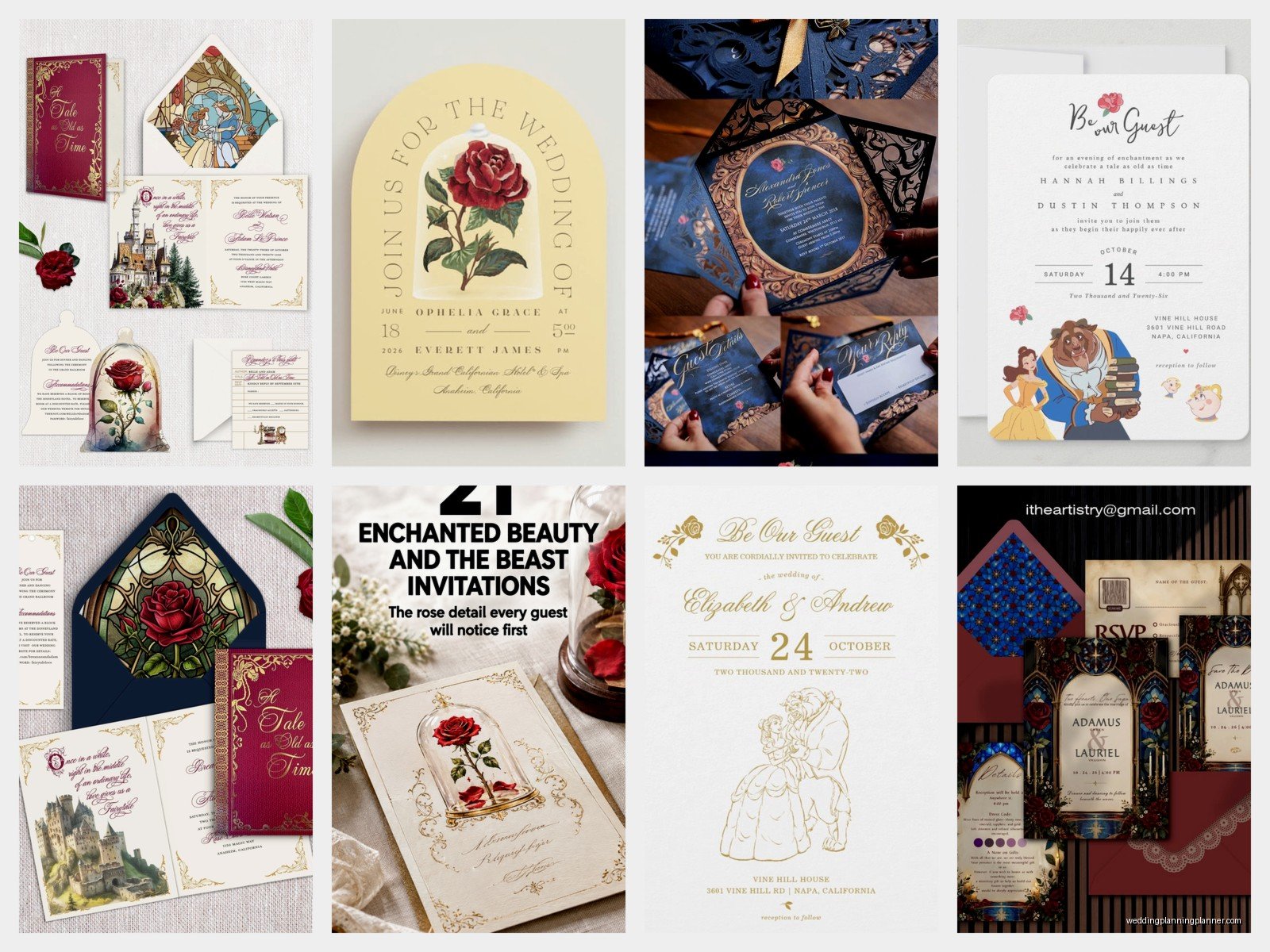
So there are a bunch of recognizable symbols from Beauty and the Beast that translate really well to invitation design. The enchanted rose is obviously the big one and you can use it as a border element, a watermark behind your text, or as the main focal point on the envelope liner.
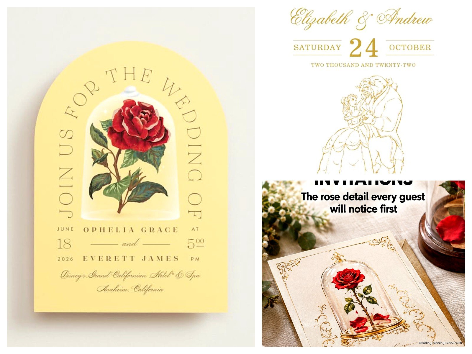
The castle silhouette works great as a subtle footer or you can go bigger with it as a background image. I’ve done invitations where we put a very faint castle outline behind all the text in a light gold ink and it looked incredible in person but didn’t photograph as well which was sort of disappointing for the couple’s social media posts but whatever.
Specific Design Ideas That Work
Here’s what I’ve seen actually look good in real life not just on Pinterest:
- Gold foil rose on navy cardstock with white text
- Laser cut invitation sleeves that look like the castle gates
- Wax seals with a rose design in either gold or red wax
- French script fonts that reference the fact that it’s set in France
- Yellow silk ribbon that matches Belle’s dress
- Book-style invitations that open like the one in the opening scene
- Parchment-looking paper with burned edges for that old world feel
The book-style ones are really cool but they’re also more expensive and heavier so your postage goes up. Just something to keep in mind when you’re budgeting because I’ve had couples get shocked by the mailing costs.
Wording and Text Choices
You can weave in subtle references to the story in your invitation wording without being cheesy about it. Instead of “requests the honor of your presence” you could say “requests the pleasure of your company for a tale as old as time” or keep the traditional wording and just add a small quote at the bottom.
Some couples do a line from the song at the top like “Tale as old as time, song as old as rhyme” but honestly that can read as a little too on-the-nose depending on your crowd. I usually suggest putting any direct Disney quotes on a separate details card instead of the main invitation.
My cat knocked over my coffee while I was designing a set of these last month and somehow it missed all the sample prints, like she has impeccable aim when it comes to chaos but at least she spared the invitations.
Font Selections
The font choice matters SO much with these. You want something that feels romantic and maybe slightly French or old-world but still readable. Script fonts are gorgeous but if your guest list includes a lot of older relatives, you might want to use script for names only and a cleaner serif font for the actual details.
Some fonts that work really well: Bickham Script, Great Vibes, Cinzel (this one’s very castle-like), Cormorant Garamond, or Playfair Display. Avoid anything too modern or geometric because it clashes with the whole fairy tale aesthetic.
DIY vs Professional Printing
Alright so this is where I’m gonna be really honest with you. DIY Beauty and the Beast invitations can look amazing if you’ve got design skills and good quality supplies, but they can also look really craft-project-ish if you’re not careful. The difference usually comes down to paper quality and printing method.
If you’re going DIY, invest in good cardstock. Like actually good stuff, not the flimsy thing from the craft store. You want at least 110lb cardstock for the invitation itself. And please please test your printer before you print 150 invitations because home printers are notoriously bad with heavy paper and certain colors.
What Professional Printing Gets You
Professional printing services can do foiling, letterpress, edge painting, and other techniques that are basically impossible at home. Gold foil especially makes a huge difference for Beauty and the Beast themes because it catches the light and photographs beautifully.
Letterpress gives you that pressed-into-the-paper texture that feels really luxurious. Edge painting is where they paint the edges of your cardstock in gold or another color and it’s such a small detail but it elevates everything.
The downside is cost obviously. Professional invitations with special printing techniques can run anywhere from $8 to $25+ per invitation depending on what you’re doing. DIY might cost you $2-5 per invitation but requires way more time.
Envelope Styling
Don’t sleep on the envelopes because they’re the first thing your guests see and they set the tone. For Beauty and the Beast you’ve got some really fun options here.
Envelope liners are probably the easiest way to add that wow factor. You can get liners printed with rose patterns, damask designs, or even a scene from the movie. I usually go with a gold and cream damask pattern because it’s recognizable as fancy and romantic without being obviously Disney.
Addressing options that work well:
- Gold calligraphy on navy envelopes
- White ink on burgundy or deep red envelopes
- Traditional black calligraphy on cream envelopes with a gold liner
- Printed labels with a rose motif if calligraphy isn’t in the budget
I had this situation in summer 2021 where a couple ordered these beautiful burgundy envelopes and then realized their calligrapher only worked with black ink and it looked terrible, like you could barely read it. We ended up having to order new envelopes in ivory and it pushed their timeline back three weeks which was stressful for everyone involved.
Coordinating Your Suite
A full invitation suite usually includes the main invitation, an RSVP card with envelope, a details card, and maybe a weekend events card if you’ve got multiple things happening. For Beauty and the Beast themes, you wanna carry the design elements through all the pieces but you don’t have to go equally intense on everything.
I usually suggest making the main invitation the star and keeping the other cards a bit simpler. So maybe your invitation has the gold foil rose and fancy script, but your details card is just the same cardstock with a simple gold border and cleaner font. It gives visual interest without overwhelming people or breaking your budget.
What to Include
Your RSVP card needs a deadline (usually 3-4 weeks before the wedding), meal choices if you’re doing plated dinner, and maybe a song request line which is cute for this theme. Some couples add “Be our guest” at the top of the RSVP card as a subtle reference.
Details card should have your wedding website, hotel blocks, and any transportation info. You can add a small rose illustration or just keep it text-only. Registry information does NOT go on any invitation piece, it only goes on your website, and I will die on this hill because it’s just proper etiquette.
Budget Breakdown Reality Check
Let me give you actual numbers because this is where couples get surprised. For 100 invitations:
- Basic DIY with nice paper and printing at a copy shop: $200-400
- Semi-custom from Etsy or Minted with standard printing: $400-700
- Custom design with professional printing (no foil): $800-1200
- Custom design with gold foil and special techniques: $1500-2500+
- Ultra luxury with letterpress, hand-painted details, etc: $3000+
These numbers include envelopes and basic postage. Add $100-300 for calligraphy addressing depending on your guest count, more if you want envelope liners, and don’t forget you need extra invitations for keepsakes and inevitable mistakes.
Where to Actually Order These
Etsy has a ton of Beauty and the Beast invitation templates and designers who do custom work. Search for “Belle wedding invitation” or “enchanted rose invitation” and you’ll find hundreds of options. Read reviews carefully and check if they provide digital files or printed invitations because some sellers only do one or the other.
Minted and Shutterfly have some fairy tale options you can customize. They won’t be specifically Beauty and the Beast branded but you can work with their templates and add your own elements. The quality is pretty good and they handle everything including addressing which is convenient.
Zazzle lets you upload your own designs or work with their templates. The quality is sort of middle-of-the-road, it’s not gonna be as nice as true professional printing but it’s better than home printing.
Local invitation designers and print shops can do fully custom work and you get to see paper samples in person which is actually really helpful because colors and textures look different on screen than in real life. This is usually the most expensive option but also the most personalized.
Timeline Stuff
Order samples first, always. Don’t just order 150 invitations based on a screen image because you’ll probably want to make changes once you see the actual paper and colors. Samples usually take 1-2 weeks to arrive.
Once you approve the design, printing takes anywhere from 1-4 weeks depending on the company and technique. Rush options exist but cost extra. Then you need time to assemble everything, address envelopes, and mail them out.
Invitations should go out 8-10 weeks before your wedding, maybe 12 weeks if you’ve got a lot of out-of-town guests or a destination wedding. So work backwards from there to figure out when you need to start the design process, which is usually like… 4-5 months before the wedding at minimum.
Adding Personal Touches
This is where you can make your Beauty and the Beast invitations actually feel like yours and not just a themed wedding. Include details specific to your relationship or story. Maybe you met at a library like Belle would approve of, or your fiancé proposed with a rose, or you both love French food.
You could incorporate a map of the castle grounds but actually it’s the layout of your venue. Or use a quote that’s meaningful to you two even if it’s not from the movie. I’ve seen couples put their engagement photo on the details card styled like the portrait in the West Wing which is kinda cute if you’re into that.
Some people do illustration portraits of themselves as Belle and the Prince which either looks amazing or slightly awkward depending on the artist’s skill level, so really vet whoever you’re hiring for that if you go that route.
Scent is another option I don’t see used enough – you can get rose-scented paper or add a small sachet of dried roses to your invitation envelope. It’s unexpected and very on-theme, though some people are sensitive to scents so maybe skip this if you know you’ve got guests with allergies or whatever.
Common Mistakes I See People Make
Using too many fonts. Stick to two, maybe three maximum. More than that looks chaotic and unprofessional.
Going too literal with the Disney branding. You probably can’t legally use actual Disney images anyway without licensing, and honestly the subtle approach usually looks more sophisticated. Unless you’re doing a full Disney wedding and then sure, go for it, but most couples want something that feels grown-up.
Forgetting about postage costs for heavy or oversized invitations. Square envelopes cost more to mail. Anything over 1 ounce costs more. Wax seals sometimes require hand-canceling at the post office. Take a fully assembled invitation to the post office and have them weigh it before you buy stamps.
Not ordering enough invitations. Get at least 10-15 extra for mistakes, last-minute additions, and keepsakes. You can’t just reorder three more later because there’s usually a minimum order quantity and the color might not match exactly anyway.
Waiting too long to start the process and then getting stressed when timelines are tight. I see this constantly and it’s so avoidable, just start early and give yourself buffer time for the inevitable delays or changes you’ll want to make.
