
Planning Guides, Style Guide
Bilingual Wedding Invitations: Two-Language Designs
Nov
Okay so bilingual invitations are kinda my thing now
Look, bilingual wedding invitations seem straightforward until you actually try to design one and realize you’ve created a cramped mess that looks like a restaurant menu. I learned this the hard way in summer 2021 with a couple who wanted English and Mandarin on their invites, and my first draft was… let’s just say they politely asked if we could “try again” because nothing was readable.
The biggest thing people don’t get is that you’re not just translating text—you’re designing TWO invitations that need to coexist on the same piece of paper without looking chaotic. And some language combinations are harder than others because of text length differences and reading directions.
Figure out your layout approach first
You’ve basically got four ways to handle this, and each one works better for different situations:
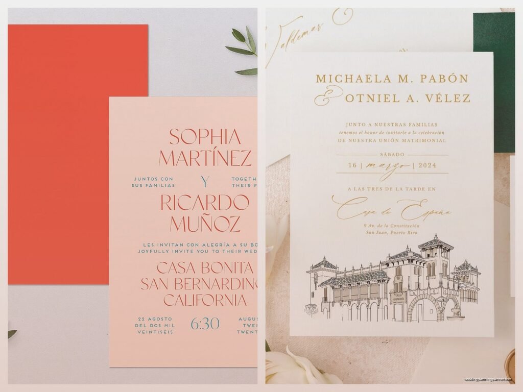
- Side-by-side: English on the left, second language on the right. This works great for languages that both read left-to-right and when your text amounts are similar. I use this probably 60% of the time.
- Stacked/sequential: English first, then the second language below it. Good when one language is clearly primary or when you have vertical space to work with.
- Separate inserts: Two completely different cards, one in each language. Honestly this is the cleanest option but also the most expensive because you’re literally printing twice as much.
- Flip design: One language on the front, flip it over for the other language. Works well for save-the-dates or simpler announcements, not so much for full invitation suites where people need to reference details quickly.
I had this one bride in spring 2023 who insisted on a flip design for her full invitation suite (English and Korean) and then got frustrated when her elderly relatives kept missing important details because they didn’t realize there was more info on the back. We ended up reprinting with a stacked layout and she was so much happier, even though she had to pay for the reprint.
Text length is gonna drive you crazy
Here’s what annoys me most about bilingual invites: languages don’t translate at the same length. Spanish typically runs about 25% longer than English. German can be way longer depending on the words. Vietnamese might be shorter. This means if you design your layout with perfect spacing for English, the Spanish version might overflow or need smaller text to fit.
What I do now is get ALL translations finalized before I even start designing. Not “we’ll figure it out later”—nope, I need every single word confirmed. Then I count characters or use a word processor to see actual text blocks. You’d be surprised how often “Reception to follow” in English becomes something significantly longer in another language.
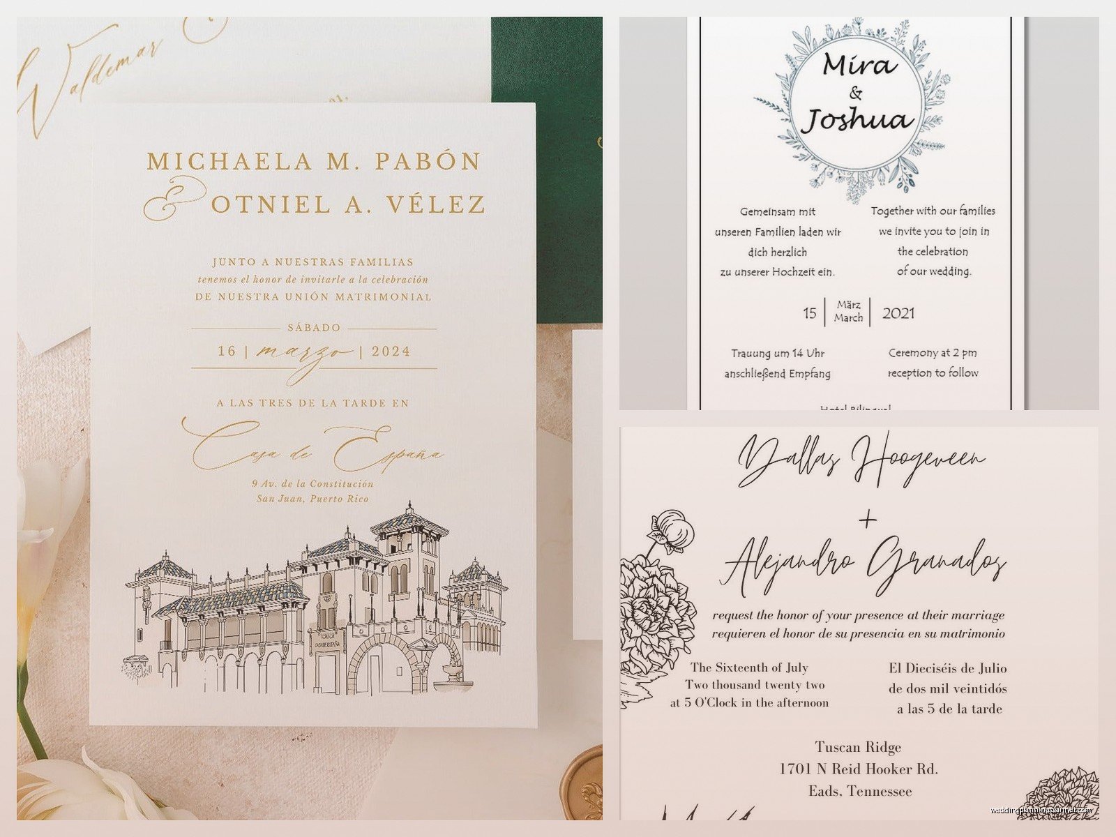
Also, some languages need specific fonts that support their character sets. Chinese, Arabic, Thai, Korean—you can’t just use your favorite romantic script font. You need fonts with the proper glyphs, and honestly finding a beautiful font that supports both English AND your second language characters can take hours of searching.
Font pairing for bilingual designs
This is where it gets technical but also kinda fun. You want fonts that feel cohesive even if they’re not the same typeface. What I usually do:
- Use the same font for both languages if possible (Google Fonts has good multilingual support—Noto Sans and Noto Serif are your friends here)
- If you need different fonts, match the weight and style. Like if your English is a light serif, don’t pair it with a heavy bold sans-serif for the second language unless you want it to look disjointed
- Keep decorative fonts to headers only, and use simple readable fonts for the actual information
- Test readability at actual size—what looks good on your computer screen at 100% might be illegible when printed at 5×7
My cat knocked over my coffee onto a proof sheet once and honestly the water damage made it easier to see which text was too small, so… thanks, Murphy, I guess?
Hierarchy matters even more with two languages
When you only have one language, it’s obvious what people should read first. With two languages, you gotta be really intentional about visual hierarchy or people’s eyes just bounce around the page randomly.
I typically make the couple’s names the biggest element in BOTH languages—like that’s your focal point regardless of which language someone reads. Then the key details (date, time, location) should be the same size in both languages. Don’t make one language’s details bigger than the other unless one is specifically primary.
Actually, that brings up a good point—some couples DO have a primary language. Like maybe the invitation is mainly for English speakers but they want Spanish included for some family members. In that case, it’s totally fine to make English more prominent and Spanish secondary. Just be clear about that from the start so everyone’s on the same page about the design direction.
Color and decorative elements
This is where you can actually have some fun and tie everything together visually. When you’ve got two languages competing for attention, strong visual elements help unify the design.
I love using:
- Border designs that frame both languages together
- A monogram or floral element that sits between or above the text blocks
- Background colors or textures that make the whole thing feel cohesive
- Consistent color for specific info (like all venue details in one color across both languages)
But don’t go overboard. I’ve seen designs with so many decorative elements trying to distract from the “problem” of two languages that it just looks cluttered. The two languages aren’t a problem to hide—they’re a feature that reflects the couple’s background.
Cultural considerations beyond just language
Okay so this might seem obvious but different cultures have different invitation etiquette. Like, Chinese invitations traditionally include specific phrasings about hosting and family names that don’t directly translate to Western invitation wording. Indian invitations often include religious symbols or prayers. Spanish invitations might list padrinos (godparents) which isn’t a thing in English invitations.
You can’t always make both versions say exactly the same thing because the cultural contexts are different. I worked with a couple where the English version said “Together with their families” but the Spanish version listed out both sets of parents by name because that’s what was culturally expected. Both versions were correct for their audience.
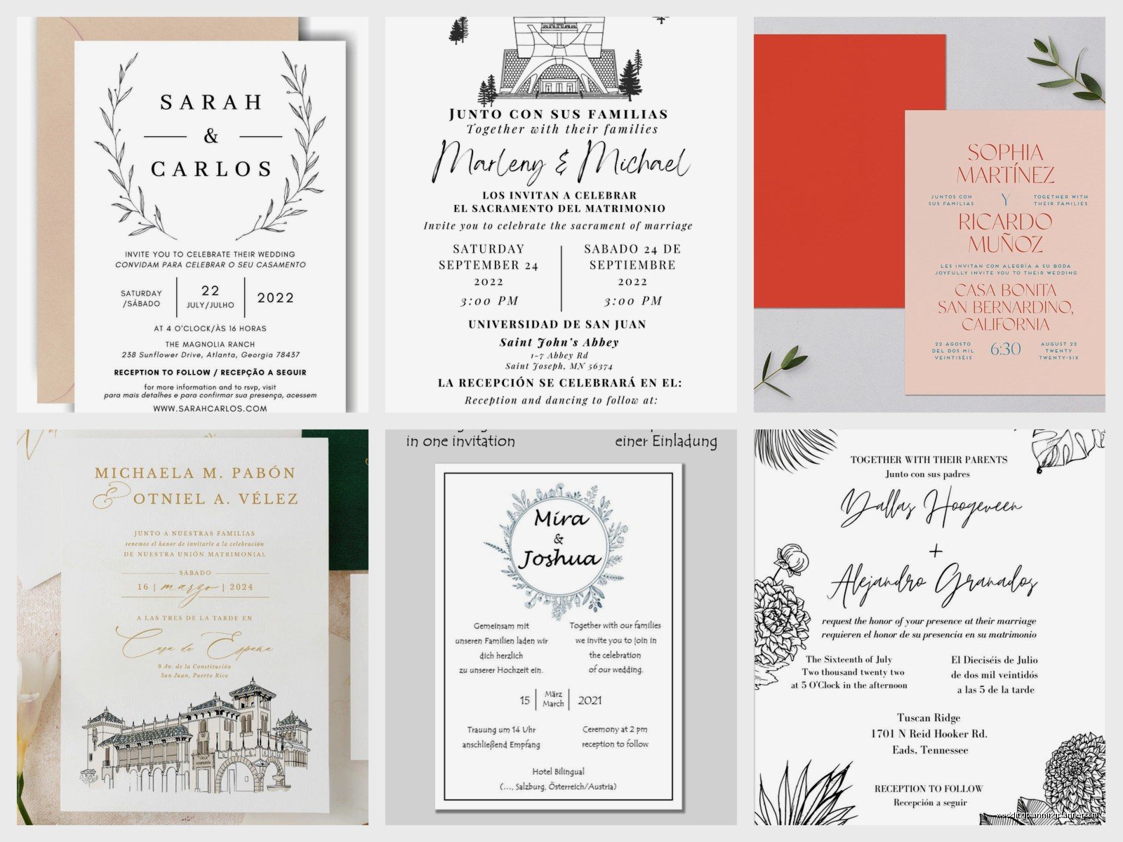
Talk to your couple about whether they want true translations or cultural adaptations. Sometimes what matters is that each language version feels right to that audience, even if they’re not word-for-word identical.
Working with professional translators
Please, please don’t use Google Translate for formal invitations. I mean, you can use it to get a rough idea, but for the final text, you want either a native speaker or a professional translator who understands formal invitation language.
Wedding invitation wording is weirdly formal and specific in every language. “Request the honour of your presence” is not casual language, and it needs to translate to equally formal phrasing in the second language. A professional translator will know the right register and formality level.
Also, they can help with name order and titles. Some languages put family names first, some use specific titles for married vs unmarried people, some have different forms of address depending on… it gets complicated, basically.
Practical printing considerations
Here’s stuff I wish someone had told me earlier:
Paper size and orientation: Sometimes you need more space, which might mean going with a larger card size or a horizontal layout instead of vertical. Don’t try to cram everything into a standard 5×7 if it’s not working—consider 5.5×8.5 or even a folded card format.
Proofing is critical: Get someone who speaks both languages fluently to proof the final design. Not just the text—the actual designed version. I’ve had situations where the text was correct but something got flipped or cut off during the design process.
Digital vs letterpress: If you’re doing letterpress or foil stamping, bilingual designs can get expensive fast because you might need multiple plates or setups. Digital printing is more forgiving for bilingual work. Engraving can work beautifully but again, cost adds up.
Envelope addressing: Don’t forget about this part! Are you doing bilingual envelope addressing too? Some couples do, some don’t. If your guest speaks both languages, you probably only need one. But if you’re sending to relatives who only speak one language, you might address their envelope in just that language.
The details cards and inserts
Okay so you’ve figured out the main invitation, but what about the RSVP card, details card, accommodation card, and whatever else you’re including? You gotta think about whether ALL of these need to be bilingual or just some of them.
Honestly, I usually recommend keeping the main invitation bilingual and then making strategic choices about the rest. Like, the RSVP card probably needs both languages. The accommodation card with hotel blocks? Maybe just English since that info is pretty universal and people can figure out hotel names and addresses. The directions card or website info? Depends on your crowd.
More cards = more cost, and if you’re doing separate inserts for each language, your invitation suite can get really thick really fast. I had one couple who ended up with like 8 separate cards because they wanted everything in both English and Spanish, and we had to use a box instead of an envelope because it was too bulky. Which was actually beautiful, but it wasn’t what they’d budgeted for initially.
Digital alternatives and wedding websites
Here’s a thought that might make your life easier—you don’t have to put EVERYTHING on the paper invitation. Your wedding website can handle a lot of the detailed bilingual content, and then your invitation just has the essential info in both languages plus a note directing people to the website for more details.
Most wedding website platforms let you create pages in multiple languages or at least have sections in different languages. This is perfect for things like detailed directions, full schedule of events, registry info, travel tips, etc. Stuff that would make your invitation packet enormous if you tried to include it all in two languages.
I usually suggest keeping the physical invitation to: names, date, time, venue, and “for more information visit [website]” in both languages. Clean, simple, readable. Then the website does the heavy lifting for everything else.
Budget real talk
Bilingual invitations usually cost more than single-language ones, just being honest. Whether it’s because you need more cards, special fonts, professional translation, more design time, or just more paper and printing, it adds up.
Ways to keep costs down:
- Use digital printing instead of letterpress or foil
- Choose a stacked layout on one card instead of separate inserts for each language
- Keep the design simple—less decorative elements means lower printing costs
- Use your wedding website for detailed information instead of printing everything
- Consider doing just save-the-dates and the main invitation in bilingual, and keeping other inserts single-language
- DIY the assembly and addressing to save on labor costs
But also, if bilingual invitations are important to you and your families, it’s worth allocating more of your stationery budget to this. It’s one of the first things guests receive and it sets the tone for your whole celebration.
Common mistakes I see all the time
Since I’m rambling anyway, let me just tell you what NOT to do because I’ve seen these mistakes repeatedly:
Using tiny font to fit everything: If your guests need a magnifying glass, your font is too small. Period. Resize your layout or use more cards.
Inconsistent information between languages: Both versions should have the same date, time, and location (obviously) but I’ve seen invites where one language had ceremony time and the other had reception time, or where addresses were formatted differently and caused confusion.
Forgetting about text direction: For languages like Arabic or Hebrew that read right-to-left, you need to think about text alignment and layout direction. Don’t just flip the text and call it done.
Ignoring white space: Just because you have two languages doesn’t mean you need to fill every millimeter of space. White space makes things readable and elegant. Embrace it.
Not considering your actual guest list: If 90% of your guests speak English and only a few family members need Spanish, maybe you don’t need a fully bilingual suite for everyone. You could do English invitations for most guests and bilingual versions just for those who need them. Saves money and design complexity.
Testing your design
Before you print 150 invitations, print ONE. Actually print it at actual size on actual paper stock. Then show it to people from both language groups—ideally people of different ages with different vision abilities.
Ask them: Can you read everything easily? Is anything confusing? Does the design feel balanced? Is it clear what’s most important? Do you understand where and when the wedding is happening?
I learned this lesson when I was watching that Netflix show about wedding planning (cannot remember the name right now, but it was surprisingly helpful?) and they talked about testing everything before the actual event. Same applies to invitations—test before you commit to the full print run.
Also check your proofs outside in natural light, not just under your desk lamp. Colors and readability can look totally different in different lighting conditions, and your guests will be opening these in their homes, not in your perfectly lit design studio.
Working with your printer
Not all printers have experience with multilingual work, so ask specifically about this when you’re getting quotes. Do they have fonts that support your languages? Have they done similar projects? Can they proof in both languages or do you need to handle that?
Some online printing services have templates for bilingual invitations, which can be helpful if you’re DIYing. But templates are limiting, so you might need to work with a local printer or a specialized stationery designer who can create custom layouts.
Get everything in writing about what’s included—number of proofs, revision rounds, file formats they need, color matching process, timeline. Bilingual projects sometimes take longer because there’s more to proof and adjust, so build in extra time before your mail date.
Alright, I think that covers most of what I’ve learned from doing these for the past few years. It’s definitely more complex than single-language invitations, but it’s also really meaningful for couples and families who are bringing together different cultures and languages. Just take it step by step, don’t rush the design process, and remember that readability always trumps trying to be too clever or decorative.
