
Planning Guides, Style Guide
Simple Elegant Wedding Invitations: Minimalist Sophisticated
Nov
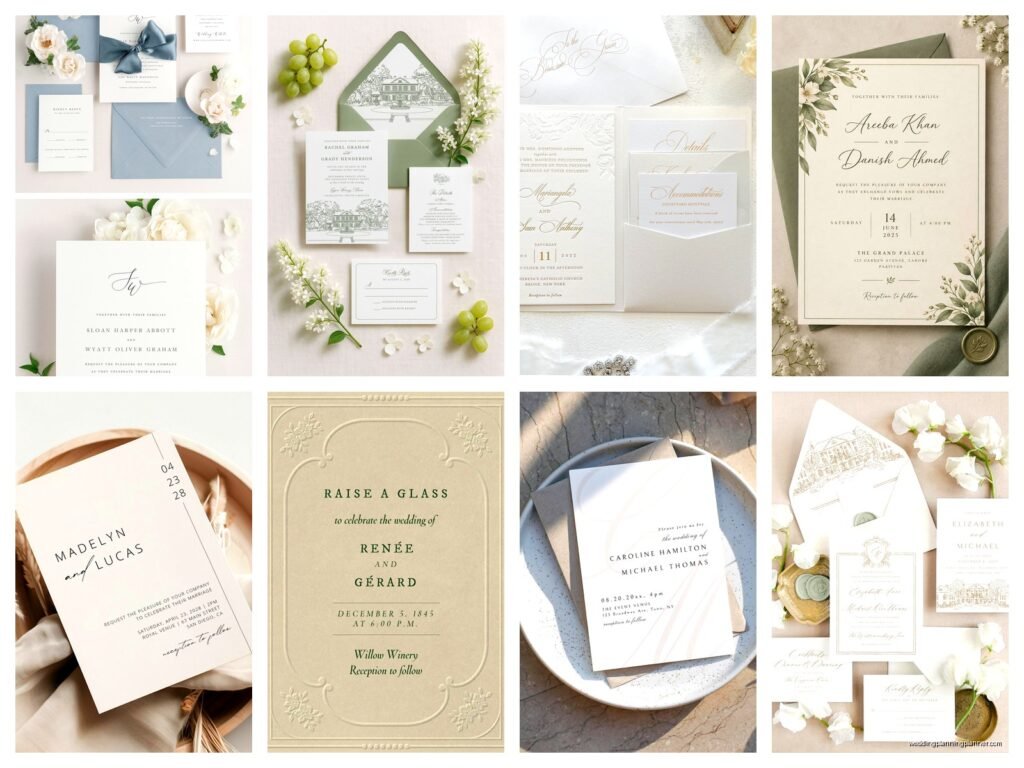
The whole minimalist invitation thing is actually way harder than it looks
So I had this bride back in spring 2023 who came to me with like seventeen Pinterest boards full of “simple” wedding invitations, and honestly? Half of them weren’t simple at all. They had letterpress, foil stamping, three different paper weights, and she kept saying “but it looks so clean!” and I’m like… girl, that’s not minimalist, that’s just expensive with lots of white space.
Here’s the thing about simple elegant wedding invitations – and I mean truly minimalist ones – they require more precision than the fancy stuff. When you strip everything down, every single element gets noticed. You can’t hide behind decorative borders or florals or whatever. It’s just typography, paper, and negative space doing all the work.
Start with your paper stock because it matters SO much
Okay so the paper is gonna carry like 60% of the sophistication factor when you’re going minimalist. I usually tell couples to feel at least five different paper samples before deciding because the texture is everything when you don’t have other design elements to distract.
Cotton paper is your friend here. Something in the 110-130 lb range feels substantial without being bulky. I’m partial to crane lettra or mohawk superfine, but there are tons of good options. The key is that when someone picks it up, they should immediately think “oh, this is nice” before they even read a word.
Matte finishes work better than glossy for this aesthetic. Glossy reads as… I dunno, more corporate? More event announcement than wedding invitation. You want that soft, almost velvety feel under your fingers.
And please, PLEASE don’t go with bright white if you’re aiming for sophisticated. Ecru, ivory, soft grey, even a really pale blush – these read as more intentional. Bright white can look like printer paper if you’re not careful, and that’s the opposite of what we want.
Typography is literally doing all the heavy lifting
This is where people mess up constantly and it drives me nuts. They think minimalist means they can just slap some text in Helvetica and call it a day. Nah.
You need to choose your typefaces like you’re casting actors for specific roles. I typically use two fonts maximum – one for names/headers and one for details. Sometimes just one font in different weights if I’m feeling really restrained.
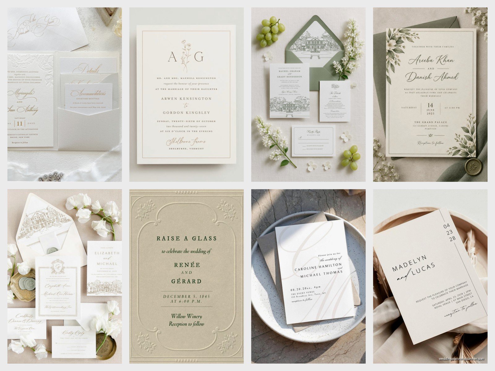
Serif fonts like Garamond, Baskerville, or Cormorant give you that classic sophisticated vibe. They’ve been around forever for a reason. For sans-serif options, try Futura, Montserrat, or Brandon Grotesque – they’re clean but still have personality.
The spacing between letters (tracking) and between lines (leading) is where the magic happens. You want generous spacing. Like, more than feels comfortable at first. That breathing room is what makes it look expensive and intentional rather than just… empty.
I had this moment during a really stressful client meeting in summer 2021 where the groom literally didn’t understand why we couldn’t just make the text bigger to fill the space, and his fiancée was getting upset, and I had to explain that negative space IS the design element here, not a problem to solve. My cat jumped on my laptop during the Zoom call which honestly broke the tension and we all laughed and then they finally got it.
Layout and composition without overthinking it
Center alignment is your safest bet for minimalist invitations. It’s classic, it’s balanced, it works. But if you wanna get a bit more modern, try left-aligned text with asymmetrical placement on the page.
The rule of thirds applies here just like in photography. Don’t center everything vertically on the page – it can look stiff. Try positioning your text block in the upper two-thirds or lower two-thirds. Creates more visual interest without adding design elements.
Margins should be generous. I’m talking at least an inch on all sides, sometimes more. When I see invitations with text creeping toward the edges, it makes me twitchy. It looks cramped and loses that airy, sophisticated feel.
One thing that really elevates minimalist design is paying attention to hierarchy. The most important info (usually the couple’s names) should be the most prominent. Then ceremony details. Then reception info. RSVP details can be smallest. This guides the reader’s eye naturally without needing decorative elements to create that flow.
Color palette keeping it sophisticated
Monochromatic is your friend. Black on white/ivory is classic and never looks dated. But you can absolutely play with subtle variations.
Charcoal grey instead of black gives you a softer look while staying neutral. Navy blue is sophisticated and works for evening weddings. Deep forest green has been having a moment and it’s gorgeous for minimalist designs.
If you want to incorporate your wedding colors, do it through a single accent – maybe a colored envelope liner or the RSVP card in a soft sage or dusty blue. But keep the main invitation itself restrained.
Metallic accents can work but you gotta be careful. Gold foil can read as trying too hard if the rest of the design isn’t perfectly executed. I actually prefer blind debossing (where you press an impression into the paper without ink) for minimalist invites. It’s subtle, tactile, sophisticated, and doesn’t add visual clutter.
What to actually include text-wise
Minimalist doesn’t mean leaving out important information, but it does mean being economical with words. You don’t need “request the honour of your presence” when “invite you to celebrate their wedding” works just fine and uses fewer lines.
Skip the parents’ hosting line if it’s not important to you. Start with the couple’s names. That’s what people care about anyway.
For the date and time, spell everything out. “Saturday, the twenty-third of September, two thousand twenty-five at four o’clock in the afternoon” – yeah it’s longer, but it looks more formal and elegant than “9/23/25 at 4pm” which feels… sorta informal for a wedding invitation even if you’re going minimalist.
Venue name and city/state. That’s all you need for location on the main invite. Save the full address for your details card or wedding website.
The invitation suite components
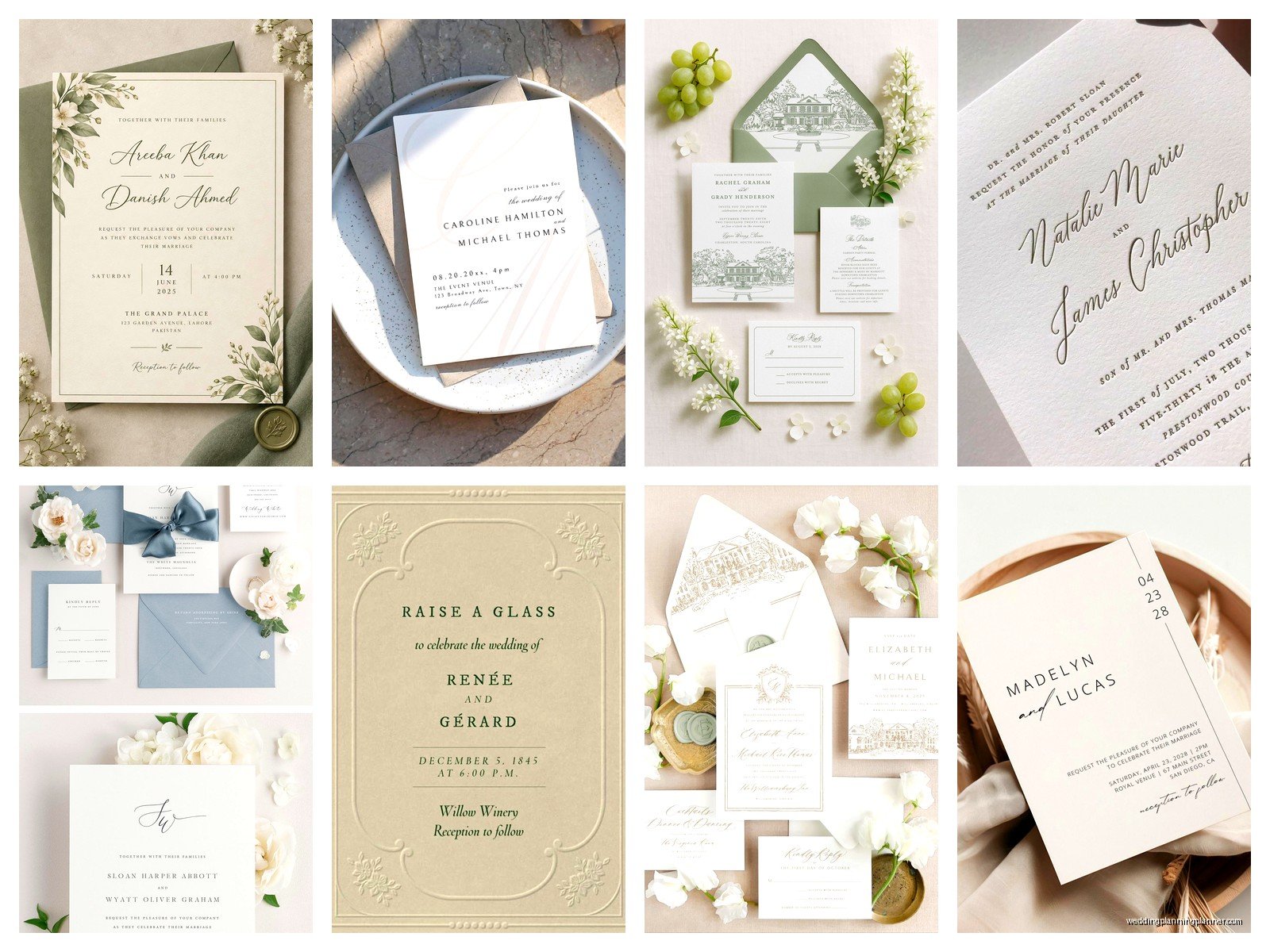
A truly minimalist suite might just be the invitation itself with a simple RSVP card. You don’t need seven different inserts explaining every detail of your wedding weekend.
Main invitation, RSVP card with envelope, and maybe a details card with your wedding website URL where guests can find everything else. That’s it. Three pieces.
If you’re doing accommodations info or a weekend itinerary, put that online. I know some older guests prefer everything in print, but you can always mail a separate details card to specific guests who you know don’t use the internet much.
Keep your RSVP card just as minimal as the main invite. “Kindly respond by [date]” with a line for names and maybe meal choice if needed. You don’t need decorative borders or matching florals or whatever. Consistency in typography and layout across all pieces is what creates the cohesive sophisticated look.
Envelope game matters more than you think
The envelope is literally the first thing your guests see, so don’t cheap out here. If your invitation is minimalist and elegant, a flimsy envelope ruins the whole effect before they even open it.
Euro flap envelopes instead of standard pointed flaps look more modern and intentional. They’re not much more expensive but they make a difference.
For addressing, professional calligraphy is gorgeous but expensive. Digital calligraphy (where a calligrapher creates a custom font from their handwriting) is a good middle ground. Or honestly? Really clean printed addresses in a nice serif font can look just as sophisticated if done well.
What annoys me SO MUCH is when people do this whole minimalist elegant invitation and then use those printed return address labels from Vista Print on the back flap. Like… no. Get a custom stamp made with your address, or print directly on the envelope, or have someone hand-write them. Those labels ruin everything.
Printing methods and what actually matters
Digital printing has come so far that for most minimalist designs, you honestly can’t tell the difference from letterpress unless you’re really looking. It’s way more affordable and works perfectly fine for clean typography.
Letterpress is beautiful if your budget allows. That impression into the paper adds a tactile element that works really well with minimalist design. But it’s pricey – usually starting around $1200-1500 for 100 invitations depending on your area.
Thermography (the raised printing) can look kinda cheap on minimalist invitations in my opinion. It’s trying to mimic engraving but it doesn’t quite get there, and when you have such simple design, that slightly plasticky texture is more noticeable.
Flat printing (digital or offset) is perfectly fine. What matters more is the quality of the paper and the precision of the design. I’ve seen $3 per invitation digital printed suites that looked more sophisticated than $15 thermography ones because the design was better.
Timing and ordering logistics
Order samples before you commit to anything. Like, actual printed samples on the actual paper stock. Colors look different on screen versus in print, and you need to see how the typography feels at actual size.
Most printers need 2-3 weeks for production, sometimes longer during peak wedding season (May through October). Then you need to factor in assembly time and mailing.
Send invitations 8-10 weeks before your wedding date. Save the dates should go out 6-8 months prior, and those can be even simpler – honestly a postcard with just your names, date, and location works great for minimalist aesthetic.
DIY versus professional and being honest about it
You can totally DIY minimalist invitations if you have a good eye for design and access to quality paper. It’s actually easier than trying to DIY complex floral designs or whatever.
Programs like Canva have decent templates, though you’ll need to customize them significantly because everyone uses the same ones. Adobe InDesign is better if you know how to use it – gives you way more control over spacing and typography.
Print at a local print shop rather than at home. Your home printer, even a nice one, probably can’t handle the paper weight you want and the quality won’t be there. Local print shops can usually do small runs affordably.
But honestly? If design isn’t your thing, hire it out. A professional stationer or graphic designer who specializes in wedding invitations will create something that looks polished in ways that are hard to articulate but totally noticeable. I work with several designers who do minimalist work beautifully, and their rates are usually way more reasonable than people expect – sometimes $300-500 for custom design.
Real talk about budget
Minimalist can be affordable or expensive depending on your choices. Basic digital printing on nice cotton paper with clean typography might run you $3-5 per invitation suite. Letterpress on custom paper with a designer could be $15-20 per suite.
Where you save: no foil stamping, no die cuts, no elaborate envelope liners, fewer insert cards, simpler assembly.
Where you might spend more: really nice paper stock makes a bigger difference when it’s not covered in design elements, professional design services if you’re not confident doing it yourself, quality envelopes.
For 100 invitations, budget somewhere between $300-800 for a nice minimalist suite including postage. You can go lower if you’re DIYing and using basic materials, or higher if you’re adding letterpress or other premium elements.
Little details that make the difference
Envelope liners in a subtle pattern or solid color add a nice surprise when guests open the invitation. Even just a colored liner in your wedding color elevates things.
Wax seals on the back flap are having a moment and they work beautifully with minimalist invitations. Simple monogram or just a solid seal in your accent color.
Custom stamps for postage instead of regular stamps. They’re the same price but look more intentional. Or if you’re mailing internationally, those vintage airmail stamps are gorgeous and very minimalist in aesthetic.
Belly bands (paper bands that wrap around the invitation suite) can keep everything together without needing a pocket folder or other bulky enclosure. Just a simple band with your monogram or names.
The weight of your invitation matters – aim for it to feel substantial in hand but not so heavy that you’re paying extra postage. Most suites should be fine with regular stamp but weigh one fully assembled before ordering all your postage to be sure.
Honestly the best minimalist invitations I’ve seen are the ones where every single choice was intentional. The paper, the font, the spacing, the color – nothing was default or accidental. That’s what reads as sophisticated rather than just plain or boring, you know? It’s the difference between minimalism and just… not trying. And when you get it right, people definitely notice even if they can’t articulate exactly why it looks so good
