
Planning Guides, Style Guide
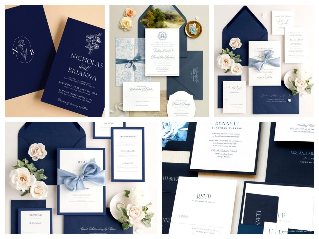
Navy Wedding Invitations: Dark Blue Nautical Elegant
Nov
Navy Invitations Are Having a Moment and Here’s What You Need to Know
Okay so navy wedding invitations are genuinely one of my favorite things to work on right now because they’re elegant without being stuffy and they work for basically any season. I had this bride in spring 2023 who was absolutely set on navy and gold, and honestly at first I was like “another nautical wedding” but then we went in this really sophisticated direction and it completely changed how I think about dark blue stationery.
The thing with navy is it reads as formal automatically. You don’t have to try hard. It’s not like blush pink where you’re fighting to make it look grown-up or sophisticated—navy just IS. And when you pair it with the right paper stock and printing method, you’re gonna get something that feels expensive even if you’re working with a smaller budget.
Paper Stock Actually Matters More Than You Think
I’m gonna be real with you—the paper you choose makes or breaks a navy invitation. I’ve seen people pick gorgeous designs and then print them on flimsy 80lb cardstock and it just looks… sad? Navy ink or navy cardstock shows every single flaw, every fingerprint, every slight bend in the paper.
For navy invitations, you want at least 110lb cardstock if you’re doing a single-layer invitation. But honestly, I usually push clients toward 120lb or even 130lb because it has that substantial feel when someone picks it up. You know that moment when you get an invitation in the mail and you can immediately tell it’s for something fancy just by touching it? That’s what we’re going for.
Textured papers work really well with navy too. Linen finish, felt finish, cotton paper—they all add dimension. Smooth papers can look amazing but they’re less forgiving with printing inconsistencies. I had a client once who insisted on smooth white cardstock with navy thermography printing and the printer messed up the first batch and you could see EVERY. SINGLE. SMUDGE. We had to reorder and it pushed back her timeline by three weeks and she was stressed and I was stressed and it was just… anyway, textured paper hides minor imperfections better.
Printing Methods That Actually Look Good With Navy
This is where people get overwhelmed but it’s not that complicated once you understand the basics.
Thermography is probably the most popular because it gives you that raised, shiny look that feels formal and it’s way cheaper than letterpress. It works beautifully with navy ink on white or cream paper. The shine catches the light and makes the text pop. But—and this annoyed me for YEARS until I figured out how to explain it to clients—thermography doesn’t work on dark paper. You can’t do white thermography on navy cardstock. The process just doesn’t allow for it. So if you’re dreaming of white text on navy backgrounds, thermography isn’t your friend.
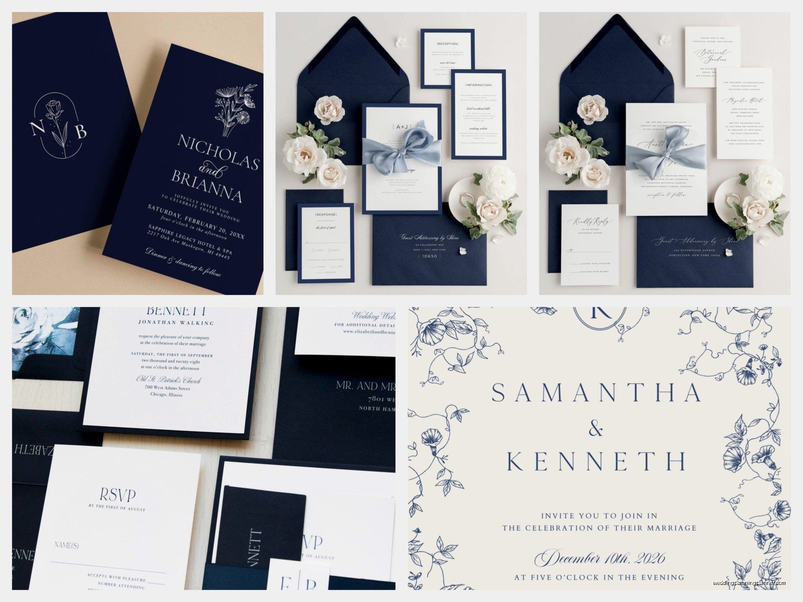
Digital printing is your budget-friendly option and honestly it’s come so far in the last few years. You can do white ink on navy cardstock with digital printing now, though you might need to find a specialty printer. The finish is flat, which some people love because it feels more modern and less fussy. I kinda like the clean look of it for contemporary designs.
Letterpress is the fancy option and if you have the budget, oh my god it’s gorgeous with navy. You can do navy impressions on white paper or white impressions on navy paper. There’s something about that debossed texture that makes navy look even richer. But you’re gonna pay for it—usually starting around $800-$1200 for 100 invitations depending on complexity.
Foil stamping with navy paper is *chef’s kiss* especially if you do gold foil, rose gold foil, or silver foil. This is what that spring 2023 bride ended up doing—navy cardstock with gold foil text and a gold foil anchor motif that was super subtle. It wasn’t cheesy nautical, it was elegant nautical, and her guests were texting her photos of the invitations before they even RSVP’d.
Color Combinations That Don’t Look Like a Sailor Costume
Here’s the thing about navy—yes it’s nautical, but it doesn’t HAVE to scream “we’re getting married on a boat.” The accent colors you choose make all the difference.
Navy and gold is classic and formal. It works for ballroom weddings, historic venues, evening ceremonies. Use a warm gold, not yellow-gold, because yellow-gold can look… I don’t know, it just doesn’t have the same richness.
Navy and blush or navy and dusty rose softens the whole look. It’s romantic without being too sweet. Good for garden weddings, spring or summer ceremonies, outdoor venues.
Navy and white is crisp and clean. Very preppy, very New England yacht club if that’s your vibe. Works well for coastal weddings obviously but also for minimalist modern weddings.
Navy and burgundy or navy and wine is moody and dramatic. Fall and winter weddings, this is your palette. Add some gold accents and you’ve got something really stunning.
Navy and greenery (like sage green or eucalyptus tones) is having a moment right now. It feels organic and less formal, good for rustic-elegant vibes or barn weddings that still want to feel upscale.
My cat just knocked over my coffee while I’m writing this and I’m choosing to ignore the puddle spreading across my desk, so let’s keep going…
Design Elements That Make Navy Invitations Special
You can go full nautical with anchors, rope borders, ship wheels, lighthouse illustrations—and honestly if that’s your wedding theme, lean into it. But you can also do navy invitations that have nothing to do with boats.
Watercolor elements work beautifully with navy. Watercolor florals, watercolor borders, even abstract watercolor washes. The softness of watercolor balances the formality of navy.
Geometric designs and Art Deco patterns pair really well with navy too. Think gold geometric frames with navy text, or navy backgrounds with gold Art Deco corner details. Very Gatsby, very elegant.
Botanical illustrations in line art—like delicate drawn greenery or flower outlines—look sophisticated against navy. You can do white line art on navy cardstock or navy line art on white cardstock.
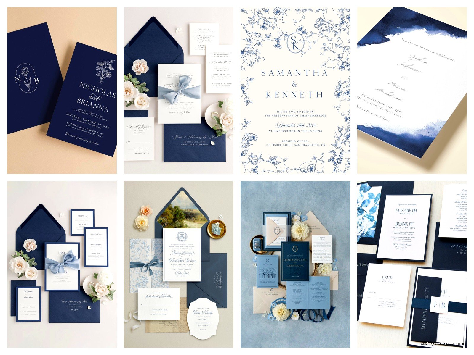
Monograms and crests feel natural with navy because it already has that formal, traditional vibe. A custom monogram in gold foil on a navy invitation is just… it’s a power move, honestly.
One thing that lowkey annoys me is when people want to add TOO many design elements. Like they want navy cardstock AND gold foil AND a ribbon AND a wax seal AND a vellum overlay and I’m like… pick three. Maximum three special elements or it starts looking cluttered and you can’t appreciate any of them individually.
The Actual Nautical Elements and When to Use Them
If you’re doing a waterfront wedding or you genuinely love nautical themes, there are ways to incorporate those elements without it looking like a child’s birthday party.
Anchors: Keep them small and use them as accent details, not the main focal point. A tiny anchor at the bottom of the invitation or incorporated into your monogram works. A giant anchor graphic in the center is gonna read as… well, not elegant.
Rope borders: These can work if they’re thin and subtle. Thick rope borders start feeling costume-y.
Nautical stripes: Nah. Just nah. Unless you’re doing like a super casual rehearsal dinner invitation, skip the stripes. They’re too informal for most wedding invitations.
Compass roses: Actually kind of cool if done in a sophisticated way, like a subtle background element or a small detail on the back of the invitation.
Wave patterns: Can be elegant if they’re abstract and not cartoon-y. Delicate wave lines as a border? Sure. Crashing wave illustrations? Probably not.
Navy Invitation Suites: What to Include
Okay so you’ve got your main invitation figured out, but a full suite includes multiple pieces and you want them to feel cohesive without being matchy-matchy boring.
Your main invitation should be the most formal piece. This is where you use your fanciest printing method, your heaviest cardstock, your most elegant design.
The RSVP card can be simpler. You don’t need to do gold foil on this one—save your budget for the main invitation. But keep the color palette consistent. If your main invite is navy with gold, your RSVP should incorporate those colors too.
Details cards (accommodations, directions, wedding website) can be even more simplified. I usually do these in just navy text on white cardstock with maybe a small design element that echoes the main invitation.
Envelope liners are where you can have fun. Navy envelopes with gold liners? Stunning. White envelopes with navy and gold pattern liners? Also beautiful. This is a place where you can bring in patterns or watercolor designs that might be too busy for the actual invitation.
For envelope addressing, you’ve got options. Navy envelopes with white ink calligraphy look amazing but white ink is tricky and you need someone who knows what they’re doing. Gold ink on navy envelopes is easier and equally gorgeous. Or you can do white or cream envelopes with navy calligraphy, which is the most traditional option.
Belly Bands, Ribbons, and Other Extras
This is where you can really make your invitations feel special, but also where costs add up fast so be strategic.
Belly bands (those paper bands that wrap around the invitation suite) in navy with gold foil text are elegant and functional—they keep all your pieces together. You can get custom ones printed with your names or wedding date.
Ribbon in navy, gold, or a combination can be gorgeous. Silk ribbon feels more luxe than grosgrain. I had a bride who did navy silk ribbon tied around her invitations with a small gold wax seal and they were just… people kept them as keepsakes, that’s how pretty they were.
Wax seals in gold or navy are having a HUGE moment right now. You can get custom seals made with your monogram or wedding date. Fair warning though—they can be fragile in the mail and might increase postage costs because they make the envelope thicker. Always take a fully assembled invitation to the post office to get it weighed before you mail all of them.
Vellum overlays can add a soft, romantic layer. You can print a design or text on the vellum or leave it translucent. With navy invitations, vellum creates this nice contrast between the dark cardstock and the delicate overlay.
Printing Your Navy Invitations: DIY or Vendor?
Look, I’m gonna be honest—if you want thermography, letterpress, or foil stamping, you need a professional printer. These aren’t DIY-friendly techniques. You need specialized equipment and expertise.
If you’re doing digital printing, you CAN do it yourself if you’re comfortable with design software and you have access to a good printer. But here’s what people don’t realize—home printers usually can’t handle cardstock over 100lb, and they definitely can’t do white ink on dark cardstock. You’d need to use a professional printing service even if you design it yourself.
Places like Minted, Zola, and Papier have navy invitation templates you can customize. They’re not custom-custom, but they handle the printing and usually the quality is solid. Prices range from like $200-$600 for 100 invitations depending on what printing method and extras you choose.
For truly custom work, you’re looking at working with a stationery designer (hi, that’s me) or a small print shop. Expect to pay more—usually starting around $500-$800 for 100 invitations for digital printing, and $1000+ for letterpress or foil stamping. But you get exactly what you want and the quality is usually noticeably better.
Timeline Stuff Nobody Tells You
Order samples before you commit to anything. Colors look different on screen versus in person, and navy especially can vary a lot—some navies are more blue, some are almost black, some have purple undertones. Get physical samples.
Give yourself AT LEAST 4-6 months before your wedding to deal with invitations. That gives you time for design, proofing, printing, assembly, addressing, and mailing. If you’re doing custom work or letterpress, add another month or two.
Order 10-15% more invitations than you think you need. People make mistakes during assembly, addresses change, you’ll want to keep some for yourselves as keepsakes. It’s way cheaper to order extras upfront than to do a small reprint later.
Mail your invitations 8-10 weeks before the wedding for local guests, 12 weeks for destination weddings. And seriously, take one to the post office to weigh it—I cannot stress this enough. I watched a bride have to hand-stamp 200 envelopes with extra postage because she assumed regular stamps would be enough and half of them got returned. Don’t be that bride.
Common Mistakes People Make With Navy Invitations
Using navy that’s too light—it ends up looking like regular blue and loses that sophisticated formal feeling. You want a true deep navy, not a medium blue.
Pairing navy with too many other colors. Pick one or maybe two accent colors max. Navy, gold, blush, greenery, and silver all together is just chaos.
Forgetting about readability—if you’re doing navy text on dark backgrounds or white text on navy, make sure the font is big enough and clear enough to actually read. Delicate script fonts can disappear against dark backgrounds.
Not considering the season—navy works year-round but you gotta adjust the overall design. Navy with lighter florals and softer colors for spring/summer, navy with richer colors and heavier designs for fall/winter.
Skipping the proofing stage—always, ALWAYS get a printed proof before approving the full print run. Colors, spacing, alignment—everything looks different printed than on screen. I had a client approve everything digitally and then when the invitations arrived, the navy looked almost purple because of how it printed on that specific paper stock and we had to rush reorder everything. Just get the proof.
