
Planning Guides, Style Guide
Sunflower Invitations: Yellow Floral Wedding Cards
Nov
Getting Started with Sunflower Wedding Invitations
So sunflower invitations are having this massive moment right now and honestly they’ve been popular for like the past three years straight. I had this bride in summer 2021 who was absolutely obsessed with sunflowers to the point where she wanted them on literally everything including the napkin rings which sounds cute but trust me it can get overwhelming real fast. Anyway, the thing about yellow floral wedding cards is they immediately set this cheerful, rustic-meets-garden vibe that people either absolutely love or… well, you gotta make sure it’s actually your style before committing.
The first thing you need to decide is whether you want realistic sunflowers or more stylized illustrations. Realistic ones photograph better and look more sophisticated if you’re going for that farmer’s market chic wedding. The illustrated versions tend to skew younger and more whimsical. I’ve worked with both and honestly the illustrated ones are easier to match with other design elements because they’re not trying to be botanically accurate.
Paper Stock and Printing Methods
Okay this is where people make their first big mistake. You cannot just print sunflower designs on regular cardstock and expect them to look good. The yellows will look washed out and sad. You want a paper stock that’s at least 110lb, preferably something with a slight texture like linen or felt finish. Smooth cardstock works too but it gives off more formal vibes which might clash with the whole sunflower thing unless that’s specifically what you’re going for.
Digital printing is gonna be your most budget-friendly option and honestly it’s come so far that most guests won’t even notice the difference. But if you want those yellows to really pop, letterpress or foil stamping makes a huge difference. I had a client spend an extra $800 on gold foil accents for her sunflower invites and yeah it was expensive but those things were gorgeous. The foil caught the light and made the whole design feel more elevated.
Thermography is that middle ground option where the ink is raised but it’s not as expensive as letterpress. It gives you texture and dimension which works really well with sunflower petals because it makes them feel more three-dimensional.
Color Schemes That Actually Work
This is where I see people struggle the most. Yellow is a tricky color to pair and if you’re not careful your invitations can end up looking like a school bus or a packet of mustard. The classic combo is sunflower yellow with kraft brown or that rustic burlap texture. It’s been done a million times but there’s a reason it works.
What I actually prefer though is pairing the sunflowers with a deep navy blue or even black. Sounds weird but the contrast makes the yellows look richer and more golden instead of that bright crayon yellow. Forest green is another option that gives you that garden party feel without being too matchy-matchy.
Some brides want to go all-in with yellow backgrounds and I always try to talk them out of it or at least suggest a very pale butter yellow instead of bright yellow. A bright yellow background makes your text nearly impossible to read and it’s just… a lot. Your guests are gonna open that envelope and need sunglasses.
Terracotta or rust colors have been trending lately with sunflower invites and I’m actually here for it. It gives you that warm autumn vibe even if you’re having a summer wedding. Dusty blue is another one that’s super popular right now.
Design Layout Options
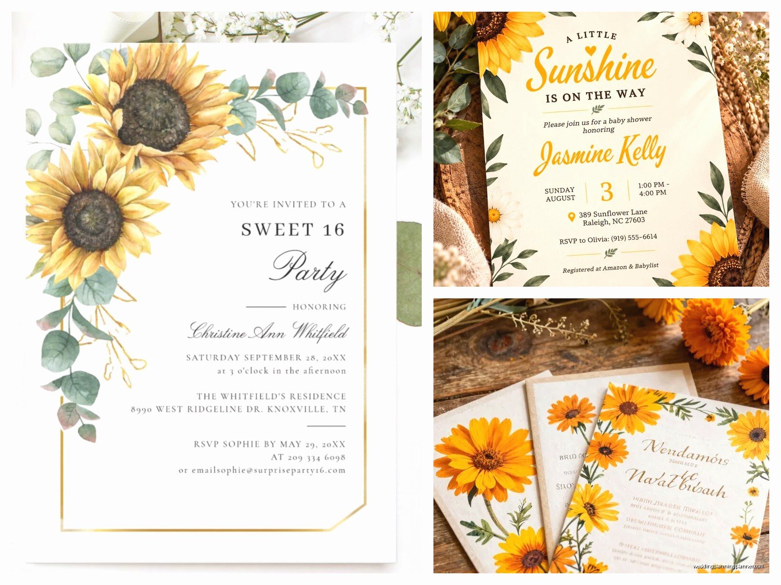
You’ve got a few different directions you can go with the actual layout. The most common is having a sunflower border that frames your text, either on all four sides or just along the top and bottom. This is safe and classic but it’s also kinda predictable at this point.
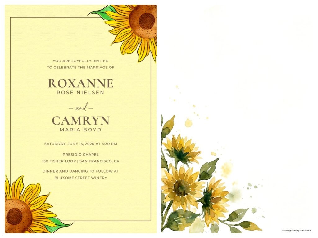
A single large sunflower in the corner (usually top right or bottom left) gives you more room for text and feels more modern and minimal. I love this approach for couples who want sunflowers but don’t want their invitation to scream SUNFLOWERS you know?
Scattered sunflowers across the background as a pattern can work but you gotta be careful that it doesn’t compete with your text. The pattern needs to be subtle enough that your words are still the main focus. I’ve seen designs where the background pattern was so busy I couldn’t even read the venue address without squinting.
Watercolor sunflowers are having a moment and they photograph really well for those Instagram flat-lay shots that everyone does now. The soft edges and paint-like quality make them feel more artistic and less literal. My cat actually knocked over my coffee onto a set of watercolor sunflower samples last spring and somehow it almost made them look better? Obviously don’t recommend that as a design technique.
Wording and Font Choices
Fonts are where people get into trouble because they pick something that matches the rustic vibe but then nobody can read it. Those super scripty handwritten fonts look pretty in the mockup but when your 80-year-old grandmother is trying to figure out what time the ceremony starts, she’s not gonna appreciate your aesthetic choices.
I usually recommend pairing one script font (for names or the word “wedding”) with a clean sans-serif or simple serif for all the actual information. You want readable fonts for the date, time, venue, and RSVP details. Save the decorative stuff for the headers.
Avoid fonts that are too formal or traditional like Copperplate or Times New Roman because they’ll clash with the casual nature of sunflowers. You’re going for approachable and warm, not corporate or stuffy.
The wording itself should match your wedding vibe. If you’re doing a backyard barbecue wedding, your invitation can be more casual: “Join us for BBQ and dancing” or whatever. If you’re doing sunflowers at a barn venue but still want some formality, you can keep traditional wording but the sunflower design will casual it down a bit.
Envelope Addressing and Extras
Okay so you’ve designed your invitation but don’t forget about the envelope because that’s the first thing people see. Kraft envelopes are the obvious choice and they’re budget-friendly. White or cream envelopes work if you want something more traditional. I’ve seen people do yellow envelopes and… nah. It’s too much.
Envelope liners are an easy way to add that extra touch without breaking the bank. You can get sunflower-patterned liners or even just a solid yellow or navy liner that coordinates with your color scheme. They’re usually like $1-2 per envelope which adds up but makes a noticeable difference when people open them.
For addressing, you can do digital calligraphy printing which looks handwritten but isn’t. Real calligraphy is beautiful but expensive and time-consuming. I had a bride in spring 2023 who insisted on hand-calligraphing 200 envelopes herself and she had a complete meltdown by envelope 47. Just… be realistic about your time and skill level.
Wax seals in gold or yellow are really popular right now with sunflower invites. They photograph well and add a vintage touch. You can get custom stamps with your initials or just use a sunflower design. Fair warning though: wax seals sometimes get damaged in the mail or they make the envelope non-machinable which means extra postage.
Coordinating Your Suite
Your invitation doesn’t exist in isolation. You’ve gotta think about the whole suite: RSVP cards, details cards, reception cards if you’re doing a separate ceremony and reception, maybe a weekend events card if you’re doing welcome drinks or a day-after brunch.
Not everything needs to have sunflowers on it. Actually, I’d argue that only your main invitation should have the full sunflower design and everything else should just pull colors or small accent elements. Your RSVP card might just have a tiny sunflower icon or a yellow border. Your details card could be all text with no florals.
Belly bands or vellum wraps are popular for keeping everything together and they give you another design opportunity. A vellum wrap with a sunflower printed on it or a belly band in navy with gold text looks really polished.
What really annoys me is when couples order invitations from different vendors and then wonder why nothing matches. The yellows will be different shades, the paper textures won’t coordinate, and it looks disjointed. If you’re gonna piece together your suite from multiple sources, get physical samples first and make sure they actually work together.
Budget Considerations
Let’s talk money because sunflower invitations can range from like $2 per invite to $15+ depending on what you choose. Digital printing on standard cardstock with no fancy finishes is your cheapest option. You can get really nice designs from places like Minted or Zazzle for around $2-3 per invitation.
If you want letterpress or foil stamping, expect to pay at least $8-12 per invite, sometimes more if you’re going through a boutique stationer. Custom illustration will cost more than using stock designs or templates.
DIY is an option but be honest with yourself about whether you actually have time for that. I’ve seen too many brides think they’re gonna save money by printing at home and then they end up spending more on wasted paper, ink cartridges, and paper cutters than they would’ve spent just ordering them. Plus the stress factor… is it really worth it?
You can save money by doing digital RSVPs instead of including reply cards. Just direct people to your wedding website. Some older guests might not love this but it cuts costs significantly and you don’t have to pay for extra postage on RSVP envelopes.
Timing and Ordering
Order samples before you commit to anything. Most companies will send you samples for like $5-10 and it’s so worth it to see the actual paper quality and colors in person. What looks good on a screen might look completely different in real life, especially with yellows which can vary wildly.
You wanna send save-the-dates about 6-8 months before your wedding, earlier if you’re doing a destination wedding or holiday weekend. Invitations should go out 8-10 weeks before the wedding date. Don’t send them too early or people forget, don’t send them too late or people can’t make plans.
Order about 10-15% more invitations than you think you need because there will be addressing mistakes, last-minute additions to the guest list, or you’ll want to keep extras for your wedding album or to frame. I always keep one for myself from every wedding I plan because they’re like little pieces of art.
Proofread everything multiple times and have at least two other people proofread too. I’ve caught so many mistakes that would’ve been mortifying: wrong dates, misspelled venue names, missing information about hotel blocks. Once they’re printed, you can’t fix them without reordering everything.
Matching Your Invites to Your Wedding
Your invitations set expectations for your wedding, so make sure they’re accurately representing what guests will experience. If your invites are super rustic with kraft paper and casual fonts, people are gonna expect a laid-back barn wedding or outdoor celebration. If you’re actually having a formal ballroom wedding with a sit-down dinner, that disconnect is gonna be weird.
You don’t need to have actual sunflowers at your wedding just because they’re on your invitations, but there should be some visual connection. Maybe yellow in your color palette, or wildflowers in the centerpieces, or that same rustic vibe carried through in your decor choices. The invitation is making a promise about the aesthetic and you wanna deliver on that or… people might feel like they were misled about what kind of event they were attending.
Think about how your invitations will photograph too because everyone takes pictures of them for social media now. Will they look good in a flat-lay with your rings and flowers? Do the colors photograph true or do they look different on camera?
I always tell couples to save one of their invitations to use in their engagement photos or day-of detail shots. It’s a nice callback and it ties everything together visually when you’re looking back at photos years later. Plus your photographer will appreciate having something pretty to style with.
