
Planning Guides, Style Guide
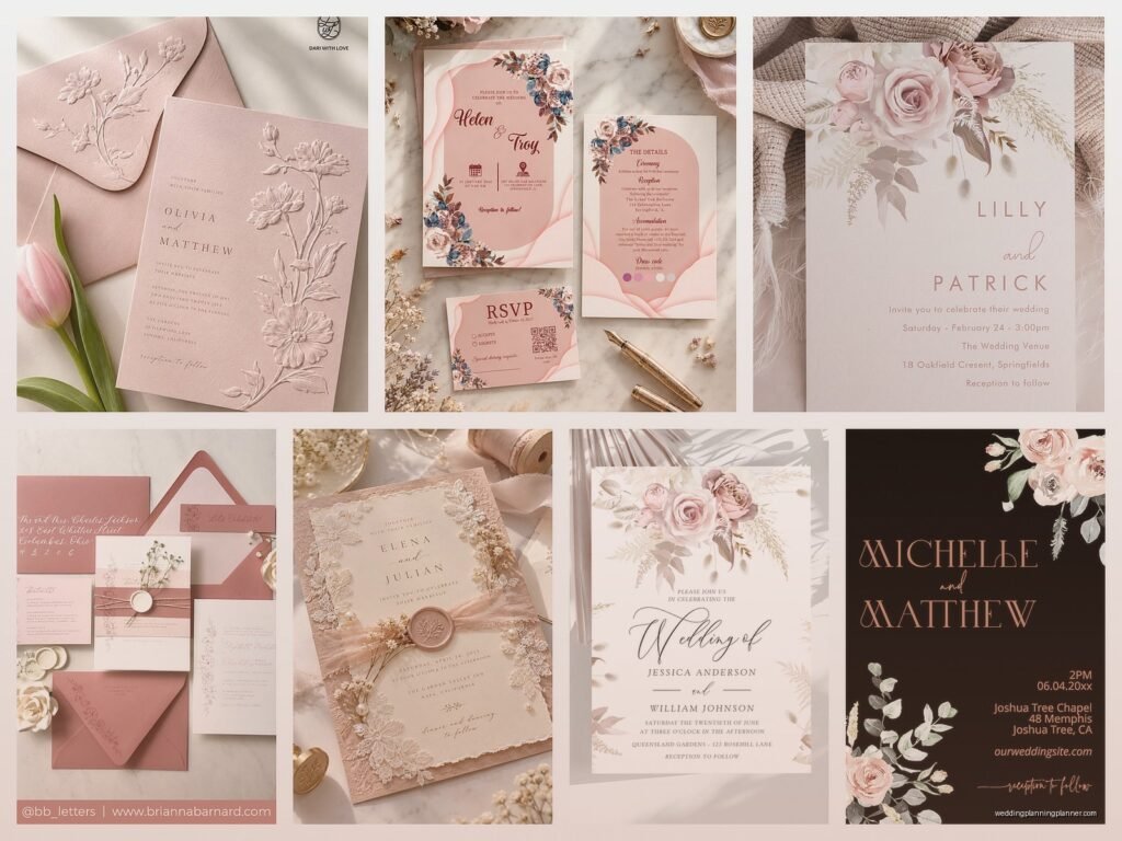
Dusty Rose Wedding Invitations: Muted Pink Blush Designs
Nov
Dusty Rose Is Having A Moment And Here’s What You Need To Know
So dusty rose invitations are everywhere right now and honestly they’re not going anywhere soon. This muted pink shade is basically the Swiss Army knife of wedding colors because it works with literally everything and doesn’t scream “I’m trying too hard.” I had this bride in spring 2023 who was SO stressed about her color palette looking too millennial pink (remember that phase?) and dusty rose saved her entire vision.
The thing about dusty rose is it’s not actually one color. It’s like saying “blue” – there’s navy, sky blue, teal, whatever. Dusty rose can lean more mauve, more peachy, more gray, or more brown depending on the undertones. When you’re picking invitations, you gotta look at them in natural light because what looks perfect on your screen at 11pm is gonna look completely different when it arrives at your door.
What Actually Makes An Invitation “Dusty Rose”
The technical answer is it’s a desaturated pink with gray or brown undertones. The practical answer is it looks like someone took blush pink and dusted it with… well, dust. It’s muted, soft, kinda vintage-y without being your grandmother’s rose pattern. You know those Instagram filters that make everything look dreamy and slightly faded? That’s the vibe.
Most printers will have dusty rose in their color options but here’s what annoyed me SO much last year – every company calls it something different. One calls it “antique blush,” another says “mauve rose,” someone else labels it “vintage pink.” I spent like two hours on a Tuesday helping a client match samples because the names meant nothing. Always order physical samples. Always.
Paper Types That Work Best
Cotton paper is your friend here. The texture adds to that romantic, slightly vintage feel that dusty rose naturally has. I usually recommend 110lb or heavier because lighter paper can make the color look washed out, and then you’ve just got… pale pink. Which isn’t the same thing at all.
Matte finishes work better than glossy for this color. Glossy can make dusty rose look too bright or too purple depending on the lighting, and it loses that soft, muted quality that makes it special in the first place. Eggshell or silk finishes are the sweet spot – they have just enough subtle sheen without being shiny.
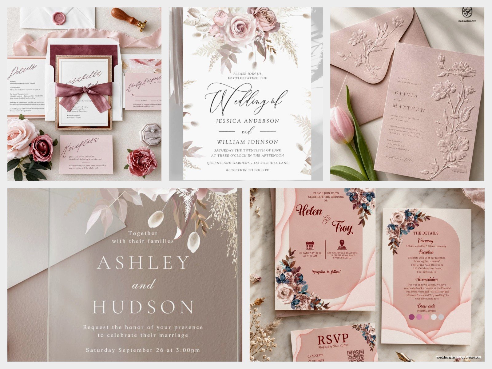
Textured papers like linen or laid (the one with the ribbed texture) can look gorgeous with dusty rose, but be careful with really heavy textures because they can make lighter text hard to read. Learned that the hard way when a client insisted on deep texture and gold foil and we could barely read the ceremony time.
Color Combinations That Actually Work
Okay so dusty rose is super versatile but you can definitely mess it up. Here’s what I’ve seen work really well:
- Dusty rose with gold foil is classic and elegant without being stuffy
- Dusty rose with sage green is literally everywhere right now and for good reason
- Dusty rose with navy creates this unexpected contrast that feels modern
- Dusty rose with cream or ivory keeps everything soft and romantic
- Dusty rose with terracotta or rust gives you that desert/boho vibe
- Dusty rose with gray (especially charcoal) looks super sophisticated
What doesn’t work as well? Pairing it with bright white can make the dusty rose look dirty or faded. And combining it with other pastels sometimes just looks like a baby shower unless you’re really intentional about it. Not that there’s anything wrong with baby showers but probably not the vibe you want.
Metallics And Foil Options
Gold is the obvious choice and yeah, it works. Rose gold feels a bit overdone at this point but if you love it, go for it. Copper is having a moment and pairs beautifully with the peachy undertones in some dusty rose shades.
Silver or platinum foil can work but it tends to cool down the dusty rose, making it lean more mauve. Which might be exactly what you want! Just know that’s what’s gonna happen. I had a client who specifically wanted that cooler tone and we used silver foil with dusty rose and eucalyptus green and it was stunning.
Here’s the thing about foil though – it’s expensive. Like, significantly more expensive than digital printing. If budget is tight, you can get a similar effect with metallic ink, though it won’t have that shiny dimensional quality that real foil has.
Design Styles That Complement Dusty Rose
This color works across basically every wedding style which is part of why it’s so popular. For classic formal weddings, think dusty rose with traditional serif fonts, maybe some gold accents, clean lines. It reads as elegant without being too traditional or stuffy.
For bohemian or garden weddings, dusty rose with watercolor florals is like… I mean it’s been done a million times but it’s been done a million times because it works. Add some greenery illustrations, maybe a flowy script font, and you’re set. My cat actually knocked over a full cup of coffee on a set of watercolor dusty rose invitations once and I almost cried, but the bride had ordered extras thank god.
Modern minimalist designs look incredible with dusty rose. Just clean typography, lots of white space, maybe a thin dusty rose border or geometric shape. It keeps the color from feeling too romantic or vintage if that’s not your thing.
Vintage or art deco styles are where dusty rose really shines though. Think geometric patterns, fancy borders, maybe some gold foil details. It has this 1920s or 1930s quality that feels glamorous but not costume-y.
Typography Choices
Script fonts work well but don’t go too swirly or you’ll lose legibility. I generally recommend saving decorative scripts for names or key words and using a clean serif or sans-serif for the actual information. Your guests need to know what time to show up, you know?
Serif fonts in darker colors (charcoal, navy, deep brown) against dusty rose backgrounds are super readable and look polished. Sans-serif fonts can work too but sometimes they feel too casual unless that’s specifically the vibe you’re going for.
One thing to watch out for – really light text on dusty rose doesn’t always have enough contrast. White or cream text can disappear depending on how saturated your dusty rose is. If you want light text, make sure to order a sample first because what looks fine on screen might be impossible to read in person.
Envelope Situations
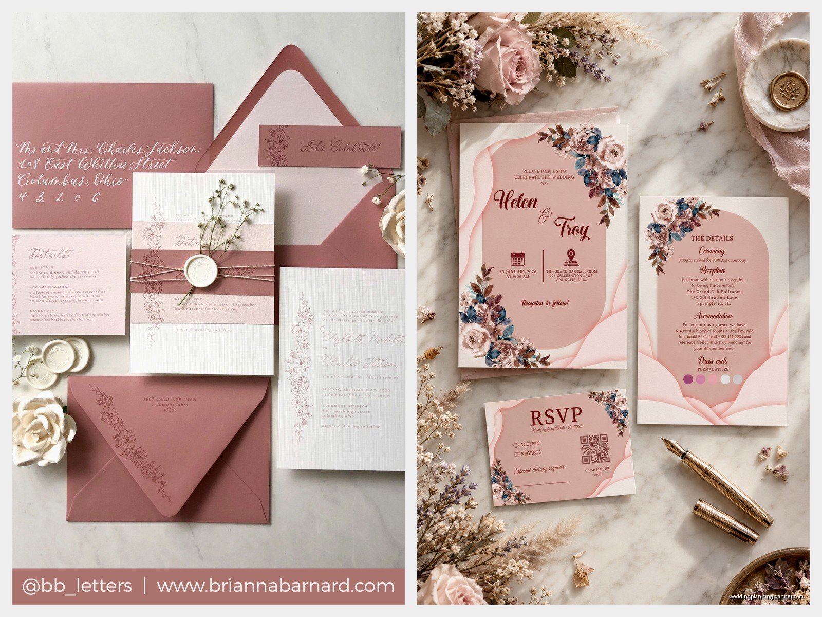
Dusty rose envelopes are gorgeous but here’s something nobody tells you – they show Every. Single. Smudge. Fingerprints, pen marks, slight dirt from handling, all of it shows up way more than on white or cream envelopes.
If you’re doing dusty rose envelopes, consider:
- Using envelope liners in a complementary color instead of fully colored envelopes
- Going with white or cream envelopes with a dusty rose liner for easier addressing
- Hiring a calligrapher if you want handwritten addresses because mistakes are harder to hide
- Using printed labels which some people think is less formal but honestly looks clean and modern
I personally love a cream envelope with a dusty rose liner and maybe some floral or greenery peeking out. It’s that nice surprise when your guests open it without the stress of keeping colored envelopes pristine.
Addressing And Calligraphy
Dark inks work best on dusty rose – think black, charcoal, navy, deep burgundy. Metallic inks can be tricky because they need really good contrast to be readable. Gold ink on dusty rose envelopes sounds pretty but can be hard to read depending on the lighting.
If you’re hiring a calligrapher, make sure they’ve worked with colored envelopes before because some inks don’t adhere well to certain papers or finishes. Had a situation in summer 2021 where the calligraphy was smearing on the envelopes because the paper had a slight coating that nobody knew about until we were halfway through addressing 150 envelopes. That was a fun week.
Printing Methods
Digital printing is the most affordable option and honestly looks great for dusty rose. The color reproduction is usually pretty accurate and it’s perfect if you have a tight budget or timeline. Just make sure your printer uses high-quality equipment because cheap digital printing can look… cheap.
Letterpress with dusty rose is absolutely beautiful. The impression in the paper adds this tactile, luxurious element and the color looks rich and saturated. It’s pricey though, and you’re limited in how many colors you can use unless you want to pay for multiple plates.
Thermography gives you that raised ink effect without the letterpress price tag. It works well with dusty rose and adds a nice dimensional quality. Some people think it feels dated but I think it still has a place, especially for more traditional weddings.
Foil stamping we already talked about but worth mentioning again – it’s gonna cost you but it looks incredible. If budget allows, even just using foil for names or a border can elevate the whole design.
Suite Components Beyond The Invitation
Okay so you’ve got your main invitation sorted, but there’s all the other stuff to think about. RSVP cards in dusty rose with white or cream text look cohesive. Details cards can either match or be in a complementary color – I often do cream or white details cards with dusty rose accents.
Belly bands or vellum wraps in dusty rose can tie everything together literally and figuratively. Wax seals in coordinating colors (dusty rose, gold, terracotta) add a nice vintage touch if that’s your style. Though honestly wax seals in the mail can be kinda risky because they sometimes get crushed or fall off, so maybe use them more for hand-delivered invitations or just decorative purposes.
Programs, menus, place cards, table numbers – you can carry the dusty rose through all your paper goods or just use it as an accent. I usually recommend not going 100% dusty rose for everything because it can start to feel overwhelming. Mix in neutrals or your other wedding colors to break it up.
Seasonal Considerations
Dusty rose works year-round but it definitely has different vibes depending on the season. Spring dusty rose tends to lean more pink and pairs well with fresh florals and greenery. Summer dusty rose can go more peachy or coral, especially for outdoor or garden weddings.
Fall dusty rose is probably my favorite – it leans more mauve or has those brown undertones that pair perfectly with burgundy, rust, and gold. It feels cozy without being too heavy. Winter dusty rose with silver or platinum accents, maybe some deep green or navy, creates this elegant, sophisticated palette that doesn’t feel like Christmas.
The season also affects paper choices. Heavier, textured papers feel right for fall and winter. Lighter, smoother papers work better for spring and summer. Though these are just guidelines, not rules – do what feels right for your wedding.
Budget-Friendly Options
Real talk, wedding invitations can get expensive fast, especially with all the upgrades and fancy printing methods. If you love dusty rose but need to watch your budget, here’s what I’d prioritize:
Get the color right first. Invest in good quality digital printing in the exact dusty rose shade you want rather than cheap printing with foil accents. The base color matters more than the bells and whistles.
DIY envelope liners are totally doable if you’re crafty. You can buy pre-cut liners or cut your own from dusty rose cardstock. It takes time but saves money and adds that custom touch.
Skip the full suite and just do invitation plus RSVP card. You can put all the extra details on your wedding website. I know some people love having all the insert cards but honestly most guests just want to know where and when to show up.
Consider doing dusty rose as an accent rather than the main color. White or cream invitations with dusty rose envelopes or liners or borders can give you the look for less since you’re using less colored ink or paper.
Common Mistakes To Avoid
Don’t assume all dusty rose is the same. Order samples from any vendor you’re considering because “dusty rose” means different things to different companies. What one calls dusty rose might be straight-up mauve to another.
Don’t forget about readability. I see so many pretty invitations that are impossible to read because there’s not enough contrast between the text and background or the font is too decorative. Your invitations need to communicate information, not just look pretty.
Don’t order your invitations too early. I know everyone says to stay ahead of schedule but paper and ink can fade or get damaged if stored too long, especially if you’re not storing them properly. Six months before your wedding is plenty of time, and it also means you’ll have more accurate guest count estimates… though let’s be honest, that changes right up until the deadline anyway.
Watch your quantities when ordering. Most printers have minimum orders or price breaks at certain quantities. Sometimes ordering 125 costs almost the same as ordering 100, so do the math before finalizing your count.
Working With Designers And Printers
If you’re working with a stationery designer, bring reference images of dusty rose shades you like. Pinterest is your friend here, but also fabric swatches, paint chips, flowers, whatever helps communicate the exact tone you’re envisioning. I can’t tell you how many times a bride says “dusty rose” and I show her options and she’s like “no, more pink” or “no, more gray” or whatever.
Ask about their revision policy upfront. Most designers include a certain number of revisions, but once you go beyond that, you might be paying extra. Know what you’re getting before you start.
Request a printed proof before they print your full order. What looks perfect on screen can look different printed, especially with color-sensitive shades like dusty rose. The proof might cost extra but it’s worth it to avoid 150 invitations in the wrong shade showing up at your door.
If you’re using an online template service, you usually have less control over exact color matching, but they’re way more affordable. Just know that’s the tradeoff you’re making – convenience and cost versus customization and precision. Both are totally valid choices depending on what matters to you.
