
Planning Guides, Style Guide
Watercolor Save the Date: Painted Artistic Announcements
Nov
Okay So Watercolor Save the Dates Are Actually Not That Scary
Look, watercolor save the dates sound super fancy and intimidating but honestly they’re one of my favorite things to work with because they can go in like a million different directions. I had this bride back in spring 2023 who was absolutely terrified she couldn’t afford the “aesthetic” she wanted and we ended up doing these gorgeous watercolor announcements for way less than she thought. But I’m getting ahead of myself.
First thing you gotta decide is whether you’re actually painting them yourself or working with a designer who does watercolor work. This changes literally everything about your timeline and budget. If you’re DIY-ing it, you need like 3-4 months minimum because watercolor is kinda unpredictable and you’ll mess up more than you think. If you’re hiring someone, you can usually get away with 2-3 months but honestly don’t push it.
The Actual Painting Part If You’re Doing It Yourself
So when I say watercolor save the dates, I mean actual painted elements that get photographed or scanned and then printed. You’re not gonna hand-paint 150 individual cards because that’s literally insane and also they’d all look different which some people like but most people hate.
You need decent watercolor paper first – I always recommend Canson or Strathmore cold press, nothing fancy. Hot press is too smooth for beginners and you’ll just get frustrated. Get the 140lb weight minimum or it’ll buckle and warp when wet. Also you need actual watercolor paints, not those kids sets, but you also don’t need the $200 professional tubes. The Winsor & Newton Cotman series is perfectly fine.
Here’s what nobody tells you: you’re gonna paint way more versions than you use. Like I probably painted 20+ floral elements for that spring 2023 bride before we found the ones that worked. You paint loose florals, geometric shapes, color washes, whatever matches your vibe. Then you scan them at like 600 dpi minimum – this part is super important because if you scan at 300 dpi thinking it’s enough, when you go to print them larger they’ll look pixelated and blurry.
What really annoyed me when I was learning this was that everyone online makes it look so effortless. They’re like “oh just let the paint flow” but watercolor has a mind of its own and if your paper is too wet or not wet enough or the humidity is wrong that day, it does completely different things. I remember ruining an entire afternoon of work because my cat Miso knocked over my water cup onto a painting I’d spent two hours on… but anyway.
Working With A Designer Instead
If you’re hiring someone, you need to look at their actual portfolio not just their Instagram. Instagram is all the highlight reel stuff. Ask to see full wedding suites they’ve done, not just individual pieces. The style can range from super loose and organic to more controlled and precise – you gotta know what you want.
Prices are all over the place honestly. I’ve seen watercolor save the date designs from $300 to $3000 depending on whether it’s a template they customize or a fully custom painting. Most designers charge somewhere between $500-1200 for custom watercolor save the dates including the design work and print-ready files.
You’ll usually do a consultation call, they’ll ask about your colors and wedding style and venue, then they create some initial concepts. This is where people mess up – you need to be specific about what you want but also… watercolor is supposed to feel organic and flowy so if you’re too controlling about exact placement of every element it’s gonna lose that painted quality.
Color Choices That Actually Matter
Okay so color theory with watercolor is different than with digital design because watercolor has transparency and layering. You can’t just pick any three colors and expect them to work together. Blues and greens almost always work. Pinks and corals are gorgeous but can look washed out if they’re too pale. Burgundy and navy is having a moment but it can read really dark on save the dates.
I always tell people to think about how the colors will photograph because you’re gonna want to post these on Instagram or whatever. Really pale colors sometimes disappear in photos. Really dark colors can make the text hard to read if you’re not careful with placement.
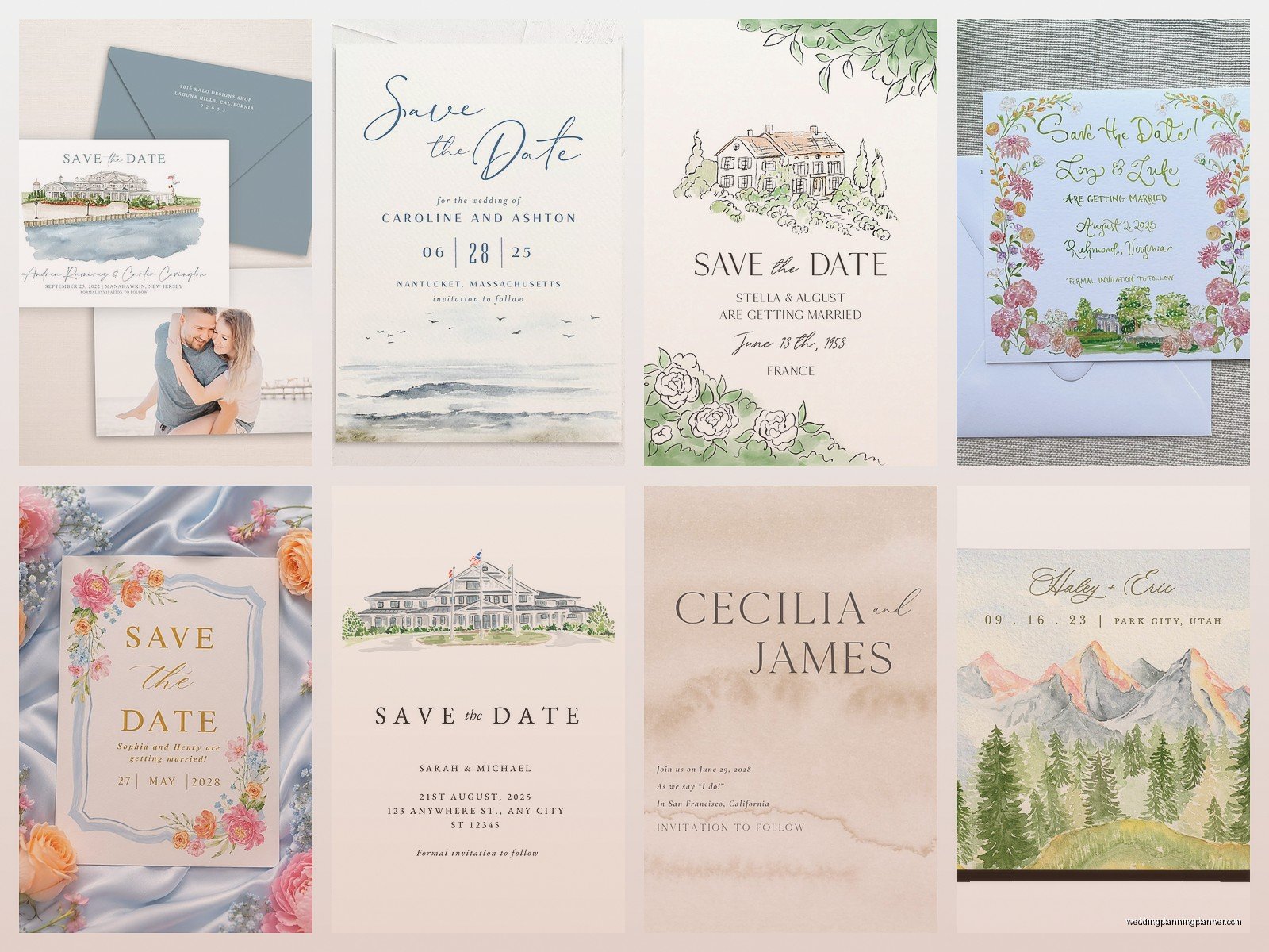
One thing that works really well is doing a watercolor wash as a background element with darker text on top. Or you can do watercolor florals or shapes around the border with clean white space in the middle for text. The worst is when people try to put text directly over busy watercolor areas – it just becomes unreadable and looks like a mess.
Getting The Text Part Right
So you’ve got your watercolor elements sorted but now you need to add your actual information. Most people do this digitally even if the painting was done by hand. You photograph or scan your painted elements, bring them into Photoshop or Canson or whatever design program, then add text layers on top.
Font pairing is huge here and honestly it’s where I see people mess up the most. You want something that complements the organic feel of watercolor but is still readable. I usually go with a script font for names and a clean sans-serif or simple serif for the details. Don’t use more than two fonts or it gets chaotic.
Your save the date needs: your names, wedding date, location (city and state at minimum), and something like “invitation to follow” or “formal invitation to follow.” Some people add their wedding website but honestly you can skip that if you want a cleaner look. The website can go on the back or on a separate details card.
Printing Options That Won’t Break The Bank
Alright so printing is where costs can spiral out of control real fast. You’ve got your digital files ready with your watercolor design and now you need actual physical cards to mail.
Online printers like Minted, Artifact Uprising, or Catprint are gonna be your most affordable options. Minted specifically has a ton of watercolor templates if you’re not doing fully custom work. You’re looking at maybe $1.50-3.00 per card depending on size and paper quality. They usually have sales though – never pay full price at Minted, just wait like two weeks and there’ll be a 20% off sale.
For paper, I recommend at least 120lb cardstock. Anything thinner feels cheap and flimsy. Matte finish usually looks better with watercolor designs than glossy because glossy can make the painted elements look too digital somehow? It’s hard to explain but matte just feels more authentic.
Standard size is 5×7 which is perfect because it’s big enough to make an impact but not so huge that postage gets expensive. You can do 4×6 to save money but honestly it looks kinda… I don’t know, it just doesn’t have the same presence when someone opens their mailbox.
The Actual Logistics Nobody Talks About
Okay so you need your guest list finalized before you order. Seems obvious but you’d be shocked how many people order 100 save the dates then realize they forgot 30 people. Order extras – I always say get 10-15% more than you think you need because addresses will be wrong, cards will get damaged, you’ll want some for your own keepsakes.
Addressing is a whole thing. You can hand-address them which looks gorgeous with watercolor designs but takes forever. You can print labels but that looks kinda cheap with a fancy watercolor card. You can hire a calligrapher which is beautiful but expensive – usually $2-5 per envelope. Or you can use digital calligraphy printing which has gotten really good and costs way less.
Postage! This is what annoys me so much – people spend all this money on beautiful watercolor save the dates then slap an ugly forever stamp on them. Get pretty stamps. The USSD has botanical stamps, floral stamps, watercolor-style stamps. Or go to the post office and get them hand-cancelled so they don’t go through the machine and get all marked up. Hand-cancelling is free you just have to ask.
Also weight your save the date before you buy stamps because if you’re using thick cardstock or adding extras like belly bands or vellum overlays, you might need extra postage. Nothing worse than having your save the dates returned because of insufficient postage.
Design Elements That Make Watercolor Save The Dates Actually Special
So beyond just slapping some watercolor flowers on a card, there are ways to make these really stand out. Vellum overlays with watercolor backgrounds showing through are gorgeous. You can do a watercolor painted envelope liner – these are easier than you think, you just need a template and some spray adhesive.
Deckled edges on the paper give it that handmade artsy feel. You can DIY deckled edges with a ruler and water or order them pre-cut. Wax seals on the envelopes are having this huge moment right now and they look amazing with watercolor designs. You can get custom wax seals with your initials for like $30-50.
Some people do watercolor on wood veneer which sounds weird but actually looks incredible – it’s thin sheets of real wood that you can paint on and then print on. More expensive but very unique.
Or you can keep it simple with just a watercolor wash in your wedding colors and clean typography. Sometimes less is more, especially if your wedding style is more minimalist or modern. Not everything needs to be covered in painted flowers, you know?
Timeline For Actually Getting These Done
Save the dates should go out 6-8 months before your wedding, or 8-12 months if it’s a destination wedding. So work backwards from there. If you’re DIY-ing the watercolor, start 4 months before you need to mail them. If you’re hiring a designer, start conversations 3 months out minimum.
Here’s a rough timeline: Month 1 – finalize design and colors, create or commission watercolor elements. Month 2 – add text, finalize layout, order printed samples to check colors and quality. Month 3 – order full quantity, receive them, address them, add any extras like envelope liners. Then mail them out.
That spring 2023 bride I mentioned? She came to me 6 weeks before she wanted to mail save the dates and it was honestly so stressful. We made it work but barely, and she had to skip some of the special touches she wanted because there wasn’t time. Don’t be that person.
Common Mistakes I See All The Time
Using too many colors – stick to 2-4 max or it looks like a kindergarten art project. Not leaving enough white space – watercolor needs room to breathe. Putting important text over dark watercolor areas where it’s unreadable. Forgetting to proofread before printing (I’ve seen some truly unfortunate typos on save the dates). Not testing print colors – what looks good on your screen might print totally different.
Also people sometimes go too literal with their watercolor elements. Like if you’re getting married at a beach, you don’t need watercolor seashells and waves and anchors and… you get it. Pick one or two elements that suggest the theme without being over the top.
Oh and another thing – make sure your watercolor style matches your overall wedding vibe. If you’re doing a super formal ballroom wedding, loose flowy watercolor might feel off. If you’re doing a garden party, tight geometric watercolor shapes might be weird. There’s gotta be some cohesion between your save the dates and your actual wedding aesthetic or guests will be confused about what to expect.
You can also think about whether you want your save the dates to match your invitations exactly or just coordinate. Some people do watercolor save the dates then switch to letterpress or foil invitations which is totally fine as long as the colors and overall feel connect somehow.
Honestly watercolor save the dates are one of those things that seem complicated but once you break down the steps it’s pretty manageable. Whether you’re painting them yourself or working with a designer, the key is starting early enough that you’re not stressed and can actually enjoy the process instead of just trying to get it done
