
Planning Guides, Style Guide
Enchanted Forest Invitations: Woodland Fairy Tale Theme
Nov
Getting Started with Your Woodland Fairy Tale Invitations
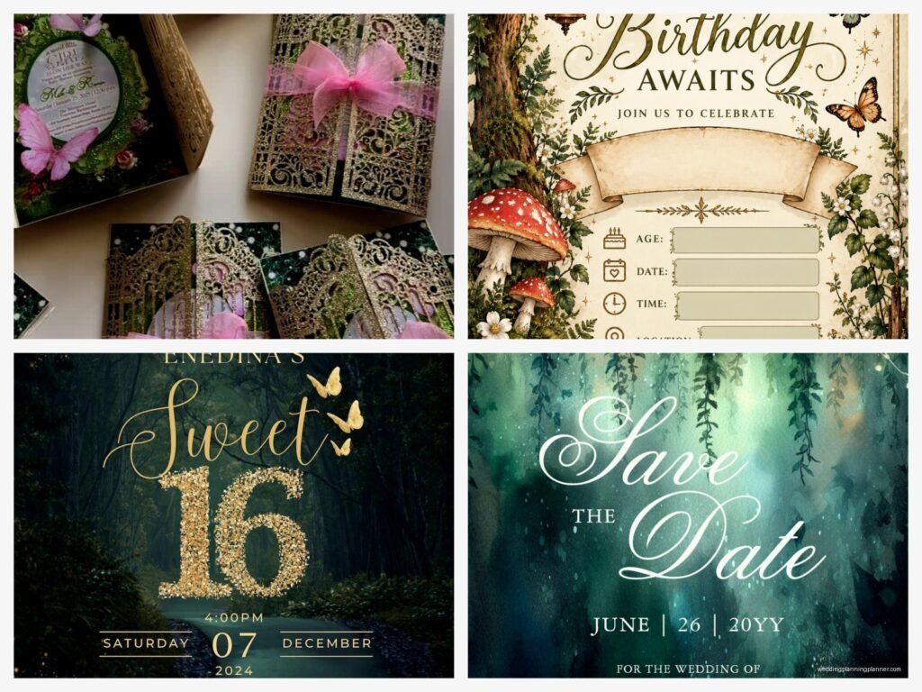
So the first thing you gotta know about enchanted forest invitations is that they’re actually way easier to pull off than people think, but also everyone wants something different when they say “woodland fairy tale.” Like, some brides are picturing full-on Midsummer Night’s Dream with glitter and wings, and others want this rustic earthy vibe with mushrooms and moss. You need to figure out which direction you’re going before you even think about paper stock.
I had this bride back in spring 2023 who kept sending me Pinterest boards with like seventeen different vibes – ethereal fairy lights, dark moody forests, whimsical cartoon toadstools, AND elegant ferns. We spent three weeks just narrowing down her actual vision because she kept saying “I love all of it” and honestly it was driving me up the wall. The invitations can’t be everything at once, you know?
Color Palettes That Actually Work
Your color scheme is gonna dictate literally everything else, so let’s start there. The most common palette I see is forest green, gold, and cream – super classic, works every time. But you can also do:
- Deep purple, emerald green, and copper for a more mysterious enchanted vibe
- Sage green, blush pink, and white for softer fairy tale feels
- Navy blue, silver, and moss green for nighttime forest magic
- Burgundy, burnt orange, and brown for autumn woodland
- Mint green, lavender, and ivory for spring fairy garden
The thing that annoyed me for YEARS was when couples would say they wanted “natural” colors but then reject anything brown or beige because it wasn’t “pretty enough.” Like… forests have brown in them? That’s the whole point? Anyway.
Choosing Your Paper and Materials
Texture matters so much for this theme. You want people to touch the invitation and immediately think “forest.” I always recommend:
Kraft paper as your base – it’s affordable, it photographs beautifully, and it instantly gives that organic woodland feel. You can get it in different weights, and the 80-100lb range works best for invitations because it feels substantial but isn’t gonna cost you a fortune in postage.
Handmade paper with inclusions is gorgeous if your budget allows. I’m talking about paper with actual flower petals, leaves, or seeds embedded in it. There’s this company I use that makes plantable seed paper that guests can literally put in soil and grow wildflowers from. It’s kinda perfect for the theme, though I’ll warn you that it doesn’t print quite as crisply as regular cardstock.
Vellum overlays add this magical translucent quality. You can print your main invitation details on kraft or cream cardstock, then add a vellum overlay with forest illustrations or your names in a delicate script. When you layer them together with a wax seal or twine, it looks expensive even when it’s not.
Design Elements to Include
This is where you get to have fun with it. Your enchanted forest invitation needs some combination of these elements to really sell the theme:
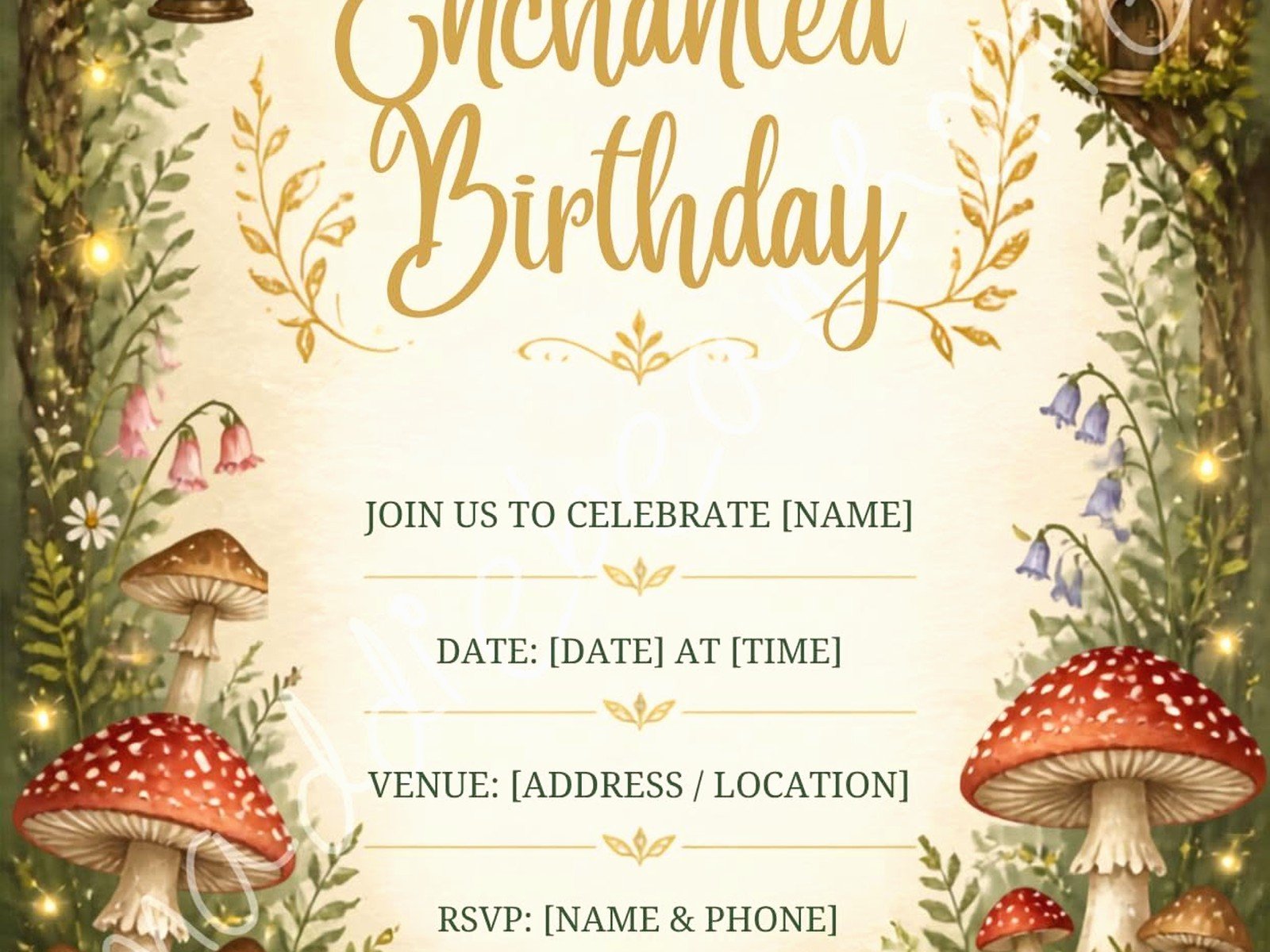
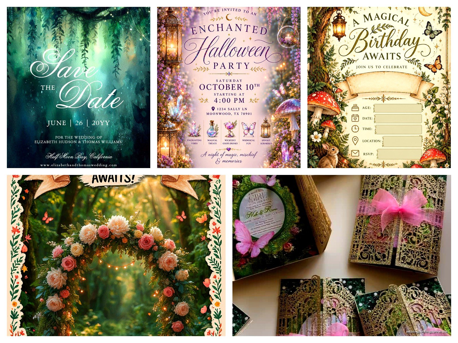
Botanical illustrations – ferns, ivy, oak leaves, wildflowers, mushrooms, acorns. I prefer hand-drawn or watercolor styles over clipart because they feel more organic. You can frame your text with a wreath of mixed greenery, or just have delicate leaf borders.
Woodland creatures – foxes, deer, rabbits, owls, butterflies. Keep them subtle unless you’re going full whimsical. Like a tiny deer silhouette in the corner is elegant, but a cartoon bunny wearing a waistcoat is… a choice. Know your audience.
Trees and branches – birch trees are super popular right now for this theme. You can create a border that looks like birch bark, or have tree branches arching over your text. Willow branches give a more romantic drooping effect.
Magical touches – fireflies, stars, moon phases, fairy dust sparkles. This is where you decide how literal you’re going with the “fairy tale” part. Some couples want actual illustrated fairies, others just want the suggestion of magic through glowing elements.
Typography Choices
You’re gonna want to pair fonts carefully here. My go-to combination is a romantic script for names (think flowing, organic, hand-lettered style) with a clean serif or elegant sans-serif for the details. The script shouldn’t be so swirly that people can’t read it – I’ve seen invitations where guests literally couldn’t figure out the couple’s names and that defeats the whole purpose.
Some fonts that work really well: anything that looks hand-written but remains legible, woodland-inspired display fonts for headers (there are some beautiful free ones with little leaf details built into the letters), and simple all-caps fonts for dates and locations so that information is crystal clear.
Printing Methods
Okay so this is where budget really comes into play. Let me break down your options:
Digital printing is the most affordable and works great for most designs. You can do full color, gradients, watercolor effects, whatever. The downside is it doesn’t have that luxury tactile quality, but honestly for woodland themes it’s usually fine because you’re adding other textural elements anyway.
Letterpress is stunning for this theme because you get that pressed-into-the-paper effect that feels very artisanal and organic. It’s pricey though – expect to pay like 3-4 times what digital costs. Best for simple designs with one or two colors. That impression in the paper is just… chef’s kiss for enchanted forest vibes.
Foil stamping in gold, copper, or even green foil can add that magical sparkle. You can foil stamp just your names or specific design elements like stars or leaf details. It’s a nice middle ground between digital and full letterpress – adds luxury without breaking the bank completely.
I had one couple do kraft paper invitations with copper foil mushrooms and it was so unexpectedly perfect. Like, mushrooms sound weird but they looked absolutely magical.
Envelope Situations
Don’t sleep on your envelopes because they’re the first thing guests see. For enchanted forest invitations, I usually suggest:
Brown kraft envelopes to match kraft invitations, or deep green envelopes if you’re doing cream/white invitations. You can also do envelope liners with forest patterns – there are gorgeous ones with watercolor leaves or starry night skies.
Address them in a romantic calligraphy style, either hand-done or printed to look hand-done. You can add little illustrated elements like a tiny fern or acorn next to the return address.
Wax seals are basically mandatory for this theme in my opinion. Deep green, gold, or burgundy wax with a forest-themed seal (tree, leaf, antlers, initial in a botanical frame). Yes they cost extra and yes they’re worth it. My cat knocked over my entire box of wax seal stamps last month and I almost cried – those things aren’t cheap.
Finishing Touches and Assembly
This is where your invitations go from nice to “wow I need to frame this.” Layer everything thoughtfully:
Start with your envelope, add a liner if you’re using one. Then assemble your invitation suite – main invitation, details card, RSVP card and envelope. You can tie them together with natural twine, silk ribbon in forest colors, or even attach them with a small sprig of dried flowers or eucalyptus.
Belly bands are great for holding everything together. You can make them from cardstock with a botanical illustration, or use actual ribbon. I’ve seen people use strips of birch bark (you can buy these online) which is extra but looks incredible.
If you’re including multiple cards, layer them with the largest on bottom and smallest on top, slightly offset so you can see each piece. Or stack them all and wrap with vellum and twine for a bundled scroll effect.
What to Include in Your Suite
Beyond the main invitation, you’ll probably need:
- Details card with accommodations, website, dress code
- RSVP card and pre-addressed stamped envelope
- Weekend events card if you’re doing welcome drinks or day-after brunch
- Map or directions card if your venue is tricky to find
You can carry the forest theme through all of these pieces or keep the extra cards simpler. I usually suggest doing full theme on the main invitation and RSVP, then simpler coordinating designs on the details cards to save money and avoid overwhelming people with too much visual information.
DIY vs Professional Printing
Look, I’m gonna be real with you – DIY can save money but it’s also gonna cost you time and sanity. I’ve watched couples spend weeks cutting and assembling invitations by hand, and sometimes it’s worth it because they love the process, but sometimes they end up exhausted and resenting their wedding before it even happens.
If you’re doing DIY, order samples first. Print one complete invitation at home or through your planned printer, assemble it fully, and see if you actually like it. Then multiply the assembly time by however many invitations you need and decide if you really want to spend that many hours on this.
Things that are easy to DIY: printing on kraft cardstock at home, tying twine, adding wax seals (once you get the hang of it), assembling pieces. Things that are harder: any kind of foiling, letterpress (you need equipment), perfect die-cutting, calligraphy if you don’t have that skill.
There’s also a middle ground where you order professionally printed pieces but assemble them yourself. That’s honestly the sweet spot for most couples – you get quality printing but save on assembly costs.
Wording and Etiquette Stuff
Your wording can be traditional or more casual depending on your wedding vibe. For enchanted forest, I see a lot of couples incorporating nature-themed language like “join us as we begin our adventure” or “under the forest canopy” or whatever. Just make sure all the actual necessary information is clear – who, what, when, where, how to RSVP.
You can add a quote or poem if you want, something about love and nature or forests or magic. Keep it short though or… actually I had this one invitation that had an entire paragraph-long quote from some obscure fantasy novel and it was just too much, you know? Nobody read it.
Timeline and Ordering
Order your invitations about 4-5 months before your wedding. This gives you time for design, proofing, printing, and assembly, plus you’ll mail them 6-8 weeks before the wedding date.
Always order extras. I tell every client to order at least 10-15 more than they need because addresses change, invitations get lost, you’ll want to keep some for your own keepsakes, and inevitably someone’s great-aunt will call saying she never got hers even though you definitely sent it.
Get proof copies before doing your full print run. Check for typos (because they happen – I once sent invitations to print with the wrong year and wanted to die), make sure colors look right, verify that everything fits in the envelopes you ordered.
Speaking of envelopes, measure your fully assembled invitation before ordering envelopes because adding ribbons and wax seals and layers makes things thicker than you’d expect. A standard A7 envelope might not fit your creation once you’ve added all the embellishments.
Budget Breakdown
Since everyone always asks, here’s roughly what you’re looking at for 100 invitations:
Budget-friendly (DIY with digital printing): $150-300. You’re doing most of the work yourself, printing at home or through an online service, using simpler designs and minimal embellishments.
Mid-range (professional digital printing with some special touches): $500-900. You’re getting quality paper, maybe some foil or special finishes, professional printing, and you’re assembling yourself.
Luxury (letterpress, handmade paper, all the things): $1200-2500+. You’re getting the full experience with premium materials, specialized printing, maybe hand-painted elements or custom illustrations, professional assembly.
These are just estimates and can vary wildly based on what you include. The wax seals alone can add $100-200 to your total. Custom illustrations might be another $200-500. It adds up fast, which is why I always tell couples to prioritize – figure out which elements matter most to you and splurge on those, go simpler on the rest.
Common Mistakes to Avoid
Don’t make your design so dark that the text is hard to read. I see this all the time with moody forest themes – deep green background, brown text, and suddenly your grandma can’t read when the ceremony starts.
Don’t forget postage costs. Thick invitations with wax seals and ribbons need extra postage, sometimes a lot of extra postage. Take a fully assembled invitation to the post office and have them weigh it before you buy stamps.
Don’t use glitter. Just… nah. It gets everywhere, it’s bad for the environment, postal workers hate it, and it doesn’t photograph as well as you think it will. If you want sparkle, use foil or metallic ink instead.
Test your printer if you’re DIYing. Kraft paper can be tricky because it’s not perfectly smooth, and some home printers jam with thicker cardstock. Run tests before you print all 100 invitations at midnight the day before they need to go out (yes, I’ve seen this happen).
