
Planning Guides, Style Guide
Black Wedding Invitation: Dark Elegant Gothic Designs
Nov
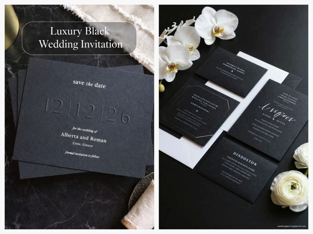
Okay So Black Wedding Invitations Are Having a Moment
Black wedding invitations are honestly one of those things that people either get immediately or they look at you like you’ve lost your mind. I had this couple back in spring 2023 who came to me wanting “dark romance but make it classy” and their parents were absolutely horrified until they saw the final product. Then suddenly everyone wanted one for their own events.
The thing about black invitations is they’re not just for Halloween weddings or people going through a phase. They’re sophisticated, they photograph incredibly well, and they make a statement without screaming for attention. Plus they hide fingerprints way better than white invitations which is gonna sound weird but trust me after you’ve watched a groom handle pristine white cardstock with pizza grease still on his fingers…
Choosing Your Black Base
So first thing you need to decide is what kind of black you actually want because yeah there are different blacks. Matte black cardstock is your classic elegant option. It feels expensive, it looks expensive, and it doesn’t show glare in photos. I usually recommend 110lb or heavier cardstock because anything lighter feels flimsy and you don’t want people thinking you printed these at home on regular paper.
Glossy black is more dramatic but it shows fingerprints like crazy and can look kinda cheap if you don’t pair it with the right elements. I’ve used it successfully but only when we’re doing foil stamping or letterpress on top.
Then there’s textured black paper which I’m obsessed with lately. Linen texture, felt texture, even this cool leather-look paper I found last month. The texture adds depth and makes it feel more luxe without adding cost to printing techniques.
Paper Weight Matters More Than You Think
I cannot stress this enough – go heavy or go home. 110lb minimum for the invitation itself. If you’re doing a full suite with details cards and RSVP cards, those can be slightly lighter at 80lb but the main invitation needs that weight. I learned this the hard way when a client insisted on saving money with lighter stock and the invitations literally bent in half in some of the envelopes during shipping.
Text and Design Elements
Here’s where it gets fun. You’ve got your black background so now you need contrast. White ink is the obvious choice and it works beautifully but it’s not your only option.
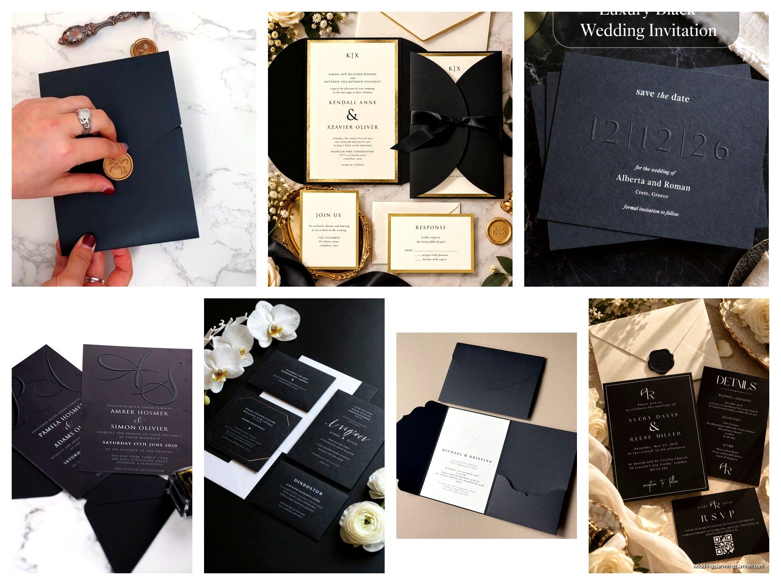
Metallic inks are where black invitations really shine. Gold foil stamping on black is *chef’s kiss* – it’s elegant, it’s timeless, it photographs like a dream. Rose gold gives you romantic vibes without being too soft. Silver is sleek and modern. Copper is having a moment and I’m here for it.
I had this bride in summer 2021 who wanted everything black and gold and at first I thought it might be too much but we did black invitations with gold foil for the names and key details, then gold envelope liners, and gold wax seals. The whole thing was stunning and honestly changed how I thought about metallic elements.
Font Selection Is Critical
On black backgrounds you need fonts that are either delicate enough to feel elegant or bold enough to make an impact. Nothing in between really works. Thin script fonts look gorgeous – think Beloved Script or Hatton – but make sure the printer can handle fine lines on dark paper because some printers struggle with this.
For modern gothic vibes I love pairing a dramatic serif like Orpheus or Butler with clean sans serif fonts for the details. You want that contrast between ornate and simple or else everything just… mushes together visually.
Gothic Design Elements Without Going Full Costume Party
The word “gothic” scares some people because they immediately think Halloween decorations but gothic design is actually really elegant when you do it right. Think Victorian architecture, old cathedrals, romantic literature.
Victoriana flourishes and filigree patterns work beautifully as borders or corner elements. You can find tons of these as vector graphics. Just don’t overdo it – one ornate element per invitation is plenty.
Dark florals are huge right now. Black roses, deep burgundy peonies, dark dahlias printed or foiled onto the invitation. I usually recommend keeping these to one corner or as a subtle background element rather than covering the entire invitation.
Geometric patterns give you gothic vibes without being too literal. Art deco patterns especially – those angular lines and symmetrical designs feel both vintage and modern.
Wax Seals Are Your Secret Weapon
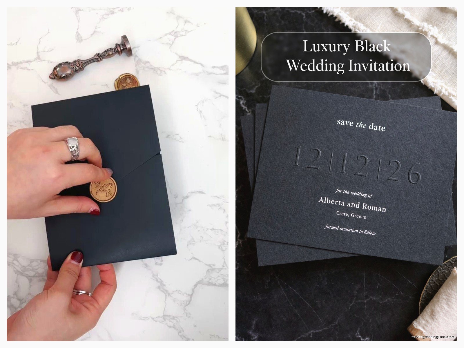
Okay so wax seals on black envelopes are absolutely gorgeous and they’re not as complicated as people think. You can buy custom wax seal stamps on Etsy for like $30-40. Deep red wax, black wax, or metallic wax all look incredible.
Pro tip: practice on scrap envelopes first because the first few always look wonky. Also use glue gun sealing wax not traditional wax because traditional wax cracks during mailing and you’ll have angry clients. The glue gun version is flexible enough to survive the postal service.
Printing Methods
Digital printing is the most affordable option and honestly works fine for most black invitations. Make sure your printer has experience with dark cardstock though because white ink on black requires different printer settings than regular printing.
Letterpress on black paper is stunning but expensive. The impression creates this beautiful dimensional effect and if you do white or metallic ink letterpress it’s just… wow. Budget around $8-15 per invitation for this though.
Foil stamping is my personal favorite for black invitations. It’s pricier than digital but less than letterpress usually. The metallic foil catches light and adds that luxury factor. You can do full foil coverage or just accent elements. I usually recommend foiling the couple’s names and maybe a decorative element then doing the rest in digital printing to save money.
What Annoys Me About Foil Stamping Though
The minimum order quantities drive me crazy. Most foil stamping companies require minimums of 50-100 invitations which is fine for most weddings but I’ve had smaller intimate weddings where the couple only needs 30 invitations and then we’re stuck paying for 100 or finding alternative solutions. It’s just… annoying when you find the perfect design and then the minimums don’t work.
Envelope Considerations
You can go black envelopes for full drama or contrast with white/cream envelopes. Honestly both work. Black on black is very fashion-forward and dramatic. Black invitation in a cream envelope feels more classic and approachable.
If you do black envelopes you’ll need white or metallic ink for addressing. Most calligraphers charge extra for white ink on dark envelopes because it’s more difficult and requires special pens. Budget an extra $1-2 per envelope for this.
Envelope liners are a nice touch – you can do metallic liners, patterned liners, or even black liners with metallic patterns. They’re like the little surprise when someone opens the envelope. My cat knocked over an entire box of gold metallic liner paper last month and I’m still finding little gold pieces stuck to things in my office.
Suite Components That Work With Black Invitations
You don’t have to make everything black. Actually I usually recommend varying the suite components for visual interest.
The main invitation should be black obviously. But your details card could be cream with black text. RSVP card could be black with gold accents. Envelope liner adds another color or metallic element. This gives you a cohesive suite without it being monotone.
Belly bands are great for holding everything together – you can do black ribbon, velvet ribbon, or even leather cord for texture. Vellum overlays with black or metallic printing also add dimension.
Don’t Forget About Readability
This is gonna sound obvious but I’ve seen so many designs where people get carried away with the aesthetic and forget that people actually need to read the thing. Your venue address, date, and time need to be crystal clear. Don’t use super fancy fonts for critical information. Script fonts are beautiful for names and decorative elements but use clean readable fonts for the actual details people need to know.
Styling Details That Elevate Gothic Black Invitations
Okay so once you have your basic invitation designed here’s how you take it from nice to incredible.
Deckled edges give you that romantic old-world feel. You can buy deckle edge scissors or have your printer do it. It softens the formality of black cardstock slightly which creates interesting tension.
Layering different paper weights and colors creates depth. Black invitation on top of a slightly larger gold metallic backing for example.
Vintage stamps for mailing – you can buy vintage black or dark stamps on Etsy or if you’re mailing domestically in the US you can use the black heritage stamps. They coordinate way better than random colorful stamps.
Tassel or ribbon bookmarks if you’re doing invitation suites that are more like booklets – very dramatic and people always comment on these.
Common Mistakes People Make
Using black ink on black paper seems obvious to avoid but I’ve literally had clients suggest this thinking it would look “mysterious” – nah it just looks blank.
Going too theme-y with the gothic elements. Like adding skulls or crosses or overly spooky imagery. Unless you’re specifically having a Halloween wedding keep the gothic elements subtle and architectural rather than costume-y.
Forgetting about postage weight. Black cardstock especially the heavy stuff plus wax seals plus multiple inserts can push you over standard postage weight. Take a finished invitation to the post office and have them weigh it before you buy stamps.
Not ordering samples first. Always always order printed samples before you commit to 100+ invitations. Colors look different on screen versus printed especially with metallics and what looks elegant on your computer might look completely different in person.
Working With Different Wedding Styles
Black invitations aren’t just for one type of wedding. I’ve done them for modern minimalist weddings using black with white and one metallic accent. For romantic gothic weddings with florals and vintage elements. For art deco themed weddings with geometric patterns and gold foil. For moody garden weddings with dark botanicals.
The key is adjusting your design elements to match the overall wedding vibe. Modern wedding? Clean lines, minimal embellishment, maybe one dramatic font. Romantic wedding? Florals, script fonts, softer metallic like rose gold. Classic formal wedding? Traditional layout, elegant serif fonts, gold or silver foil.
Seasonal Considerations
Fall and winter weddings are natural fits for black invitations but honestly they work year-round if you style them right. Summer black invitations can work with lighter metallic accents and maybe incorporating some white space. Spring black invitations look gorgeous with dark floral elements and soft metallics.
I did a summer 2022 wedding with black invitations and copper foil accents for an outdoor evening wedding and it was perfect – the black felt elegant for the formal evening vibe even though it was July.
Budget Breakdown
Since everyone always wants to know costs here’s roughly what you’re looking at per invitation for different approaches.
Basic digital printing on black cardstock with white ink: $3-5 per invitation. This includes printing, envelope, and basic assembly.
Digital printing with one foil element: $6-9 per invitation depending on how much foil coverage.
Letterpress or full foil: $10-18 per invitation. Add another $2-4 if you want envelope liners, wax seals, or calligraphy addressing.
These prices usually include design work if you’re working with a stationer but if you’re DIYing the design yourself you can cut costs significantly on the design end and just pay for printing.
DIY Versus Professional
Look I’m gonna be honest – black invitations are harder to DIY than standard invitations. Printing white ink on black paper requires special printer settings and most home printers can’t handle it well. The ink often looks gray or streaky instead of crisp white.
If you’re committed to DIYing I’d recommend designing them yourself but then sending the files to a professional printer who specializes in dark cardstock. You’ll save money on design but still get quality printing.
For foil stamping or letterpress you really need to go professional unless you want to invest in expensive equipment. There’s no good DIY workaround for these techniques.
Assembly you can definitely DIY though – stuffing envelopes, adding wax seals, attaching belly bands. Put on a good show (I worked through an entire season of some crime documentary series while assembling invitations last year) and make an evening of it.
Coordinating With Other Wedding Stationery
Your invitations set the tone so your other stationery should coordinate. Programs, menus, place cards, table numbers – these don’t all need to be black but they should reference the black invitation aesthetic.
I usually do programs and menus in cream or white with black text and maybe one metallic accent that matches the invitation. Full black programs can be hard to read in dim ceremony or reception lighting.
Place cards look gorgeous on black cardstock with gold or silver calligraphy. They’re small enough that you can do something dramatic without it being overwhelming.
Table numbers can go either way – black with metallic numbers or metallic backgrounds with black numbers both work.
Thank you cards after the wedding should definitely coordinate. Either black with metallic accents or flip it and do cream/white with black text and a small element that references the invitation design.
Working With Vendors
When you’re talking to stationers or printers about black invitations bring visual references. Pinterest boards, screenshots, physical samples if you have them. “Black and elegant” means different things to different people and you want to make sure you’re on the same page.
Ask specifically about their experience with dark cardstock and white/metallic inks. Not all printers handle this well and you don’t wanna be their first experiment.
Get actual printed samples before approving anything. Screen proofs don’t show you paper texture, how metallics catch light, or actual color accuracy on dark backgrounds.
Timeline-wise black invitations don’t necessarily take longer than regular invitations but if you’re doing special techniques like foil or letterpress build in extra time. I usually recommend starting the invitation process 6-8 months before the wedding date and having them mailed 8-10 weeks before the wedding.

Canva
Wedding Memories Hardcover Template Canva Editable For Notebook, Journal, Novel, Hard Covers, Canva template For KDP Cover 6×9″ 120 pages
Canva
The Ultimate Wedding Planning Bundle, Canva Editable.
Canva
Customizable Wedding Video Invitations templates, Canva Editable Digital Wedding invitation Minimalist, Animated Custom Invitation
Digital Planning Templates
Wine Wedding Planner Bundle – 200-Page Printable PDF + 10 Editable Wedding Invitations | Instant Digital Download
Canva
Orange Wedding Planner Bundle – 200-Page Editable Canva Templates + 10 Editable Wedding Invitations | Instant Digital Download
Digital Planning Templates
Champagne Wedding Planner Bundle – 200-Page Printable PDF + 10 Editable Wedding Invitations | Instant Digital Download
Canva
Wedding Memories Hardcover Template Canva Editable For Notebook, Journal, Novel, Hard Covers, Canva template For KDP Cover 6×9″ 120 pages
Digital Planning Templates
Yellow Wedding Planner Bundle – 200-Page Printable PDF + 10 Editable Wedding Invitations | Instant Digital Download
Canva
Dusty Blue Wedding Planner Bundle – 200-Page Editable Canva Templates + 10 Editable Wedding Invitations | Instant Digital Download