
Planning Guides, Style Guide
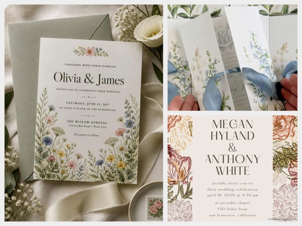
Floral Wedding Invitations: Botanical Flower Designs
Nov
Okay so floral wedding invitations are having a MOMENT
Like honestly if one more bride tells me she wants “something botanical but not too busy” I’m gonna… actually no, I love it, but you know what I mean. Floral invitations are everywhere right now and there’s a reason – they’re gorgeous, they work with basically any wedding style, and they give you so much flexibility with colors and moods.
So here’s the thing about botanical flower designs on invitations. You’ve got a million directions you can go, which is exciting but also kinda overwhelming. I had this bride back in spring 2023 who came to me with like seventeen Pinterest boards of different floral styles and she was nearly in tears because she couldn’t figure out what she actually wanted. We literally sat there for two hours going through what made her save each image and it turned out she just wanted garden roses in blush tones. Sometimes you gotta dig deeper than the surface aesthetic.
Different Floral Styles You Should Know About
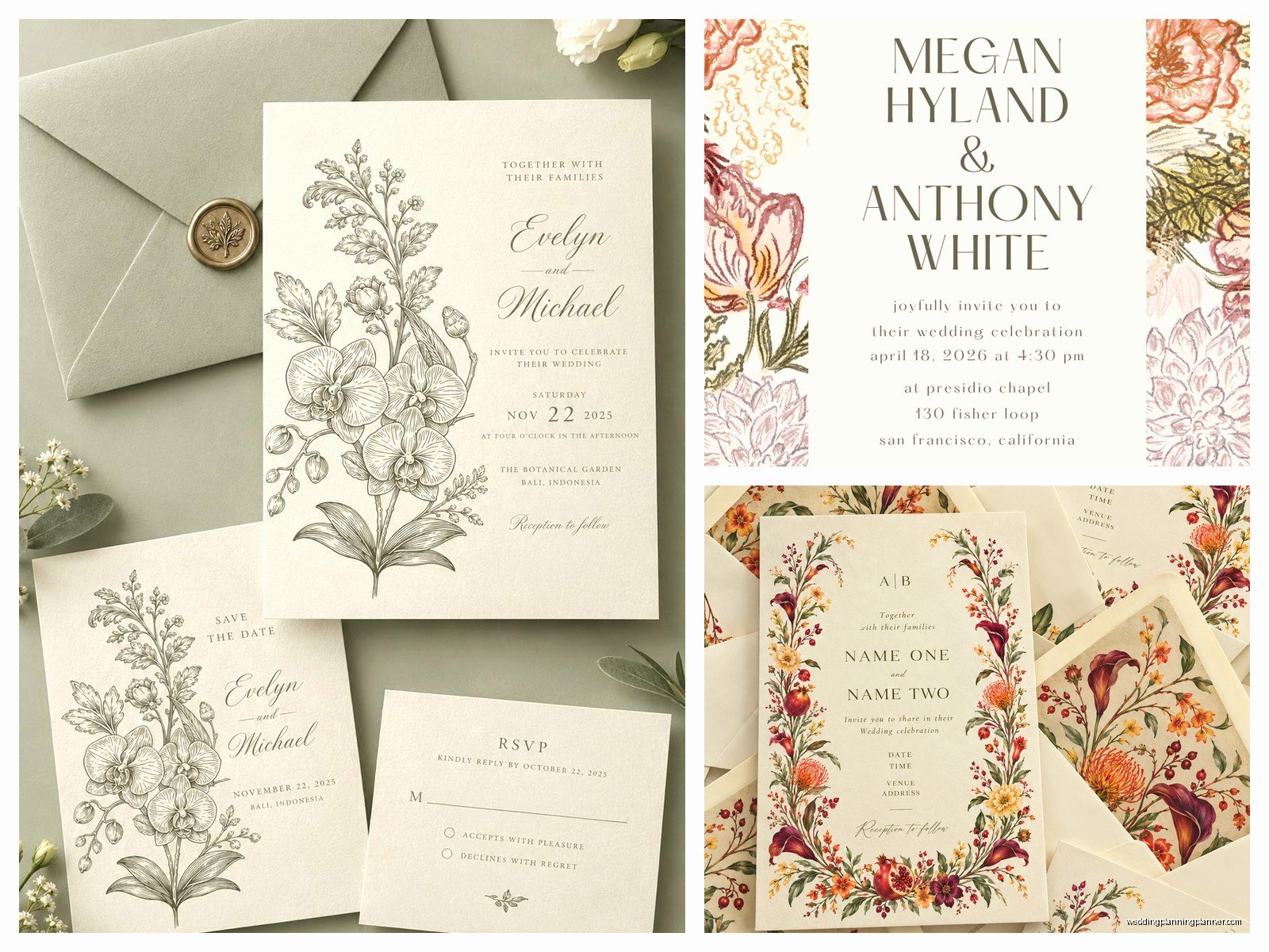
Alright so there are some main categories of floral invitation designs that’ll help you figure out your direction:
- Botanical illustrations – These are the detailed, almost scientific-looking drawings. Think vintage herb garden vibes. Very line-based, often in one or two colors, super elegant.
- Watercolor florals – Soft, painterly, romantic. These can be full-color or monochromatic. They tend to have that dreamy blended look.
- Pressed flower style – Flat, delicate, looks like actual pressed flowers. Very organic and natural.
- Bold modern florals – Think big graphic flowers, sometimes abstract, often in unexpected color combos.
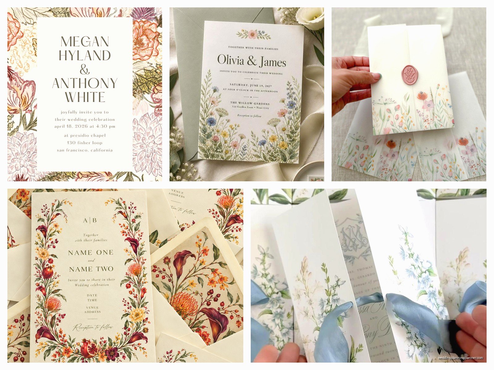
- Wildflower meadow – Loose, unstructured arrangements with lots of different flower types. Very boho.
- Classic garden roses – Traditional, romantic, what most people picture when they think “floral wedding.”
You need to pick a style that actually matches your wedding vibe, not just what looks pretty on Instagram. I see this mistake constantly.
Choosing Your Flowers (This Matters More Than You Think)
So here’s where it gets interesting – the actual flowers you choose for your invitation design should probably relate to something. Your wedding flowers, your venue’s garden, flowers that mean something to you, or even just flowers that bloom in your wedding season.
I worked with a couple who got married at a botanical garden in summer 2021, and we designed their invitations around the specific roses that were in the garden’s heritage rose collection. Their guests literally walked past those same roses on the way to the ceremony. That attention to detail? Chef’s kiss.
Some popular choices:
- Peonies – romantic, lush, spring/early summer
- Garden roses – timeless, elegant, work year-round
- Eucalyptus – everyone’s favorite greenery right now
- Anemones – dramatic centers, modern feel
- Ranunculus – delicate, lots of petals, very pretty
- Olive branches – Mediterranean, organic
- Wildflowers (daisies, Queen Anne’s lace, etc.) – casual, meadow vibes
- Proteas – bold, tropical or modern
- Lavender – romantic, fragrant associations, French countryside
But honestly? Pick what you actually like. Don’t choose peonies just because they’re trendy if you think they look like overblown carnations or whatever.
Color Palettes That Actually Work
This is where people get stuck. You can do florals in literally any color scheme, but some combinations just work better for invitations specifically.
Neutrals with one accent color – This is your safest bet. Cream or white background, greenery in sage or olive tones, maybe blush or terracotta as an accent. Very versatile, won’t overwhelm your text.
Monochromatic – All one color family. Like dusty blue florals on white, or burgundy tones on cream. Very sophisticated.
Bold and bright – If your wedding is colorful, lean into it. Jewel tones, vibrant garden colors, whatever. Just make sure your text is still readable.
Earth tones – Browns, terracottas, burnt oranges, deep greens. Very organic and grounded.
What annoys me is when people choose a color palette that’s gorgeous but then their text gets completely lost in it. I’ve had to redesign so many invitations because the bride picked this beautiful deep purple floral background and then wanted light gray text and like… no. That’s not readable. Your grandmother needs to be able to read this without a magnifying glass.
Composition and Layout Stuff
Okay so where you actually PUT the florals on your invitation matters. You’ve got options:
Border/frame – Flowers arranged around the edges of your invitation, text in the center. Classic, always works, gives you lots of white space.
Corner arrangements – Florals in one or more corners. More modern, asymmetrical, lets the text breathe.
Full bleed background – Flowers covering the entire background with text overlaid. Bold, makes a statement, but you gotta be careful with readability.
Bottom arrangement – Florals along the bottom, text above. Very balanced and structured.
Scattered/organic – Flowers placed randomly across the design. Can look really natural and loose or really messy depending on execution.
Minimal accent – Just a small floral element, like a single stem or small cluster. Very modern and understated.
I usually recommend keeping at least 40-50% of your invitation as negative space (blank area). This gives your eye somewhere to rest and makes the text way more readable. Also my cat knocked over my coffee while I was working on a design last week and I’m still finding tiny drops of coffee on random papers, but that’s… not related to this, I just needed to complain about it somewhere.
Printing Methods Make a Huge Difference
So you can have the most beautiful floral design in the world, but if you print it wrong, it’ll look cheap. Here’s what you need to know:
Digital printing – Most affordable, great for detailed designs and full-color florals. Perfect for watercolor styles or anything with lots of colors. The quality has gotten really good in recent years.
Letterpress – Creates an impression in the paper. Gorgeous for botanical line illustrations. Usually limited to one or two colors unless you wanna spend a fortune. That texture though? Beautiful.
Foil stamping – Metallic foil applied to your design. Amazing for adding gold or copper to floral elements. Can be combined with other printing methods.
Thermography – Raised printing that mimics engraving. Good middle ground between digital and letterpress for traditional florals.
Engraving – The most formal and expensive. Creates crisp lines, perfect for very detailed botanical illustrations.
For most couples, digital printing is totally fine. The quality is excellent now and you can do full-color floral designs without breaking the bank. Save your money for the florals that’ll actually be at your wedding, you know?
Paper Choices That Complement Florals
The paper you print on changes everything about how your florals look. Some options:
- Smooth cotton – Clean, modern, lets colors pop
- Textured cotton – Adds dimension, very tactile, romantic
- Recycled paper – Organic feel, perfect for wildflower designs
- Vellum overlays – Translucent layer over your invitation, dreamy with florals underneath
- Kraft paper – Rustic, earthy, great for botanical illustrations
- Handmade paper – Deckled edges, very organic, sometimes has actual petals embedded
Weight matters too. You want at least 100lb cardstock for your main invitation. Anything lighter feels flimsy and cheap, even if your design is gorgeous.
Working With a Designer vs DIY Templates
Look, I’m biased obviously, but there’s a difference between custom design and using a template. Templates are fine if you’re on a tight budget and you find one that really works for you. Sites like Minted or Zola have some beautiful floral options.
But if you want something unique or you have specific flowers in mind or you need the design to match your actual wedding flowers… you probably want a designer. We can create custom illustrations of your specific bouquet, match exact colors, adjust compositions to fit your wording, all that.
The middle ground is semi-custom – you find a design you like and a designer modifies it for you. Changes colors, swaps out some flowers, adjusts the layout, whatever.
Common Mistakes I See All The Time
Okay so here’s what to avoid:
Too many different flowers – Unless you’re specifically going for a wildflower meadow vibe, stick to 3-4 flower types max. More than that looks cluttered and confused.
Flowers that don’t match your season – If you’re having a November wedding, maybe skip the bright sunflowers? Or if you’re doing sunflowers, lean into a fall palette with them.
Ignoring your venue style – Tropical proteas and palm leaves look weird for a rustic barn wedding. Garden roses feel wrong at a modern art gallery. Match your vibe.
Sacrificing readability for aesthetics – I cannot stress this enough. If people can’t read your invitation, what’s the point?
Choosing trendy over timeless – That super trendy pampas grass and dried flower look might feel dated in five years when you look back at your wedding photos. Just something to consider.
Forgetting about your suite – Your invitation should coordinate with your save the dates, programs, menus, place cards, etc. Think about the whole suite, not just one piece.
Adding Extra Details to Florals
If you wanna make your floral invitations extra special, consider:
- Wax seals with botanical motifs
- Silk ribbon in colors that match your florals
- Envelope liners with a coordinating floral pattern
- Custom stamps with floral designs
- Deckled edges on your paper for an organic feel
- Actual dried flowers attached to the invitation (careful with mailing these though)
- Translucent vellum belly bands with floral details
These little touches add up cost-wise, so pick one or two that really matter to you rather than trying to do everything.
Practical Stuff About Ordering and Timeline
Order samples before you commit to anything. Colors look different on screen vs in person, and you need to see the paper quality and printing method in real life.
Timeline-wise, you wanna start looking at designs about 6-8 months before your wedding. Order your invitations at least 3-4 months out, which gives you time for design, proofing, printing, and assembly. Mail them 6-8 weeks before your wedding date.
Order 10-15% extra invitations. You’ll need them for keepsakes, last-minute guests, mistakes in addressing, whatever. They’re cheaper to order extra upfront than to do a second print run.
Budget Real Talk
Floral invitations can range from like $2 per invitation for simple digital printing to $30+ per invitation for custom design with letterpress and foil and all the fancy extras.
Average range for nice quality is probably $5-12 per invitation for the suite (invitation, RSVP card, details card, envelopes). That’s for semi-custom or template-based designs with digital printing.
If you’re doing full custom design and letterpress or engraving, expect $15-25+ per invitation.
Remember you’re paying per invitation, not per guest. One invitation goes to each household, so you need way fewer than your guest count.
Digital Invitations with Florals
Okay so if you’re doing digital invitations (which honestly more people are doing now), florals still work great. You can do animated florals, like flowers that bloom when someone opens the invitation, or parallax scrolling effects with layers of flowers and greenery.
Digital gives you more freedom with color since you’re not limited by printing costs. You can do full rainbow gardens if that’s your thing. Just make sure the file size isn’t so huge that it takes forever to load or people can’t open it on their phones.
Some couples do both – digital for the main invitation and then physical floral cards for older relatives or VIPs who might appreciate the traditional approach. That’s totally valid.
Mixing Floral Styles With Other Design Elements
Your invitation doesn’t have to be ONLY florals. You can mix botanical elements with geometric shapes, metallic accents, calligraphy… whatever feels like you. I’ve seen gorgeous invitations that combine line-drawn botanicals with modern sans-serif fonts, or watercolor flowers with gold foil geometric frames, or pressed flower styles with hand-lettered text.
The key is making sure everything feels cohesive. All the elements should feel like they belong together, like they’re part of the same design language. If something feels off or forced, it probably is.
And honestly? Trust your gut. If you love it, that’s what matters. You’re the one getting married, not Pinterest or Instagram or your aunt who has opinions about everything. Pick the florals that make you happy, print them on nice paper, and send them out into the world. That’s really all there is to it.

Canva
Wedding Memories Hardcover Template Canva Editable For Notebook, Journal, Novel, Hard Covers, Canva template For KDP Cover 6×9″ 120 pages
Canva
The Ultimate Wedding Planning Bundle, Canva Editable.
Canva
Customizable Wedding Video Invitations templates, Canva Editable Digital Wedding invitation Minimalist, Animated Custom Invitation
Digital Planning Templates
Wine Wedding Planner Bundle – 200-Page Printable PDF + 10 Editable Wedding Invitations | Instant Digital Download
Canva
Orange Wedding Planner Bundle – 200-Page Editable Canva Templates + 10 Editable Wedding Invitations | Instant Digital Download
Digital Planning Templates
Champagne Wedding Planner Bundle – 200-Page Printable PDF + 10 Editable Wedding Invitations | Instant Digital Download
Canva
Wedding Memories Hardcover Template Canva Editable For Notebook, Journal, Novel, Hard Covers, Canva template For KDP Cover 6×9″ 120 pages
Digital Planning Templates
Yellow Wedding Planner Bundle – 200-Page Printable PDF + 10 Editable Wedding Invitations | Instant Digital Download
Canva
Dusty Blue Wedding Planner Bundle – 200-Page Editable Canva Templates + 10 Editable Wedding Invitations | Instant Digital Download