
Planning Guides, Style Guide
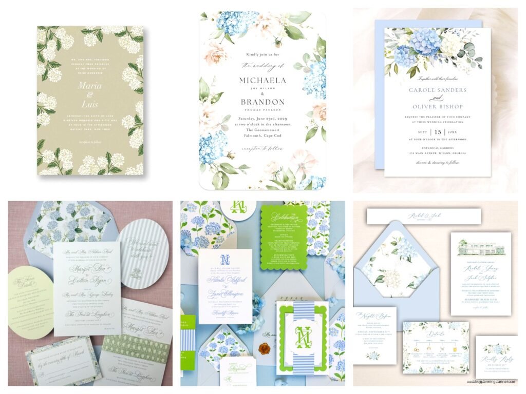
Hydrangea Wedding Invitations: Blue Pink Flower Designs
Nov
Picking Your Hydrangea Colors and Getting Started
So hydrangea invitations are having this massive moment right now and honestly they work for like 80% of wedding styles which is why I recommend them so often. The thing is, hydrangeas come in these gorgeous blues and pinks naturally, and that color combo is just… it hits different on wedding stationery. You’re gonna want to decide first if you’re going full realistic botanical illustration or more watercolor-y and soft.
I had this bride in spring 2023 who was absolutely convinced she wanted navy hydrangeas on her invites and I had to gently explain that hydrangeas don’t really come in navy, they come in that softer periwinkle-to-royal blue range. She ended up going with a gorgeous dusty blue and it looked way better than what she originally wanted, but that conversation took like three emails back and forth which was… anyway.
The blue and pink together creates this really versatile palette. You can lean more blue for a sophisticated garden vibe, more pink for romantic and sweet, or do a 50/50 split which I actually think works best. The key is making sure your designer uses the right shades – you want those blues to be true hydrangea blue, not like, turquoise or teal. And the pinks should be that soft blush to mauve range, not hot pink unless you’re doing something really modern.
Design Styles That Actually Work
Alright so there’s basically four main approaches to hydrangea invitation designs and I’ve worked with all of them:
Watercolor hydrangeas are probably the most popular right now. They give you that soft, romantic look without being too heavy. The colors bleed into each other a bit and it feels really organic. This works especially well if your wedding has a garden or outdoor element. You can do a full watercolor background or just have the hydrangea blooms as accents in the corners.
Botanical illustrations are more detailed and realistic. These are gorgeous if you’re doing a more formal wedding or if you really love that classic botanical print vibe. They tend to be line drawings with color fills, so they’re a bit crisper than watercolor. I kinda prefer these for spring and summer weddings specifically.
Modern minimalist with hydrangea elements is where you take just one or two blooms and keep everything else super clean. White background, simple typography, maybe one hydrangea cluster in the corner. This prevents the design from feeling too busy or cottage-core if that’s not your thing.
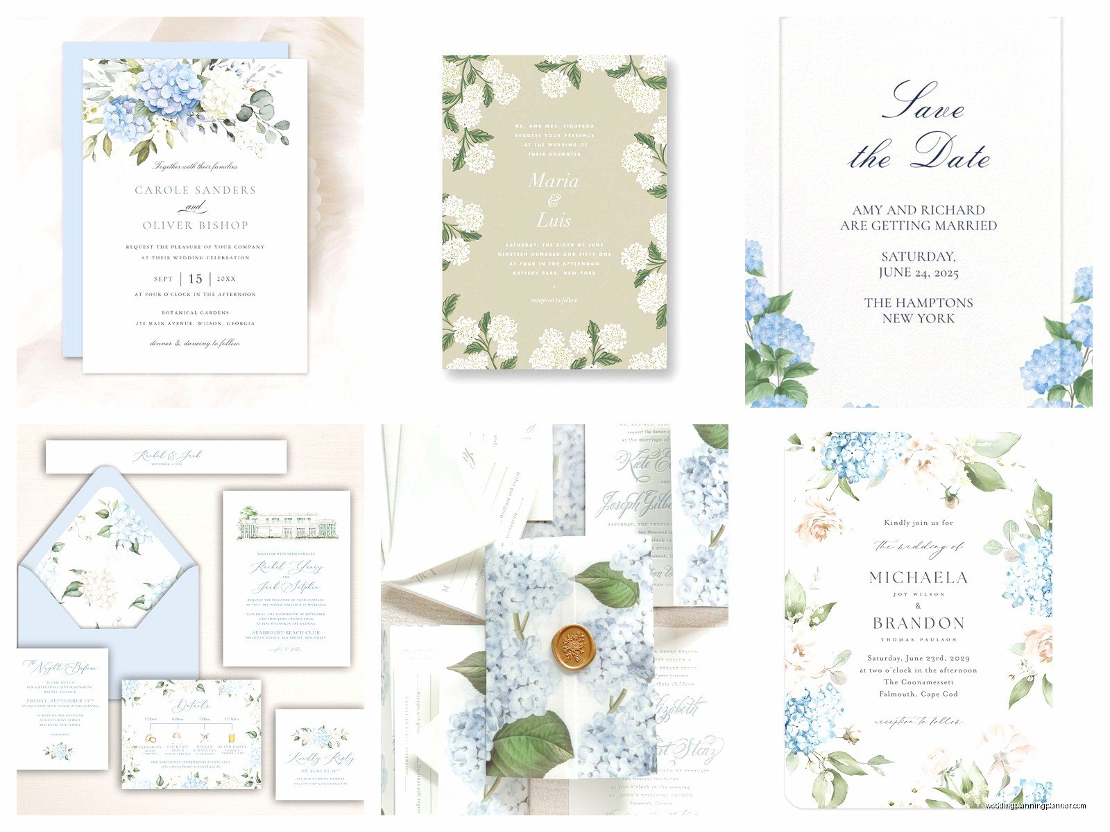
Maximalist floral where hydrangeas are mixed with other flowers and greenery. This is like… you’re creating a whole garden on the invitation. Peonies, roses, eucalyptus, and hydrangeas all together. It’s a lot but when it works, it really works.
Paper Stock and Printing Methods
Okay this is where people mess up because they don’t think about how the printing method affects those delicate blue and pink shades. Digital printing is fine for most hydrangea designs and it’s the most budget-friendly, but you gotta make sure your printer does color-matching because those blues can come out looking really flat or too purple if they’re not calibrated right.
Letterpress is beautiful for hydrangea invitations but here’s the thing – you’re limited to simpler designs because you’re pressing the design into the paper. So if you want that super detailed watercolor look, letterpress isn’t gonna work. But for botanical line drawings with maybe one or two colors? Chef’s kiss. The texture adds something special.
Foil stamping in rose gold or silver can look really pretty with hydrangea designs, especially if you do the flowers in print and then add foil to your names or the border. I had one couple do blue and pink hydrangeas with copper foil and it was unexpected but worked somehow.
For paper stock, I always push people toward something with a bit of texture – cotton paper or linen finish. Smooth cardstock can make hydrangea designs look too flat. You want that paper to have some… personality I guess? My cat knocked over my coffee on a sample set once and the textured paper actually held up better than the smooth ones, which tells you something about quality.
Color Combinations Beyond Just Blue and Pink
So yeah the classic is blue and pink hydrangeas together, but you can play with the supporting colors to totally change the vibe. Pairing your hydrangeas with:
- Cream or ivory backgrounds instead of white makes everything feel softer and more vintage
- Gray or charcoal for text creates a modern sophisticated look
- Sage green or eucalyptus adds that garden element without competing with the flowers
- Gold accents for luxury vibes – but don’t overdo it or it gets tacky fast
- Navy blue text with pink hydrangeas is really popular for nautical-adjacent weddings
What annoys me is when people try to add too many colors. Like they want blue hydrangeas, pink hydrangeas, purple text, gold foil, green leaves, and a yellow border and it’s just… no. Pick three colors max for your whole invitation suite. The hydrangeas already give you two colors, so you need like one or maybe two more for text and accents.
Typography Choices That Don’t Fight With the Flowers
Your font choices matter SO much with floral designs because you can either complement the flowers or create this weird competition where nothing looks good. For hydrangea invitations specifically, I usually recommend:
A delicate serif or script for names and headlines – something with personality but still readable. Those super swirly fonts that look like they belong on a fairy tale book? Nah, too much with the detailed flowers. You want elegant but not fussy.
For your body text (details, RSVP info, etc.), go with a clean sans-serif or a simple serif. The flowers are doing the decorative work, your text just needs to be legible. I’ve seen people use the same swirly script for everything and then their guests can’t figure out what time the ceremony starts, which defeats the whole purpose of an invitation.
Letter spacing is important too – give your text room to breathe especially if you’ve got hydrangeas framing it. Cramped text next to busy florals makes people’s eyes tired.
Suite Coordination
Okay so you’ve got your main invitation designed with hydrangeas, now you need to figure out the rest of your suite. You don’t have to put hydrangeas on every single piece – actually that can look kinda repetitive. Here’s what I typically suggest:
Main invitation: Full hydrangea design, this is your showpiece
RSVP card: Maybe just a small hydrangea accent in one corner, keep it simpler
Details card: Could do a hydrangea border or just use the same color palette without the actual flowers
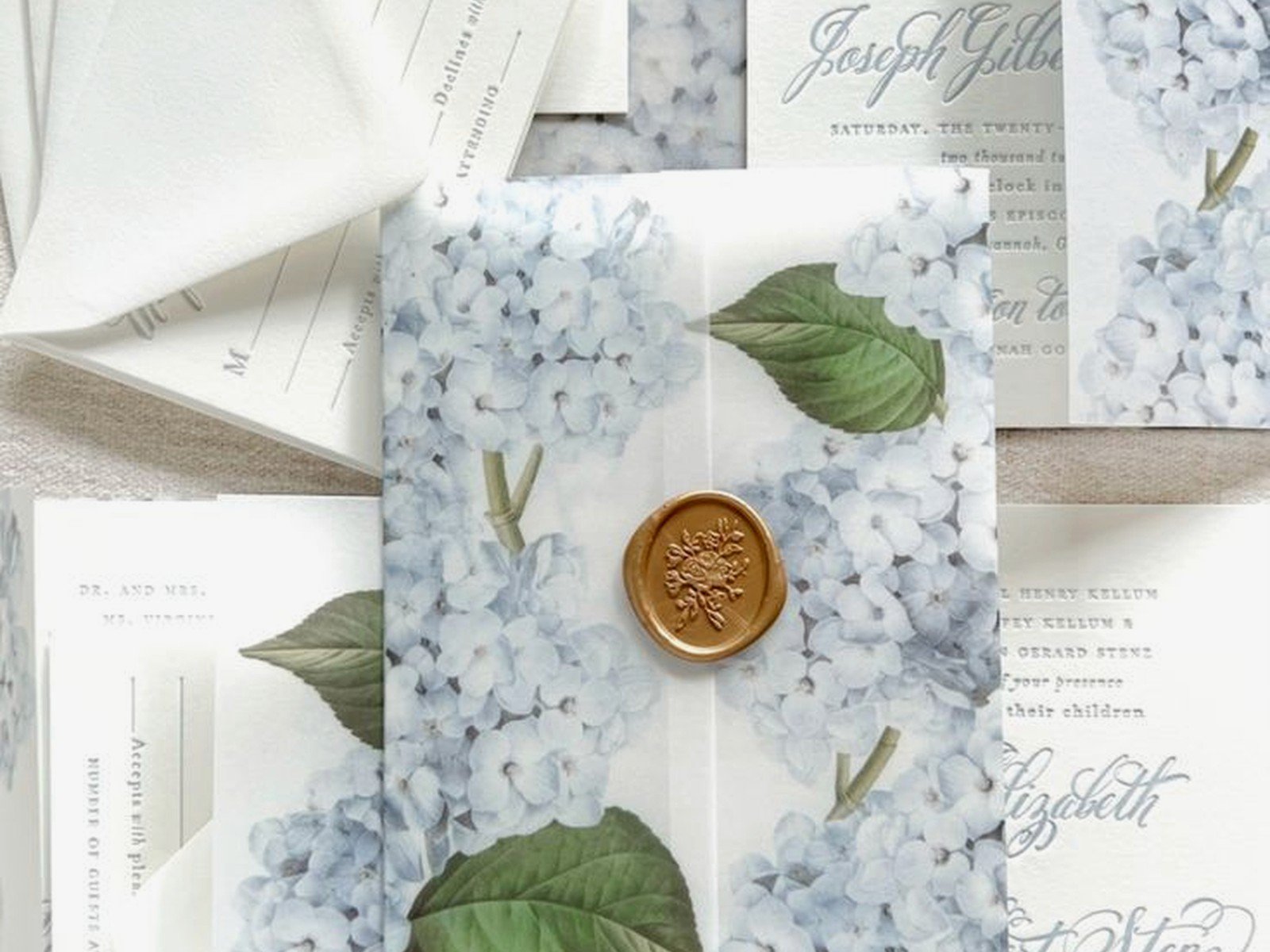
Envelope liner: This is a great place for an all-over hydrangea pattern that’s more subtle, like a watercolor wash
Belly band or ribbon: Solid color that pulls from the hydrangeas – dusty blue or blush pink
The envelope addressing is where you can get creative too. I love when people do the return address in that same dusty blue or have a little hydrangea illustration as part of the return address design.
Seasonal Considerations
Hydrangeas bloom in summer mostly, like June through September depending where you are, so they’re perfect for summer weddings obviously. But here’s the thing – the design works year-round because those blue and pink colors aren’t super seasonal. I’ve done hydrangea invitations for fall weddings (paired with burgundy accents), winter weddings (with silver and white), and obviously spring weddings.
For summer weddings you can go bright and saturated with your hydrangea colors. For fall, lean into the muted mauves and dusty blues. Winter weddings can do icy blues with the hydrangeas. Spring is when you can do the most traditional soft pinks and periwinkle blues.
The other thing about hydrangeas is they actually dry really beautifully, so if you’re crafty or working with a florist who does dried flowers, you can carry that theme through to your actual wedding flowers which creates nice continuity.
Working With Designers and Setting Expectations
If you’re hiring a stationer or invitation designer for custom hydrangea invitations, you gotta be clear about what you want. Send them photos of hydrangea varieties you like – because there’s mophead hydrangeas, lacecap hydrangeas, and they look really different. Mophead are those big round pom-pom looking ones, lacecap are flatter with smaller flowers in the center.
Most designers will do 2-3 rounds of revisions, so use them wisely. First round, focus on the overall layout and color palette. Second round, refine the details like spacing and font sizes. Don’t waste your revisions on tiny things in round one or… actually I had this client who used all three revisions changing the shade of pink by like 2% each time and then wanted to change the whole layout after and I was like, we’re past that point now.
Ask about digital proofs versus printed proofs. Digital looks different than printed because of how screens show color versus how ink on paper looks. If you’re doing specific custom colors, get a printed proof before you order 150 invitations.
DIY Options and Templates
Look, not everyone has the budget for custom stationery and that’s totally fine. There are some really good template options out there for hydrangea invitations. Etsy has tons – just make sure you’re buying from someone who has good reviews and provides the right file formats.
If you’re editing templates yourself, here’s what you need to know:
- You’ll probably need Canva, Adobe Illustrator, or Photoshop depending on the template
- Don’t resize the hydrangea graphics or they’ll get pixelated and weird
- Stick with the fonts the designer used or choose something really similar – random font substitutions rarely work
- Print a test copy at home before you order 100+ from a print shop
- Check your margins – most printers need at least 0.25 inch margins
You can also buy pre-designed hydrangea invitation sets from places like Minted or Zazzle where you just customize the text. These are more limited but they’re designed by professionals so the colors and layouts already work.
Matching Your Actual Wedding Flowers
One question I get ALL the time is whether the hydrangeas on the invitation need to match the actual wedding flowers exactly. Short answer: nah, not exactly. But they should coordinate. If your invitations show bright blue hydrangeas and then your wedding flowers are all burgundy dahlias, that’s gonna feel disconnected.
What I usually tell couples is to think of the invitation as setting the tone and color story. If you have blue and pink hydrangeas on your invites, your florist can interpret that in lots of ways – actual hydrangeas, sure, but also other blue and pink flowers, or even just using those colors in your linens and bridesmaid dresses while doing totally different flowers.
Fresh hydrangeas can be expensive depending on the season and your location, so don’t feel locked in just because they’re on your invitation. The invitation is establishing an aesthetic, not making promises about specific flowers.
Envelope and Postage Details
Okay this is the practical stuff that people forget about until the last minute. Your envelopes matter almost as much as the invitation itself because that’s what people see first.
For hydrangea invitations, I love a colored envelope – dusty blue or blush pink lined envelopes are gorgeous. You can also do white or cream envelopes with a hydrangea pattern liner. Just make sure the liner doesn’t show through the envelope if you’re using thin paper stock, because that looks messy.
Addressing options: you can do traditional calligraphy in navy or gray ink, digital calligraphy printing, or even just clean typed addresses. I personally think the super fancy calligraphy can compete with hydrangea designs that are already pretty detailed, so sometimes simpler addressing actually looks better.
Stamps – this is where you can have fun. There are vintage botanical stamps, blue butterfly stamps, floral forever stamps… find something that coordinates. Or just use regular stamps, nobody’s gonna judge you for that.
Weight is important because hydrangea invitations with all the inserts and a lined envelope can easily go over one ounce, which means extra postage. Take a fully assembled invitation to the post office and have them weigh it before you buy stamps for all of them. Also ask about hand-canceling if your envelopes are square or have any embellishments – it costs a bit extra but prevents the post office machines from destroying your beautiful invitations.
Budget Breakdown
Since I’m talking practically here, let’s talk money. For 100 invitations with hydrangea designs:
DIY templates from Etsy: $15-40 for template, $100-200 for printing, $50-100 for envelopes = roughly $200-350 total
Semi-custom from online sites: Usually $300-600 for the suite depending on printing method and paper quality
Custom from a stationer: $800-2000+ depending on how many pieces, printing methods, and paper choices. Letterpress and foil stamping add $$$
My recommendation is always to spend your budget on the main invitation and RSVP, then go simpler on the other inserts. Nobody frames your accommodations card, you know?
There was this episode of The Great British Baking Show where someone’s showstopper collapsed right at the end and I think about that every time a bride wants to add one more element to an already complex invitation suite – sometimes more isn’t better, it’s just… more likely to fall apart or look cluttered.
Common Mistakes to Avoid
After doing this for years, here’s what I see people mess up with hydrangea invitations specifically:
Choosing hydrangea designs that are too dark or saturated – they end up looking heavy instead of fresh and pretty. Hydrangeas should feel light and airy, not like they’re weighing down the page.
Mixing too many flower types with the hydrangeas. Like I said before, maximalist can work, but if you’ve got hydrangeas, roses, peonies, dahlias, and sunflowers all competing, it’s just visual chaos.
Not considering readability – I’ve seen invitations where the text is overlaid on top of detailed hydrangea illustrations and you literally cannot read the ceremony time. The flowers are the background, the information is the priority.
Forgetting about your venue style when choosing the design. Super formal ballroom wedding with casual watercolor hydrangea invitations? The vibe is off. Make sure your invitation design matches your venue’s formality level or you’ll confuse your guests about dress code.
Ordering invitations before you have final guest count and details. This seems obvious but people do it all the time, then they need reprints because the ceremony time changed or whatever.
Not ordering extras – always get at least 15-20 extra invitations for last-minute additions, keepsakes, mistakes in addressing, whatever. They’re cheaper when you order them all at once than trying to reorder later.
