
Planning Guides, Style Guide
Mobile Wedding Invitation: Smartphone-Optimized E-Invites
May
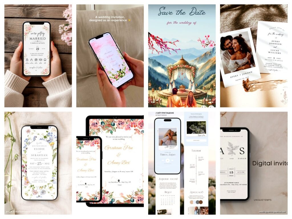
Okay So Mobile Wedding Invites Are Actually Kind of a Big Deal Now
Look, I’m gonna be straight with you – mobile wedding invitations are not just “a trend” anymore. Like, back in spring 2023 I had this couple who sent out these gorgeous letterpress invites that cost them literally $2,400, and then half their guests couldn’t find the venue because the tiny printed map was impossible to read and nobody actually keeps physical addresses anymore. They just… don’t. Everyone’s on their phones constantly anyway, so why are we still pretending people are gonna pin your beautiful cardstock invite to their fridge?
The thing is, about 85% of emails are opened on mobile devices now. Wedding invites sent digitally? Same deal. Your aunt Linda is checking her email on her iPhone while waiting in the Costco checkout line. Your college friends are scrolling Instagram during their lunch break. If your e-invite looks like garbage on a phone screen, it’s basically useless.
What Makes a Wedding Invite “Smartphone-Optimized” Anyway
So this is kinda technical but also not really? Basically you need your invitation to:
- Load fast even on crappy cell service
- Display correctly without people having to zoom in and out like they’re examining a treasure map
- Have clickable buttons that are actually big enough to tap with a normal human thumb
- Work on both iPhone and Android because yes, people still fight about this
- Not require people to download anything sketchy
The file size thing really matters. I learned this the hard way with a destination wedding in summer 2021 where the couple wanted this animated video invitation with their engagement photos and a soundtrack and the whole thing was like 45MB. Half their international guests never even saw it because it wouldn’t load on hotel wifi or international data plans. We had to remake the whole thing.
Responsive Design Is Your Best Friend
Responsive design basically means your invitation automatically adjusts to whatever screen size someone’s using. Desktop, tablet, phone – it reshapes itself to fit. Most good e-invite platforms do this automatically now, but you gotta check because some of the cheaper or DIY options… don’t.
When you’re designing, I always tell people to check it on an actual phone, not just resize your browser window. It’s different. The way your thumb interacts with buttons, how scrolling feels, whether text is actually readable without squinting – you need to physically test it. I usually check on at least three different devices because my cat stepped on my iPad once and somehow RSVPed “yes plus three” to a client’s wedding, which was mortifying but also proved that the buttons were too easy to accidentally tap.
Platform Options That Don’t Suck
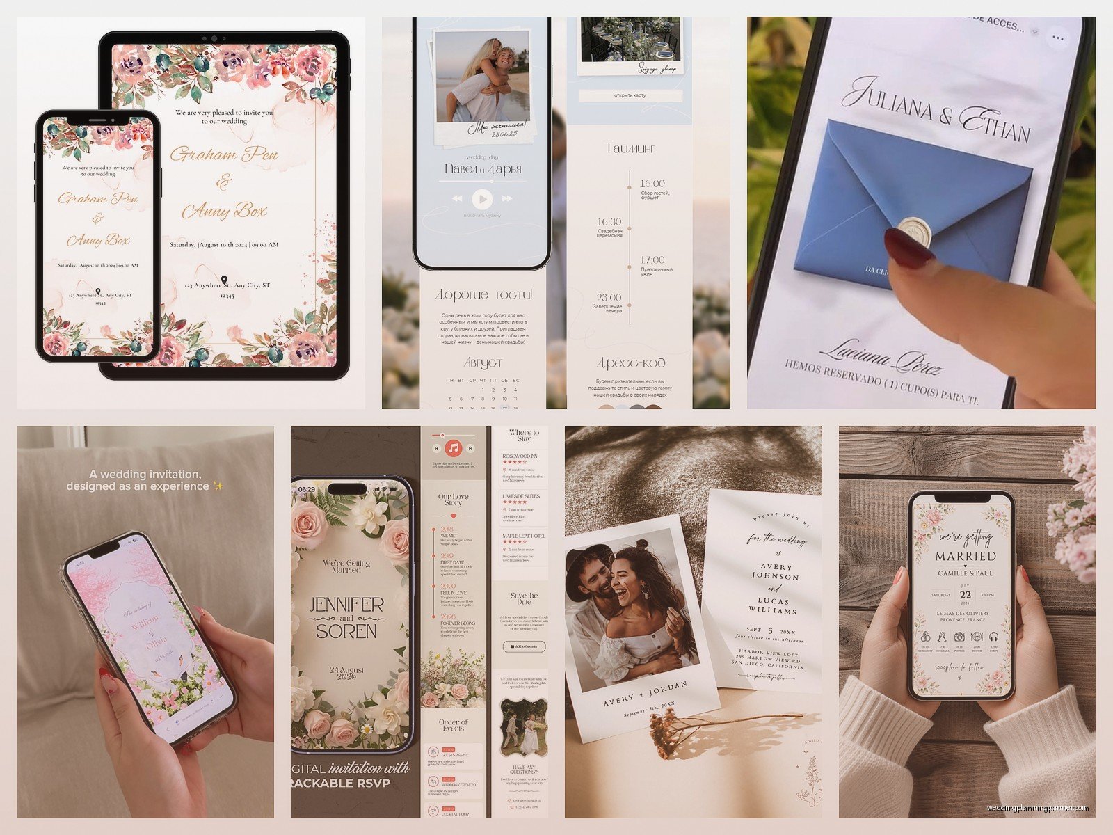
Alright so there’s like a million e-invite platforms out there and honestly most of them are fine? But here’s what I actually recommend to clients:
Paperless Post is probably the most well-known and their mobile optimization is solid. The free options are kinda limited but their paid designs are really beautiful. Everything’s responsive automatically and they have good tracking so you can see who opened what.
Greenvelope is similar but slightly more eco-focused in their branding, which some couples really care about. Their interface is clean and mobile-friendly.
Joy is the one I’ve been recommending most lately because it’s completely free for basic features and includes a whole wedding website builder. The RSVP system works really well on mobile and you can manage everything from your phone too.
Minted has digital options now that match their paper designs, which is nice if you’re doing like, paper invites for grandparents but digital for everyone else.
What annoys me though is when people try to just… create a regular graphic in Canva and text it to everyone as a photo. Nah. That’s not an e-invite, that’s just a picture. You need actual functionality – RSVP buttons, calendar integration, links to your registry or website, maybe directions that open in Google Maps. A static image doesn’t do any of that.
Design Stuff That Actually Matters on Small Screens
Okay so when you’re picking or designing your mobile invite, here’s what to think about:
Font size matters way more than you think. What looks elegant and delicate on your laptop screen is completely unreadable on a phone. I generally say nothing smaller than 14pt for body text, and your main details (date, time, location) should be even bigger. Some designers get really precious about typography and… look, I get it, but readability wins.
Vertical layouts work better than horizontal. Phones are vertical. People hold them vertically. Don’t make people turn their phone sideways to read your invite. Just design it to scroll down naturally.
Keep important info at the top. A lot of people won’t scroll if they don’t have to. Your names, date, and location should be visible immediately without scrolling. The registry link and accommodation details can be further down.
Use high contrast. That gorgeous pale pink text on white background? Invisible in bright sunlight when someone’s checking their phone outside. Dark text on light backgrounds or vice versa. Save the subtle tone-on-tone stuff for your paper goods if you’re doing those too.
The RSVP Situation
This is where mobile optimization really earns its keep because getting people to actually RSVP is like… pulling teeth sometimes? But when you make it really easy – like, they click one button and they’re done – response rates go way up.
Your RSVP form needs to be:
- Short as possible (just the essentials)
- Have big tap targets for checkboxes and buttons
- Not require people to type a lot on their phone keyboard
- Include meal choices if you need them, but use buttons not dropdown menus
- Have a clear confirmation message so people know it worked
I had this wedding where the RSVP form had like 15 questions including “what’s your favorite memory of the couple” and “song requests” and “do you have any advice for the newlyweds” and people just… didn’t fill it out. It was too much. Keep it simple: coming or not, how many people, meal choice if needed, dietary restrictions, done.
Calendar Integration Is Underrated
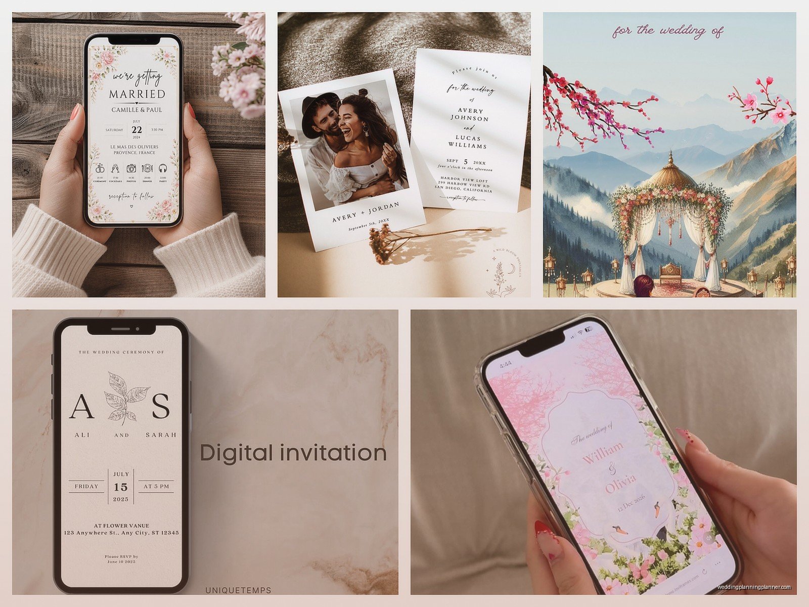
One feature that’s really helpful is when people can add your wedding directly to their phone calendar with one tap. Most good platforms include this automatically – it generates an .ics file or whatever the technical thing is. When someone clicks “Add to Calendar” it opens their phone’s calendar app with all the details already filled in. This is huge for making sure people actually show up on the right day because we’ve all seen those screenshots of people who show up to weddings on the wrong weekend.
Testing Before You Send
Please please please test your invites before sending them to 150 people. Send it to yourself first. Check it on your phone, your partner’s phone, maybe borrow your mom’s phone if she has a different type than you. Click every link. Try the RSVP form. Make sure nothing’s broken.
Things to specifically check:
- Do all the links actually work
- Does the RSVP form submit correctly
- Are the images loading (and loading quickly)
- Is everything spelled correctly (spell check doesn’t catch everything)
- Do the buttons actually look like buttons or are they confusing
- Can you read everything without zooming
- Does it work in both portrait and landscape mode
I once sent out save-the-dates for a client and the venue link went to a completely different venue in a different state because I copied the wrong Google Maps link. Someone caught it within an hour thankfully but that was… stressful.
Accessibility Stuff You Should Consider
Not everyone interacts with their phone the same way and I feel like this gets forgotten a lot. Some people use screen readers, some people have color blindness, some people have shaky hands or use assistive devices.
Basic things that help: use actual text instead of text embedded in images when possible (screen readers can’t read images), make sure your color contrast is strong enough, keep your navigation simple and logical, use clear descriptive labels for buttons like “RSVP Here” instead of just “Click Here.”
Also like, not everyone has the latest iPhone? Some of your guests might have older phones or budget Android devices. Your invite should still work for them. This usually means avoiding super fancy animations or features that only work on new devices.
The Timing Thing
When you send digital invites matters because people’s phones are… a lot. If you send it at 3am, it’s gonna get buried under 50 other notifications by morning. I usually recommend sending during normal business hours on a weekday, like Tuesday or Wednesday afternoon. Not Monday (everyone’s overwhelmed), not Friday (weekend mode activated, they’ll forget), not evenings when people are busy.
And you’re gonna need to follow up. Even with the easiest mobile RSVP system, people forget or procrastinate. Send a reminder like 2-3 weeks before your RSVP deadline. Most platforms let you see who hasn’t responded yet so you can send targeted reminders.
Combining Digital and Paper
Some couples do both and honestly that’s fine? Like, send mobile invites to your tech-savvy friends and traditional invites to your grandparents who still have a landline. Or send everyone paper invites but include a QR code that links to your mobile-optimized wedding website with RSVP functionality.
QR codes are actually really useful for this because people can just point their phone camera at it and boom, they’re at your website. No typing weird URLs. Just make sure the QR code is big enough to scan easily – at least 1 inch square on printed materials.
Common Mistakes I See All The Time
People try to cram too much information into the invite itself. Your e-invite should have the essential details and then link to your wedding website for everything else. Accommodations, registry, travel info, full schedule – that all lives on the website, not in the invite.
Using too many different fonts or colors. Like I get that you want it to be unique but when you have 5 different fonts and 8 different colors, it just looks chaotic on a small screen. Pick 2 fonts max (one for headers, one for body text) and a cohesive color palette.
Making the file size too big with huge images or animations. Keep your images optimized for web. There are free tools online that compress images without making them look terrible. Your invite should load in like 2 seconds max, even on a slower connection.
Forgetting to proofread. Auto-correct does weird things and you might not notice until it’s already sent to everyone. I once saw an invite that said “Please join us for our welding” instead of wedding and it became a whole thing.
Security and Privacy Considerations
If you’re using a platform that requires guests to create an account or login, some people won’t do it. They just won’t. Make the RSVP process as frictionless as possible – ideally they can respond without creating an account, maybe just entering their email address for confirmation.
Also be aware that if you’re collecting guest information (addresses for thank you cards, phone numbers, dietary restrictions), you’re responsible for keeping that data secure. Use reputable platforms that take privacy seriously. Don’t just throw together a Google Form and call it a day without checking the privacy settings.
What About Video Invites
Video invites are trendy right now and they can be really cute but they need to be SHORT. Like 30 seconds max. Anything longer and people won’t watch the whole thing, plus it makes the file size huge. And make sure the important information is also written out somewhere because not everyone can play videos with sound (maybe they’re at work, maybe they’re in a quiet place, maybe they’re hard of hearing).
If you do video, optimize it for mobile. That means vertical or square format, not horizontal. Add subtitles or text overlays with the key details. And have a thumbnail image that looks good because that’s what people see before they decide whether to press play.
I’m kinda obsessed with The Bear right now and there’s this episode where everything goes wrong during a dinner service, and that’s basically what happens when you don’t test your digital invites properly – everything falls apart in real-time and you can’t fix it once it’s out there… okay that’s probably a dramatic comparison but you get what I mean.
Managing Responses and Guest List
The beauty of mobile e-invites is that responses come directly into a dashboard you can check from anywhere. Most platforms let you export your guest list to Excel or whatever, see who’s responded, send reminders to people who haven’t, track meal choices, all that stuff.
You can check this from your phone too, which is weirdly addictive? Like you’ll be checking constantly to see if anyone new RSVP’d. Set boundaries for yourself or you’ll drive yourself crazy refreshing the page every 20 minutes.
Some platforms also let guests update their RSVP if their plans change, which is super helpful. Way easier than people texting you “actually I can’t make it anymore” two weeks before the wedding and you having to manually update everything.