
Planning Guides, Style Guide
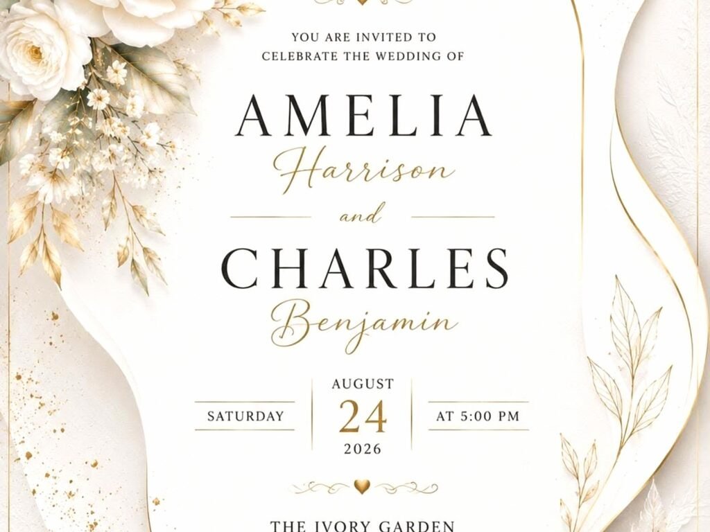
Reception Invitation Card: Post-Ceremony Party Design
May
Reception Invitation Cards Are Different From Your Ceremony Invites
Okay so first thing—and I cannot stress this enough because I literally had a bride freak out on me about this in spring 2023—your reception invitation is NOT the same as your ceremony invitation. If you already had the ceremony (maybe it was intimate, maybe it was a courthouse thing, maybe it was a destination wedding with just family), the reception invite needs different wording, different vibes, totally different approach.
The whole point is you’re inviting people to celebrate AFTER you’re already married. You’re not asking them to witness the vows. That ship has sailed. Now you’re basically throwing a party to be like “hey we did the thing, come eat cake with us.”
Timing Is Gonna Make or Break Your Design Choices
Here’s where you gotta think about the gap between ceremony and reception. Are we talking like… the ceremony was last month? Six months ago? A year ago? This matters SO much for your card design because it affects the formality level and the whole tone.
If your ceremony was super recent (like within 2-3 months), you can keep things fairly traditional-looking. Use your wedding colors if you want, reference your wedding date, make it feel connected to the original event. But if it’s been a while, honestly it starts feeling weird to do the whole formal wedding stationery thing. I had this couple once who got married during COVID in 2020 and didn’t do their reception until summer 2021, and we went with this really fun, almost garden-party style design because the formal moment had passed, you know?
The Wording Situation
This is where people get SO confused and I get it because there’s no like… standard template that everyone uses. But here’s what I typically recommend:
- Skip the “request the honor of your presence” stuff—you’re not requesting anything formal
- Use “invite you to celebrate” or “join us for a reception” or even just “let’s party”
- Include your married names (you’re already married!)
- Make it clear this is AFTER the ceremony happened
- Be specific about what kind of party this is—dinner? cocktails? dancing? backyard BBQ?
Sample wording I use a lot: “Jane and John Smith invite you to celebrate their marriage” or “Please join Mr. and Mrs. Anderson for a reception celebrating their recent marriage” or if you wanna be more casual “We got hitched! Come celebrate with Jane & John.”
Design Elements That Actually Work
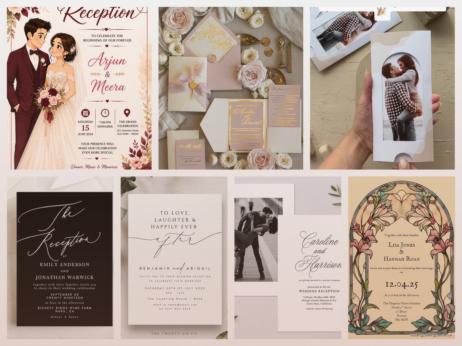
Alright so let’s talk about what goes on this card visually because I see people overthink this constantly.
Photos—Yes or No?
Including a photo from your actual ceremony is kinda genius for reception invites. It immediately tells people “this already happened, now we’re partying.” I love using a really good ceremony photo as like a small element on the invite, maybe in a corner or as a background with a light overlay. Not the whole card—that feels too much like a holiday card situation—but as an accent.
Some couples do an engagement photo instead which… okay fine, but it doesn’t really communicate the same thing? Like if you’re gonna use a photo, use one that shows you’re MARRIED married.
Color Schemes That Don’t Look Wedding-y
Here’s what annoys me: when people try to make their reception invite look exactly like their ceremony invite but with different words. It creates confusion! People think they missed something or got a duplicate or whatever.
I usually suggest picking 1-2 colors from your wedding palette but changing up the style completely. So if your wedding invites were blush and gold with formal calligraphy, maybe your reception invite is more modern with geometric shapes in gold and navy. Still connected but clearly different.
Or honestly? Just pick completely new colors that match the vibe of your reception. If you’re doing a casual backyard thing, sage green and terracotta might work better than your original champagne and ivory scheme.
Formality Level
You can go way more casual with reception invites unless your reception is like… at a country club or super formal venue. The ceremony is the formal part. The reception is the fun part. Your invitation design should reflect that.
I’m talking:
- Fun fonts instead of traditional script (but still readable please)
- Playful graphics—illustrations of champagne glasses, party decorations, whatever matches your theme
- Brighter colors
- Less traditional layout—you don’t need to center everything
- Modern typography mixing
My cat literally just knocked over my coffee while I’m writing this and I’m choosing to not deal with it yet, but anyway—
Size and Format Options
You don’t have to do the standard 5×7 invitation thing. Actually I kinda prefer when reception invites are different sizes because again, DIFFERENTIATION.
Postcard style works great for receptions. It’s casual, it’s affordable, it’s easy to mail. You can do a 4×6 or 5×7 postcard with all your info on one side and a photo or design on the other. Plus you save money on envelopes which, let’s be real, adds up.
Square invites (5.5×5.5 or 6×6) look modern and fun. They cost more to mail because of the shape but they stand out.
Flat cards vs folded—I usually say flat for receptions unless you have a LOT of information to include. Folded cards feel more formal and you probably don’t need that energy for a post-ceremony party.
What Information Actually Needs to Be on There
Okay here’s your checklist and don’t skip any of this:
- Your names (married names if you changed yours)
- Clear statement that this is a reception/celebration/party
- Date and time
- Full venue address—don’t assume people know where “The Riverside Pavilion” is
- Dress code if it’s not obvious
- RSVP date and method
- Your wedding website if you have one
Optional but nice:
- Registry info (or “your presence is the only present we need” if you’re into that)
- Hotel information if you have out-of-town guests
- A note about what to expect—is there dinner? just cocktails? dancing?
- Parking details if venue parking is weird
The RSVP Card Debate
Do you need a separate RSVP card for a reception invite? Honestly… I’m gonna say no most of the time. Just direct people to your website or give them an email address. If your crowd is older and not tech-savvy, maybe include a simple RSVP postcard, but I find that most people doing separate receptions are comfortable with digital RSVPs.
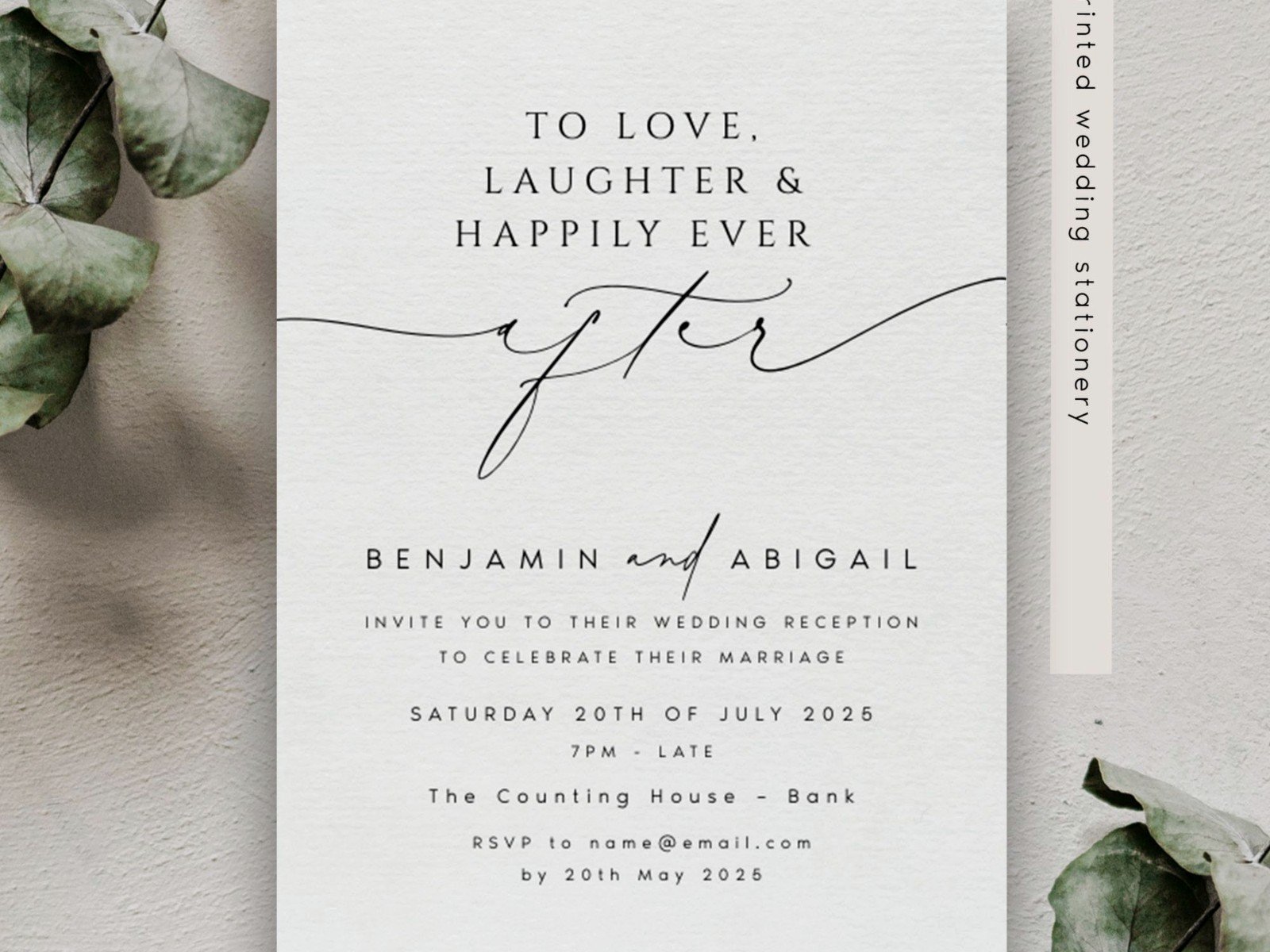
The RSVP deadline should be like 3-4 weeks before your reception so you can get final headcounts to your caterer and venue. I had this one couple who made their RSVP deadline only 2 weeks out and it was a NIGHTMARE trying to get final numbers.
Paper Quality and Printing Methods
You can definitely go less expensive with reception invites than ceremony invites. I’m not saying print them on copy paper, but you don’t need 130lb double-thick cotton cardstock either.
Good options:
- 100lb cardstock—substantial but not over the top
- Matte finish—looks modern and sophisticated
- Digital printing—totally fine for reception invites, way cheaper than letterpress or foil
- Online printing services—Minted, Zazzle, Vistaprint all have good options
If you wanna splurge on ONE special element, do foil on just your names or a small detail. You don’t need the whole card foiled.
Theme and Style Direction
Think about what kind of reception you’re actually throwing because your invite should… match that vibe? Seems obvious but you’d be surprised.
Backyard BBQ reception? Your invite can have casual script fonts, maybe some illustrated food elements, warm colors, relaxed layout. Don’t send a formal black and white invite for a BBQ.
Cocktail party at a rooftop venue? Go modern and sleek—clean lines, maybe some art deco elements, metallic accents, sophisticated color palette.
Destination reception (like you got married elsewhere but having a party in your hometown)? Include little elements that reference where you actually got married—palm trees if it was tropical, mountains if it was Colorado, whatever.
Formal dinner reception? Okay fine, you can go more traditional here but still keep it lighter than ceremony invites.
DIY vs Professional Design
Look, I’m a stationery person so obviously I lean toward professional design, but I also get that budgets are real and if you already spent a ton on ceremony invites, you might wanna DIY the reception ones.
If you’re going DIY:
- Use Canva—they have tons of templates you can customize
- Stick to 2-3 fonts maximum
- Make sure there’s enough contrast between text and background
- Print a test copy before ordering 100 of them
- Check margins—home printers especially have minimum margin requirements
If you’re hiring someone:
- Show them photos of your ceremony invites so they can intentionally make these different
- Be clear about your budget upfront
- Ask about rush fees if you’re on a tight timeline
- Get a proof before final printing—mistakes happen
Matching Envelope Situation
Envelopes for reception invites can be simple. You don’t need inner envelopes, you don’t need envelope liners (though they’re cute if you want them), you don’t need wax seals.
What you DO need is clear addressing. If you’re handwriting them, make sure your handwriting is actually legible or… just print labels. There’s this weird shame about using printed labels but honestly the postal service appreciates when they can actually read the address.
Colored envelopes can be fun for reception invites! A sage green envelope or dusty blue or even black—adds personality without adding much cost.
Timing for Sending These Out
Send reception invites 6-8 weeks before your event. You can go shorter (like 4 weeks) if it’s super casual or if most of your guests are local, but give people enough time to plan, especially if it’s on a weekend and they need to arrange childcare or whatever.
If your reception is during a holiday season or summer when people travel a lot, send them 8-10 weeks out. Actually I had this couple doing a Fourth of July weekend reception and we sent invites in April because we knew people book their summer plans early and it worked out great.
Digital Invites—Are They Okay?
Yes! Honestly for reception invites, digital is totally acceptable, especially if you’re on a budget or planning quickly or your crowd is younger and tech-comfortable.
Paperless Post, Greenvelope, even a nice Canva design sent as a PDF—all fine options. You can still make them beautiful and personalized. The key is making them look designed and intentional, not like you threw together an Evite in five minutes (no shade to Evite but… you know what I mean).
One thing about digital though—you’re gonna get fewer responses. People ignore emails way easier than physical mail sitting on their counter. So follow up more aggressively with digital invites.
Special Considerations
If you had a private ceremony and literally nobody was there except you two and maybe an officiant, your reception invite needs to make that clear. Something like “After a private ceremony in [location], we invite you to celebrate with us” so people don’t feel bad about not being invited to the ceremony.
If some people WERE at your ceremony, you might need two different invitation wordings—one for ceremony guests (“join us as we continue the celebration”) and one for reception-only guests (“join us to celebrate our recent marriage”). Or just use wording that works for both groups, which is usually easier.
Destination wedding situation where you had 20 people at the actual wedding and now you’re doing a bigger reception at home? Make it celebratory and inclusive in tone. You want everyone to feel excited to come, not like they’re at the B-list party or… actually this is probably its own topic that I could go on about for hours.
Common Mistakes I See All the Time
Making it look too much like a wedding invitation when it’s not—we covered this but seriously it’s the most common issue.
Not being clear about what kind of event it is. If you’re just doing cocktails and appetizers, SAY THAT. Don’t let people show up expecting a full dinner.
Forgetting to include an end time, which makes it hard for people to plan their day, especially if they have kids.
Using confusing wording that makes people think they missed your wedding and now they’re worried they offended you by not coming to something they weren’t actually invited to. Keep it simple and clear.
Choosing fonts that are impossible to read because they look pretty. Your 60-year-old uncle needs to be able to read the address without a magnifying glass.
Not proofreading. I once caught an invite that said “celerbation” instead of “celebration” right before it went to print and the bride almost died.