Planning Guides, Style Guide
Wedding Invitation Card Layout: Design & Ordering Guide
May
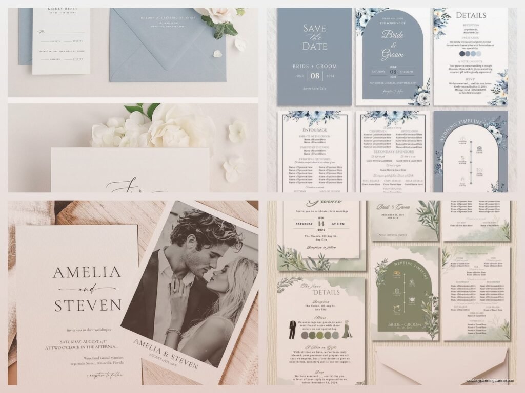
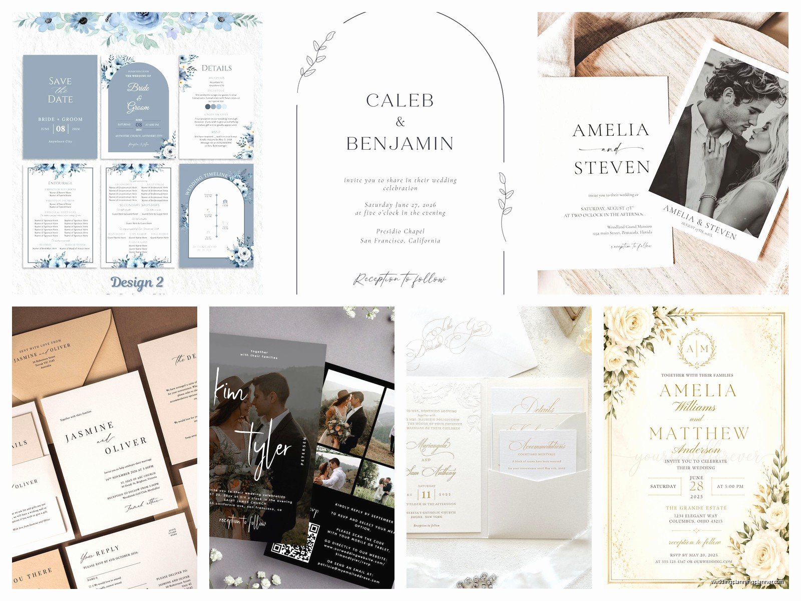
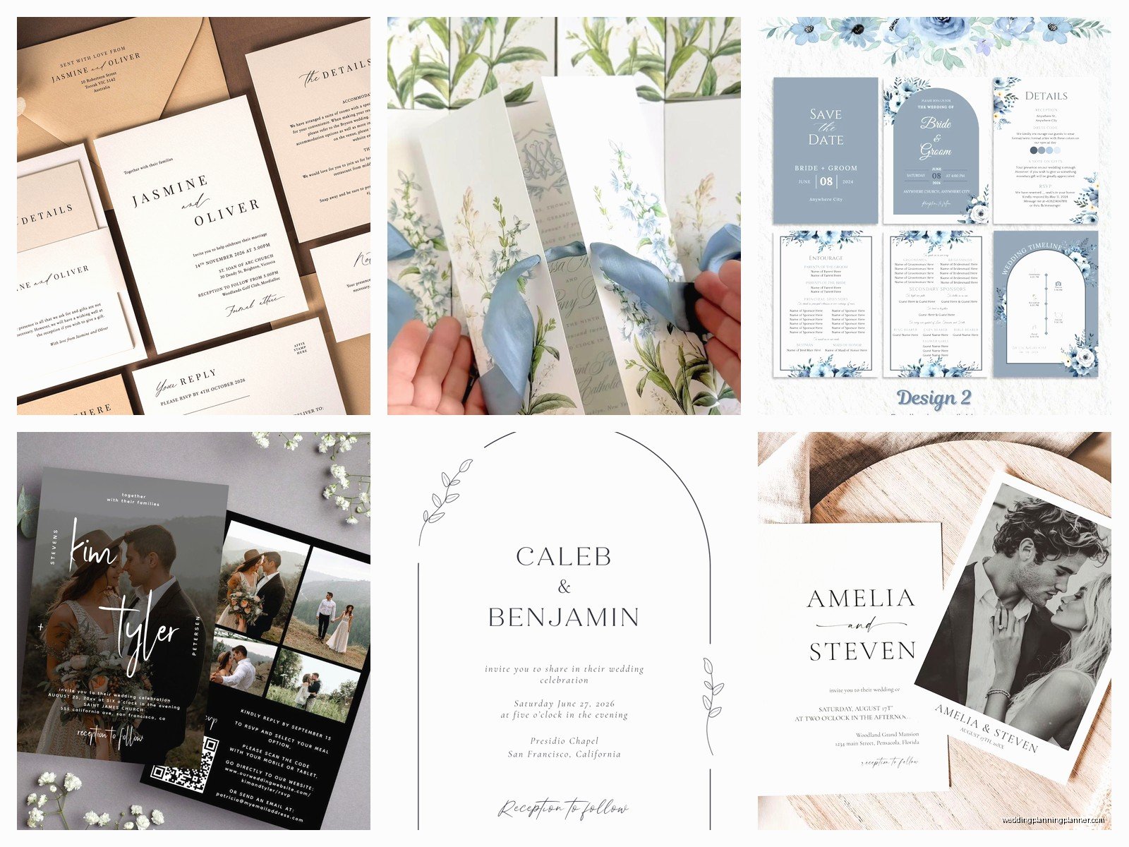
The Basic Layout Elements You Actually Need
Okay so the invitation card layout isn’t as complicated as everyone makes it seem but there ARE specific things that need to be on there and a specific order that just… works better. I learned this the hard way in summer 2021 when a bride called me crying because her invitations came back from the printer and she’d forgotten to include the actual ceremony TIME. Just the date. Can you imagine opening a wedding invitation that says “Join us on June 12th” and then… nothing about when to show up?
The standard layout goes like this: host line at the top (whoever’s hosting, usually “Mr. and Mrs. Parent Names request the honor of your presence”), then the request line (that’s the “request the honor” part or “invite you to celebrate”), then the couple’s names, then the date and time, then the venue name and address, then reception details if it’s at a different location.
Here’s what really needs to be on the main invitation card:
- Host line (who’s throwing this party)
- The actual request to attend
- Couple’s full names
- Date spelled out completely
- Time spelled out
- Venue name
- City and state
- Reception information if different location
The thing that annoys me SO much is when couples want to cram their entire love story onto the invitation. Like I get it, you met at a coffee shop and he spilled latte on your laptop and it was adorable, but that belongs on your wedding website, not on a 5×7 piece of cardstock that costs $8 per unit to print.
Size Matters More Than You Think
Standard invitation sizes are 5×7 inches or 5.5×8.5 inches. These are standard because they’re the most cost-effective to print and they fit nicely in standard envelopes that don’t cost a fortune. I always tell clients to stick with standard unless they have a really good reason not to.
Square invitations look gorgeous but they cost more to mail because the post office charges a non-machinable surcharge. Found this out when a client in spring 2023 had budgeted $0.73 per invitation for postage and then discovered she actually needed $1.10 because of the square shape plus the weight. That’s an extra $111 for 300 invitations that could’ve gone toward literally anything else.
If you’re gonna go custom size, just know:
- Anything under 5×7 looks cheap (sorry but it’s true)
- Anything over 6×9 gets pricey fast for printing AND mailing
- Square = extra postage always
- Weird dimensions = custom envelopes = $$$$
The Hierarchy Thing Everyone Forgets About
Visual hierarchy is basically making sure people’s eyes go where you want them to go. The most important info should be the biggest or boldest. Usually that’s the couple’s names. Then the date. Then the venue.
I see so many DIY designs where everything is the same size and weight and your eye just kinda… floats around the page not knowing where to land. It’s like when my cat Miso stares at the wall for no reason – there’s no focal point, just confusion.
Use at least three different text sizes. Your names should be the largest element. The host line and request line can be smaller and more elegant. Date and time should be prominent but not competing with the names. Venue info can be smaller still.
Font weights matter too. You can keep the same font family but use light, regular, and bold weights to create that hierarchy without making it look like a ransom note with twelve different fonts.
White Space Is Not Your Enemy
This is where people mess up constantly. They think they need to fill every inch of the card with text or design elements or borders or whatever. Nah. White space (or negative space if you wanna get technical) makes your invitation look expensive and elegant.
A good rule is that about 40% of your invitation should be empty space. Sounds like a lot but trust me on this. The breathing room makes everything more readable and just… prettier.
Margins should be at least 0.25 inches on all sides, but I usually recommend 0.5 inches. Anything closer to the edge and you risk important info getting cut off during trimming. Printers aren’t perfect and there’s always a tiny bit of shift that happens.
Typography Without Making Your Guests Squint
Alright so font size minimum should be 10pt for body text. I actually prefer 11pt or 12pt because hello, people over 50 exist and they shouldn’t need reading glasses just to see what time your wedding starts.
Script fonts are beautiful but use them sparingly. All-script invitations are hard to read and if someone’s name is Phillip or Millicent or something with lots of double letters, script fonts can make it look like “Philllip” or… you get the idea.
My go-to formula: elegant script or decorative font for names only, clean serif or sans-serif for everything else. Mixing two fonts is plenty. Three is pushing it. Four or more and you’re in graphic design jail.
Some font combinations that actually work:
- Garamond (body) + Allura (names)
- Montserrat (body) + Great Vibes (names)
- Cormorant (everything) in different weights
- Futura (body) + Edwardian Script (names)
Color Choices That Won’t Ruin Everything
Most invitations are black ink on white or cream cardstock because it’s classic and readable and photographs well. But if you want color, go for it – just be smart about it.
Dark text on light background. Always. Light text on dark background can look cool but it’s harder to read and more expensive to print because you’re printing the entire background.
If you’re doing colored text, make sure there’s enough contrast. Navy blue on cream? Great. Light pink on white? Can’t read it. Gray on ivory? Squinting required.
Metallic inks (gold, rose gold, silver) cost more than regular ink. Foil stamping costs even MORE than that. Just FYI when you’re budgeting. I had a bride who fell in love with rose gold foil and then nearly fainted when she got the quote for $2,400 for 150 invitations.
Wording That Doesn’t Sound Weird
Formal wording has specific rules and honestly they’re kinda outdated but some families still care about this stuff. “Honour” is spelled with a U for formal invitations (it’s the British spelling). “Request the honour of your presence” is for religious ceremonies. “Request the pleasure of your company” is for non-religious or reception-only.
But you don’t have to be formal. If you’re having a casual wedding, your invitation can say “Come party with us” or “Join us for tacos and dancing” or whatever fits your vibe.
Just be clear about the important stuff. I’ve seen invitations that were so cutesy and vague that guests didn’t know if kids were invited, if there was dinner, or if they needed to RSVP.
The Insert Cards Situation
Your main invitation shouldn’t have everything on it. That’s what insert cards are for. Typical inserts include:
- RSVP card with envelope
- Reception card (if ceremony and reception are different locations)
- Accommodations card with hotel blocks
- Weekend events card if you’re doing welcome drinks or brunch
- Direction or map card
- Wedding website card
Honestly though? You can put most of this info on your wedding website and just include a simple card with the website URL. Saves money on printing and postage because fewer cards = lighter envelopes.
The RSVP card is the one insert you probably can’t skip unless you’re doing online-only RSVPs. Even then, older guests appreciate having a physical card to mail back.
Assembly Order Because Apparently This Matters
There’s a traditional order for stacking everything in the envelope and yeah, it seems fussy, but it does make the invitation look more polished when someone opens it.
From bottom to top:
- Main invitation (face up)
- Tissue paper if you’re using it (I usually skip this, it’s kinda unnecessary)
- Reception card
- Other insert cards in size order, largest to smallest
- RSVP envelope face down with the flap on top
- RSVP card tucked under the envelope flap, face up
The whole stack goes into the envelope so when someone pulls it out, they see the invitation first.
Working With Printers Without Losing Your Mind
Okay so you’ve got your design sorted and now you need to actually print these things. You’ve got options: online print shops, local print shops, or DIY printing at home.
Online shops like Minted, Paperless Post’s print service, Zazzle, or Vistaprint are convenient and usually have good templates. Turnaround is typically 2-3 weeks. They’re gonna have design limitations though – you can only customize within their template structure.
Local print shops give you more control and you can see paper samples in person, which is huge because colors look different on screen than in real life. I always recommend getting a proof printed before committing to 200 invitations. Always. That $20 proof could save you from a $1,500 mistake.
DIY printing… look, I’m not gonna say don’t do it, but be realistic. Home printers can’t do heavy cardstock very well. The alignment is hard to get perfect. And if you mess up 15 invitations, you just wasted expensive paper.
Paper Stock Makes A Difference
Cardstock weight is measured in pounds (lb) or grams per square meter (gsm). For invitation cards, you want at least 80lb cover (216gsm) but 100lb cover (270gsm) feels more substantial.
Finish options:
- Matte – no shine, elegant, shows fingerprints less
- Glossy – shiny, colors pop, can look cheap if not done well
- Textured/linen – has a subtle texture, very classic
- Cotton – super luxe, expensive, feels amazing
I’m partial to matte cardstock with a slight texture because it feels expensive without being fussy. Cotton paper is gorgeous but you’re gonna pay like $4-6 per invitation just for the paper.
Ordering Timeline So You’re Not Screwed
Work backwards from your wedding date. Invitations should go out 6-8 weeks before the wedding. You need time for:
- Design and revisions: 2-3 weeks
- Proof approval: 3-5 days
- Printing: 2-3 weeks
- Shipping to you: 1 week
- Assembly and addressing: 1-2 weeks (this takes longer than you think)
- Mailing: factor in postal delays, add extra time
So you need to start the invitation process at least 3-4 months before your wedding. More if you want custom design or letterpress or anything fancy.
I had a couple who waited until 8 weeks before their wedding to start designing invitations and we had to do rush printing which cost an extra $300 and they still barely got them out in time and—wait, I’m getting stressed just thinking about it.
Addressing Envelopes Without Crying
You’ve got options here too: handwrite them (time-consuming but personal), print labels (easy but can look cheap), print directly on envelopes (need the right printer), or hire a calligrapher (beautiful but $2-5 per envelope).
If you’re printing addresses, use a nice font and make sure they’re properly formatted according to post office standards. Yeah, there are standards. The post office’s machines read addresses better when they’re formatted correctly.
Guest name goes on the outer envelope. If you’re using double envelopes (fancy), inner envelope has just names, no addresses.
Return address goes on the back flap or upper left corner of the front. I prefer back flap because it looks cleaner.
Postage Is More Complicated Than It Should Be
Take a fully assembled invitation to the post office and have them weigh it before you buy stamps. I cannot stress this enough. Invitations are almost always heavier than one stamp’s worth.
A standard invitation with several inserts usually needs about $1.10-$1.50 in postage. You can use regular forever stamps (you’ll need 2-3 per envelope) or buy pretty wedding stamps.
Hand-canceling is when the post office manually processes your envelopes instead of running them through the sorting machine. This prevents the envelopes from getting beat up and keeps any wax seals or embellishments intact. It’s free but you have to specifically request it and some post offices are annoying about it.
Common Mistakes That’ll Haunt You
Not ordering enough invitations. Get at least 10-15 extra. You’ll mess some up during assembly, addresses will change, you’ll want keepsakes.
Forgetting about RSVP postage. Put a stamp on those RSVP envelopes or people won’t send them back. Yes, even though they should, they won’t if there’s no stamp.
Using an email address that’s hard to type. If you’re including your wedding website, make sure the URL is short and simple. Not “www.johnandcatherinegetmarriedseptember2025.com” – just “johncatherine2025.com” or whatever.
Not proofreading. Have at least three people read the proof before you approve it for printing. Fresh eyes catch mistakes you’ve looked at so many times you can’t see them anymore.
Budget Real Talk
Invitations typically cost $300-$800 for 100 invitations including all the inserts and envelopes. That’s for standard printing from an online shop. Custom design adds $200-500. Letterpress or foil stamping adds $800-2000. Calligraphy adds another $200-500.
You can definitely DIY for cheaper – like $100-200 if you design it yourself using Canva or whatever and print through a budget printer. Just know what you’re getting into time-wise.
Ways to save money without looking cheap: skip the extra inserts and put info on your website, use digital RSVPs, print your own belly bands or ribbon instead of buying them, choose standard sizes, stick to one or two ink colors.
The invitation is the first impression of your wedding so it’s worth investing something here, but you don’t need to go broke over it. Your guests will look at it for like 30 seconds and then stick it on their fridge with a magnet shaped like a pineapple or something. Just saying.