Planning Guides, Style Guide
Wedding Invitation Card With Photo: Design & Ordering Guide
Jun
Photo Invitation Cards Are Actually Way More Complicated Than You Think
So you want to put a photo on your wedding invitation and honestly this is where like 60% of my clients get stuck because they think it’s just slapping a picture onto cardstock but nah it’s way more involved than that. I learned this the hard way back in spring 2023 when a bride sent me what she thought was a print-ready file and it was literally a screenshot from Instagram. We had to start over completely.
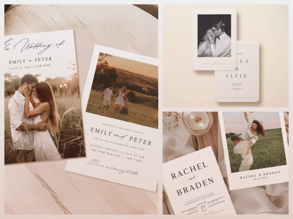
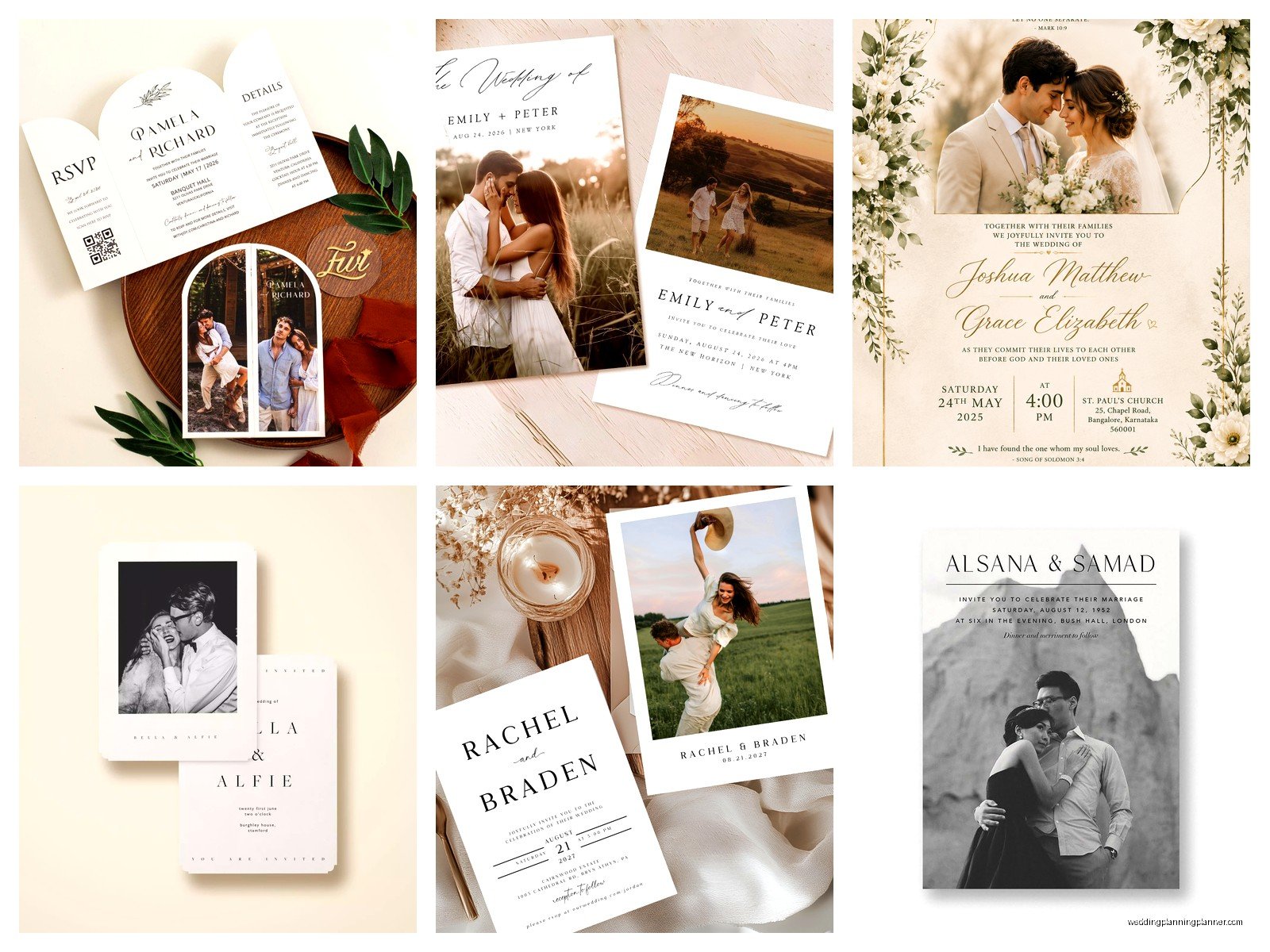
First thing – you gotta decide what kind of photo invitation you actually want because there are like four main categories and they all require different approaches. There’s the full-photo-background style where your engagement pic is the entire card, there’s the photo-as-an-element design where it’s incorporated into a layout with text and graphics, there’s the photo-on-the-back situation, and then there’s multiple photos arranged in a collage style. Each one has different file requirements and honestly different price points too.
The Photo Quality Thing Nobody Wants to Hear
Your photo needs to be high resolution and I’m gonna be super specific here because this is where people mess up constantly. You need at least 300 DPI (dots per inch) at the actual printed size. So if your invitation is 5×7 inches and you want the photo to fill the whole thing, your image file needs to be 1500×2100 pixels minimum. Phone photos can work but only if they’re recent iPhone or high-end Android pics taken in good lighting, not zoomed in.
What really annoyed me last year was this groom who kept insisting his photo was “fine” because it looked good on his computer screen, but screens only need 72 DPI so obviously it looked fine there but it was gonna print all pixelated and blurry. We went back and forth for like two weeks before his fiancée finally got him to use a different photo from their photographer’s gallery.
If you’re using professional engagement photos – which honestly is the easiest route – make sure you download the high-res versions from your photographer, not the web gallery proofs. I’ve seen people accidentally use watermarked preview images and then act shocked when the watermark prints on 150 invitations.
Design Layouts That Actually Work
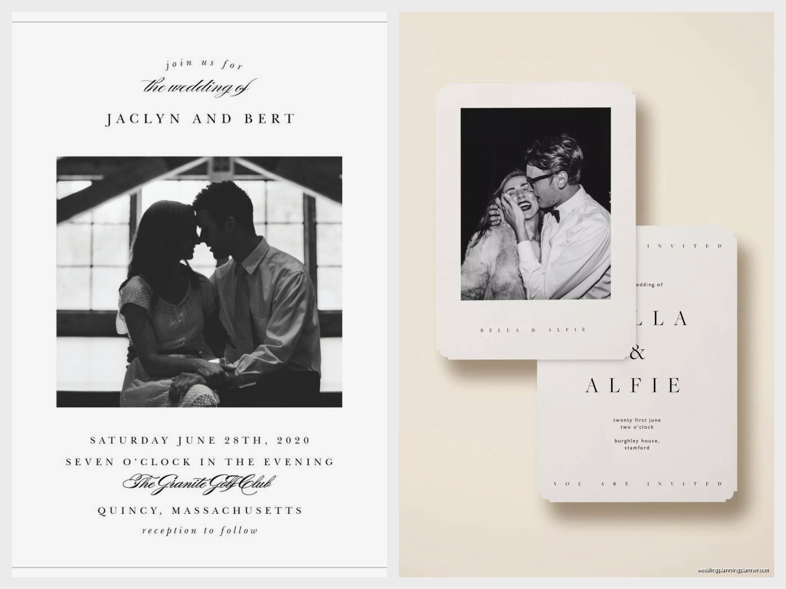
Alright so once you have your photo sorted, you need to think about layout and this is where it gets fun or frustrating depending on your personality type. The full-bleed photo background is super popular right now – that’s where the photo extends all the way to the edges with no border. Your text goes right on top of the image, usually in white or a light color if it’s a darker photo, or in a dark color if your photo is light and airy.
The trick with this style is making sure there’s enough contrast so people can actually read your text. I usually tell clients to either add a subtle overlay (like a semi-transparent white or black layer) behind the text, or make sure the photographer can edit the photo to lighten or darken specific areas where text will go. You don’t want your ceremony time disappearing into someone’s navy suit jacket or whatever.
The Frame/Border Approach
If you want something a bit more traditional-looking, you can do a framed photo design where the picture sits in a specific area and the rest is solid colored cardstock or has decorative elements. This is actually easier to work with because you’re not fighting with the photo for readability. The photo might be at the top third of the card, or along one side, or even as a smaller element with botanical illustrations or geometric shapes around it.
My cat knocked over my coffee while I was working on a design like this last month and I had to redo the whole mockup but honestly the second version was better anyway so thanks Mochi I guess.
For the layout you’re gonna want to think about hierarchy – what do guests need to see first? Usually it’s your names, then the date, then the location, then the time and other details. The photo should enhance this, not compete with it. I’ve seen designs where the photo is so dominant that you have to like search for the actual wedding information which defeats the entire purpose.
Color Coordination Is Sneakily Important
Something people don’t think about until it’s too late is how the colors in your photo affect the overall invitation design. If your engagement photo has a lot of warm sunset tones – oranges, pinks, golds – and then you try to pair it with cool navy and silver text and design elements, it’s gonna look off. Not terrible necessarily but just… not cohesive.
I usually pull 2-3 colors directly from the photo to use in the text and design elements. Most design programs have an eyedropper tool that lets you sample colors from your image. So if there’s a beautiful dusty blue in the background of your photo, use that exact shade for your header text or a decorative border. It makes everything feel intentional instead of like you just randomly chose colors.
Choosing The Right Printing Method
Okay this is where it gets technical but stay with me because it actually matters for your final product. There are three main printing methods for photo invitations: digital printing, offset printing, and thermography. Digital is the most common and most affordable for photo invitations because it handles color really well and you can print small quantities without the price per unit being insane.
Digital printing uses basically a fancy version of a laser printer and it’s perfect for full-color photos. The quality is really good now – like way better than it was even five years ago. Most online invitation companies use digital printing. It’s gonna cost you somewhere between $1.50 and $4 per invitation depending on paper quality and size.
Offset printing is the traditional method and it can produce slightly richer colors but it requires a minimum order quantity usually around 250-500 pieces and there are setup fees. For most couples this doesn’t make sense unless you’re having a massive wedding or you’re really particular about color accuracy. I had a bride in summer 2021 who insisted on offset printing because her mom used it for her wedding invitations in 1989 or something and honestly the difference was so minimal that I’m not sure it was worth the extra $600 but whatever makes you happy I guess.
Thermography is that raised printing technique and it doesn’t really work well with photos. You can have thermography text on a card with a photo but the photo itself needs to be digitally printed. So if someone tries to sell you fully thermographed photo invitations, that’s not really a thing.
Paper Stock Options Get Overwhelming Fast
The paper you choose makes a huge difference in how your photo looks when printed. Glossy or semi-gloss paper makes photos look vibrant and colors pop – it’s like the difference between a magazine photo and a newspaper photo. The downside is that glossy paper shows fingerprints easily and can feel a bit cheap if it’s too thin.
Matte paper gives you a softer, more elegant feel and it’s easier to write on if you’re addressing envelopes by hand or having guests fill anything out. Photos on matte paper look more subtle and sophisticated but they can sometimes appear slightly less vibrant. I personally love matte finishes – they feel more expensive even when they’re not.
Then there’s textured paper like linen or felt finishes which add dimension but can sometimes interfere with fine photo details. If your photo has a lot of intricate elements or small details, stick with smooth paper. Textured papers work better when the photo is more about overall mood and color than specific details.
Paper weight matters too – you want at least 100lb cardstock for invitations. Anything lighter feels flimsy. Most premium invitations are 120lb or 130lb cardstock which feels substantial without being awkwardly thick.
Working With Online Design Tools vs Hiring Someone
Most invitation websites now have pretty decent design tools where you can upload your photo and customize templates. Minted, Zola, Artifact Uprising, Shutterfly – they all have user-friendly interfaces. The templates are actually well-designed for the most part and they handle all the technical file setup stuff automatically so you don’t need to worry about bleed lines or color modes or any of that.
The limitation is that you’re working within their template structure. You can change colors, fonts, move text boxes around a bit, but you can’t completely customize everything. For probably 80% of couples this is totally fine and you’ll end up with a nice invitation.
If you want something more unique or you have a specific vision, you might need to hire a designer. Wedding invitation designers charge anywhere from $300 to $1500+ for custom work depending on their experience and how many revision rounds you need. They’ll create your design in professional software like Adobe InDesign and give you print-ready files that you can take to any printer.
Or there’s the middle ground – buying a template from Etsy or Creative Market for like $15-40 and customizing it yourself in Canva or Photoshop if you’re kinda tech-savvy. This gives you more flexibility than website builders but doesn’t require hiring a designer.
The Actual Ordering Process
Once your design is finalized you gotta order a proof before printing the full quantity. I cannot stress this enough because I’ve seen so many disasters where people skip the proof to save time and then their invitations arrive with a typo or the photo is weirdly cropped or the color is way off from what they expected on screen.
Digital proofs (PDF previews) are helpful but they don’t show you actual color accuracy or paper quality. Physical proofs cost extra – usually $10-30 depending on the company – but they’re worth it if you’re particular about how things look. You can see exactly what your guests will receive.
Turnaround time varies a lot. Online companies usually quote 2-3 weeks for production after you approve the proof, but during busy season (January through May basically) it can stretch to 4 weeks. Local print shops might be faster – sometimes 1-2 weeks – but they’re often more expensive per unit.
Order extras. This is just practical advice because you’re gonna forget people or addresses will be wrong or someone will spill coffee on theirs or you’ll want to keep a few for your own records. I tell clients to order 10-15% more than their actual guest count.
What About Envelope Liners And All That Extra Stuff
Since you’re already doing photo invitations you might be tempted to go all out with matching envelope liners, belly bands, wax seals, whatever. This can look amazing but it also adds cost and assembly time. Envelope liners with a photo or coordinating pattern run about $0.75-2.00 each. Belly bands are another $1-3 per invitation.
I think envelope liners are worth it if your budget allows because they create such a nice reveal moment when guests open the envelope. But belly bands are kinda unnecessary unless you have multiple enclosure cards that need to be held together – they’re mostly decorative.
One thing that actually matters more than fancy extras is getting good envelopes. If you’re doing photo invitations with nice paper and design, don’t cheap out with flimsy envelopes. Spend the extra $0.30 per envelope for heavier weight or colored envelopes that complement your design.
File Format Technical Stuff You Might Need
If you’re working with a designer or a local print shop they’re gonna ask for specific file formats and honestly this confused me when I first started too but here’s what you need to know. Print files are usually PDF format, specifically PDF/X-1a or PDF/X-4 which are print-optimized. The color mode needs to be CMYK not RGB – this is super important because RGB is for screens and CMYK is for printing and the colors will look different.
Your photo should be embedded in the file, not linked, and it needs to be in CMYK mode too. Most professional photos are in RGB so they need to be converted. This affects the colors slightly – usually things look a tiny bit less vibrant in CMYK – but it ensures what you see in the proof is what actually prints.
Bleed is another thing – that’s the extra 0.125 inches around all edges that gets trimmed off. Any background colors or photos that go to the edge need to extend into this bleed area so you don’t end up with white borders. The design tool or your designer handles this but it’s good to understand what it means if they mention it.
When Photos Don’t Work As Well
I’m gonna be honest, there are some situations where photo invitations aren’t the best choice. If you’re having a black-tie formal wedding, a photo invitation might feel too casual unless it’s done in a really sophisticated way – like maybe a formal portrait in black and white with elegant typography. Super traditional families sometimes expect classic engraved invitations without photos.
Also if your wedding has a very specific color scheme and your engagement photos don’t match it at all, forcing a photo onto the invitation might work against your overall aesthetic. Like if your wedding is all burgundy and emerald green but your photos are beachy with aqua water and sand tones, that’s gonna feel disconnected… or maybe you make it work by using the photo on a save-the-date instead and going non-photo for the actual invitation.
Budget-wise, photo invitations aren’t necessarily more expensive than non-photo ones but they’re not cheaper either. If you’re really trying to keep costs down, simple text-based designs on nice paper can actually look more elegant and cost less than a photo invitation on basic paper.
Proofreading Is Not Optional
Check every single detail before you approve anything for printing. And I mean have multiple people check it because you’re gonna be blind to errors after staring at your invitation for weeks. Common mistakes I see: wrong date (especially getting the day of the week wrong – make sure Sunday April 15th is actually a Sunday), misspelled venue names, missing or wrong times, outdated website URLs if you included one.
Check that your photo isn’t accidentally flipped or mirrored – this happens more than you’d think with design software. Make sure no one’s head is cut off awkwardly or that important details aren’t lost in the trimmed areas. Zoom in on the digital proof and look at every word individually.
Also confirm your return address on the envelopes is correct because you’ll want RSVPs to actually get back to you. Triple-check the RSVP deadline date makes sense – it should be at least 3-4 weeks before your wedding date to give you time to get final counts to your caterer.