Planning Guides, Style Guide
Wedding Invitation Paper: Card Stock & Material Guide
May
Okay so card stock is basically everything when it comes to invitations
The weight matters SO much and nobody tells you this until you’ve already ordered 150 invitations that feel like printer paper. I learned this the hard way in summer 2021 when a bride called me literally crying because her invitations arrived and they were flimsy. The vendor had listed them as “cardstock” but they were like 80lb cover which is… not it.
So here’s what you gotta know about weights. Card stock is measured in pounds (lbs) or sometimes GSM (grams per square meter) if you’re ordering from European suppliers or fancy boutique printers. For wedding invitations, you want at least 80lb cover stock as your absolute minimum, but honestly I recommend 100lb or 110lb cover. That’s gonna feel substantial when someone picks it up. It says “we spent money on this” without actually saying it.
The difference between 80lb and 110lb is wild. Hold them side by side and the 80lb feels like something you’d print a school project on. The 110lb has this weight to it that just feels expensive and intentional.
Cover stock vs text stock (this confuses everyone)
Alright so there’s cover stock and text stock and they measure them differently which is super annoying. Text stock is thinner – it’s what you’d use for like, the actual pages inside a book. Cover stock is thicker and what you want for invitations. But here’s where it gets confusing: 80lb text stock is NOT the same thickness as 80lb cover stock. The cover stock is thicker. I know. It makes no sense.
When you’re ordering, always specify COVER stock. If a vendor just says “cardstock” ask them to clarify. Trust me on this.
Material types and what they actually mean for your invitations
There are so many paper types and everyone acts like you should just automatically know what they are. You don’t. Most people don’t. I’ve been doing this for years and I still sometimes have to google specific finishes.
Matte cardstock
This is your standard, no-shine finish. It’s smooth, it prints really well, and it’s the easiest to write on if you’re doing hand calligraphy for addresses. Matte is reliable and classic. You can’t really go wrong with it. The texture is subtle and it photographs well without any weird glare. I use matte probably 60% of the time because it’s just… easy. It works.
Glossy or gloss cardstock
Shiny finish, very smooth. Colors look super vibrant on glossy stock which is cool if you have a really colorful design. But – and this is important – it shows fingerprints like crazy. Also if you’re planning to write addresses by hand, some pens will smudge on glossy. You’ll want to test your pens first. I had a situation in spring 2023 where we did these gorgeous glossy invitations with a watercolor design and the bride wanted to hand-address them and we had to find specific gel pens that wouldn’t smear. It took forever.
Glossy also can look a bit… I don’t wanna say cheap but sometimes it gives very “printed at home” vibes even when it’s professionally done. Use it for modern designs with bold colors, not for traditional formal weddings.
Linen cardstock
This has a subtle crosshatch texture that looks like linen fabric. It’s textured but not too much. Linen is really popular for classic, traditional weddings. It has this established, old-money kind of feel without being pretentious. The texture does mean that really fine details in your design might not print as crisply, so keep your designs a bit simpler if you go with linen.
I love linen for neutral color palettes – whites, creams, soft grays. It just works.
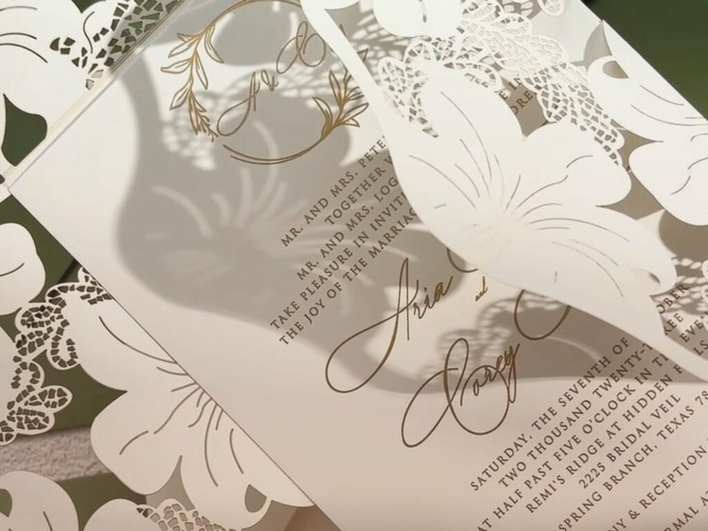
Cotton paper
Okay cotton paper is where you start getting into the fancy territory. This is made with cotton fibers (usually 25% or 100% cotton) and it has this soft, substantial feel. It’s thick, it’s textured, and it feels expensive because it IS expensive. Cotton paper often has deckled edges (those soft, torn-looking edges) which look gorgeous but also mean you’re gonna pay more.
100% cotton is what you see for like, really high-end letterpress invitations. It’s soft enough that the letterpress can create that deep impression. If you’re doing digital or offset printing, you don’t necessarily need cotton – but if you want that luxury feel, it’s worth it.
The thing that annoyed me recently was a bride who insisted on 100% cotton for 300 invitations and then wanted to add all these inserts and details and couldn’t understand why the budget was so high. Like… you picked the most expensive paper option and then added six enclosure cards. The math isn’t mathing.
Pearlescent or shimmer cardstock
This has a subtle sparkle or pearl finish. It catches the light and has this elegant shimmer without being over-the-top glittery. I actually really like pearlescent for evening weddings or formal events. It photographs beautifully and feels special.
The shimmer comes in different colors too – you can get pearl white, champagne, rose gold, silver. Just make sure your design doesn’t get lost in the shimmer. Simple, elegant designs work best.
Kraft paper
This is that brown, recycled-looking paper. Very rustic, very casual. Perfect for barn weddings or outdoor celebrations. Kraft paper is usually not super heavy – you’ll see it in lighter weights – and it has this organic, handmade vibe. Some people love it, some people think it looks unfinished. There’s no middle ground really.
If you’re doing kraft, lean into the rustic theme completely. Don’t try to make it formal. It won’t work.
Specialty papers that are kinda extra but sometimes worth it
So beyond your basic cardstocks you’ve got some specialty options that can really make your invitations stand out but also… they’re not always necessary? Depends on your vibe and budget.
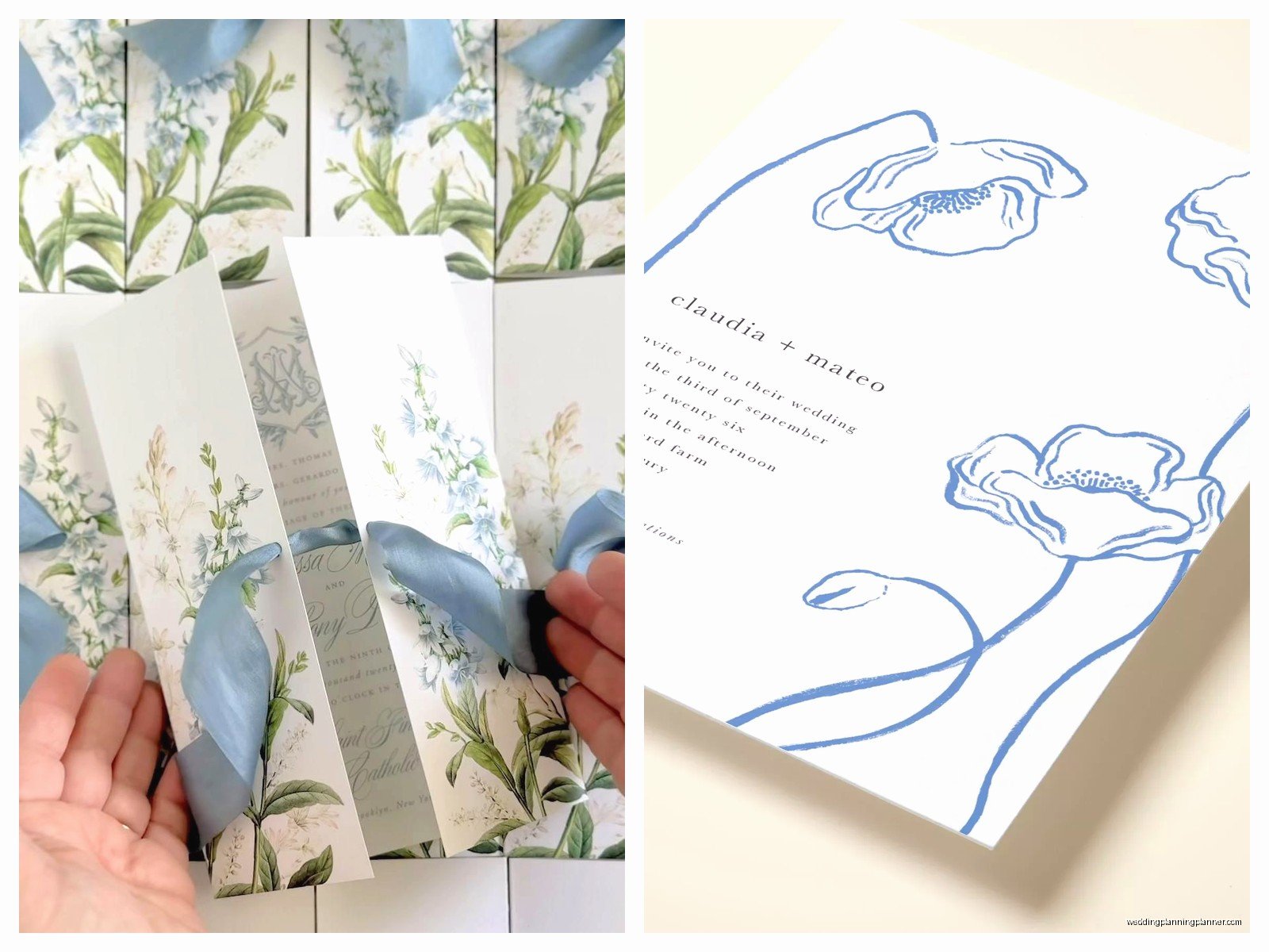
Vellum
Vellum is that translucent, frosted paper that you layer over other paper. It’s not thick enough to be a full invitation on its own – it’s usually 17lb to 30lb. You use it as an overlay, often with text printed on it, placed over a colored or patterned card. It’s really pretty and romantic but it’s also an extra piece which means extra cost for printing and assembly.
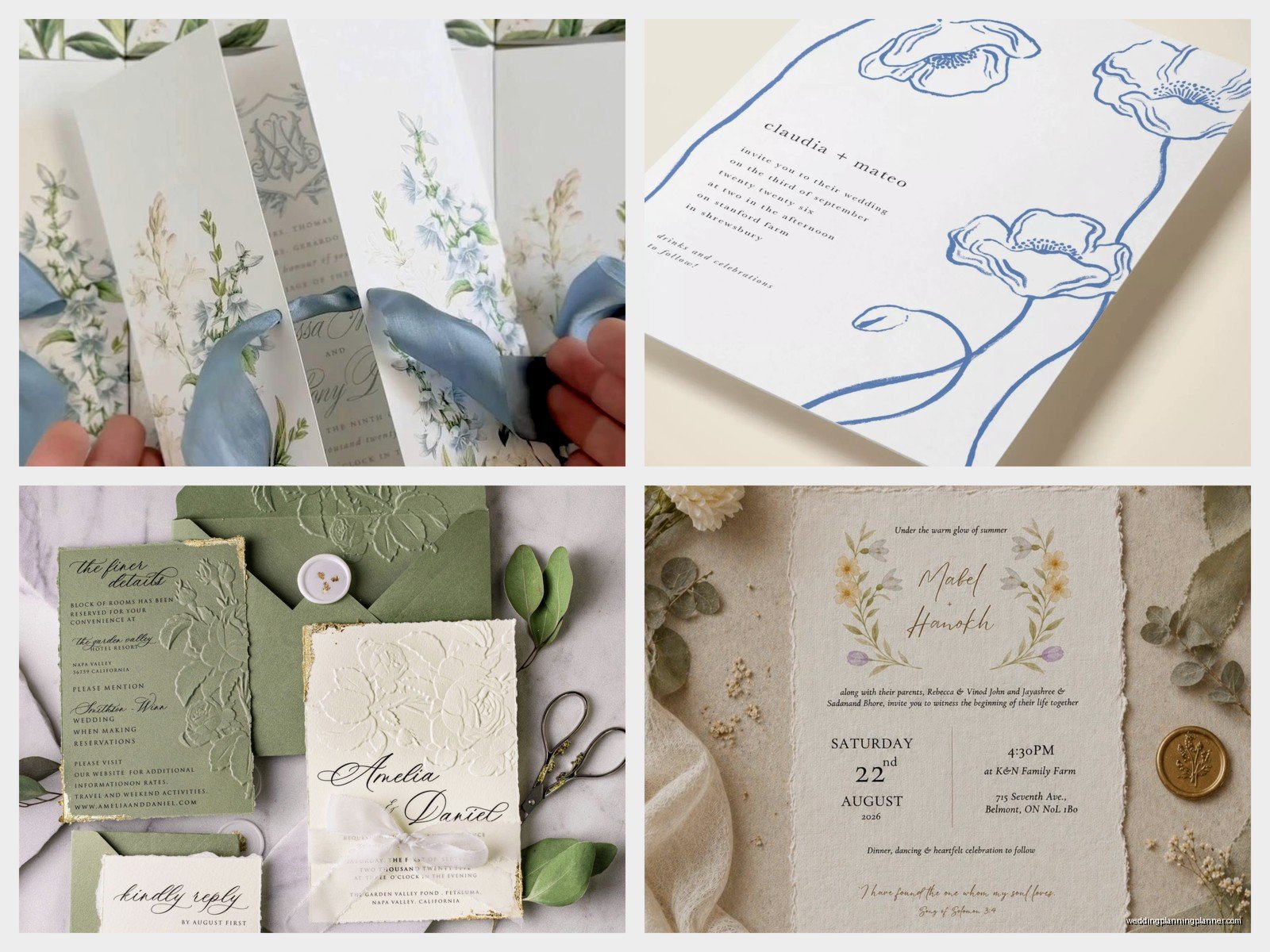
I use vellum a lot for modern weddings or when someone wants to soften a bold design. The translucent quality is just really elegant.
Handmade paper
This is paper that’s literally made by hand, often with visible fibers, flower petals, or other inclusions. Each sheet is slightly different. It’s beautiful and unique but it’s also expensive and can be hard to print on. You usually need to find a printer who’s experienced with handmade papers because they don’t feed through printers the same way.
Handmade paper is for people who really want something one-of-a-kind and have the budget for it.
Metallic cardstock
Actual metallic paper – gold, silver, copper, rose gold. Not shimmer, but like actual metallic finish. It’s bold. It’s dramatic. It’s definitely not for everyone. The thing with metallic is that it can be hard to print on – some printing methods don’t work well on metallic surfaces. You might need to do foil stamping or letterpress instead of digital printing.
But if you want glamorous and you want people to remember your invitation? Metallic does that.
How to pick the right paper weight for your invitation suite
This is where people get overwhelmed because you’re not just picking paper for one piece, you’re picking it for multiple pieces and they all need to work together but they don’t all need to be the same weight.
Here’s my general approach and you can adjust based on what feels right:
Main invitation card: 110lb cover stock minimum. This is your star piece. It should feel substantial. If you’re doing letterpress or if budget allows, go for 100% cotton in 118lb or similar.
Response card: 80lb to 100lb cover. It can be slightly lighter than the invitation but still needs to feel like quality cardstock. Remember people are gonna mail this back so it needs to hold up.
Details card (accommodations, directions, etc): 80lb cover is fine. These are informational so they don’t need to be as heavy. Or you could do 70lb text stock if you want them to feel distinctly different from the invitation.
Envelope liners: If you’re doing custom liners, use text weight paper (around 60lb-70lb text). It needs to be thin enough to fold and fit inside the envelope without adding too much bulk.
My cat just knocked over my coffee while I’m writing this so if there are typos… that’s why. Anyway.
Practical things nobody mentions until it’s too late
Okay so here’s the stuff I wish someone told every couple before they order invitations:
Postage. Heavier paper means heavier invitations means more postage. If your assembled invitation weighs over 1oz, you need extra postage. If it’s thick or has anything lumpy (wax seals, ribbon), it might be non-machinable which means EVEN MORE postage. Take a fully assembled invitation to the post office and have them weigh it before you buy stamps.
Printer compatibility. Not all papers work with all printing methods. If you’re DIY printing at home, test your paper first. Some textured or thick papers won’t feed through home printers. Ask your printer (professional or home printer) what they recommend.
Envelopes need to match the formality. Don’t put a gorgeous 110lb cotton invitation in a cheap flimsy envelope. The envelope is what people see first. Invest in good envelopes. They should be at least 24lb paper, preferably with a nice finish or lining.
Sample everything. Order paper samples before you commit to 150 invitations. Most paper suppliers will send you samples for free or cheap. Touch them. Write on them. See how they photograph. What looks good online might feel wrong in person or vice versa.
Combining different papers in one suite
You can totally mix paper types and it actually looks really good when done intentionally. Like you might do your main invitation on white cotton cardstock, then add a vellum overlay with gold printing, then have your details card on kraft paper for contrast. Or do matte for most pieces but use shimmer for the response card.
The key is making sure everything still feels cohesive. They should share some element – color palette, printing style, design theme – so they obviously go together even though they’re different papers.
Budget real talk
Paper quality affects your budget significantly. Here’s roughly what you’re looking at:
Basic matte or linen cardstock: Most affordable, totally acceptable for any wedding.
Cotton paper: Maybe 30-50% more expensive than basic cardstock.
Specialty papers (handmade, metallic, etc): Can be 2-3x the cost of basic cardstock.
If you’re working with a tight budget, put your money into the main invitation card and use simpler, lighter paper for the inserts. Nobody’s gonna judge you for having your accommodations card on regular cardstock.
Where to buy paper if you’re DIYing
If you’re printing your own invitations you can buy cardstock from:
- Paper Source – good selection, you can see and touch everything in store
- Cards & Pockets – huge variety online, great for DIY projects
- LCI Paper – wholesale pricing if you’re buying in bulk
- Neenah Paper – they make really high-quality cardstock
- French Paper – beautiful colors and textures
- Even places like Michael’s or Hobby Lobby have decent cardstock for simple projects
Always buy extra. Like at least 25% more than you need because you WILL mess some up. You’ll have printer jams or you’ll smudge ink or you’ll just decide you hate how one looks and want to redo it.
Testing your paper before committing
This is gonna sound excessive but print test invitations on your chosen paper before you print all of them. Print one complete invitation, assemble it exactly how you plan to assemble all of them, put it in the envelope, seal it, and look at it. Does it feel right? Does it look balanced? Is the paper weight what you expected?
Then mail that test invitation to yourself. See what condition it arrives in. See if the envelope stays sealed. Check if anything smudged or if the paper warped at all. Better to discover problems with one test than with 150 finished invitations.
I can’t tell you how many times this has saved clients from disasters. One time we discovered that the ribbon we were using bled dye onto white envelopes during transit. If we hadn’t tested it first, all 200 invitations would’ve arrived with pink stains on them.
Also photograph your test invitation in different lighting – natural light, indoor light, flash. Make sure it photographs how you want it to because everyone’s gonna photograph their invitation and post it.