
Planning Guides, Style Guide
Wedding Invitation Website Templates: Event Site Designs
Jul
Okay So Wedding Website Templates Are Actually Super Helpful
Look, I’m just gonna say it upfront – wedding invitation websites have become basically non-negotiable at this point. Like back in spring 2023 I had this couple who refused to make one because they thought it was “too impersonal” and then they spent literally three weeks answering the same questions over and over via text message about parking and hotel blocks and I was like… you see why this exists right?
The whole point of these templates is they give you a structure so you’re not staring at a blank page wondering what the hell to put on your wedding website. Because trust me, even though you think you know what information people need, you’re gonna forget something important.
What Actually Goes On These Event Sites
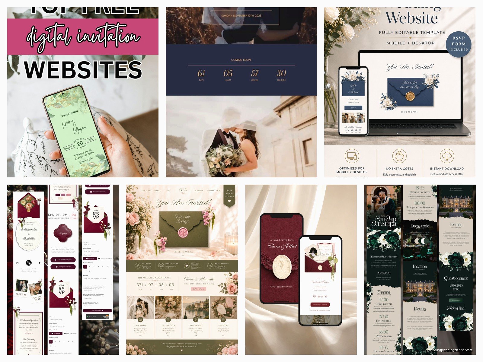
So the basic sections you need are pretty standard across most templates. You’ve got your home page obviously, then usually an “Our Story” section (which honestly I find kinda cheesy but couples love it so whatever), the actual event details page, RSVP functionality, travel/accommodations info, registry links, and maybe a photo gallery.
The templates make this easy because they already have placeholder sections. You just swap out the dummy text with your actual information. Some platforms I recommend are Minted, Zola, The Knot, Joy, and Withjoy. Each one has different vibes and price points.
Free vs Paid Templates
Here’s the thing about free templates – they’re fine for most people. Like genuinely fine. The Knot and Wedding Wire offer completely free options that look professional enough. You’ll have their branding on there (usually a small logo at the bottom) but most guests won’t even notice or care.
Paid templates usually run between $30-150 and what you’re getting is more customization options, the ability to remove platform branding, better design elements, and sometimes more robust RSVP systems. I had this wedding last summer where the bride was a graphic designer and she was SO particular about fonts and she ended up going with a premium Squarespace template because she needed that level of control.
If your wedding has a really specific aesthetic – like you’re doing a vintage 1920s thing or a modern minimalist vibe – the paid templates give you more flexibility to match that.
Matching Your Invitation Design
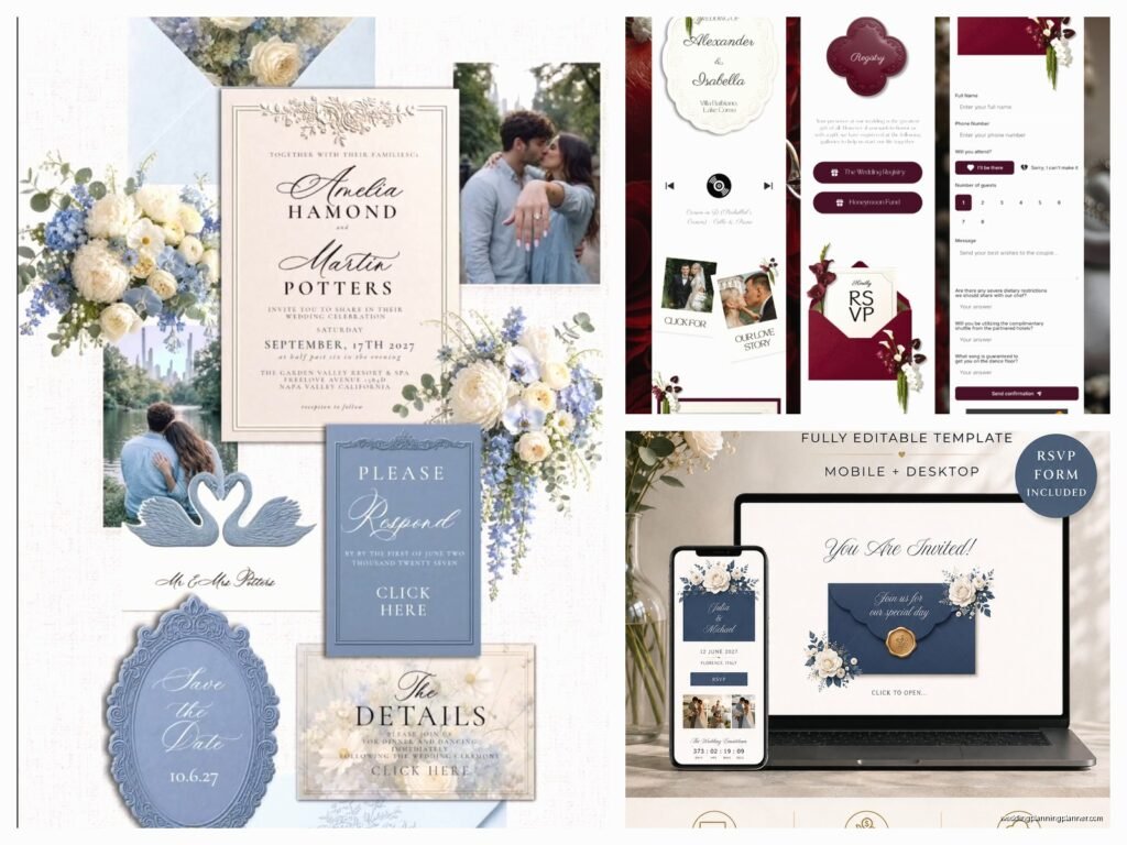
This is where people get confused and honestly it used to annoy me so much when couples would have this gorgeous invitation suite and then their website looked like it was from a completely different wedding. The whole point is cohesion.
Most template platforms now let you coordinate. Minted is really good at this – if you order invitations through them, they have website templates that literally match the same design. Same fonts, same color palette, same decorative elements. It’s pretty seamless.
But if you’re ordering invitations from one place and building your website somewhere else, you gotta pay attention to:
- Color scheme – pull the exact hex codes from your invitation if possible
- Font pairings – try to use the same or similar fonts
- Overall mood – formal invitations need formal websites, casual invitations can have more relaxed website copy
- Graphic elements – if your invitation has floral borders, find a template with similar decorative elements
The RSVP Function Is The Whole Point Honestly
Okay so this is the part that actually saves you insane amounts of time and stress. Digital RSVPs through your wedding website are a gamechanger. I cannot emphasize this enough.
When you’re looking at templates, check what the RSVP system can do. The good ones let you:
- Track responses in real-time with a dashboard
- Collect meal choices
- Note dietary restrictions
- Manage plus-ones (you can set whether someone is invited with a guest or not)
- Send reminder emails to people who haven’t responded
- Export your guest list to a spreadsheet
The meal choice thing is huge. Instead of including those tiny reply cards with checkbox options that people lose or forget to mail back, they just select their entree online. Your caterer will love you for having an organized list.
Some platforms like RSVPify or Zola let you create multiple events within one website – so if you’re having a welcome dinner, the wedding ceremony, and a next-day brunch, guests can RSVP to each one separately. Super helpful for destination weddings.
The Registry Integration Situation
Most templates now have a dedicated registry page where you can link to multiple registry sites. This is way better than including registry info in your invitation (don’t do that, it’s tacky, I will die on this hill).
Zola is kinda genius because they have their own registry system built into the website platform, so it’s all in one place. But you can also link external registries from Amazon, Crate & Barrel, or wherever. My cat literally walked across my keyboard while I was setting one of these up for a client once and somehow added a $400 coffee maker to their registry that we didn’t discover until after the wedding… anyway.
Design Elements That Actually Matter
When you’re choosing a template, think about the photos you’re gonna use. Most templates have spots for engagement photos or childhood pictures if you’re doing that whole “our story” timeline thing.
Mobile responsiveness is non-negotiable. Like I’m serious about this. More than 60% of your guests are gonna look at your website on their phones, so if the template doesn’t automatically adjust to mobile screens, skip it. All the major platforms I mentioned are mobile-optimized but if you’re using something obscure, test it on your phone before committing.
Some design things to consider:
- Hero images – that big photo at the top of the home page should be high quality and horizontal orientation works best
- Loading speed – if your template is super graphics-heavy it might load slowly which is annoying for guests
- Navigation – should be obvious and easy, guests shouldn’t have to hunt for the important info
- Readability – fancy script fonts are pretty but if people can’t read your ceremony time that’s a problem
What Information Actually Needs To Be There
Alright so you’ve picked a template, now you gotta fill it in. Here’s what I tell every couple because otherwise they either include way too much or forget crucial details.
Event Details Page
This needs the exact venue name, full address (not just the street address – include city, state, zip), date, time, and ideally a Google Maps embed so people can click directly for directions. Also note if there are multiple locations – like if ceremony and reception are in different spots, make that super clear.
Dress code goes here too. Please be specific. “Cocktail attire” or “Black tie optional” is helpful. “Dressy casual” is confusing and everyone will interpret it differently.
Travel and Accommodations
If you have hotel blocks, list them with booking codes and deadlines. Include the booking link or phone number. Distance from venue is helpful too.
Airport information for destination weddings or if you have a lot of out-of-town guests. Rental car suggestions or info about ride-sharing in the area.
Parking details – this is something people always forget and then I get panicked texts the day before the wedding. Is parking free? Do they need to use a specific lot? Is valet available?
FAQ Section
This section saves you SO much time answering individual questions. Common things to include:
- Are kids invited? (Be clear about this one way or the other)
- What’s the weather usually like that time of year?
- Will the ceremony be indoors or outdoors?
- Is there an unplugged ceremony policy?
- What time should guests arrive?
- How long will the reception last?
- Who do I contact if I have questions?
Customizing Without Making It Weird
So templates are meant to be customized but there’s like a sweet spot between “this looks exactly like the template” and “I changed so much stuff it looks broken now.”
Colors are the easiest thing to customize. Most platforms let you choose from preset color palettes or input custom colors. Stick to 2-3 main colors max or it starts looking chaotic.
Fonts – usually you can change fonts but don’t go crazy. One font for headings, one for body text. That’s it. I’ve seen people use like five different fonts and it looks like a ransom note.
Photos should be high resolution. Blurry engagement photos on a website just look… not great. If you don’t have professional photos yet, good quality iPhone pics in nice lighting work fine.
The Timeline Thing
Some templates have this cute timeline feature where you can show your relationship milestones. First date, got engaged, adopted a dog together, whatever. It’s optional and honestly if you’re not into it, just delete that section. Not every template component needs to be used.
Password Protection Or Nah
Some couples want their wedding website to be password-protected for privacy reasons. Most platforms offer this option. You’d include the password on your save-the-dates or invitations.
Pros: keeps random people from finding your wedding details, feels more exclusive, prevents venue info from being totally public
Cons: people lose the password constantly, it’s an extra step that might prevent some guests from accessing info they need, older relatives get confused
I usually recommend skipping the password unless you have a specific reason for privacy. The convenience of guests being able to easily access the site outweighs the privacy thing for most weddings.
Updating Throughout Your Planning
Your wedding website isn’t a set-it-and-forget-it thing. You’re gonna need to update it as details get finalized.
Set reminders for yourself to add info as you book vendors. Once you finalize your hotel blocks, update the accommodations page. When you figure out your ceremony timeline, add that. When you select your menu, maybe add a note about what’s being served so guests with dietary restrictions can… wait actually maybe that’s too much information, scratch that.
The RSVP deadline should be clearly stated and most platforms let you automatically close RSVPs after a certain date. Set this for about 3-4 weeks before your wedding so you have time to follow up with people who didn’t respond and get final counts to your caterer.
Common Template Mistakes I See All The Time
Too much text. Nobody’s reading three paragraphs about how you met. Keep it brief and scannable. Bullet points are your friend.
Outdated information that never got changed. If your ceremony time changes from 4pm to 5pm, update the website immediately and maybe send an email blast to everyone.
Broken links, especially to registries or hotel booking sites. Test every link before you send out your invitations.
Making the website too late. Ideally you want this live before your save-the-dates go out, or at least include the URL on your save-the-dates so people can start planning travel.
Not including a contact person. Someone (maybe your wedding planner, a parent, or the maid of honor) should be listed as a point of contact for questions. Otherwise you’ll be fielding texts during your bachelorette party about whether Aunt Susan’s plus-one is invited.
Platform-Specific Notes
Zola has the most comprehensive free option and their interface is really user-friendly. Good choice if you’re not super tech-savvy.
Minted is best if you want your website to match your paper invitations exactly. Their designs are really elegant and they have good customization without being overwhelming.
The Knot has been around forever and has tons of templates. Some look a bit dated honestly but they’re functional and free.
Withjoy is super clean and modern looking. Great if you want a minimalist aesthetic. Their RSVP system is solid.
Squarespace gives you the most design control but requires more technical knowledge. Better for couples where someone has website building experience or really specific design needs.
Riley & Grey has gorgeous templates if you’re willing to pay more – they’re in the $200+ range but they’re stunning and include things like custom domain names.
Look, at the end of the day, the template you pick matters way less than just having a website with accurate information that’s easy for your guests to find. Don’t overthink it too much. Pick something that roughly matches your vibe, fill in all the important details, test it on your phone, and send it out. Your guests just wanna know where to show up and where you’re registered, they’re not critiquing your font choices.