Planning Guides, Style Guide
Wedding Poster Design: Complete Guide
Apr
So You Need a Wedding Poster
Okay so wedding posters are kinda having this massive moment right now and honestly I’ve been designing them for couples since like 2019 but they really exploded during the pandemic when people needed creative ways to announce postponements or share their joy when guest lists got slashed. The thing is, most people think wedding posters are just big invitations but nah, they’re actually their own category with totally different rules.
First thing you gotta know is SIZE MATTERS. Wedding posters typically range from 16×20 inches up to 24×36 inches. I learned this the hard way in summer 2021 when a couple ordered what they thought was a “poster” but I designed it at invitation proportions and when they got it printed at 24×36 it looked absolutely ridiculous with huge amounts of white space and tiny text in the middle. That was a fun weekend of emergency redesigns.
The purpose of your poster determines literally everything about the design. Are you using it as a welcome sign at the venue? Is it gonna be framed in your home forever? Is it for a rehearsal dinner announcement? Each of these needs different information hierarchy and different design approaches.
Welcome Posters vs Keepsake Posters
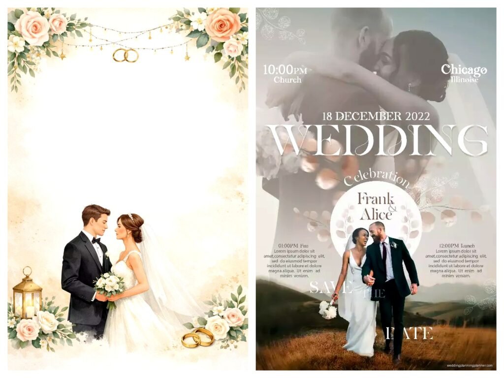
Welcome posters need to be readable from like 10-15 feet away which means your names should be HUGE and the wedding date should be immediately visible. You’re basically designing a sign, not art. I usually go with names at minimum 120pt font, sometimes up to 200pt depending on name length. The venue name and date should be at least 48-60pt.
Keepsake posters are different because people will actually look at them up close. You can include way more details – your wedding party names, a meaningful quote, the menu from your reception, lyrics from your first dance song, whatever. These can have smaller text because someone’s gonna be standing right in front of it in your hallway for the next 30 years.
Typography Is Gonna Make or Break This
Listen, I get really annoyed when people use more than three fonts on a wedding poster. REALLY annoyed. Like irrationally annoyed. You need one main font for names, one secondary font for details, and maybe an accent font for small elements. That’s it. When I see posters with five different script fonts all competing for attention I just… it looks like a ransom note from a very fancy kidnapper.
Script fonts are gorgeous but you can’t use them for everything. If your names are in a flowing script, your details need to be in a clean sans-serif or a readable serif. The contrast is what makes it work. Some of my go-to combinations: Playlist Script with Montserrat, Cormorant Garamond with Lato, or Allura with Raleway.
And please for the love of everything don’t use Papyrus or Comic Sans. I know that sounds obvious but in spring 2023 I had a groom specifically request Comic Sans because he thought it would be “funny and ironic” and his fiancée almost called off the wedding. Okay not really but there were some tense conversations.
Color Schemes That Actually Work
Your poster doesn’t have to match your wedding colors exactly but it should coordinate. If your wedding is blush and gold, your poster can be cream and rose gold. If your wedding is navy and burgundy, the poster could be deep blue with wine-colored accents.
Here’s what I typically do: pick one dominant color (usually a neutral – cream, white, kraft paper brown, navy, charcoal), one accent color from your wedding palette, and one metallic if you’re feeling fancy. Three colors maximum for the design itself, not counting the background.
Backgrounds can be tricky because… okay so if you’re printing on colored cardstock you need to design with that in mind. If you’re printing on white paper, you have more flexibility. Kraft paper posters are super popular right now and they photograph beautifully but your colors need to have enough contrast or everything just mushes together.
What Information Actually Goes On There
For a welcome poster at your venue you absolutely need your names, wedding date, and some kind of greeting like “Welcome to Our Wedding” or “Welcome to the Wedding of” – I know it seems obvious but you’d be surprised how many couples forget to actually welcome anyone.
Optional but nice: the venue name and city, the hashtag if you’re using one (though honestly hashtags are sorta dying out), a meaningful quote or Bible verse if that’s your thing, timeline of events if it’s a complex day.
For a keepsake poster you can get creative. I’ve designed posters that include the couple’s love story timeline, the entire wedding party with little illustrations, the couple’s favorite things about each other, even one that had their cat’s name prominently featured because Mr. Whiskers was apparently very important to their relationship. (Speaking of cats, mine just knocked over my coffee while I’m writing this so that’s fun.)
Layout Basics That You Need to Know
Center-aligned is classic and works for formal weddings. Everything stacked neatly in the middle, symmetrical, balanced. It’s the safe choice and there’s nothing wrong with safe.
Asymmetrical layouts are more modern and honestly more interesting visually but they’re harder to pull off. You need to understand visual weight – if you put all your text on the left side, you need something on the right side to balance it. That could be a floral illustration, a photo, a decorative element, whatever.
Border designs are having a moment. You can frame your text with a geometric border, a floral wreath, an art deco pattern, whatever matches your vibe. Just make sure the border doesn’t overpower the actual information because I’ve seen posters where the border is so elaborate you can barely read the names.
White space is your friend. Beginning designers always want to fill every inch of the poster but breathing room makes everything more elegant. If you’re designing an 18×24 poster, you should have at least 2 inches of margin on all sides, sometimes more.
Design Styles and Trends
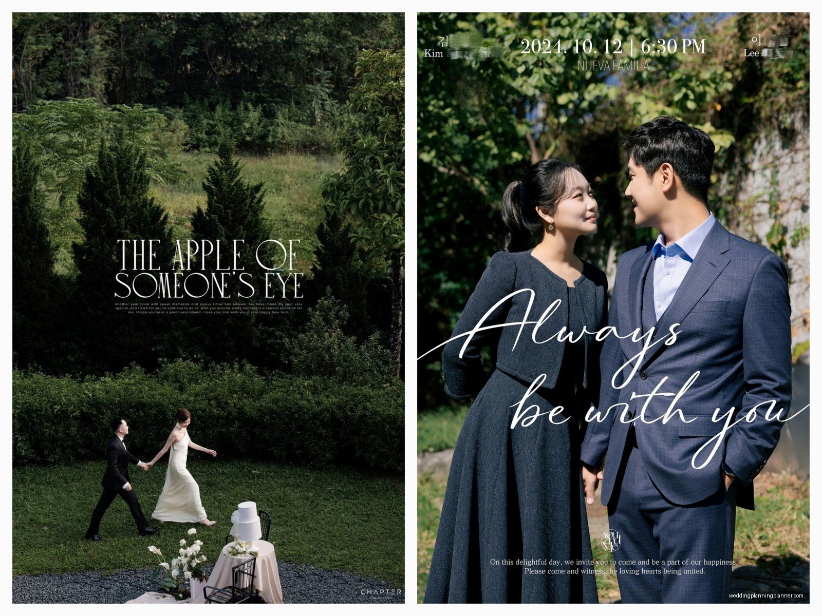
Minimalist modern is huge right now – clean lines, lots of white space, simple sans-serif fonts, maybe one delicate line drawing. Think Scandinavian design aesthetic. These are timeless and photograph really well.
Botanical and floral will literally never go away. Greenery wreaths, watercolor flowers, pressed flower designs, whatever. If you’re going this route, make sure your florals don’t overwhelm your text. The flowers should frame or accent the information, not compete with it.
Vintage and retro styles come and go but art deco is having a resurgence. Think Great Gatsby vibes – geometric patterns, gold accents, bold typography. These work really well for formal evening weddings.
Rustic and kraft paper designs are still popular especially for barn weddings or outdoor celebrations. Mason jar illustrations, wood grain textures, handwritten-style fonts. Just don’t go overboard with the burlap aesthetic because it can start looking dated.
Photos or No Photos
Including an engagement photo on your poster is totally a personal choice. It makes the poster more personal obviously but it also makes it harder to design around. If you’re gonna use a photo, it needs to be high resolution – at least 300 DPI when sized for the poster dimensions or it’ll look pixelated and terrible.
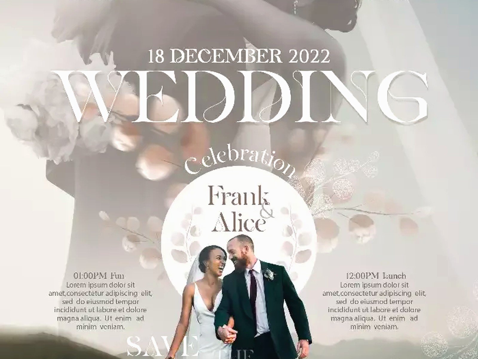
Photo placement matters. You can make it the background with text overlaid (but then you need to add a semi-transparent overlay so the text is readable), you can put it in a frame or circle as one element of the design, or you can do a half-and-half layout with the photo on one side and text on the other.
Honestly some of the most beautiful wedding posters I’ve designed have been photo-free because it gives you so much more flexibility with color and design elements but like I said, totally personal preference.
Technical Stuff You Can’t Ignore
Resolution needs to be 300 DPI minimum for printing. If you’re designing in Canva or any online tool, make sure you’re downloading the highest quality version. I’ve seen too many couples try to print a 72 DPI image meant for web use and wonder why it looks blurry.
Color modes matter – design in CMYK if you’re printing professionally, RGB if it’s staying digital. This affects how colors appear when printed. That gorgeous bright blue on your screen might print as purple if you’re not careful with color modes.
Bleed and trim are technical printing terms but basically you need to extend your background design about 0.125 inches beyond the edge of your poster so when it’s cut there aren’t any white edges. Most print shops will have specifications for this.
File formats: save as PDF for printing, PNG with transparent background if you need that flexibility, and keep a working file in whatever program you’re using (PSD for Photoshop, AI for Illustrator, whatever).
Where to Actually Print These Things
Local print shops are great if you need it fast and want to see paper samples in person. They’re usually more expensive but the customer service is better and you can discuss options with an actual human.
Online printers like Printful, Vistaprint, or Minted are cheaper and have good quality but you can’t see samples first. I usually order a small test print before committing to the full size just to make sure colors look right.
Paper choices matter more than you think. Matte cardstock is classic and doesn’t have glare in photos. Glossy makes colors pop but can be hard to photograph. Linen or textured paper adds a fancy touch but costs more. Foam board is sturdy for welcome signs that need to stand up on an easel.
Common Mistakes I See All the Time
Using low-resolution images or graphics that look pixelated when enlarged. This is probably the number one issue I deal with when couples try to DIY their posters.
Too much information crammed onto one poster. If you need to include your entire wedding day timeline, ceremony program, menu, AND seating chart, you probably need multiple posters or a different format entirely.
Fonts that are too small. If your guest list skews older, you need readable font sizes. I usually don’t go below 24pt for any important information on a welcome poster.
Forgetting about the display method – if your poster is going on an easel you need to account for the bottom portion being partially hidden. Important info should be in the top two-thirds.
Not proofreading. I cannot stress this enough. Have three different people check for typos, wrong dates, misspelled names, incorrect venue addresses. Once it’s printed at poster size, mistakes are really expensive to fix.
DIY vs Hiring a Designer
Look, I’m a designer so obviously I’m biased but I’ll be honest – if you have a good eye for design and you’re comfortable with tools like Canva, you can absolutely DIY a beautiful wedding poster. Canva has templates specifically for this and they’re actually pretty good as starting points.
But if you’re not confident in your design skills or you want something really custom and unique, hiring a designer is worth it. We know how to balance elements, choose fonts that work together, and handle all the technical printing stuff. Most wedding stationery designers charge between $150-400 for a custom poster design depending on complexity.
You can also do a hybrid approach – buy a template from Etsy or Creative Market and customize it yourself with your information and colors. Templates usually run $15-50 and give you a professional starting point.
Timeline for Getting This Done
If you’re ordering from an online designer, allow 2-3 weeks for the design process including revisions. Then add another 1-2 weeks for printing and shipping. So you’re looking at about a month total, maybe more during busy wedding season (May through October).
If you’re DIYing it, you can knock out the design in a weekend if you’re focused, but I’d still give yourself at least 2 weeks before you need it just in case printing takes longer than expected or you need to reorder because something looks wrong.
Rush orders are possible but expensive and stressful for everyone involved so just… don’t do that to yourself if you can avoid it.
Display Ideas Beyond the Obvious
Welcome posters obviously go on an easel at your venue entrance but you can also use them at the rehearsal dinner, the welcome party if you’re doing a destination wedding, or even at your bridal shower.
After the wedding, frame it and hang it in your home. I have couples who create a whole gallery wall with their poster, photos from the wedding, and their invitation suite all framed together.
Some people are doing double-sided posters now – welcome message on one side, seating chart or timeline on the other. This is smart if you’re trying to minimize the number of signs at your venue.
You can also do a series of smaller posters instead of one large one – like three 11×14 posters that each have different information or that tell your love story in a triptych format or something like that.
Anyway that’s basically everything I know about wedding poster design after doing this for years. The main thing is just make sure it reflects your personality as a couple and that people can actually read it because a gorgeous poster that no one can decipher is just expensive wall decoration.