Planning Guides, Style Guide
Invitation Layouts: Design & Ordering Guide
May
Okay so invitation layouts are basically where most couples get stuck
The layout is literally how all your information sits on the card and honestly it matters way more than people think. I had this couple back in spring 2023 who kept sending me Pinterest screenshots of invitations they loved but when we tried to fit their actual wording into those designs everything looked cramped and weird. That’s because they weren’t thinking about their specific content – they just saw pretty designs.
First thing you gotta know is that traditional invitation layouts follow a hierarchy. Your names are usually the biggest text, then the request line (like “request the pleasure of your company”), then ceremony details, then reception info if it’s on the same card. But honestly? You can break these rules if you want, just make sure people can actually find the important stuff.
The main layout styles you’ll see everywhere
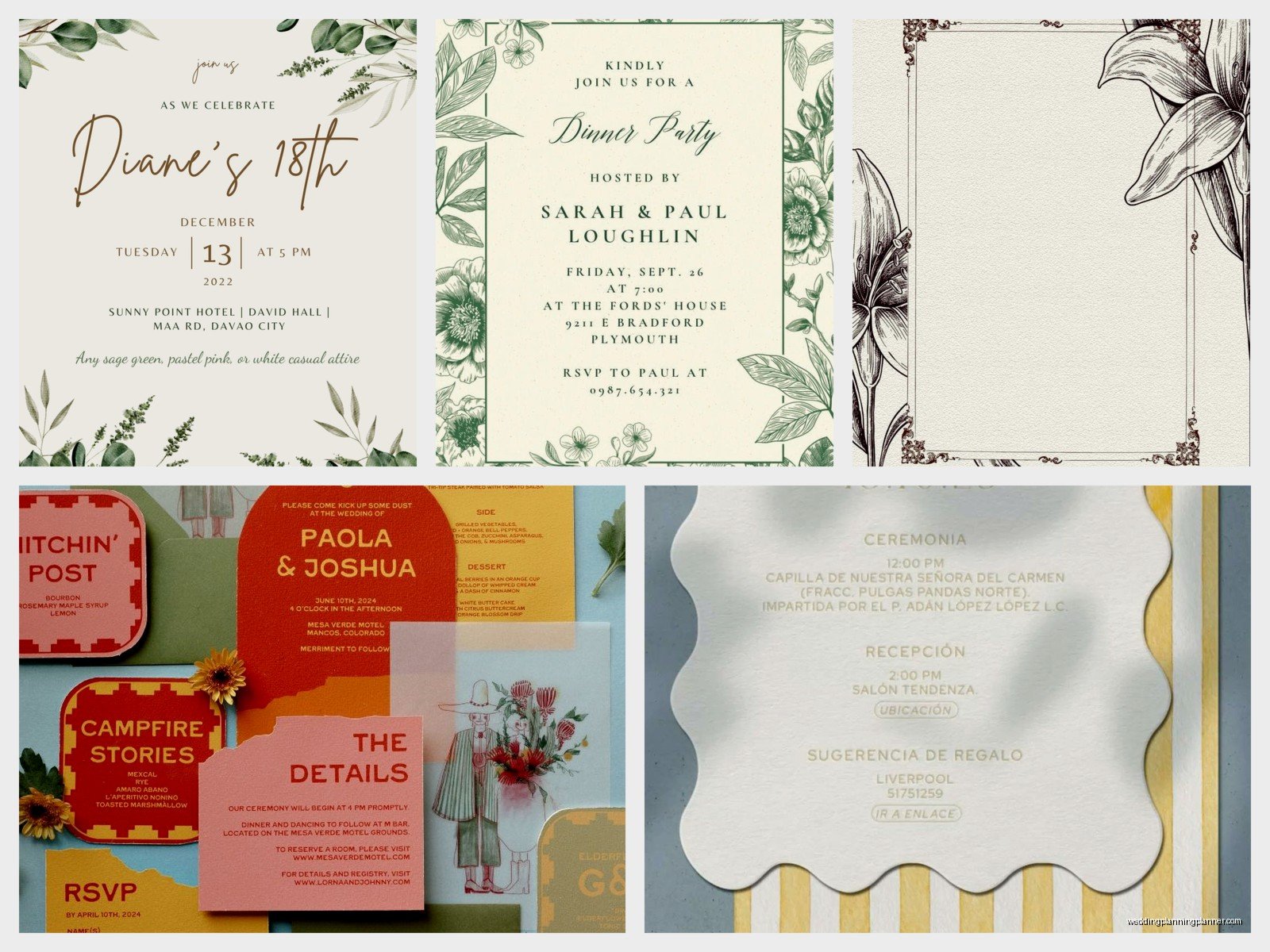
Center-aligned is the classic one. Everything stacked in the middle of the card. It’s safe, it works with almost any wording length, and it photographs well when people lay it flat. I use this probably 60% of the time because it just… works. You don’t have to overthink it.
Left-aligned is more modern and honestly I think it looks cleaner with longer text blocks. If you’ve got a bunch of info to include – like when the ceremony is at one place and reception somewhere else and there’s a cocktail hour situation – left-aligned keeps it readable. Just make sure you have enough margin on the right side or it looks unbalanced.
Asymmetrical layouts are where you get creative but also where things can go wrong fast. Maybe your names are on the left, details on the right, some decorative element in the corner. These look amazing when done right but require more back-and-forth with your designer. My cat knocked over my coffee all over a proof I was reviewing once and honestly the water stains kinda looked like an intentional watercolor element? But anyway that’s not helpful here.
What actually needs to be on your invitation
So the main invitation card should have: whose wedding it is (your names obviously), who’s hosting if you’re doing that traditional thing, the date, the time, the venue name and city/state. That’s the bare minimum. You’ll see some invites that also include the full venue address but I usually put that on a details card instead because it makes the main invite less cluttered.
The request line is that “request the honour of your presence” or “invite you to celebrate” part. Traditional Christian ceremonies use “honour” spelled the old British way (with a u) and Jewish ceremonies often say “invite you to share in their joy” or something similar. But honestly you can write whatever feels like you. I’ve seen “let’s party” on casual wedding invites and it was perfect for that couple.
One thing that really annoys me is when couples try to cram EVERYTHING onto one card because they think it looks fancier or they’re trying to save money on printing. Then you’ve got tiny 8-point font and addresses and dress codes and website URLs all competing for space and it just looks messy. Just use an details card, I promise it’s fine.
Sizing actually matters more than you think
Standard invitation size is 5×7 inches. It’s popular because it fits normal envelopes, printing is cheaper since it’s a common size, and it feels substantial without being awkward to mail. I probably recommend this size for like 70% of my clients.
Square invitations (like 6×6 or 7×7) look really modern and photograph beautifully but they cost more to mail. The post office charges extra for non-standard sizes and you need square envelopes which are also pricier. Just factor that into your budget upfront.
Smaller sizes like 4×6 or A6 (4.5×6.25) work great for minimalist designs or if you don’t have tons of text. They feel more intimate somehow? And they’re cheaper to print and mail. But if you’ve got a detailed venue name and multiple events, you might run out of space quick.
Larger sizes (like 5.5×8.5 or 6×9) give you room to play with layout and whitespace. These work really well for destination weddings where you need to include more context or if you want big dramatic typography. Just remember they need bigger envelopes and might require extra postage.
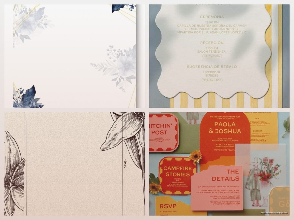
The whole suite situation
Okay so you’ve probably seen those photos of invitation suites laid out all pretty with like seven different cards. Here’s what actually goes in there and what you actually need because there’s a difference.
Main invitation card – obviously you need this one. This is the fancy one with your names and ceremony details.
Reception card – if your ceremony and reception are in different locations or at very different times, you want a separate card for this. Keeps the main invite clean. Usually smaller than the main card, maybe 4×6 or 4.5×6.
Details card – this is where I put everything else. Hotel room blocks, transportation info, dress code, weather warnings if it’s outdoors, your wedding website. Sometimes this becomes two cards if there’s a lot going on and that’s totally fine.
RSVP card with envelope – you need this unless you’re doing online-only RSVPs which honestly I recommend because tracking paper RSVPs is a nightmare. But some older guests really prefer paper so maybe include both options? The RSVP card should have a clear deadline (usually 3-4 weeks before the wedding), space for names, meal choices if you’re doing that, and a line for number of guests attending.
Response envelopes should be pre-addressed to whoever’s handling RSVPs and pre-stamped. Don’t make your guests find stamps, they won’t do it and you’ll have to chase them down anyway.
Design elements that actually affect layout
Borders and frames can make text feel more contained and formal but they also eat up space. If you’re using a border, make sure there’s enough margin between the border and your text – at least a quarter inch or it looks cramped. I see this mistake constantly and it drives me crazy.
Monograms are cute but figure out where they’re going early. Top center? Bottom center? As a background watermark? They affect how much room you have for text. And speaking of monograms, the traditional format is bride’s first initial, last name initial in the middle (bigger), groom’s first initial. But honestly do whatever order feels right to you.
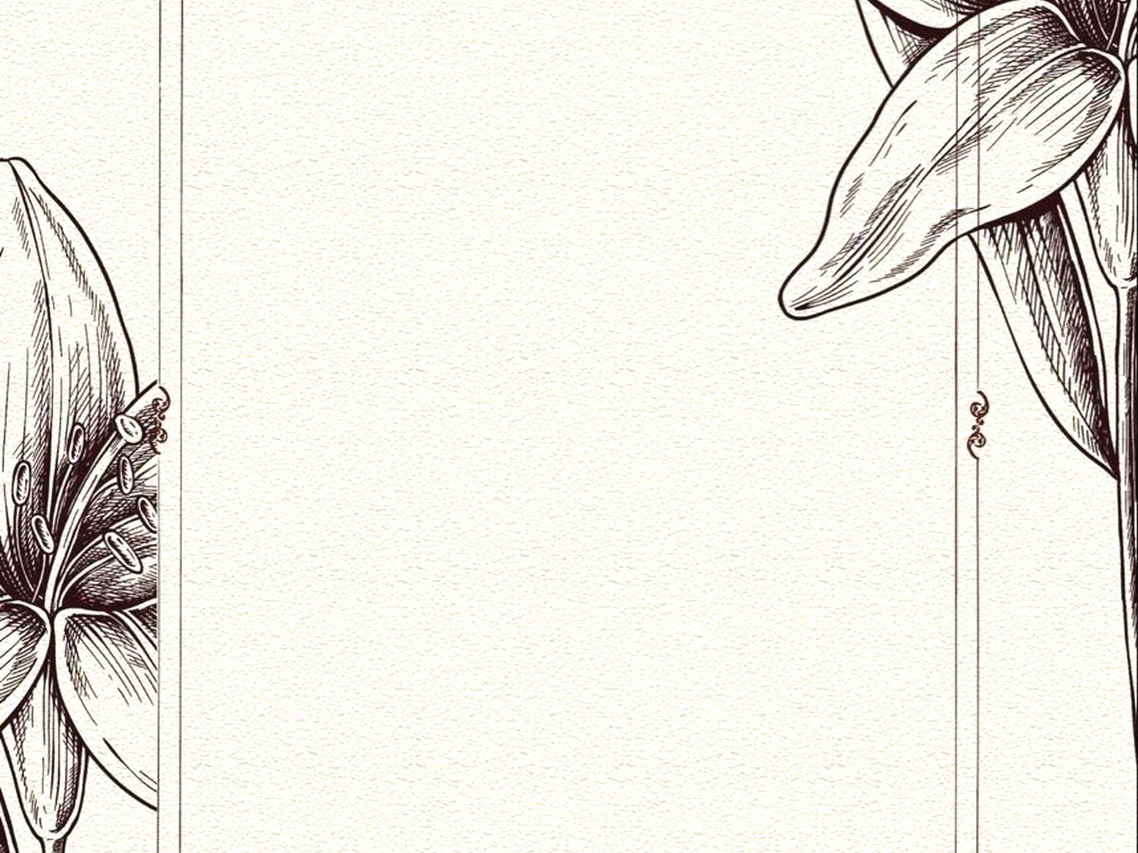
Florals or illustrations – if you’re adding these, decide if they’re accent elements in corners or if they’re more of a full background situation. Background florals look gorgeous but make sure your text is still readable. I had a bride in summer 2021 who fell in love with this super detailed rose illustration and wanted it behind all the text and we had to do like six rounds of revisions to make the words actually legible because the flowers were so busy.
Metallic foiling or letterpress adds texture and dimension but it also adds cost and production time. Foiling is beautiful for names or borders. Letterpress gives you that pressed-in vintage feel. Both require specific layout considerations – you can’t foil tiny detailed text, it won’t work. And letterpress needs enough space around pressed elements.
Typography stuff you should probably know
Don’t use more than three fonts on one invitation. Seriously. One script font for names, one serif for main text, maybe one sans-serif for smaller details. More than that and it looks like a ransom note.
Script fonts are pretty but they’re hard to read in all caps and at small sizes. If you’re using a script, keep it for names or short phrases. Your venue address shouldn’t be in a swirly script that nobody can decipher.
Font size hierarchy helps people scan the invitation quickly. Names might be 24-36 point, main details 12-14 point, smaller info 10-11 point. You want clear visual distinction between the most important info and supporting details.
Line spacing matters SO much and nobody thinks about it. If your lines are too close together it feels cramped. Too far apart and it feels disconnected. Your designer should handle this but if you’re DIYing it, 1.2 to 1.5 line spacing usually works for invitation text.
Ordering timeline because this takes longer than you expect
Start looking at designs 6-8 months before your wedding. I know that sounds early but good stationery designers book up and custom work takes time. If you’re ordering from an online template place you can probably start later, like 4-5 months out.
Design process usually takes 2-4 weeks depending on how many revision rounds you need. First you’ll see initial concepts, then you’ll give feedback, then you’ll get revised versions. Most designers include 2-3 rounds of revisions. After that you might pay extra for more changes.
Proof everything SO carefully before you approve final printing. Check names, dates, times, addresses, website URLs. Have someone else read it too because you’ve probably looked at it so many times you can’t see mistakes anymore. I once had a couple approve an invite with their venue address wrong and we didn’t catch it until after printing – had to rush order details cards with the correct address and it was expensive and stressful.
Printing takes 2-4 weeks usually. Digital printing is faster (maybe 1-2 weeks) but letterpress or foiling can take 3-4 weeks or more. Then you need time to assemble everything, address envelopes, and mail them.
Mail your invitations 6-8 weeks before the wedding. That gives guests time to make plans, book travel if needed, and send RSVPs back. For destination weddings, send them 3 months out.
Budget real talk
Digital printing is your most affordable option, usually $2-5 per suite depending on how many pieces you’re including and how fancy the paper is. This is what I recommend for most couples honestly because it looks great and won’t destroy your budget.
Letterpress runs $8-15+ per suite typically. It’s gorgeous and has that luxury feel but you’re paying for the craftsmanship and setup costs.
Foil stamping is usually $5-12 per suite depending on how much foiling you’re doing. Gold and silver are standard, colored foils sometimes cost more.
Online template services (like Minted or Zola or Paperless Post for digital) are budget-friendly, usually $1-3 per invitation. You’re limited to their templates but there are thousands of options and you can customize colors and text.
Custom design from a stationer – this is where I live obviously – runs anywhere from $500 to $3000+ for full service depending on the designer’s experience, how complex your design is, printing methods, and how many pieces you need. You’re paying for custom artwork created specifically for you and personalized service.
DIY layout tips if you’re doing this yourself
Use Canva or Adobe InDesign if you know how to use it. Canva has invitation templates that are actually pretty good and way easier than starting from scratch. Just customize the text and colors.
Keep margins consistent – at least 0.5 inches on all sides, preferably 0.75 inches. This gives your design breathing room and prevents text from getting cut off during printing.
Print a test version at home on regular paper just to check layout and spacing before you order the real thing. Sometimes what looks good on screen doesn’t translate to physical paper.
Alignment is everything. If you’re centering text, make sure it’s actually centered. If you’re left-aligning, make sure everything lines up properly. Misaligned text looks sloppy even if everything else is beautiful.
Watch your bleeds if you’re doing a design that goes to the edge of the card. You need to extend your background or images 0.125 inches beyond the trim line so there aren’t white edges after cutting.
Common layout mistakes I see constantly
Too much information crammed onto the main invite. Move some stuff to a details card or your website, please.
Inconsistent styling across the suite. If your main invite is formal and traditional, your RSVP card probably shouldn’t be super casual and modern. Keep the vibe consistent.
Forgetting about envelope liners or addressing until the last minute. These are part of your overall suite design and should coordinate with your invitations.
Not considering how the suite looks assembled together. Each piece might look nice individually but when you stack everything in the envelope, do the sizes make sense? Is there a logical order?
Choosing a layout that doesn’t work for your wording. If you have long names or a long venue name, that delicate script font in a small size isn’t gonna work. Pick a layout that accommodates your actual content.
Honestly the biggest thing is just starting early and being realistic about your timeline and budget. Invitations take longer than people expect and rushing leads to mistakes or settling for something you don’t actually love. Give yourself time to explore options, get samples if possible, and make thoughtful decisions about what layout style actually represents you as a couple and works for your specific wedding details. And umm don’t be afraid to ask questions – that’s literally what wedding planners and stationers are here for