
Planning Guides, Style Guide
Wildflower Wedding Invitation: Meadow Botanical Designs
Nov
Getting Started with Wildflower Meadow Invitations
Okay so wildflower wedding invitations are having a HUGE moment right now and honestly I get why. They’re less stuffy than formal florals but still romantic, and they work for basically any outdoor or garden wedding vibe. The meadow botanical look specifically—that’s where you’re pulling from actual field flowers, not just generic roses or peonies—gives you this organic, slightly wild aesthetic that couples are obsessed with.
First thing you gotta know is that wildflower designs work best when they don’t look too controlled. This drove me nuts back in spring 2023 when I had a client who kept asking me to make the Queen Anne’s lace “more symmetrical” and I’m like… that’s literally the opposite of what makes wildflowers special? They’re supposed to look like someone just gathered them from a field and pressed them onto paper.
Choosing Your Wildflower Palette
The color story matters SO much here. You can go full-on vibrant meadow with yellows, purples, oranges, and hot pinks, or you can do the softer pastel version with lavenders, pale yellows, dusty blues, and whites. I usually ask couples to think about what season their wedding is happening in because that affects which wildflowers make sense.
For spring meadow vibes you’re looking at:
- Forget-me-nots
- Bluebells
- Wild violets
- Primrose
- Early daisies
Summer wildflowers give you way more options and honestly more drama:
- Black-eyed Susans
- Cornflowers
- Poppies (the red ones are stunning but can read formal, so I usually suggest California poppies)
- Queen Anne’s lace
- Wild daisies
- Chicory
- Yarrow
Fall meadow designs work with like goldenrod, asters, and late-season wildflowers that have more muted tones. Winter wildflower invitations are… well they’re kinda tricky because you’re working with dried botanicals or evergreens mixed with seed heads, but that’s a whole different aesthetic.
Design Layout Options
The way you arrange the wildflowers on the invitation totally changes the vibe. I’ve done probably a hundred variations at this point and these are the main styles that actually work:
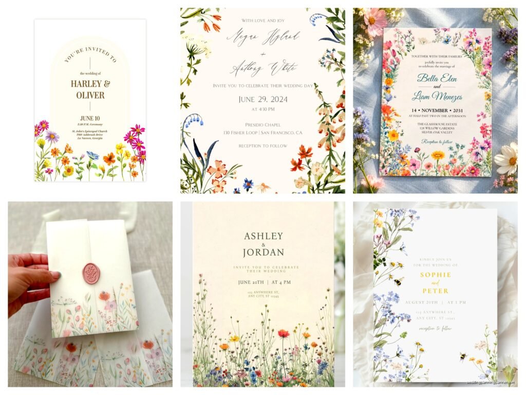
Border frames: This is where you create a wreath or border of wildflowers around the text. Super popular, maybe a little overdone at this point but couples still love it. The text sits in the middle with flowers framing it on all sides or just top and bottom.
Corner clusters: Just one corner (usually top right or bottom left) has a bunch of wildflowers clustered there, and the rest of the invitation is clean. This looks more modern and gives the text breathing room.
Scattered pattern: Individual wildflowers and stems scattered across the whole invitation, sometimes behind the text, sometimes around it. This is my personal favorite because it feels the most organic and… I dunno, it just doesn’t try so hard?
Single stem feature: One dramatic wildflower stem running up the side or across the bottom. Minimalist but still botanical. Works really well if you’re doing a more contemporary wedding.
Illustration Style vs Photography vs Pressed Flowers
So you’ve got three main ways to get wildflowers onto your invitation and each one has a totally different feel.
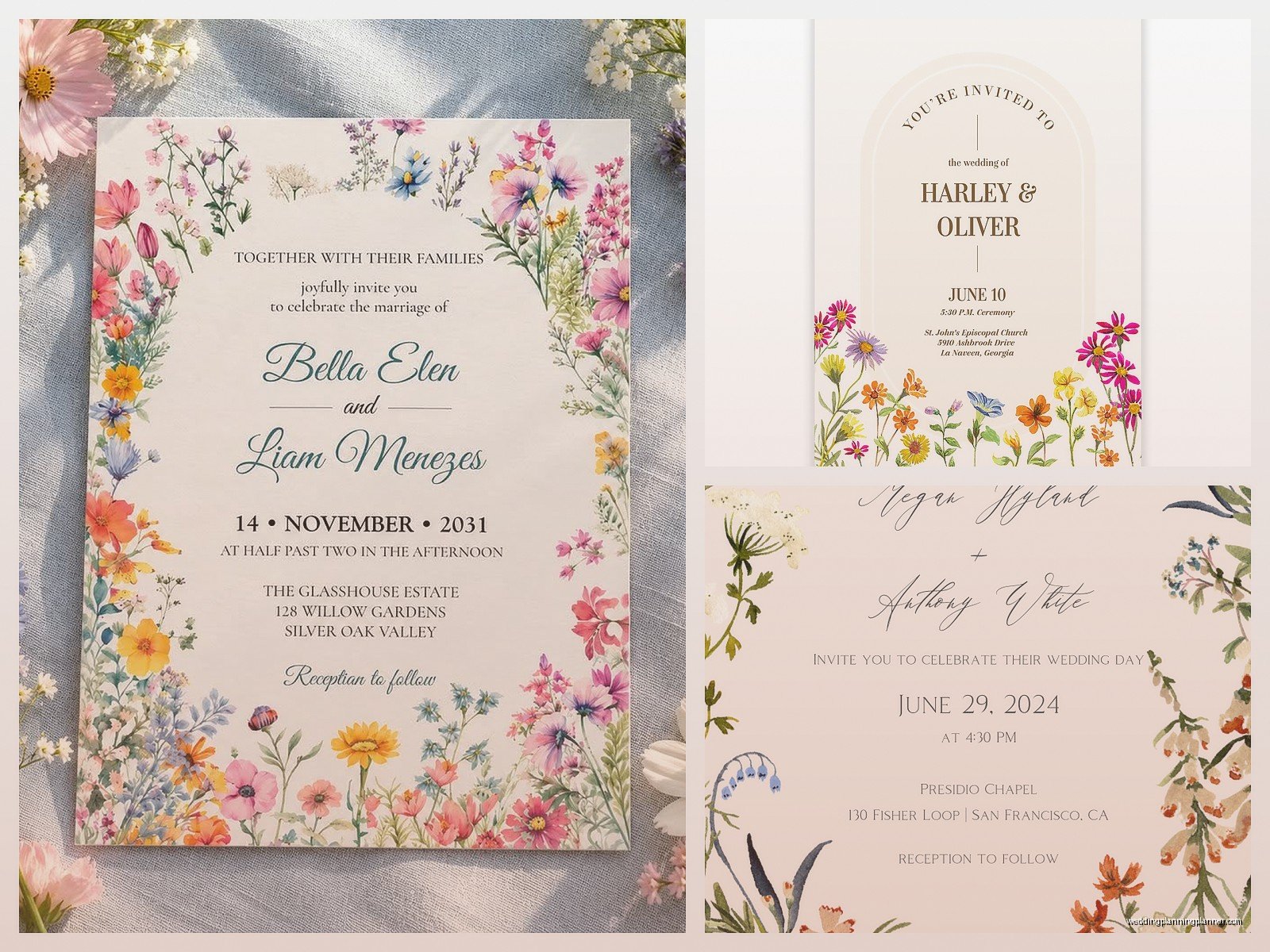
Watercolor illustrations are probably the most common right now. They’re soft, romantic, and you can customize the exact flowers and colors. The downside is that everyone and their cousin is doing watercolor florals, so you risk looking same-y. I worked with an illustrator in summer 2021 who did these incredible loose, sketchy wildflowers that didn’t look like every other Etsy template, and those invitations still stand out in my memory.
Line drawings or botanical sketches give you a more vintage, scientific vibe. Think old botanical textbooks. These work great if you’re doing a more rustic or cottagecore wedding. You can do them in black ink, sepia, or even colored ink.
Photography or digital scans of actual wildflowers look super realistic but can sometimes feel too heavy or dark on an invitation. You need a really good designer to make photographic florals not overwhelm the text.
Actual pressed flowers are gorgeous but here’s where I’m gonna be real with you—they’re expensive and time-consuming if you’re doing them for real. Like, actually pressing flowers onto each invitation. Some couples do this for small weddings (under 50 guests) but for anything bigger, you’re usually looking at printed versions that look like pressed flowers.
Paper and Printing Choices
The paper stock you choose seriously affects how the wildflower design comes across. I always tell couples that meadow botanicals need a paper that feels natural, not ultra-glossy or metallic.
Cotton paper is my go-to. It has this soft, textured feel that matches the organic vibe of wildflowers. The thickness makes the invitation feel substantial too, which matters more than people think.
Recycled paper with visible fibers or seeds embedded in it (yeah, plantable paper is a thing) works perfectly for eco-conscious couples. The slightly rough texture adds to the meadow aesthetic.
Vellum overlays can be pretty if you want to add dimension—like having wildflowers printed on the vellum layer over the main invitation. Just make sure the text is still readable because I’ve seen this go wrong where you can’t actually read the ceremony time and… that’s kinda the whole point of an invitation.
For printing, digital printing is most budget-friendly and works fine for most wildflower designs. Letterpress is stunning if you’re doing line drawings or simpler designs—the impression in the paper adds this tactile element that’s really special. Foil stamping can work for certain elements (like gold foil on wheat stems or copper on dried grasses) but don’t go overboard or it starts looking fancy-formal instead of meadow-casual.
Text and Typography Considerations
This is where a lot of people mess up actually. They choose these elaborate script fonts because they think it matches the romantic wildflower vibe, but then nobody can read the damn invitation. My cat knocked over my coffee while I was working on a wildflower suite last month and honestly the coffee stain looked better than the font the couple had originally picked.
For wildflower meadow invitations, you want typography that feels organic but stays legible:
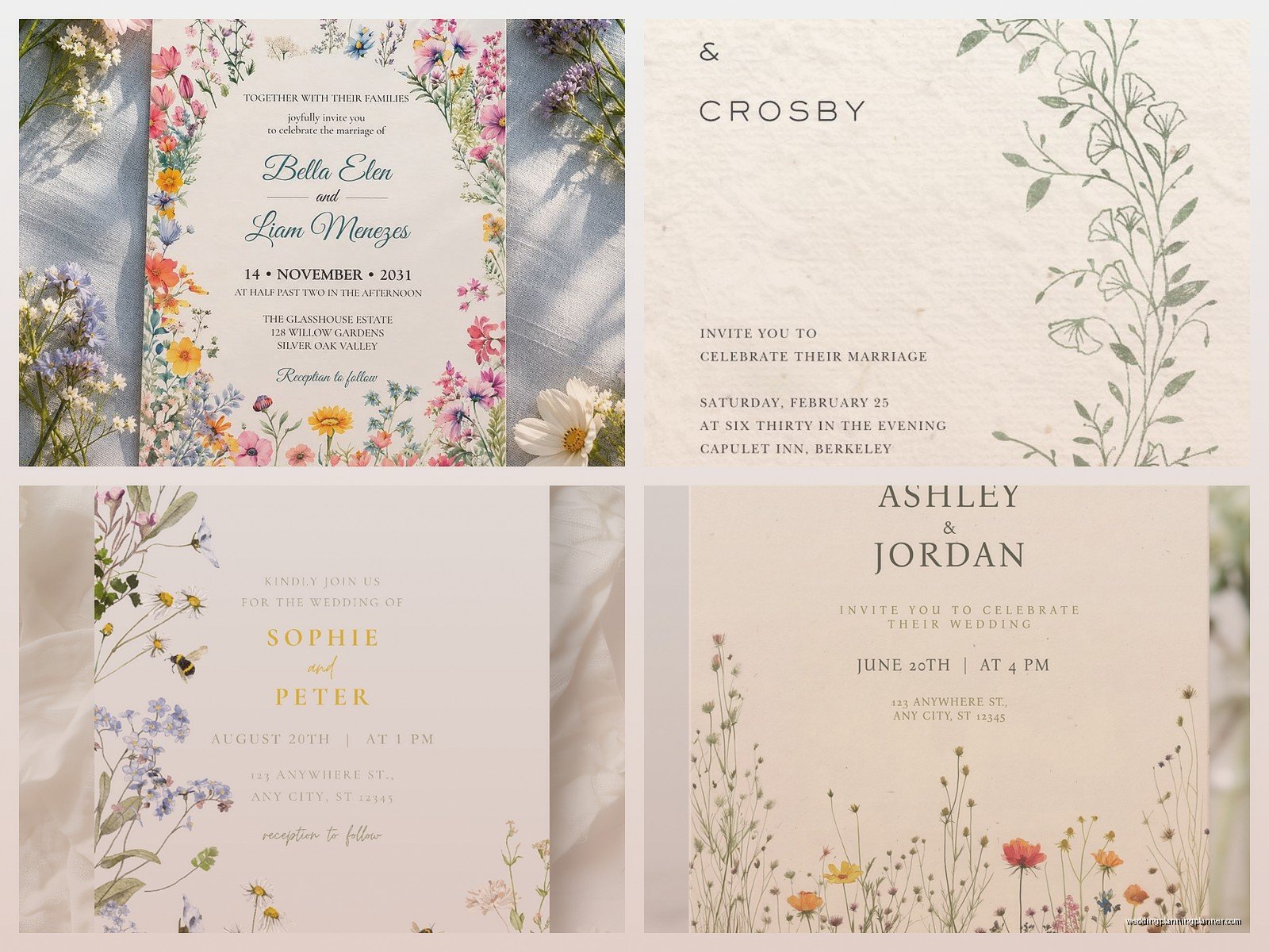
- Mix a simple serif or sans-serif for the main information with maybe one script font for names or “please join us”
- Don’t use more than two fonts total, maybe three if you’re really confident
- Make sure there’s enough contrast between the text and any background florals
- Consider the weight of your text—too thin and it disappears against busy wildflowers, too heavy and it fights with the delicate botanical elements
I usually go with something like a clean serif for the body text (ceremony details, date, time, location) and then a loose, handwritten-style font for the couple’s names. Keeps it balanced.
Color Combinations That Actually Work
The temptation with wildflowers is to use ALL THE COLORS because meadows are so diverse, right? But invitation design needs more restraint than an actual field of flowers.
Here are combinations I’ve used successfully:
Dusty blue + butter yellow + cream: Soft and summery without being too baby shower-ish. The blue grounds it.
Terracotta + goldenrod + olive green: Very fall meadow, warm and earthy. This palette photographs beautifully too.
Lavender + sage + white: Classic and calming. Works for spring or summer. Maybe a bit overdone lately but couples still request it constantly.
Coral + marigold + forest green: More vibrant and energetic. Good for couples who want color but not like… tropical bright.
Monochromatic: All shades of purple wildflowers, or all yellows, or all whites and creams. This actually looks really sophisticated and lets you use more variety of flower types without it getting chaotic.
The Suite Beyond the Main Invitation
Okay so you’ve designed the main invitation but wildflower meadow themes work across your whole stationery suite if you carry them through thoughtfully. You don’t want exact repeats of the same design on every piece—that gets boring.
Save the dates: Use a simpler version of your wildflower design, maybe just one or two flower types. This gives people a preview without giving away the whole look.
RSVP cards: I like doing a small corner accent or a single stem along the bottom. Keep it minimal since this is a functional piece.
Details cards: You can go a bit more decorative here with maybe a different arrangement of the same wildflowers you used on the main invite.
Envelopes: Liner options are endless—you can do an allover wildflower pattern, a watercolor wash in your colors, or even a meadow landscape scene. Envelope addressing in a botanical green or soft brown ink ties everything together. Some couples do wildflower illustrations on the envelope flap which looks really pretty when people open their mail.
Belly bands or ribbon: A simple ribbon in sage green or cream with a small wildflower tag or wax seal continues the theme without adding much cost.
Working With Designers or DIY Templates
Look, I’m gonna be honest—if you have zero design experience, fully custom wildflower invitations are probably beyond a DIY project unless you’re willing to spend like 40 hours learning design software. But there are options.
Custom designers: You’ll pay more (anywhere from $800 to $3000+ depending on complexity and quantity) but you get exactly what you want. Make sure you look at their portfolio and specifically their botanical work. Not every invitation designer is good at organic, flowing designs—some are better at geometric modern stuff.
Semi-custom templates: Sites like Minted or Zola have wildflower designs you can customize with your text and sometimes colors. This is the middle ground for budget and customization. You’re still gonna pay a few hundred bucks but way less than fully custom.
Etsy templates: If you’re comfortable with Canva or basic editing software, you can buy templates for like $15-40 and edit them yourself. The quality varies wildly (no pun intended) so read reviews. Some are gorgeous, some look like someone just slapped clipart on a background.
One thing that annoyed me recently was a couple who bought a cheap template, edited it themselves, didn’t check the bleed settings, and then blamed the printer when their invitations came out with white borders cutting through the wildflowers. Like… there are tutorials for this stuff, you gotta do the basic research if you’re going DIY.
Practical Details People Forget
The pretty design stuff is fun but there are practical things that’ll mess up your wildflower invitations if you don’t think about them:
Postage: Wildflower suites with vellum overlays, ribbons, or weird shapes need extra postage. Take a fully assembled invitation to the post office and have them weigh it BEFORE you buy 150 stamps. Also those invitations might need hand-canceling so they don’t get destroyed in sorting machines.
Timing: Custom invitations take time. Like, 8-12 weeks from design start to delivery is normal. If you’re doing letterpress add more time. Don’t email a designer 6 weeks before your wedding expecting wildflower invitations to materialize.
Proofreading: I cannot stress this enough—have multiple people read your invitation text before it goes to print. The number of times I’ve seen “Saterday” or wrong venue addresses on beautiful wildflower invitations is… it’s too many times.
Assembly: If you’re doing belly bands, ribbons, wax seals, or multiple inserts, assembly takes FOREVER. Budget time for this or hire it out. Some print shops offer assembly services.
Samples first: Always order a sample or proof before printing the full quantity, especially if you’re working with colors. Wildflower designs can look really different on screen versus printed, particularly if you’re doing watercolors.
Seasonal Authenticity
This might sound nitpicky but if you’re having a December wedding, maybe don’t use bright sunflowers and poppies all over your invitations? It just feels… off. I mean you can do whatever you want, it’s your wedding, but there’s something nice about having your invitation florals match the actual season or at least feel plausible for when your wedding is happening.
Winter weddings can still do wildflower themes using dried seed heads, evergreen sprigs, winter berries, and maybe some paperwhites or hellebores. Spring obviously has tons of options. Summer is peak wildflower season so go wild—uh, you know what I mean. Fall has those gorgeous late-season wildflowers with more muted, earthy tones.
Matching Your Invitation to Your Actual Wedding
Your wildflower invitation should hint at what guests will experience at your wedding, but it doesn’t need to be a literal preview. If you’re doing meadow wildflowers on your invites, that suggests an outdoor or garden wedding with a natural, organic vibe. Make sure your venue and overall wedding style align somewhat or guests might show up expecting a field party and find themselves in a hotel ballroom with crystal chandeliers and that’s gonna feel weird.
The florals in your invitation don’t have to match your actual bouquet or centerpieces exactly, but they should be in the same family. If your invitation is all delicate pastels and then your wedding has bold tropical flowers, there’s a disconnect. Just something to think about when you’re planning everything together or… you know, not everyone cares about this stuff being perfectly coordinated and that’s fine too, weddings are stressful enough without obsessing over whether your invitation cornflowers match your centerpiece cornflowers.
Anyway, wildflower meadow invitations are really versatile and work for so many different wedding styles as long as you pay attention to the details and don’t try to make them something they’re not. Keep the design organic, choose your colors intentionally, make sure people can actually read the important information, and you’ll end up with invitations that set the perfect tone for your wedding.

Canva
Wedding Memories Hardcover Template Canva Editable For Notebook, Journal, Novel, Hard Covers, Canva template For KDP Cover 6×9″ 120 pages
Canva
The Ultimate Wedding Planning Bundle, Canva Editable.
Canva
Customizable Wedding Video Invitations templates, Canva Editable Digital Wedding invitation Minimalist, Animated Custom Invitation
Digital Planning Templates
Wine Wedding Planner Bundle – 200-Page Printable PDF + 10 Editable Wedding Invitations | Instant Digital Download
Canva
Orange Wedding Planner Bundle – 200-Page Editable Canva Templates + 10 Editable Wedding Invitations | Instant Digital Download
Digital Planning Templates
Champagne Wedding Planner Bundle – 200-Page Printable PDF + 10 Editable Wedding Invitations | Instant Digital Download
Canva
Wedding Memories Hardcover Template Canva Editable For Notebook, Journal, Novel, Hard Covers, Canva template For KDP Cover 6×9″ 120 pages
Digital Planning Templates
Yellow Wedding Planner Bundle – 200-Page Printable PDF + 10 Editable Wedding Invitations | Instant Digital Download
Canva
Dusty Blue Wedding Planner Bundle – 200-Page Editable Canva Templates + 10 Editable Wedding Invitations | Instant Digital Download