
Planning Guides, Style Guide
Sage Green Wedding Invitations: Soft Green Herbal Designs
Nov
Sage Green Wedding Invitations Are Everywhere Right Now
Okay so sage green invitations are having a MOMENT and honestly it’s been that way since like 2019 but it really exploded during the pandemic weddings. I had this couple in spring 2023 who were dead set on sage green everything and we spent three weeks just looking at different shades because apparently there are like forty variations of “sage” and they all look completely different depending on your printer.
The thing about sage green is it’s not just one color – you’ve got your gray-greens, your dusty greens, your eucalyptus tones, your olive-ish situations. When you’re designing invitations with herbal elements, you gotta figure out which sage you’re actually going for because that changes everything about your design approach.
Why Herbal Designs Work With Sage
The botanical trend isn’t going anywhere. Herbs specifically – like actual cooking herbs, not just random greenery – give you this really grounded, organic feel that’s less “enchanted forest” and more “garden party that somehow looks expensive.” Think rosemary sprigs, thyme branches, sage leaves obviously, maybe some lavender if you’re feeling it.
I always tell clients that herbal designs work because they’re recognizable. Your grandma knows what rosemary looks like. It’s not some exotic flower that might be a peony or might be a ranunculus – it’s just… herbs. There’s something honest about that which fits really well with the whole understated elegance thing that sage green brings.
Paper Stock Matters More Than You Think
This is gonna sound nerdy but the paper you choose will literally make or break your sage green invitations. I learned this the hard way with a July 2021 wedding where the couple ordered online without asking me first and the sage green printed as basically gray on this super white glossy cardstock. It looked like a corporate memo.
For sage and herbals, you want:
- Matte or eggshell finish – nothing shiny unless you’re doing foil accents
- Cream or natural white bases work better than bright white
- Textured papers like cotton or linen add to that organic vibe
- Recycled paper actually looks really good with these designs if you’re into that
The weight matters too. You want at least 110lb cardstock for the main invitation, but I usually push people toward 130lb because it just feels more substantial. When someone picks up an invitation with herbal designs and sage tones, they should feel like they’re holding something from a fancy garden estate, not a flyer.
Design Layout Options That Actually Work
Alright so layout-wise you’ve got a few directions you can go. The minimalist approach is probably the most popular right now – lots of white space, one or two herb illustrations, sage green text or borders. Clean, simple, looks expensive without trying too hard.
Then there’s the full botanical situation where you’ve got herbs forming a wreath or border around your text. This can look amazing or really cluttered depending on execution, so… be careful I guess? The key is making sure your text is still super readable. I’ve seen designs where people get so excited about the greenery that you can barely read the venue information.
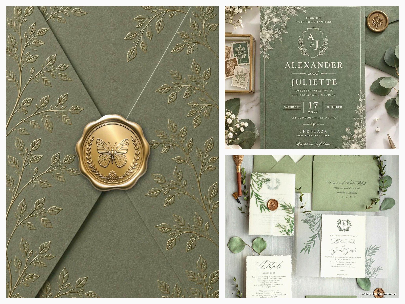
My personal favorite lately has been the asymmetrical approach – herbs clustered in one corner or along one side, everything else clean. It feels modern but still romantic. You can do this with watercolor herbs or line drawings or even pressed herb prints if you wanna get crafty.
Specific Herb Choices And What They Mean
People get really into the symbolism thing with herbs which is fine but also don’t stress about it too much. That said, here’s what different herbs bring to your design:
- Rosemary – remembrance and loyalty, also it just looks really elegant with those needle-like leaves
- Sage – wisdom and protection, obviously works well with sage green color scheme
- Thyme – courage and strength, the tiny leaves create nice texture
- Lavender – devotion and luck, though this pushes you more purple which might clash
- Olive branches – peace and friendship, very Mediterranean vibes
- Bay leaves – glory and honor, gives you those nice broad leaf shapes
You can mix and match but I wouldn’t go crazy with like seven different herbs. Pick two or three max and repeat them throughout your suite.
Color Combinations That Don’t Look Muddy
Here’s what annoys me about sage green – it can look really muddy and dull if you don’t pair it with the right colors. I’ve seen so many invitations where everything is just… green and beige and it looks like a nature documentary from the 90s.
Colors that actually elevate sage green herbal designs:
- Cream or ivory (not stark white, that’s too harsh)
- Terracotta or rust tones for warmth
- Gold foil accents – not too much, just touches
- Dusty rose or mauve if you need a softer romantic element
- Charcoal or deep gray for text, way better than black
- White space, like actual blank space, counts as a color choice
The biggest mistake is trying to make everything matchy-matchy. Your sage doesn’t need to be the exact same shade in every element. Actually it looks more natural and expensive when you have slight variations.
Printing Methods For Herbal Designs
Digital printing is fine, it’s affordable, it works. But if you’ve got the budget, letterpress or foil printing takes sage green invitations to another level. Letterpress gives you that impression in the paper that feels really tactile and special – my cat knocked over a stack of letterpress samples once and I was more upset about those than… anyway.
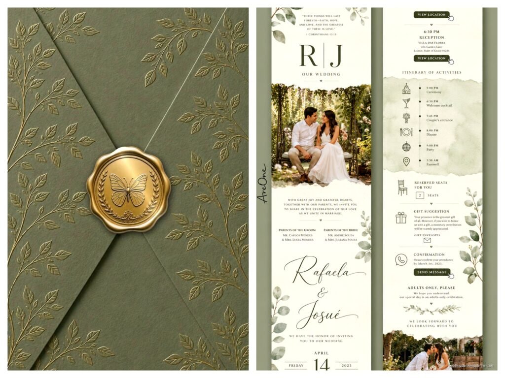
Foil stamping in gold or copper on sage green looks incredible, especially for herb outlines or borders. You can also do blind debossing which is just the impression without ink or foil, and that’s really subtle and modern.
For the actual herbal illustrations, you’ve got options:
- Watercolor style – soft and romantic, very popular
- Line drawings – clean and modern, works great with minimalist layouts
- Botanical prints – detailed and traditional, almost scientific looking
- Pressed herb prints – actual herbs used to create prints, super unique but harder to reproduce consistently
DIY Versus Professional Design
Look, you can totally DIY sage green invitations if you’re crafty and have time. There are templates everywhere – Etsy, Canva, all those places. But here’s the thing about herbal designs specifically: they need to look intentional, not like you just scattered some clip art around.
If you’re going DIY, invest in good quality herb illustrations or photos. Don’t use the free low-res stuff because it’ll print pixelated and weird. And please, please test print on your actual paper stock before you order 150 invitations. Colors look completely different on screen versus printed.
Professional designers can help you avoid common mistakes like putting dark green text on sage green background (can’t read it) or making your herbs too detailed and busy (looks chaotic when printed small). We also know how to set up files properly for different printing methods which saves you from… well, from disasters basically.
The Full Invitation Suite
Your invitation is just one piece. A full suite usually includes:
- Main invitation card
- RSVP card and envelope
- Details card (accommodations, website, whatever)
- Envelope liner or belly band
- Maybe a wax seal if you’re feeling fancy
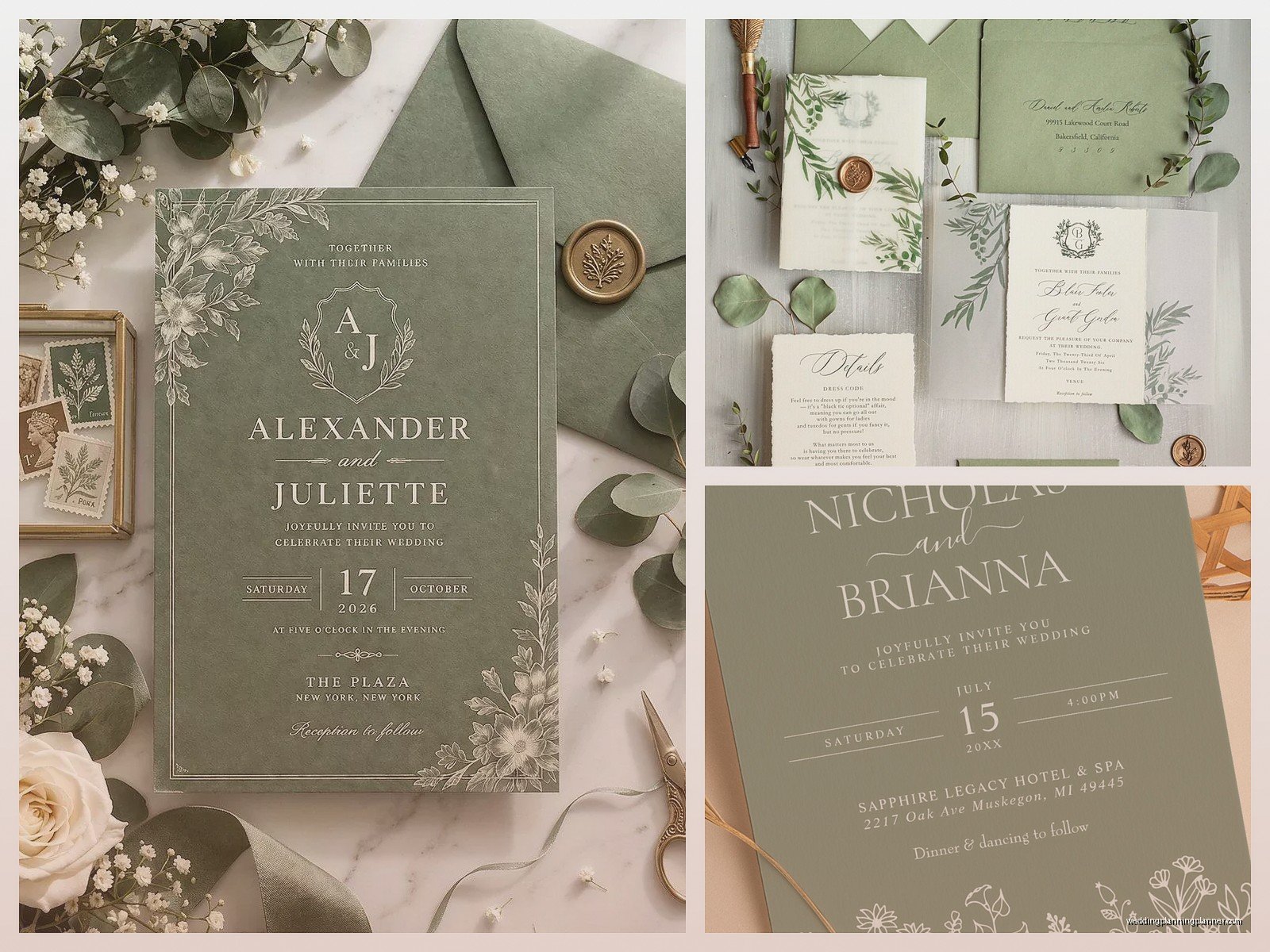
With sage and herbals, you don’t need to put herbs on every single piece. That’s overkill. Maybe your main invitation has the full herbal design, your RSVP card just has a small sprig in the corner, and your details card is mostly text with a simple border. Vary it up but keep it cohesive.
Envelope liners in sage green or with a subtle herb pattern are a nice touch that people notice when they open the invitation. It’s like a little surprise that makes the whole thing feel more considered.
Wording And Font Choices
The vibe of sage green herbal invitations is usually somewhere between rustic and refined, casual elegance, garden party sophistication – you know what I mean. Your wording should match that. Super formal traditional wording can feel off unless you’re doing a really classic botanical print style.
Fonts that work well: serif fonts for a traditional touch, modern sans-serifs for contemporary feel, or hand-lettered script for romance. Just don’t use more than two or three different fonts total or it gets messy. And please make sure your font is actually readable – I’ve seen some script fonts that are so swirly you need a decoder ring.
Text color in charcoal or deep gray usually looks better than black against sage elements. Black can be too harsh and creates too much contrast. You want everything to feel harmonious.
Timing And Ordering
Order your invitations at least 4 months before your wedding, earlier if you’re doing custom design or letterpress. Rush orders exist but they cost way more and stress everyone out.
Request samples before you commit to a large order. What looks good on a screen might not translate to paper the way you expect. That spring 2023 couple I mentioned? We went through five different sample rounds because the sage kept printing too blue or too yellow depending on the printer. It was exhausting but the final product looked perfect so whatever.
Order extras – like 15-20 more than you think you need. Addresses change, invitations get lost in mail, you’ll want keepsakes. It’s cheaper to order them all at once than to do a small reorder later.
Addressing And Assembly
Hand calligraphy on the envelopes in sage green or gold ink looks stunning but it’s pricey. Digital calligraphy (printed to look like hand calligraphy) is a good middle ground. Regular printed addresses are fine too, just use a nice font.
For assembly, there’s usually a specific order: invitation on bottom, then tissue paper if you’re using it, then reception card, then RSVP card, then any other inserts. The RSVP envelope goes under the RSVP card, addressed side up. Some people do belly bands or vellum wraps to hold everything together which looks really polished with herbal designs.
Don’t forget to account for postage weight – all those layers add up and you might need extra postage. Take a fully assembled invitation to the post office to weigh it before you buy stamps. Those fancy wax seals? They usually require hand-canceling which means extra postage and specifically asking the post office not to run them through machines or they’ll arrive broken.
Real Talk About Budget
Sage green herbal invitations can range from like $2 per suite if you’re doing basic digital printing with templates, up to $20+ per suite for custom letterpress with foil and all the extras. Most couples I work with land somewhere between $5-10 per suite for good quality semi-custom designs.
Where you can save money: skip the envelope liner, do digital printing instead of letterpress, use templates instead of custom design, assemble everything yourself, reduce the number of insert cards.
Where it’s worth spending: quality paper stock, professional printing, good herb illustrations, calligraphy addressing if your budget allows.
The invitation sets the tone for your whole wedding so it’s worth investing at least somewhat, but you don’t need to go into debt over stationery. There’s a middle ground where things look elegant and intentional without being ridiculously expensive.
Matching Your Wedding Theme
If you’re doing sage green invitations with herbs, your wedding probably has some garden or natural or organic element to it. Make sure your invitations actually match your venue and overall vibe. Sage and herbs work great for outdoor weddings, garden venues, farms, vineyards, even modern spaces with lots of greenery.
They might feel off for a ballroom wedding or ultra-modern industrial space unless you’re specifically going for that contrast. Just think about whether someone receiving your invitation will have accurate expectations about what your wedding will actually be like when they show up.
You don’t need to carry the exact same herbs through to your florals and decor, but there should be some thread connecting everything. If your invitations are all rosemary and sage, having bright tropical flowers at your reception would be kinda weird, right? Keep it cohesive but not obsessively matchy.

Canva
Wedding Memories Hardcover Template Canva Editable For Notebook, Journal, Novel, Hard Covers, Canva template For KDP Cover 6×9″ 120 pages
Canva
The Ultimate Wedding Planning Bundle, Canva Editable.
Canva
Customizable Wedding Video Invitations templates, Canva Editable Digital Wedding invitation Minimalist, Animated Custom Invitation
Digital Planning Templates
Wine Wedding Planner Bundle – 200-Page Printable PDF + 10 Editable Wedding Invitations | Instant Digital Download
Canva
Orange Wedding Planner Bundle – 200-Page Editable Canva Templates + 10 Editable Wedding Invitations | Instant Digital Download
Digital Planning Templates
Champagne Wedding Planner Bundle – 200-Page Printable PDF + 10 Editable Wedding Invitations | Instant Digital Download
Canva
Wedding Memories Hardcover Template Canva Editable For Notebook, Journal, Novel, Hard Covers, Canva template For KDP Cover 6×9″ 120 pages
Digital Planning Templates
Yellow Wedding Planner Bundle – 200-Page Printable PDF + 10 Editable Wedding Invitations | Instant Digital Download
Canva
Dusty Blue Wedding Planner Bundle – 200-Page Editable Canva Templates + 10 Editable Wedding Invitations | Instant Digital Download