Planning Guides, Style Guide
Black Wedding Card: Design & Ordering Guide
Jun
Okay so black wedding cards are having a MOMENT right now
Seriously though, I’ve been doing this wedding planning thing for almost two decades and black invitations used to be this edgy choice that maybe 2% of couples picked. Now? I’d say at least 30% of my clients are at least considering it. The whole aesthetic has shifted—black doesn’t read “funeral” anymore, it reads sophisticated and bold.
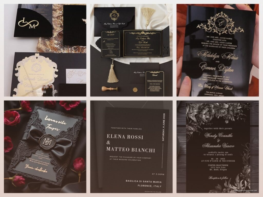
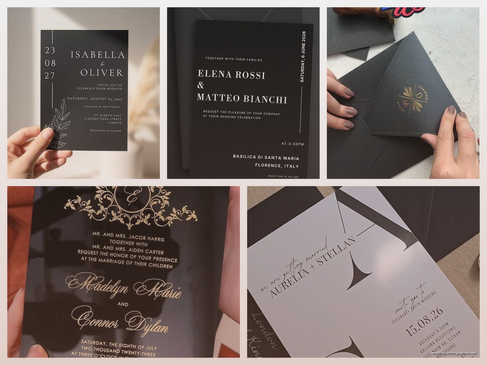
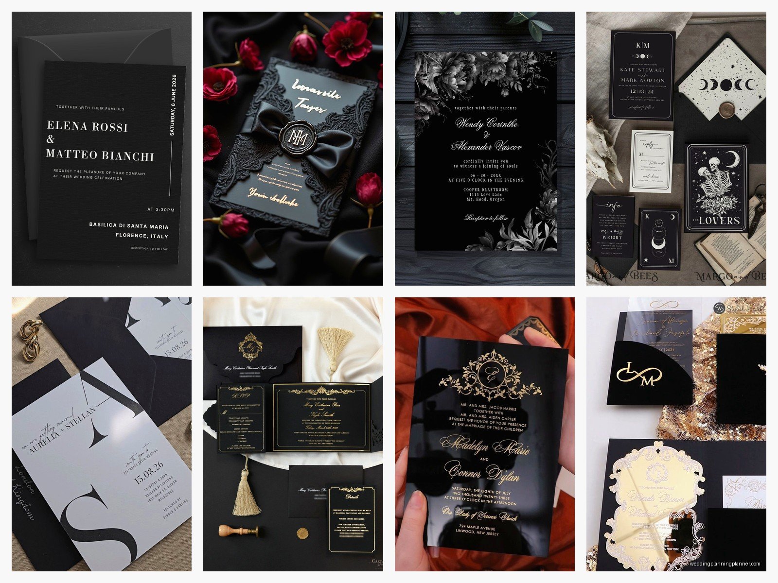
First thing you gotta know is that black wedding cards come in wildly different styles. You’ve got your all-black designs where literally everything is black including the envelope, then you’ve got black with metallic accents (gold, silver, rose gold), black with white text, or even black backgrounds with colorful elements. The variety is kinda overwhelming actually.
The paper stock matters SO much more than you think
I learned this the hard way back in summer 2021 when a couple ordered these gorgeous black cards online without asking me first, and they arrived looking like… construction paper? It was this flat, lifeless black that absorbed all light and just looked cheap. We had to reorder everything three weeks before the wedding and I was so stressed I actually broke out in hives.
Here’s what you need to know about paper:
- Matte black cardstock – This is your classic choice, super elegant, but it shows fingerprints like crazy. Tell everyone to handle them carefully or you’ll have smudges everywhere.
- Glossy or semi-gloss black – More dramatic, reflects light beautifully, but can look too “commercial” if you’re not careful. Works amazing with foil stamping though.
- Textured black paper – Linen finish, cotton finish, laid finish—these add dimension and hide imperfections better. My personal favorite for most couples.
- Velvet or suede finish – Okay this is getting fancy but if you have the budget, velvet-finish black cardstock is STUNNING. Feels luxurious, photographs beautifully.
Weight matters too. You want at least 110lb cardstock, preferably 130lb or heavier. Anything lighter and it feels flimsy, which totally defeats the whole “elegant black invitation” vibe you’re going for.
Printing methods and why foil stamping is your best friend
So here’s where it gets technical but also really important. You can’t just print black text on black paper with a regular printer—well you can but it’ll be invisible which is sort of a problem for an invitation.
Your main printing options are:
Foil stamping is probably the most popular choice for black cards. Gold foil, silver foil, rose gold, copper, even holographic foils look incredible against black. The contrast is just *chef’s kiss*. It’s more expensive than digital printing but not as pricey as you might think—I’ve seen foil-stamped invites for like $4-6 per piece which isn’t terrible if you’re doing a smaller wedding.
White ink printing gives you that classic look. It can be done digitally or with letterpress. Letterpress white ink on black cardstock is absolutely gorgeous but you’re gonna pay for it—sometimes $10-15+ per invitation. Digital white ink is more affordable and still looks great, just not quite as… I don’t know, tactile?
Thermography creates raised printing and works beautifully on black paper. It’s cheaper than letterpress but more expensive than flat digital printing. The raised effect catches light really nicely.
Laser cutting or die cutting is another direction entirely—cutting designs INTO the black paper so light shows through from a backing layer. Super dramatic but definitely on the pricier end.
Color combinations that actually work
Not all colors look good on black, which annoyed me to discover because I had this vision for a client’s invitations with navy blue text and it just… disappeared. Looked muddy and hard to read.
Colors that work brilliantly on black:
- White (obviously, classic, clean)
- Gold (any shade—yellow gold, champagne gold, antique gold)
- Silver and pewter tones
- Rose gold and copper
- Bright pink or fuchsia (for a modern pop)
- Emerald green (surprisingly stunning)
- True red (not burgundy, true red)
- Turquoise or bright teal
Colors that DON’T work well: navy, burgundy, forest green, purple (it reads muddy), brown, orange (unless it’s super bright neon orange which is a whole vibe).
Design elements that make black invitations pop
You need contrast and texture because an all-black flat card can look boring or worse, like a mistake. I always tell couples to think about layering and dimension.
Some ideas that work really well:
Vellum overlays – A translucent vellum sheet over the black card with text printed on the vellum creates this beautiful layered effect. You can do white vellum, or go bold with black vellum over a metallic or colored backing.
Belly bands or ribbons – A gold ribbon or a custom printed belly band adds a finishing touch and holds everything together. Literally and aesthetically.
Wax seals – Gold or silver wax seals on black envelopes are ridiculously elegant. Fair warning though, they can affect postage and some get damaged in mailing, so maybe do them on the actual invitation inside or hand-deliver if possible.
Envelope liners – Since you’re doing black cards, you might want black envelopes too, and a metallic or patterned liner inside makes opening the envelope feel like an event. Gold geometric patterns, floral prints, even family photos printed on the liner.
Ordering process and timeline (don’t mess this up)
Okay so the ordering timeline for black wedding invitations is basically the same as any invitation but I’m gonna walk you through it because people always underestimate how long this takes.
6-8 months before the wedding: Start looking at designs, order samples from different printers. You HAVE to order physical samples—what looks good on a screen might look terrible in person. Most companies charge like $2-5 per sample which is worth every penny.
5-6 months out: Finalize your design and wording. This takes forever because everyone has opinions—your mom wants formal wording, your partner wants casual, you’re stuck in the middle trying to make everyone happy. Just make a decision and move on, I promise no one will remember the exact wording six months later.
4-5 months out: Place your order. Most custom invitations take 3-4 weeks to produce, sometimes longer if there’s foil stamping or letterpress involved. Add extra time if you’re ordering during wedding season (May-October) because printers get backed up.
3 months out: Invitations should arrive. Check EVERYTHING immediately. Count them, check for typos (even though you proofed it 47 times, mistakes happen), make sure the color is what you expected. I had a situation in spring 2023 where a printer sent dark gray instead of true black and we had to rush reorder everything.
2.5-3 months out: Address envelopes, assemble everything, add postage. Pro tip: take a fully assembled invitation to the post office and have them weigh it. Black cardstock is usually heavier and you might need extra postage. Nothing worse than invitations getting returned for insufficient postage.
2-2.5 months out: Mail them. Give people at least 6-8 weeks to RSVP, especially if you have out-of-town guests who need to book travel.
Where to actually order these things
You’ve got lots of options and honestly the right choice depends on your budget and how custom you want to go.
Online printing services like Minted, Zazzle, Zola, Shutterfly—these are fine for simple designs and they’re affordable. You’re working with templates mostly, but they have black options and the quality is decent for the price. Expect $2-4 per invitation.
Etsy designers—this is a middle ground. You can find independent designers who create custom work or offer semi-custom templates. Quality varies WILDLY so read reviews carefully and always order samples. Prices range from $3-10 per invite depending on complexity.
Local print shops—if you want letterpress, foil stamping, or really custom work, find a local stationery designer or print shop. You’ll pay more ($8-20+ per invitation) but the quality and customization options are usually worth it. Plus you can see samples in person and actually talk to a human when things go wrong.
Luxury stationery designers—if budget isn’t a concern, companies like Bella Figura, Crane & Co, or boutique designers create museum-quality invitations. We’re talking $15-50+ per piece but they’re literal works of art.
Things that can go wrong (so you can avoid them)
The fingerprint situation I mentioned earlier? Real problem. Black shows every smudge, every fingerprint, every dust particle. When you’re assembling invitations, work on a clean surface and consider wearing those white cotton gloves like you’re handling museum artifacts. Sounds dramatic but I’m serious.
Printer ink or toner rubbing off—this happens with certain printing methods, especially if the printer didn’t seal the ink properly or… wait, my cat just knocked over my coffee mug, hold on.
Okay where was I. Right, ink rubbing off. Always do a rub test when your invitations arrive. Run your finger firmly across the printed area. If ink comes off, that’s a problem and you need to contact the printer immediately. Most reputable printers will reprint if there’s a quality issue.
Postage problems are another thing. Dark envelopes sometimes don’t go through postal sorting machines as easily, and the USPS has been known to reject certain types of closures or embellishments. Call your local post office and ask about mailing requirements before you order 150 invitations with bulky wax seals.
Text readability—I cannot stress this enough. What looks elegant and subtle on your computer screen might be completely illegible in real life. If you’re doing white text on black, the font needs to be substantial enough to read. Delicate script fonts in light colors can disappear. Always order a sample, take it outside in natural light, have your most honest friend look at it and tell you if they can read everything easily.
Matching suite pieces
So you’ve decided on black invitations, now you need to think about the whole suite—save the dates, RSVP cards, details cards, programs, menus, place cards, thank you cards. Do they all need to be black? Nah, but they should coordinate.
Some couples do black for the main invitation and then lighter colors for the other pieces. Like black invitation with gold foil, then cream RSVP cards with black text. Or all black suite but different metallics for each piece—gold invitation, silver programs, rose gold menus.
Just make sure there’s a clear visual connection. Same fonts, same color palette, same general vibe. You don’t want your invitation to be sleek modern black and gold and then your programs are rustic kraft paper with twine, you know?
Budgeting realistically
Let’s talk money because black invitations CAN be expensive but don’t have to be.
For a guest list of 100 people (so roughly 100 invitations accounting for couples and families), here’s what you’re looking at:
- Budget option (online template, digital printing): $200-400 total
- Mid-range (Etsy designer, foil accents): $500-1000 total
- High-end (custom design, letterpress or foil): $1500-3000+ total
These numbers include the full suite—invitation, RSVP card, envelopes, and maybe a details card. If you add things like envelope liners, belly bands, wax seals, custom postage stamps, you’re adding $100-500 more.
My advice? Splurge on the invitation itself and save money on other pieces. Your invitation is the first impression—it needs to be gorgeous. But your RSVP cards can be simpler and no one will care.
Wording and etiquette stuff
The actual words on your black invitation follow the same etiquette rules as any wedding invitation, but the dark aesthetic does give you a bit more flexibility to be modern and less traditional if you want.
Formal wording still works beautifully on black cards—there’s something about “Mr. and Mrs. John Smith request the honour of your presence” in elegant gold foil that just feels right. But you can also go completely casual: “Let’s party! Sarah and Mike are getting married” works too, especially with the right fonts and design.
One thing I always remind couples is that black invitations feel inherently more formal, so even if your wedding is casual, guests might interpret a black invitation as a signal to dress up. If you’re having a backyard BBQ wedding, you might want to make the casual vibe VERY clear in your wording so people don’t show up in tuxedos.
Digital printing vs splurging on foil
This is the question I get asked most. Is foil stamping worth the extra money?
Honestly? Usually yes. The way metallic foil catches light against matte black paper is just… there’s no digital printing method that replicates it perfectly. It feels special when you hold it, it photographs beautifully (and people WILL photograph your invitations and post them on social media), and it’s one of those details that elevates the whole thing from “nice” to “wow.”
That said, if you’re working with a tight budget, good quality digital printing with white ink can still look amazing. The key is using a printer who specializes in printing on dark paper—not all printers can do this well and you’ll end up with faded or streaky results if you go with the wrong company.
Okay I think I’ve covered most of the important stuff—paper weights, printing methods, where to order, what can go wrong, budgeting. The main thing is just to order samples before committing to anything, give yourself plenty of time, and don’t be afraid to go bold with the design because if you’re already choosing black invitations, you’re clearly not playing it safe anyway.