
Planning Guides, Style Guide
Fancy Wedding Invitations: Ornate Luxurious Designs
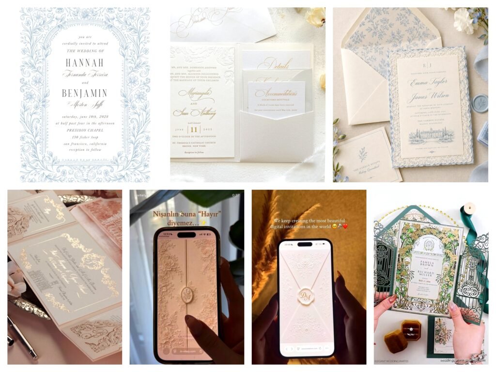
Nov
Okay so fancy wedding invitations are basically their own category at this point
Like you can’t just grab something off a template site and call it ornate. Real luxury invitations have this whole thing going on with layers and textures and honestly sometimes I look at them and think “someone’s gonna spill coffee on this before they even RSVP” but that’s the point right? They’re supposed to feel precious and over-the-top in the best way.
The main thing with ornate designs is understanding that you’re not working with one piece of cardstock. You’re building an experience. I had this bride in spring 2023 who wanted invitations that looked like they came from a French château and she kept sending me Pinterest boards with like seventeen different gold finishes and I’m sitting there thinking we need to narrow this down or her guests are gonna need sunglasses to open the envelope.
Layers are everything for that luxe look
So here’s what actually makes an invitation look expensive: layers. You want a belly band or a vellum overlay or both. The base card should be thick – I’m talking 120lb cardstock minimum, but honestly 130lb or even letterpress cotton paper feels way better. Then you add a layer of vellum with maybe some calligraphy or a wax seal on top. Or you do a belly band (that’s the paper strip that wraps around the whole suite) with a custom monogram or crest.
The belly band thing is kinda genius because it holds everything together AND it creates this unveiling moment when someone opens it. You can do them in satin ribbon, velvet ribbon for fall/winter weddings, or even metallic paper that matches your color scheme.
Printing techniques that actually matter
Letterpress is still the gold standard for fancy invitations. It creates this debossed impression in the paper that you can literally feel with your fingers. But it’s expensive – like really expensive. I usually tell clients to expect $15-30 per invitation suite just for printing, and that’s before you add extras.
Foil stamping is the other big one. You can do gold foil, rose gold, silver, copper, or even colored foils. The thing that annoyed me for YEARS was couples would see foil invitations online and not realize you can’t just foil stamp any design. You need clean lines and solid shapes because the foil needs something to adhere to. Those super delicate watercolor designs everyone loves? Yeah, they don’t foil stamp well. Learned that the hard way.
Thermography is like the budget-friendly version of letterpress. It creates raised printing that looks fancy but costs way less. Honestly for a lot of designs, guests can’t even tell the difference unless they’re really examining it closely.
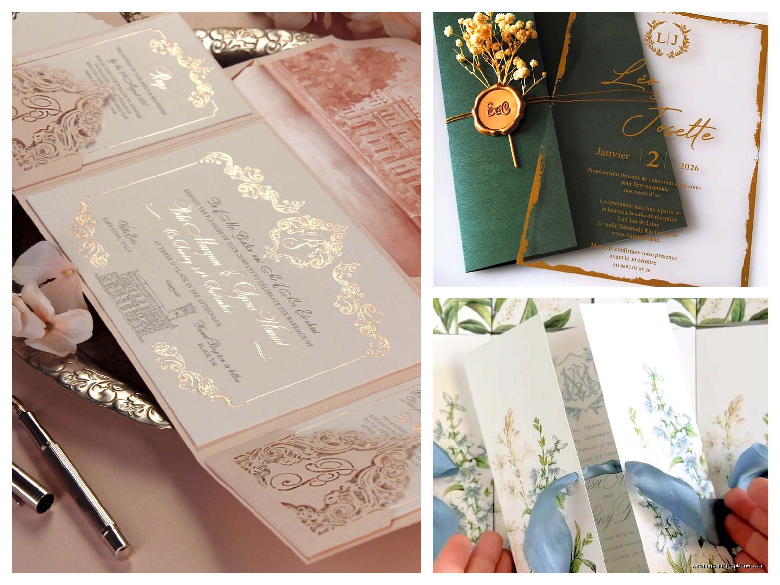
Digital printing has come so far though. You can get metallic inks, white ink on dark paper, and the quality is pretty amazing now. If you’re doing a super ornate design with lots of colors and details, digital might actually be your best bet because letterpress is limited to one or two colors usually.
Paper quality separates the okay from the wow
Cotton paper is where it’s at for luxury invitations. It has this soft, substantial feel that regular cardstock just doesn’t have. Crane’s Lettra is like the classic choice – it’s 100% cotton and it takes letterpress beautifully. But there’s also Bella Smooth, which is a cotton blend that’s slightly less expensive.
Textured papers add instant elegance. Linen texture, felt texture, even handmade papers with like flower petals or silk threads embedded in them. I worked with a couple who used lokta paper from Nepal that had actual gold leaf pieces in it and honestly it was so beautiful I kept one for myself.
Colored papers can be gorgeous too but you gotta be careful. Deep navy, burgundy, emerald green, or black can look incredibly sophisticated. But printing on dark paper usually means you need white ink or foil, which adds to the cost.
Envelopes deserve attention too
Your envelope is the first thing people see so don’t skimp here. Lined envelopes are basically required for fancy invitations. The liner should coordinate with your color scheme – it could be a solid color, a pattern, metallic paper, or even custom printed.
Envelope addressing is its own whole thing. You can do calligraphy (real calligraphy by a human, not printed to look like calligraphy), or you can do digital calligraphy which is basically a font that looks hand-done. Real calligraphy costs like $3-8 per envelope depending on the calligrapher. Digital is way cheaper but some people can tell the difference.
I’m gonna be honest, I cannot do calligraphy to save my life. My cat knocked over my practice ink bottle in 2021 and I just gave up after that. Now I have a list of calligraphers I recommend to every client.
Ornate design elements that actually work
Borders and frames immediately make something look more formal and expensive. Think art deco geometric borders, baroque scrollwork, or even simple double-line frames in gold foil. The border creates structure and makes all the text inside feel more important.
Monograms and crests are huge for luxury invitations. You can create a custom monogram with the couple’s initials in an ornate style – like intertwined letters with flourishes. Or go full aristocrat and design a family crest situation with shields and laurel branches and… okay that might be too much for some people but I’ve seen it done beautifully.
Floral illustrations work if they’re done in an elegant style. Not like cartoon flowers, but detailed botanical drawings or gold foil flower outlines. Peonies, garden roses, and olive branches are super popular right now.
Wax seals are making a comeback and honestly they’re one of my favorite details. You can get custom stamps made with initials or dates or little symbols. Real wax seals don’t mail great though – the post office sometimes smashes them. So there are adhesive wax seals now that look real but are actually flexible. They’re kinda genius.
Color palettes for ornate invitations
Metallics are obviously huge. Gold is classic, rose gold feels romantic, silver is modern elegant, copper is warm and sophisticated. You can mix metallics too – like navy with both gold and silver accents.
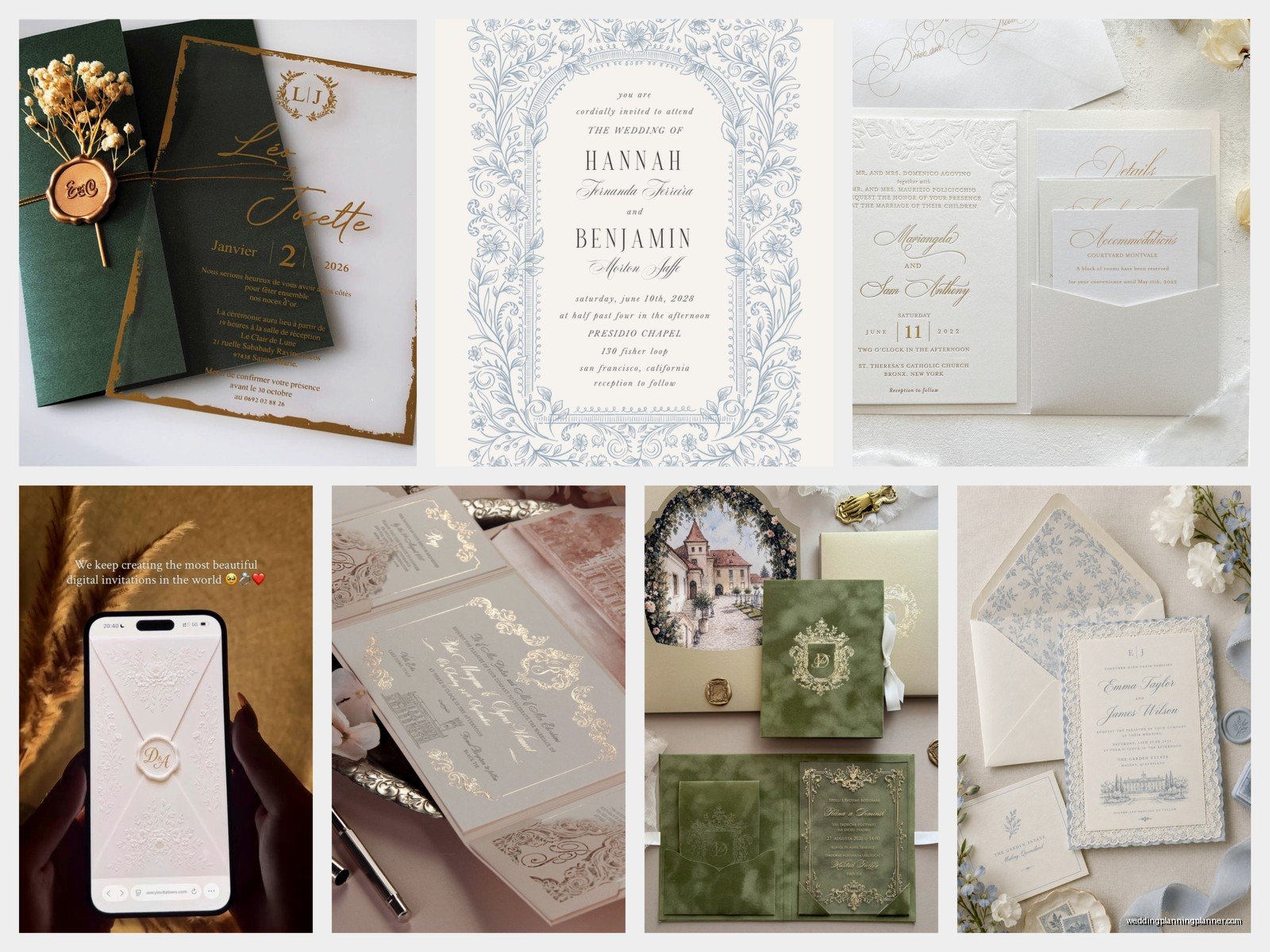
Jewel tones work really well for ornate designs. Emerald green with gold, sapphire blue with silver, amethyst purple with rose gold. These colors automatically feel rich and luxurious.
Black and white with metallic accents is timeless. Black letterpress on white cotton paper with gold foil details? That’s never gonna look dated.
Blush and gold is still going strong even though it’s been trendy for a while now. There’s a reason – it just works. Soft and romantic but still feels expensive.
The actual components of a fancy invitation suite
So a full luxury suite isn’t just one card. You’ve got the main invitation obviously, but then there’s usually a reception card if the ceremony and reception are in different places or different times. A details card with hotel information, wedding website, dress code. An RSVP card with its own envelope – and that envelope should be pre-addressed and stamped because you’re not making your guests hunt for stamps.
Some couples add a weekend events card if they’re doing a welcome party and brunch. Maybe a map card if the venue is hard to find, though honestly most people just use Google Maps now so that one’s less common.
All of these pieces should coordinate but they don’t have to match exactly. You could do the main invitation in letterpress, the details card in digital printing with the same fonts, the RSVP card with a foil border that echoes the main design. It’s about creating a cohesive look without going broke printing everything in letterpress.
Assembly is actually important
There’s a specific order for assembling fancy invitation suites. The main invitation goes on the bottom, face up. Then you stack the other cards on top in size order, largest to smallest. The RSVP card and its envelope go on top, with the envelope flap open so you can see the card tucked inside.
If you’re using a belly band, you wrap it around the whole stack before putting everything in the outer envelope. If you’re using a vellum overlay, that goes on top of the main invitation but under the other cards… actually wait, some people do it over all the cards. I’ve seen it both ways and honestly it depends on the design.
The whole assembled suite goes into the inner envelope (if you’re using one – they’re optional but traditional for formal weddings) with the text facing the back flap. Then that inner envelope goes into the outer envelope with the guests’ names facing the back flap so when they open it, they’re looking right at their names.
Budget realities because this stuff adds up fast
Okay so real talk – truly ornate luxury invitations can easily cost $25-50 per suite. Sometimes more if you’re doing like hand-painted details or gemstones or something wild. For 100 invitations, that’s $2,500 to $5,000 just for invitations.
You can make choices that keep the luxe look but reduce costs. Do letterpress on the main invitation only and print the other cards digitally. Use a beautiful paper but skip the foil stamping. Do a simple belly band instead of a custom wax seal on every envelope. Print your own envelope liners using a template and nice paper from a craft store.
One bride I worked with did this smart thing where she splurged on invitations for her 50 VIP guests – like parents’ closest friends, her grandparents, the bridal party. Full letterpress, hand calligraphy, wax seals, the works. Then for everyone else, she did a simplified version of the same design in digital printing with printed calligraphy. Same overall look, way less money, and honestly most guests didn’t know there were two versions.
Working with designers versus DIY
If you want truly custom ornate invitations, you probably need a designer. Stationery designers who specialize in luxury weddings will create something completely unique based on your wedding style, colors, venue, all of it. They handle the printing coordination, they know which techniques work together, they can troubleshoot when things go wrong.
Designers usually charge either a flat fee (like $800-2000 for full custom design) or they mark up the printing costs. Make sure you understand their pricing structure upfront.
Semi-custom is the middle ground. You choose an existing design from a luxury stationer’s collection and they customize the colors, wording, fonts, maybe add or remove some elements. This is way more affordable than full custom but still gives you a high-end look.
DIY is tough with ornate invitations because you need access to specialty printing techniques. You can’t letterpress or foil stamp at home. But you could design something beautiful and have it digitally printed, then add handmade elements yourself like ribbon, envelope liners, wax seals. It’s time-consuming but doable if you’re crafty.
Timing and logistics nobody tells you about
Order your invitations at least 4-5 months before your wedding. Custom printing takes time, especially letterpress which often has a 4-6 week turnaround. Then you need time for assembly, addressing, and mailing.
Get extra invitations printed. Like at least 10-15 extras. You’ll mess up addressing some envelopes, people will say they never got theirs, you’ll want to keep one for yourself. Extras are cheap when you’re already printing, expensive if you have to reorder later.
Mail a test invitation to yourself first. Seriously. See how it arrives, whether anything gets damaged, how long it takes. Fancy invitations with wax seals and thick paper sometimes need extra postage – you have to take one to the post office and have them weigh it.
Speaking of postage, you can get vintage stamps or custom stamps that coordinate with your design. There are people on Etsy who sell curated vintage stamp sets in specific colors. It’s a small detail but it adds to the whole fancy presentation.
Common mistakes with ornate invitations
Too much of everything. Just because you CAN add gold foil AND letterpress AND a wax seal AND ribbon AND a vellum overlay doesn’t mean you should. Sometimes restraint makes something look more expensive. Pick 2-3 special elements and do those really well.
Fonts that are too ornate to read. I see this all the time – couples choose these elaborate script fonts because they look fancy, but then half their guests can’t figure out what time the wedding starts. Ornate fonts are fine for names or small decorative text, but your main information needs to be legible.
Not considering the envelope size. If you’re adding lots of layers and inserts, make sure everything actually fits in a standard envelope size. Custom envelope sizes exist but they cost more and sometimes require extra postage.
Forgetting about accessibility. If you’ve got elderly guests or guests with vision issues, super light gray text on white paper with fancy fonts is gonna be hard to read. You can make something ornate and still readable – just keep the contrast strong and the key info in a clear font.
The other thing is not ordering save-the-dates and invitations from the same designer or at least in coordinating styles. When your save-the-dates are like beachy and casual and then your invitations are formal baroque gold extravaganza, it’s confusing. The whole paper suite should tell one story about your wedding style.
Trends in luxury invitation design right now
Agate slices and geode designs are still happening. Like actual thin slices of agate attached to invitations or geode-inspired artwork in metallics. It’s very extra but when done right, stunning.
Acrylic invitations are having a moment. Clear or frosted acrylic with printing directly on the surface, sometimes layered with paper elements. They’re modern and unexpected and definitely luxurious.
Deckled edges give that handmade artisan feel. The paper edges are intentionally rough and organic-looking instead of clean-cut. Works especially well with cotton paper.
Velvet elements – velvet ribbon, velvet paper, velvet envelope liners. Super tactile and rich-feeling, perfect for fall and winter weddings.
Hand-painted or watercolor details on each invitation. Okay this is like next-level expensive because someone’s literally painting every single one, but I’ve seen artists do small watercolor flourishes or paint the couple’s monogram on each suite and it’s absolutely gorgeous.
Laser cut designs are getting more sophisticated. Intricate patterns cut into the invitation or belly band or envelope liner. You can do lace-like patterns, geometric designs, floral motifs. The laser cutting is precise enough now that you can get really detailed.

Canva
Wedding Memories Hardcover Template Canva Editable For Notebook, Journal, Novel, Hard Covers, Canva template For KDP Cover 6×9″ 120 pages
Canva
The Ultimate Wedding Planning Bundle, Canva Editable.
Canva
Customizable Wedding Video Invitations templates, Canva Editable Digital Wedding invitation Minimalist, Animated Custom Invitation
Digital Planning Templates
Wine Wedding Planner Bundle – 200-Page Printable PDF + 10 Editable Wedding Invitations | Instant Digital Download
Canva
Orange Wedding Planner Bundle – 200-Page Editable Canva Templates + 10 Editable Wedding Invitations | Instant Digital Download
Digital Planning Templates
Champagne Wedding Planner Bundle – 200-Page Printable PDF + 10 Editable Wedding Invitations | Instant Digital Download
Canva
Wedding Memories Hardcover Template Canva Editable For Notebook, Journal, Novel, Hard Covers, Canva template For KDP Cover 6×9″ 120 pages
Digital Planning Templates
Yellow Wedding Planner Bundle – 200-Page Printable PDF + 10 Editable Wedding Invitations | Instant Digital Download
Canva
Dusty Blue Wedding Planner Bundle – 200-Page Editable Canva Templates + 10 Editable Wedding Invitations | Instant Digital Download