
Planning Guides, Style Guide
Retro Wedding Invitations: Vintage 50s-80s Designs
Nov
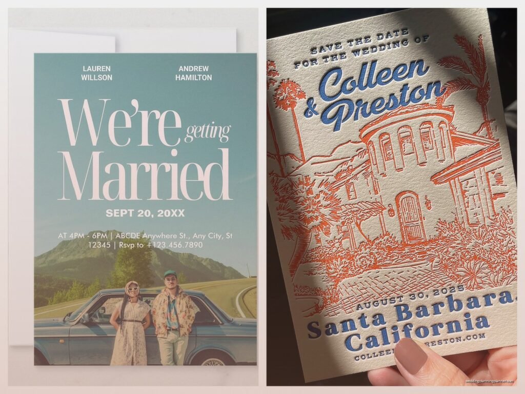
Okay So Retro Wedding Invitations Are Having a Massive Moment
You’re probably seeing them everywhere right now and honestly I get it because there’s something about vintage designs that just hits different than all those minimalist modern invites everyone was doing for like five years straight. The 50s through 80s gave us SO much good design inspiration and couples are finally figuring out how to use it without making their weddings look like a Halloween costume party.
First thing you gotta know is that each decade has its own vibe and they’re NOT interchangeable. I had this couple back in spring 2023 who kept sending me inspo pics that were like… 50s diner aesthetics mixed with 80s neon and I’m sitting there like how do I tell them this is gonna look completely unhinged. We eventually landed on late 70s disco vibes but man that was a journey.
Breaking Down Each Decade Because They’re All Different
The 50s Look
Fifties invitations are all about that post-war optimism and clean lines. Think pastel colors but not the washed out millennial pink stuff – I mean proper mint green, powder blue, coral pink, butter yellow. The typography was usually script fonts that were elegant but still readable (unlike some of the stuff we see now where you literally cannot tell what the invite says). You’ll see a lot of atomic age patterns, those starburst designs, and geometric shapes that feel kinda space-age.
For paper stock you want something with a slight texture, maybe a linen finish. Smooth glossy cardstock is gonna read too modern. I always tell clients to look for cream or ivory bases rather than bright white because bright white didn’t really exist the same way back then.
The illustrations from this era were often really sweet – little couples holding hands, church silhouettes, bells and flowers that were stylized but not overly detailed. If you’re going full 50s you might even consider that vintage luggage aesthetic if you’re doing a travel themed wedding since that was huge back then.
The 60s Situation
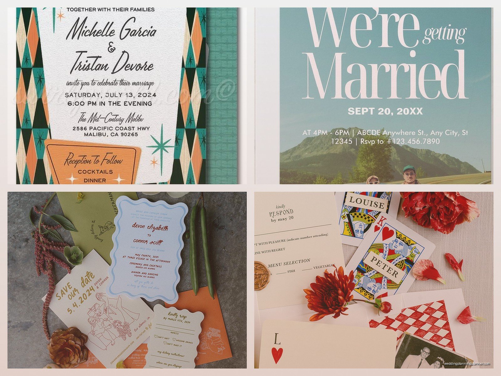
Sixty vibes split into two camps and you need to pick one. Early 60s is basically fancy 50s – still pretty conservative, lots of formal script, traditional layouts. But mid to late 60s is where things got WEIRD in the best way. Psychedelic patterns, bold typography, orange and avocado green combinations that should not work but somehow do.
If you’re doing mod 60s which is what most people mean when they say 60s wedding, you want geometric patterns, op art influences, and really bold color blocking. The fonts got more experimental – thick sans serifs, geometric shapes forming letters, really playful stuff. I’m obsessed with 60s invites that use those circular motifs and paisley patterns.
One thing that annoys me though is when people do 60s invites but then use modern printing techniques that make everything look too perfect. The whole point of that era was experimentation and slight imperfection. Consider letterpress or screen printing if your budget allows it because offset digital printing is gonna make it look like a recreation not an actual vintage piece.
The 70s Aesthetic
Seventies is probably the most versatile decade for wedding invites because you’ve got so many sub-genres. You’ve got your earth tone hippie vibes with browns, oranges, harvest golds, and those really organic flowing fonts. Then you’ve got disco glam with metallics, bold geometric patterns, and art deco revival elements. And then there’s also the country/rustic thing that was happening with more traditional Americana looks.
For a proper 70s invite I usually suggest thinking about what your venue is because that’ll guide which version of the 70s makes sense. Outdoor garden wedding? Go with the earthy bohemian route using kraft paper, wildflower illustrations, and those rounded bubbly fonts. Hotel ballroom? Lean into disco elegance with gold foil, black and white color schemes, and geometric borders.
The typography in the 70s was SO fun – you had those really thick rounded fonts that feel sorta like bubble letters, you had the continuation of psychedelic styles from the late 60s, and you also had this return to art nouveau and art deco influences. My cat knocked over my coffee while I was working on a 70s-themed suite last month and honestly the stain kinda looked like it could’ve been an intentional design choice which tells you how organic that aesthetic is.
The 80s Energy
Okay so 80s invitations are polarizing and I’m not gonna lie, they’re the hardest to pull off without looking tacky. But when they work? They WORK. You’re looking at bold colors – we’re talking hot pink, electric blue, purple, teal – often in combination. Memphis design influences with squiggly lines, geometric shapes, and patterns that seem random but are actually carefully composed.
The thing about 80s wedding invites is they were often really formal in structure but playful in decoration. So you might have very traditional wording and layout but then the border is this wild geometric pattern or there’s a color gradient happening. Pastels were also huge in the 80s – different from 50s pastels though, these were more saturated, almost neon-adjacent.
If you’re doing 80s you almost have to commit fully because half-hearted 80s just looks like you couldn’t decide on a style. I worked with a bride who wanted “subtle 80s” and I had to be like… that’s not really a thing? We ended up doing a mostly classic invite with a geometric border and it was fine but it wasn’t giving what it could’ve given if she’d just gone all in.
Actually Designing Your Retro Invite
Color Palettes That Won’t Make People Cringe
Here’s where people mess up constantly – they pick colors that REFERENCE the era but aren’t actually from the era. Like someone will say they want 70s vibes and then choose colors from a modern boho palette and it’s like nah that’s not it.
For 50s: Stick with pastels but make them slightly more saturated than modern pastels. Pair with cream or ivory, never bright white. Mint and coral together? Classic. Powder blue and butter yellow? Perfect.
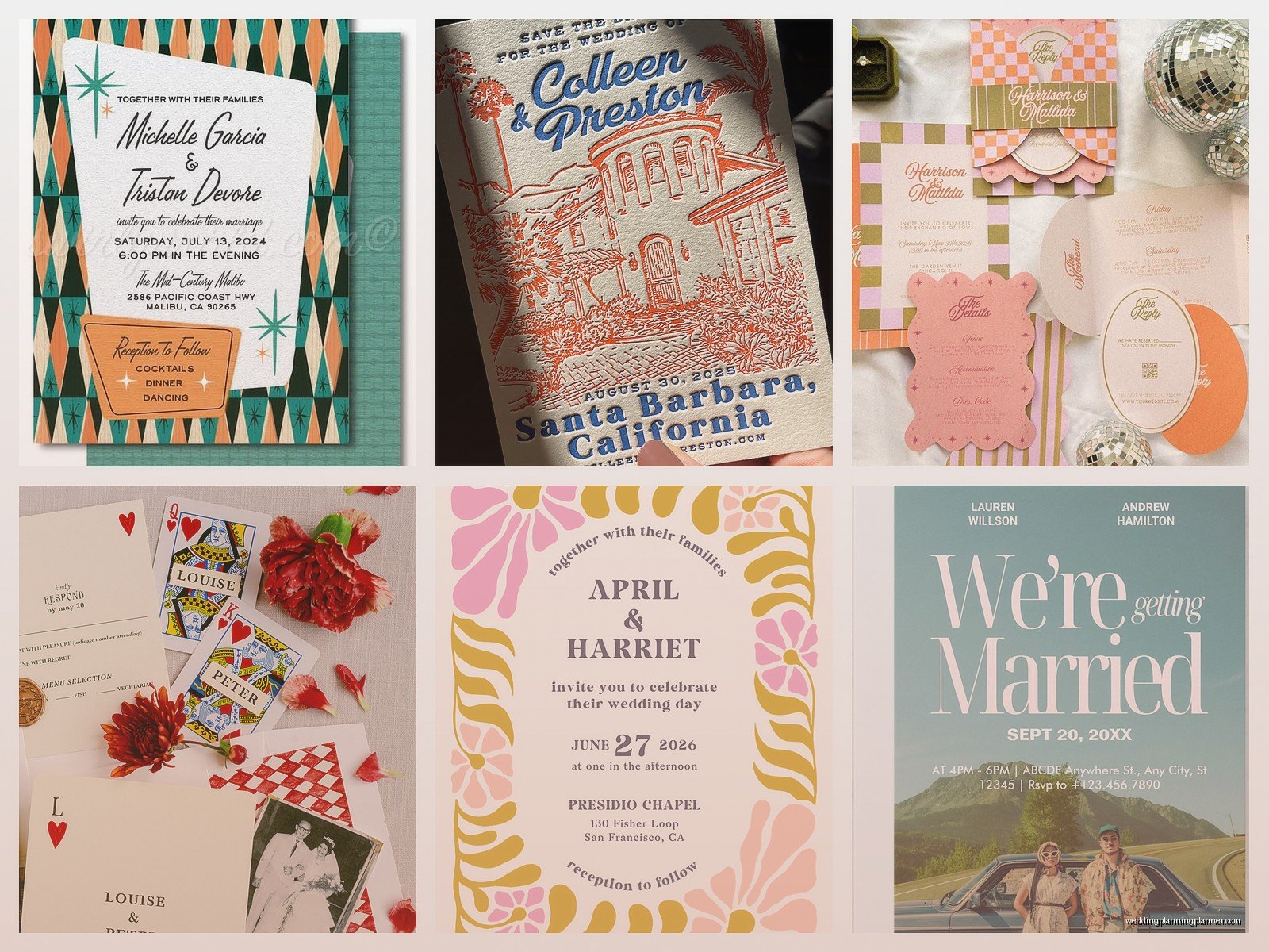
For 60s: If you’re going mod, you want saturated primary and secondary colors. Orange and pink together. Avocado green and gold. Teal and orange. Don’t be afraid of color combinations that seem wrong.
For 70s: Earth tones are your friend – burnt orange, harvest gold, chocolate brown, avocado (yes again), rust red. Or go disco with black, white, gold, and maybe one jewel tone like emerald or sapphire.
For 80s: Either go full neon brights or do the pastel version – peach, mint, lavender, and pink all together. Memphis style means you can throw in black and white geometric elements too.
Typography Is Everything
You cannot and I mean CANNOT use modern fonts on a retro invite. It’ll immediately break the illusion. Each era has specific font styles and you need to either find authentic vintage fonts or really good recreations.
For 50s look for elegant scripts like Pharmacy, Lobster (but use sparingly), or actual vintage fonts like Filmotype. Pair with simple sans serifs for details.
Sixties fonts include Cooper Black (the most 60s font ever), Bauhaus, or psychedelic-style fonts for the late 60s look. Geometric sans serifs work great for mod designs.
Seventies is where you get those groovy display fonts – think Windsor, Souvenir, ITC Bookman, or anything that looks like it belongs on a Fleetwood Mac album cover. Pair with simpler fonts for readability on the details.
Eighties fonts are gonna be things like Bodoni (very 80s), geometric sans serifs, and display fonts with strong personality. Neon-style fonts can work if you’re really committing to that aesthetic.
Layout and Composition
Vintage invitations had different layout conventions than what we do now. They were often more centered and symmetrical, especially for 50s and early 60s. As you move through the decades things get more experimental but there’s still usually a clear hierarchy.
Don’t try to cram everything onto one card the way modern minimalist invites do. Vintage suites often had multiple pieces – the main invitation, an RSVP card, maybe a details card, all coordinated but not identical. You can play with different colors and patterns across the pieces while keeping them cohesive.
Borders and frames were HUGE in vintage design. Whether it’s a simple geometric border for a 50s look or a wild Memphis-style frame for an 80s invite, don’t be afraid of decorative elements. Modern design has made everyone scared of ornamentation but vintage thrived on it.
Printing Methods That Actually Matter
Okay this is where I get kinda picky but it genuinely makes a difference. Digital printing is fine for modern invites but for vintage looks you really want to consider other methods because the texture and quality of the print affects how authentic it feels.
Letterpress is perfect for 50s and 70s designs. That impression in the paper is very vintage and it just feels expensive and intentional. The slight imperfections in coverage actually add to the vintage aesthetic.
Screen printing works amazing for 60s and 80s bold designs, especially if you’re using multiple colors. You can get really vibrant color saturation and it has that slightly handmade quality.
Offset printing is the most budget-friendly option that still looks good. It’s what was actually used for most vintage invitations so it’s authentic, and modern offset is high enough quality to reproduce vintage designs well.
Foil stamping was used in all these eras and it’s a great way to add that special vintage touch. Gold foil on a 70s disco invite? Perfect. Silver foil on a 50s elegant design? Chef’s kiss.
Details That Sell the Whole Vintage Thing
It’s the little stuff that makes people go “oh wow this is actually vintage-inspired” versus “they used a retro font I guess.”
Paper quality matters so much. You want cardstock with some texture – linen, laid, or even a slight grain. Super smooth modern cardstock will undermine your whole aesthetic. Weight-wise, go for something substantial, at least 100lb cover stock.
Envelope liners are very vintage and people forget about them. A patterned liner in coordinating colors immediately elevates your suite. For 50s do subtle patterns, for 60s-80s you can go bolder.
Stamps matter too – try to find vintage-style postage or at least avoid modern graphic stamps. The USPS has some classic designs that work better for vintage aesthetics.
Wax seals are having a comeback and they’re actually perfect for retro invites, especially 50s and 70s styles. Just make sure the color coordinates with your palette.
Belly bands, ribbon ties, or other closure methods were common in vintage suites. A simple ribbon in your color palette wrapped around the suite creates that vintage presentation.
Common Mistakes I See Literally All the Time
Mixing decades randomly – I mentioned this earlier but seriously pick ONE era and commit. A little crossover can work if you really know what you’re doing but most people don’t and it shows.
Using Instagram filters instead of actual design elements. I’ve had clients send me inspo pics that are just modern invites with a vintage filter applied and they’re like “this vibe” and I’m like that’s not a design that’s photo editing.
Not considering readability. Some vintage fonts are genuinely hard to read, especially ornate scripts or psychedelic styles. Your invite still needs to communicate information clearly. Use decorative fonts for headers and simple fonts for details.
Going too literal with themes. You don’t need to put a picture of a jukebox on your 50s invite or a disco ball on your 70s invite. The design elements themselves should convey the era without being costume-y.
Forgetting about your actual wedding style. Your invites should match your venue and overall wedding aesthetic. If you’re having a modern minimalist wedding, a bold 80s Memphis-style invite is gonna confuse your guests about what to expect.
Budget Real Talk
Vintage-style invitations can range from pretty affordable to extremely expensive depending on your approach. If you’re DIYing with templates and digital printing, you can probably do a full suite for under $300 for 100 invitations. If you’re going custom design with letterpress or screen printing, you’re looking at $1500-3000+ easily.
The middle ground is working with a designer who specializes in vintage styles (hi hello that’s me) and using quality digital or offset printing. This usually runs $600-1200 for 100 suites depending on how many pieces you include and what customization you want.
You can save money by doing digital RSVP cards instead of printed ones, simplifying your suite to just invite and details card, or using less expensive printing methods for some pieces. Like maybe letterpress for your main invite and digital for everything else.
Where to Find Inspiration That’s Actually Good
Pinterest is obvious but you gotta be careful because there’s a lot of modern stuff tagged as vintage that isn’t really capturing the authentic feel. I actually prefer looking at actual vintage ephemera – old advertisements, album covers, movie posters from the specific decade you’re targeting.
Etsy has tons of actual vintage invitations you can buy for reference. Spending $10-20 on a few real examples from your chosen era is honestly worth it to see the paper quality, printing methods, and design details in person.
Design archives and museums often have online collections. The Cooper Hewitt and MOMA both have searchable collections where you can filter by decade and see actual design work from those periods.
Old wedding magazines from your target decade if you can find them – sometimes libraries have archives or you can find scans online. These show you what was actually popular for weddings at the time, not just what modern designers think was popular.
Working With Designers vs DIY
Look I’m biased because this is literally what I do but there’s a real difference between DIY vintage invites and professionally designed ones. If you have a good eye for design and you’re willing to do the research, you can definitely create something nice yourself using templates or design software.
But if you’re not confident in your design skills, vintage aesthetics are actually harder to execute than modern minimalist stuff because there are more elements to balance. A designer who specializes in this will know which fonts pair well, how to create authentic-looking layouts, and which printing methods will give you the best result for your budget.
If you’re hiring a designer, make sure you look at their portfolio specifically for vintage work. Someone who’s amazing at modern calligraphy invites might not understand how to create authentic retro designs. Ask them about their process and what eras they’re most comfortable with.
For DIY, there are some good template marketplaces like Creative Market or Etsy where designers sell customizable templates. Just make sure you’re buying from someone who actually understands vintage design, not someone who slapped a retro font on a modern layout and called it vintage.
The biggest advantage of working with a pro is they’ll catch mistakes before printing – like when your color palette isn’t quite right for the era, or when your font pairing is off, or when… I’m rambling but you get it. Fresh eyes from someone who knows this stuff inside and out is valuable.
Matching Your Retro Invites to Other Wedding Stationery
Once you’ve nailed your invitation design, you’re gonna need to carry that aesthetic through to programs, menus, place cards, signage, and thank you cards. The good news is that once you’ve established your vintage style, applying it to other pieces is pretty straightforward.
Keep your color palette and fonts consistent across all pieces. You don’t need to use the exact same layout for everything – actually vintage weddings had more variety between pieces than modern weddings do – but the overall aesthetic should be cohesive.
Programs and menus are great opportunities to play with layout variations while keeping the style. Maybe your invite is very formal and centered but your menu has a more playful asymmetrical layout using the same fonts and colors.
Table numbers and signage can reference your era through frame styles, typography, and decorative elements without being exact replicas of your invite design. For a 50s wedding, use those starburst motifs on your table numbers. For 80s, incorporate geometric patterns into your signage.

Canva
Wedding Memories Hardcover Template Canva Editable For Notebook, Journal, Novel, Hard Covers, Canva template For KDP Cover 6×9″ 120 pages
Canva
The Ultimate Wedding Planning Bundle, Canva Editable.
Canva
Customizable Wedding Video Invitations templates, Canva Editable Digital Wedding invitation Minimalist, Animated Custom Invitation
Digital Planning Templates
Wine Wedding Planner Bundle – 200-Page Printable PDF + 10 Editable Wedding Invitations | Instant Digital Download
Canva
Orange Wedding Planner Bundle – 200-Page Editable Canva Templates + 10 Editable Wedding Invitations | Instant Digital Download
Digital Planning Templates
Champagne Wedding Planner Bundle – 200-Page Printable PDF + 10 Editable Wedding Invitations | Instant Digital Download
Canva
Wedding Memories Hardcover Template Canva Editable For Notebook, Journal, Novel, Hard Covers, Canva template For KDP Cover 6×9″ 120 pages
Digital Planning Templates
Yellow Wedding Planner Bundle – 200-Page Printable PDF + 10 Editable Wedding Invitations | Instant Digital Download
Canva
Dusty Blue Wedding Planner Bundle – 200-Page Editable Canva Templates + 10 Editable Wedding Invitations | Instant Digital Download