
Planning Guides, Style Guide
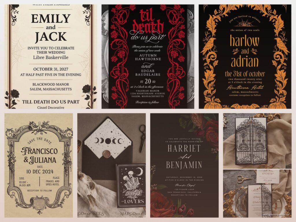
Gothic Wedding Invitations: Dark Victorian Theme Designs
Nov
Getting Started With Gothic Victorian Invitations
So gothic wedding invitations are having this massive moment right now and honestly I’ve been doing these for years before they got trendy. The dark Victorian aesthetic is probably one of my favorite things to work on because there’s so much room to play with textures and mood without going full Halloween costume party, you know?
The first thing you gotta understand is that gothic doesn’t automatically mean black everything. I had this bride back in spring 2023 who came to me absolutely convinced her invitations needed to be pitch black with red dripping font and I had to gently walk her back from that ledge because that’s… not Victorian gothic, that’s just horror movie poster. Victorian gothic is about richness, drama, ornate details, and yeah darkness but in an elegant way.
Color Palettes That Actually Work
Your base colors should be deep and moody. I’m talking:
- Deep burgundy or oxblood red
- Charcoal grey instead of straight black
- Midnight navy
- Deep purple or plum
- Forest green (this one surprises people but it works SO well)
- Ivory or cream as your light contrast, not bright white
You can absolutely use black but pair it with something. Black with gold foiling? Gorgeous. Black with deep red accents? Perfect. Just black with white text? Kinda boring actually and it reads more modern minimalist than Victorian.
Paper Stock and Texture
This is where people either nail it or completely miss the mark and it annoys me so much when I see couples cheap out on paper stock for a gothic theme. The Victorian era was all about texture and quality, so your invitation needs to feel substantial when someone picks it up.
I always recommend:
- Cotton paper stock, minimum 110lb cover weight
- Textured papers like laid or linen finish
- Handmade deckle edge paper if your budget allows
- Vellum overlays (these are so Victorian and add that mysterious quality)
The deckle edge thing is actually something I discovered by accident when my cat knocked over a stack of samples in my office and one tore in this really beautiful way, and I was like… wait, that’s kinda the look. Obviously we do it properly with actual deckle edge tools now but yeah, Muffin gets credit for that inspiration.
Typography Choices
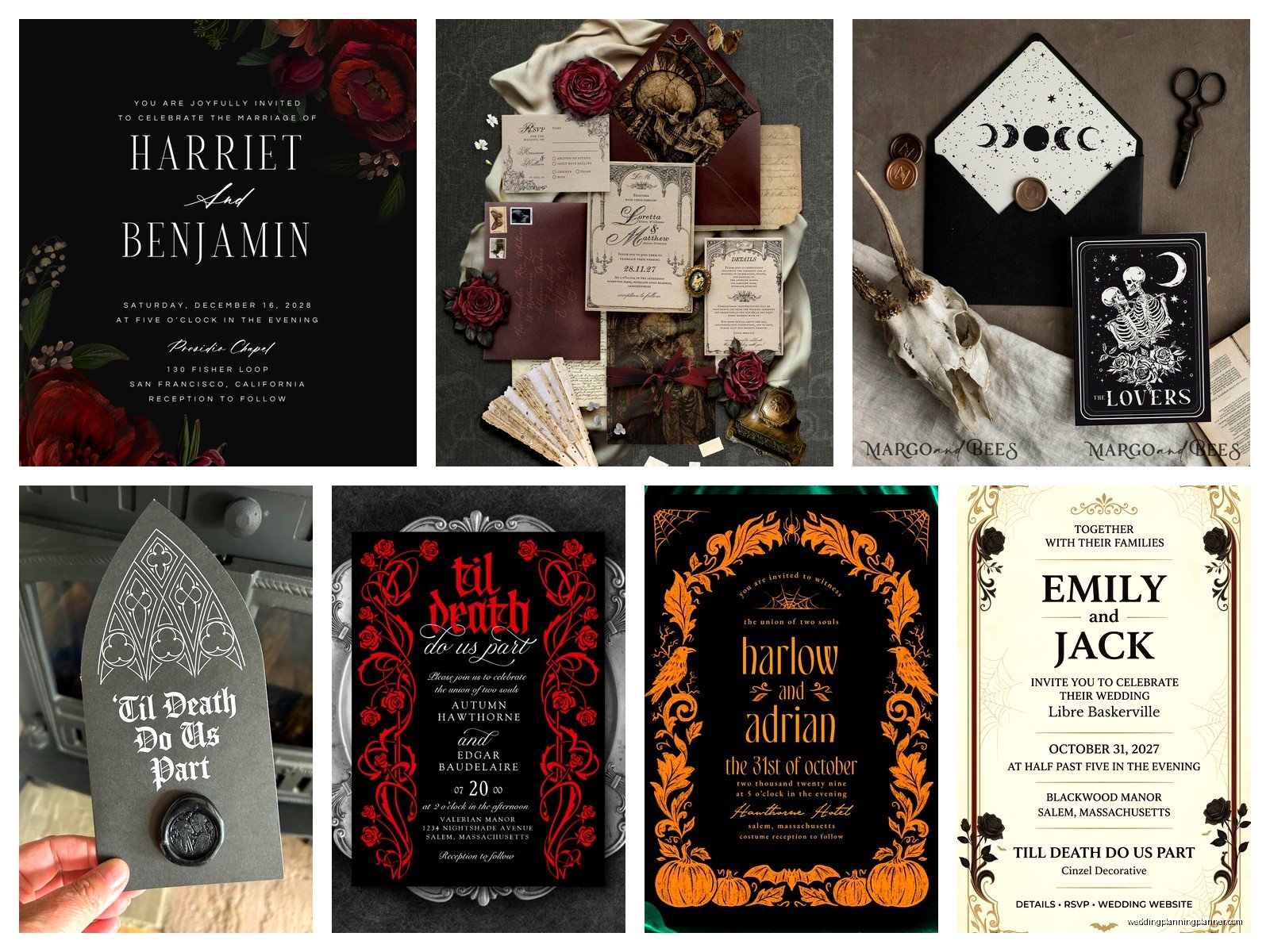
Okay so fonts are where everyone goes wrong initially. You want ornate but readable. I cannot stress this enough – if your guests need a magnifying glass and a Victorian literature degree to read your invitation, you’ve gone too far.
Good font pairings include:
- An ornate script for names (Edwardian Script, Kunstler Script)
- A clean serif for body text (Garamond, Didot, Bodoni)
- Maybe a decorative Victorian font for headers but use sparingly
What you don’t want is that Old English blackletter font for everything. I see this mistake constantly and it just looks like a medieval dungeon invitation, not Victorian gothic. The Victorians actually used pretty readable fonts for the most part, they just made them fancy with flourishes and ornamental borders.
Design Elements and Motifs
This is the fun part where you really get to build that dark romantic atmosphere. Victorian gothic design pulls from nature, architecture, and symbolism that was popular during that era.
Strong motif choices:
- Roses (especially dark red or black roses)
- Thorns and brambles
- Ravens, crows, or black birds
- Ornate frames and borders with filigree
- Cameos or silhouettes
- Gothic architecture elements like arches and spires
- Damask patterns
- Vintage keys and locks
- Pocket watches or clocks
- Candelabras
- Victorian mourning imagery (tastefully done)
You can also incorporate death-positive Victorian symbolism like skulls or skeletons but you gotta be careful with this because it can tip into tacky territory really fast. I had a couple in summer 2021 who wanted anatomical heart illustrations on their invitations and we made it work by doing it in a vintage medical illustration style with gold foiling, so it looked artistic and intentional rather than… weird.
Finishing Touches That Elevate Everything
The details are what separate a good gothic invitation from a great one. Victorians were obsessed with embellishment and you should be too.
Consider adding:
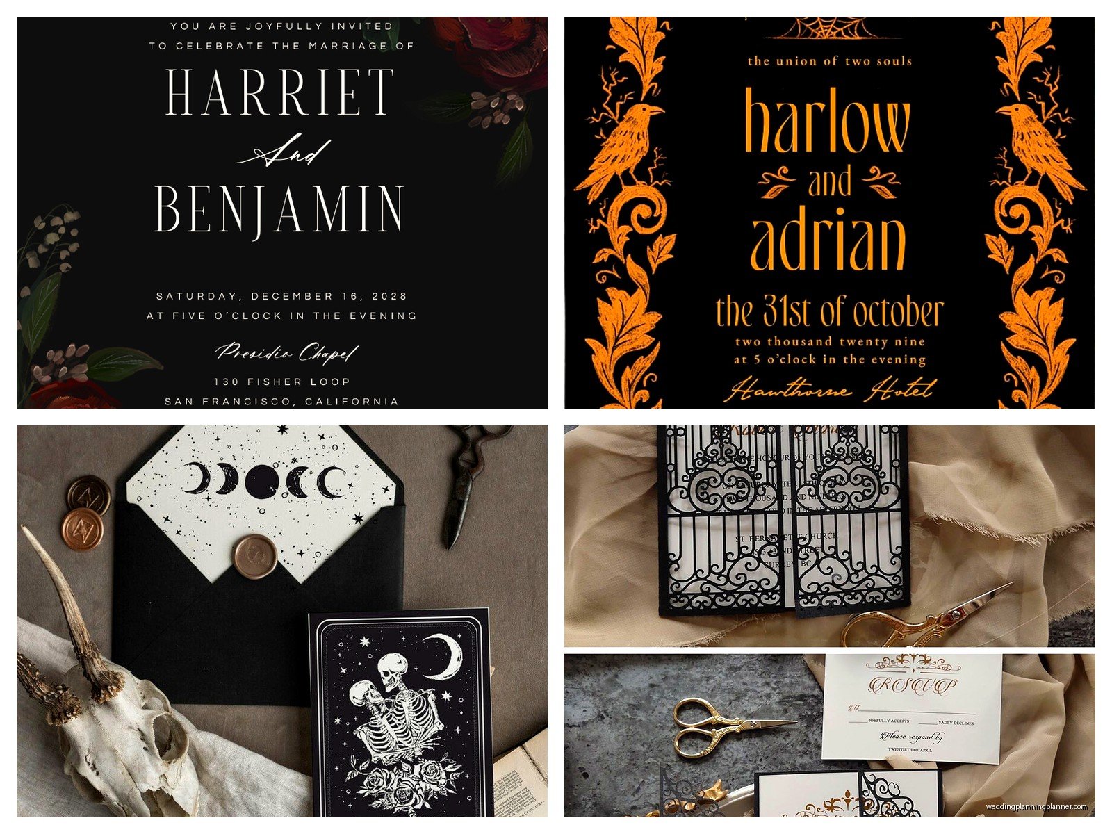
- Wax seals (deep red, black, or gold wax)
- Silk or velvet ribbon
- Gold, silver, or copper foil stamping
- Embossing or debossing
- Laser cut details
- Lace overlays or borders
- Vintage postage stamps (you can find Victorian-style ones)
The wax seal thing is probably my favorite finishing touch because it’s so tactile and dramatic. You can get custom seals made with your initials or a symbol that means something to you. I always tell couples to practice on scrap paper first though because melted wax is gonna go everywhere your first few tries.
Layout and Structure Options
Victorian invitations weren’t just flat cards – they were often elaborate multi-piece sets with all sorts of inserts and layers. You can modernize this tradition while keeping the gothic aesthetic.
Popular formats:
- Gatefold invitations that open like doors
- Pocket invitations with multiple inserts
- Booklet style with multiple pages
- Tri-fold with reveal elements
- Belly bands or wraparound sleeves
- Box invitations (more expensive but super dramatic)
I did this one invitation suite that was designed like an old book with a fabric cover and the invitation details were printed on pages inside, and it had a ribbon bookmark – the couple was obsessed with Gothic literature so it fit perfectly. That project took forever though and I definitely underquoted them on labor costs which was annoying but it turned out so beautiful I couldn’t even be mad.
Wording and Tone
Your invitation wording should match the aesthetic. You don’t need to write in old English or anything weird like that, but you can incorporate slightly more formal or romantic language.
Instead of “Join us for our wedding” you might say:
- “Request the honor of your presence”
- “Invite you to witness their union”
- “Summon you to celebrate” (if you want to be a bit playful)
You can also include romantic quotes from Victorian literature – Edgar Allan Poe, the Brontë sisters, Oscar Wilde, Mary Shelley. Just keep it short because you don’t want the invitation to feel cluttered or like… a book report.
Printing Methods
How you print matters almost as much as what you print. Different printing methods give different effects and some are more suited to gothic designs than others.
Letterpress: This is the most Victorian option because it was literally the printing method they used back then. It creates an impression in the paper and has this gorgeous tactile quality. Perfect for gothic invitations but it’s expensive.
Digital printing: Most affordable option and technology has come so far that you can get really rich colors and details. Good for intricate designs with lots of color variation.
Thermography: Creates raised text that’s shiny, kinda looks like engraving but way cheaper. Can work for gothic designs if you use it strategically.
Foil stamping: Adds metallic elements without the cost of full letterpress. I love combining digital printing with foil stamping for gothic invitations – print the base design digitally then add gold or silver foil accents.
Engraving: The most expensive option but creates the finest, most crisp details. If you have the budget, engraved invitations are absolutely stunning for this aesthetic.
Envelope and Presentation
Don’t forget about your envelopes because they’re the first thing people see. A gorgeous invitation in a boring white envelope is such a missed opportunity.
Envelope ideas:
- Black envelopes with metallic addressing
- Deep colored envelopes that match your palette
- Envelope liners with damask or gothic patterns
- Pointed flap envelopes (more dramatic than straight flaps)
- Vellum or glassine outer envelopes
For addressing, you can do calligraphy in metallic ink, use a vintage typewriter, or even print addresses in a Victorian-style font. I had this one bride who hired a calligrapher to address everything in white ink on black envelopes and it looked insane – like, so dramatic and perfect.
Coordinating Suite Pieces
Your invitation is just one piece. A full suite typically includes:
- Main invitation card
- RSVP card and envelope
- Details card (accommodations, website, etc.)
- Reception card if ceremony and reception are separate
- Weekend events card for multi-day weddings
All of these should coordinate but they don’t need to be identical. You can vary the designs slightly – maybe the main invitation is more ornate and the other pieces are simpler but use the same color palette and fonts.
Some couples also do coordinating:
- Save the dates
- Programs
- Menu cards
- Place cards
- Thank you cards
Just be aware that doing everything in a super ornate gothic style can get expensive fast and also might be overwhelming for your guests if like, every single paper item is dark and dramatic. Sometimes it’s nice to pull back on some of the smaller pieces.
Budget Considerations
Gothic Victorian invitations can range from pretty affordable to absolutely astronomical depending on your choices. Here’s where you can save versus where you should probably spend.
Save money by:
- Using digital printing instead of letterpress
- Limiting foil stamping to just one element (like names or a border)
- Doing single-layer invitations instead of multi-piece sets
- Addressing envelopes yourself or using a printer instead of hiring a calligrapher
- Ordering from online template sites and customizing (lots of good gothic templates exist now)
Spend money on:
- Good quality paper stock (this makes the biggest difference honestly)
- At least one special finishing touch like wax seals or ribbon
- Professional design if you’re not confident doing it yourself
I always tell couples to order samples before committing to a full print run. What looks good on screen doesn’t always translate to paper, especially with dark colors and metallic elements.
Common Mistakes to Avoid
After doing these for years, I’ve seen the same mistakes over and over. Don’t do these things:
- Using too many different fonts (stick to 2-3 max)
- Making text too small or too ornate to read easily
- Going so dark that details get lost
- Mixing Victorian gothic with other themes that clash (like rustic or boho)
- Forgetting about postage costs – thick, heavy invitations cost more to mail
- Not ordering enough extras (always order at least 15-20 extra)
- Waiting until the last minute to order (specialty printing takes time)
Also please for the love of everything, proofread multiple times. I had a client once who approved invitations with her fiancé’s name spelled wrong and we had already gone to print and it was this whole nightmare situation that… anyway, just proofread.
Working With a Stationery Designer
If you decide to hire someone (and for gothic Victorian, I usually recommend it unless you have design experience), here’s what to bring to your first consultation:
- Inspiration images saved in a folder
- Your color palette
- Your budget range (be honest about this)
- Guest count estimate
- Timeline for when you need them
- Any specific Victorian elements or symbolism you want included
A good designer will be able to take your vision and make it cohesive and actually executable. They’ll also know what’s possible within your budget and timeline, which is super valuable.
The back-and-forth process usually involves a few rounds of revisions. Don’t feel bad about asking for changes – that’s literally what you’re paying for – but also try to consolidate your feedback so you’re not doing like 47 tiny revision rounds because that gets old for everyone involved.
DIY Options
If you’re crafty and want to DIY, it’s totally doable but go into it with realistic expectations. Gothic Victorian invitations are more complex than simple modern designs, so they’ll take more time.
You’ll need:
- Design software (Canva has templates, or Adobe if you know how to use it)
- A good printer or access to a print shop
- Paper trimmer for clean edges
- Bone folder for crisp folds
- Whatever embellishments you’re adding
- Patience because something will definitely go wrong
I watched someone try to DIY 150 invitations two weeks before their wedding and it was… stressful. Give yourself way more time than you think you need, especially if you’re doing things like hand-tying ribbons or applying wax seals to each one.
One thing that actually works well for DIY is ordering professionally printed invitation cards and then adding your own embellishments. So you get the quality printing but still have that personal touch and save some money. You can buy pre-cut cardstock, envelopes, wax seal kits, and ribbons from craft stores or specialty paper suppliers pretty easily now.
Just make sure you do a few complete test runs before you commit to doing all of them, because what seems easy for one invitation becomes tedious by number 50 and you’ll wanna make sure your method actually works and looks consistent across all of them

Canva
Wedding Memories Hardcover Template Canva Editable For Notebook, Journal, Novel, Hard Covers, Canva template For KDP Cover 6×9″ 120 pages
Canva
The Ultimate Wedding Planning Bundle, Canva Editable.
Canva
Customizable Wedding Video Invitations templates, Canva Editable Digital Wedding invitation Minimalist, Animated Custom Invitation
Digital Planning Templates
Wine Wedding Planner Bundle – 200-Page Printable PDF + 10 Editable Wedding Invitations | Instant Digital Download
Canva
Orange Wedding Planner Bundle – 200-Page Editable Canva Templates + 10 Editable Wedding Invitations | Instant Digital Download
Digital Planning Templates
Champagne Wedding Planner Bundle – 200-Page Printable PDF + 10 Editable Wedding Invitations | Instant Digital Download
Canva
Wedding Memories Hardcover Template Canva Editable For Notebook, Journal, Novel, Hard Covers, Canva template For KDP Cover 6×9″ 120 pages
Digital Planning Templates
Yellow Wedding Planner Bundle – 200-Page Printable PDF + 10 Editable Wedding Invitations | Instant Digital Download
Canva
Dusty Blue Wedding Planner Bundle – 200-Page Editable Canva Templates + 10 Editable Wedding Invitations | Instant Digital Download