
Planning Guides, Style Guide
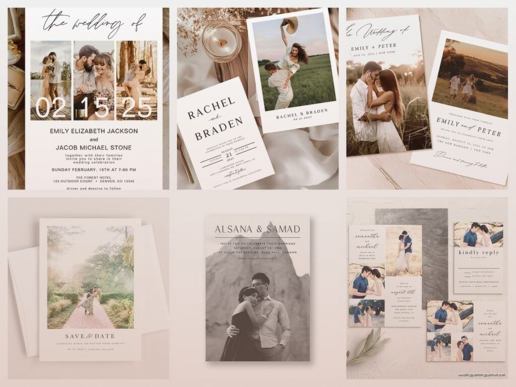
Picture Wedding Invitations: Photo Card Custom Designs
May
Getting Your Photo Wedding Invitations Actually Right
So photo wedding invitations are having this massive moment right now and honestly they’ve been popular for like the past five years but the way couples are using them has totally changed. Instead of just slapping an engagement photo on a card template, people want something that actually feels custom and reflects their whole vibe as a couple.
First thing you gotta know is that not all engagement photos work well on invitations. I learned this the hard way back in spring 2023 when a couple sent me their “perfect” photo and it was shot at sunset with them basically as silhouettes. Gorgeous for Instagram, absolutely terrible for a 5×7 invitation where you need to overlay text and still see their faces. We ended up having to use a completely different image and they were kinda annoyed but like… I tried to tell them.
Picking The Right Photo For Your Card Design
You want a photo with good lighting first and foremost. Natural light is your friend here. If the photo is too dark, it’ll print even darker and then your text becomes this nightmare to read. Also think about the composition – where are you both positioned in the frame? You need space for text, so if your faces take up the entire image, that’s gonna be a problem.
Here’s what works well:
- Photos with negative space (sky, walls, open areas) where text can sit
- Images where you’re positioned to one side rather than dead center
- Outdoor shots with good natural lighting
- Photos where your outfits don’t clash with your wedding colors
- Horizontal orientation usually gives you more layout options than vertical
What doesn’t work is photos that are too busy in the background. If there are tons of people, random objects, or cluttered scenes, your invitation will look chaotic. Simple backgrounds are your best bet.
The Resolution Thing Everyone Ignores
Okay this is the part that annoys me SO much because couples will send me photos they pulled from their photographer’s online gallery at like 800 pixels wide and then wonder why the printed version looks blurry. You need high-resolution images. I’m talking 300 DPI minimum at the actual size you’re printing.
For a 5×7 invitation, that means your photo should be at least 1500×2100 pixels if it’s covering the whole card. Most professional photographers will give you high-res files but you need to specifically ask for them. Don’t just download from the web gallery – those are compressed for web viewing.
If you’re using a photo from your phone, modern smartphones actually take decent photos that can work for invitations BUT you need to make sure you haven’t edited them down in quality through various apps. The original photo file is what you want.
Layout Styles That Actually Work
There are basically a few main approaches to photo invitation layouts and each one has different vibes and requirements.
Full Bleed Photo Background
This is where your photo covers the entire card edge to edge. It’s dramatic and modern but you need to be strategic about text placement. Usually you’ll want to add a semi-transparent overlay box behind your text or position text in a clear area of the photo. I typically use white text with a subtle shadow or a colored box that complements the photo.
The challenge here is making sure your text is readable. I’ve seen couples choose photos with super varied colors and then wonder why their cream colored text disappears in some areas. Test your text color against the actual photo before committing.
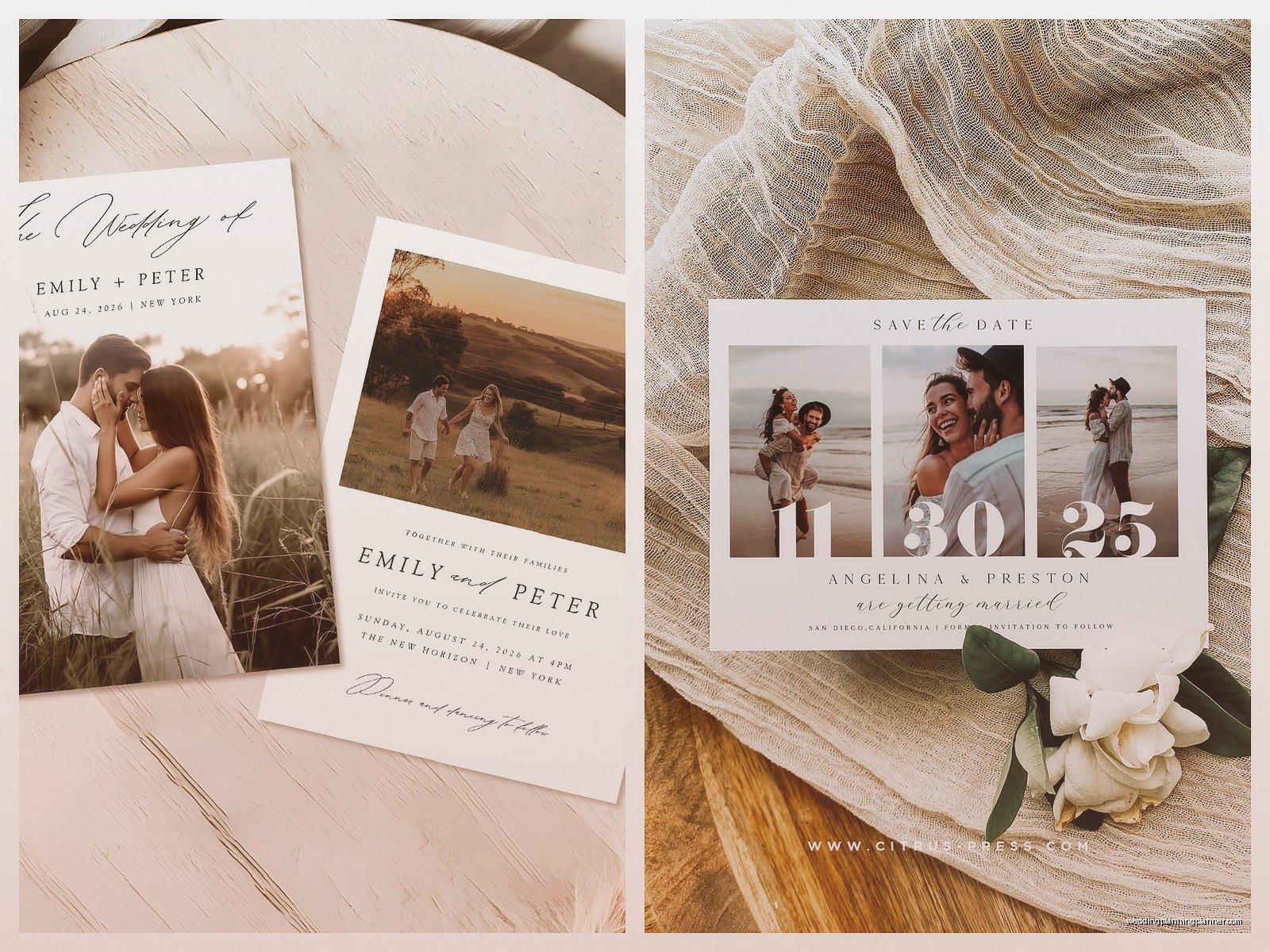
Photo With Border Frame
This is more traditional – your photo sits in the center or upper portion of the card with a border around it. The border gives you a clean space for text either below the photo or around it. This style is easier to work with because you have dedicated text space that’s not competing with the image.
You can make the border thick or thin depending on your style. Thicker borders feel more classic, thin borders feel more contemporary.
Split Design
Half the card is your photo, half is a colored or white section with your text. This is super popular right now and it solves a lot of readability issues. You can do this horizontally (photo on left, text on right) or vertically (photo on top, text below). My cat knocked over my coffee onto a proof of one of these designs last month and honestly the asymmetrical layout still looked good even with the stain so… there’s that.
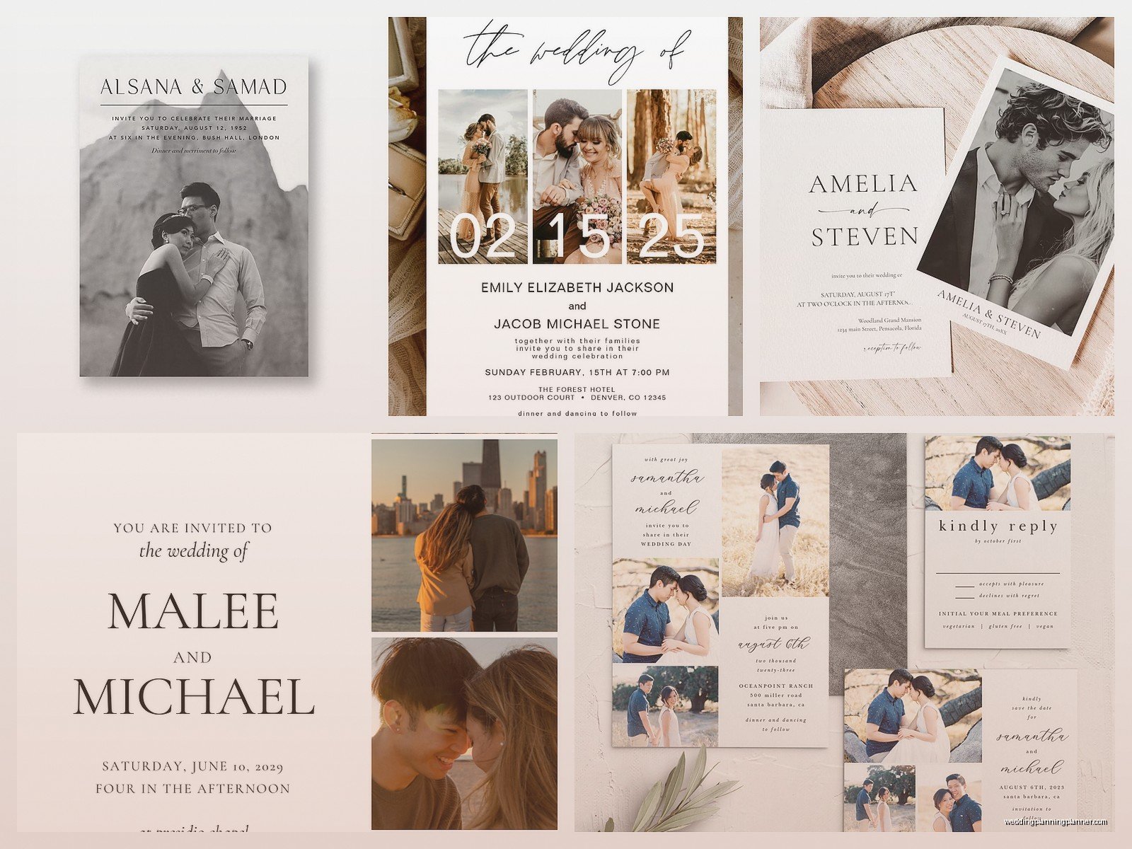
Multiple Photos
Some couples want to use 2-4 photos in a collage style. This can look really cute but it gets busy fast. If you’re doing multiple photos, keep them all in similar lighting and color tones. Mixing a bright sunny photo with a moody indoor shot will look disjointed.
Also with multiple photos you have less room for each image so make sure they’re interesting even when small.
Text Placement And Hierarchy
This is where people get overwhelmed because there’s a lot of information to fit on a wedding invitation. You’ve got your names, the date, time, venue, city, and usually some kind of invitation wording. That’s a lot to balance with a photo.
Start with your hierarchy – what’s most important? Usually it’s your names and the date. Those should be the largest text elements. Venue information can be smaller. Extra details like “reception to follow” can be even smaller.
Font pairing is crucial here. Don’t use more than two fonts, maybe three if you really know what you’re doing. I usually go with one script or decorative font for names and one clean sans-serif or serif for the details. Mixing too many fonts makes it look like a ransom note.
And please for the love of everything don’t use super thin delicate fonts on a busy photo background. They’ll disappear. You need fonts with enough weight to stand out against your image.
Color Considerations
Your photo has colors in it. Your wedding has colors. These need to work together or at least not fight each other. If your photo has tons of warm oranges and yellows but your wedding colors are cool blues and purples, it’s gonna feel off.
You can tie everything together by:
- Using your wedding colors in the text or design elements on the invitation
- Adding a colored border or text box in your wedding color
- Converting your photo to black and white if color coordination is too tricky
- Choosing a photo that naturally includes your wedding colors
Black and white photos are actually super elegant for invitations and they solve a lot of color problems. Plus they tend to feel more timeless. A photo that feels very 2024 in color might feel dated in five years, but black and white stays classic.
Printing Methods Matter More Than You Think
Not all printing is created equal and this really matters with photo invitations. Digital printing is the most common and most affordable. It works great for most photos and gives you good color reproduction. This is what online invitation companies typically use.
Letterpress doesn’t really work for full photo backgrounds – it’s better for text and simple designs. You could do a letterpress text overlay on a digitally printed photo background but that gets expensive.
Offset printing is what you want if you’re doing a large quantity (like 200+) and want the highest quality. The colors are more vibrant and consistent across all prints.
My biggest tip here is to ORDER A SAMPLE. Don’t just approve a digital proof on your screen. Colors look different printed than they do on your monitor. I had a couple in summer 2021 who approved everything online and then when the invitations arrived, the photo printed way more magenta than they expected because their monitor wasn’t calibrated. They had to rush reorder and it was this whole stressful thing that could’ve been avoided with a $10 sample.
Custom Design Versus Template
You’ve got options here. You can use a template from sites like Minted, Shutterfly, or Zazzle where you just upload your photo and customize the text. These are affordable and quick. The downside is you’re limited to their layout options and you might see other couples with similar designs.
Or you can go fully custom with a designer (hi, that’s what I do). This costs more but you get something unique. A designer can work with your specific photo, adjust the layout to highlight the best parts of the image, and create something that matches your wedding vision exactly.
There’s also a middle ground – sites like Canva where you can design your own using their tools. This requires some design sense on your part but gives you more control than templates while being cheaper than hiring a designer.
What To Ask A Designer
If you’re hiring someone to design your photo invitations, here’s what you should ask:
- How many revision rounds are included?
- Do they handle the printing or just provide files?
- What file formats will you receive?
- Can they adjust the design for other pieces like save the dates or thank you cards?
- What’s their timeline?
- Do they have experience with photo invitations specifically?
The Practical Details Nobody Tells You
Paper weight matters. For photo invitations, you want at least 110lb cardstock, preferably 130lb. Thinner paper feels cheap and photos can sometimes show through to the back if the paper is too thin. Matte finish usually looks better for photos than glossy – glossy can create glare and fingerprints show up easily.
Think about envelopes early. A full color photo invitation looks amazing but if you put it in a basic white envelope, the whole effect is kinda… diminished? Consider colored envelopes, envelope liners, or even printing your photo on the envelope flap. These extras add cost but they make the whole package feel cohesive.
Addressing is another thing – you can’t handwrite addresses on dark colored envelopes easily. You’ll need white or metallic pens, printed labels, or professional calligraphy. Just something to factor into your timeline and budget.
Timing Your Photo Shoot
If you’re planning an engagement shoot specifically for your invitations, do it at least 6 months before you need to mail invitations. That gives you time to get the photos back, choose the right one, design the invitation, order samples, make revisions, and do the final print run. I’ve had couples try to rush this in 2 months and it’s always stressful and something always goes wrong or…
Also think about what you’re wearing in the photos. Does it match the formality of your wedding? If you’re having a black tie wedding but your photo is super casual in jeans and t-shirts, there’s a disconnect. The invitation sets expectations for your guests.
Digital Versions
Don’t forget you might want a digital version of your invitation for your wedding website or to text to people for quick reference. Make sure your designer provides both print files and web-optimized versions. The file size and resolution are different for digital use.
Some couples are doing fully digital photo invitations now to save money and be more eco-friendly. That’s totally fine but I’d still put the same effort into the design. Just because it’s digital doesn’t mean it should look thrown together.
Budget Reality Check
Photo invitations can range wildly in price. Templates from online retailers start around $1-2 per invitation. Custom designed invitations from a professional start around $5-8 per invitation and can go up to $15+ for really elaborate designs with fancy printing techniques.
Don’t forget to budget for:
- Envelopes (sometimes extra cost)
- Envelope liners
- Postage (photo invitations are often heavier and might need extra postage)
- Return address printing
- Guest addressing
- Extra invitations for keepsakes
Order 10-15 extra invitations. You’ll mess up addressing some, you’ll want extras for your parents and grandparents as keepsakes, and inevitably you’ll forget someone on your list.
Common Mistakes To Avoid
Using a photo where you can’t see your faces clearly – guests want to see YOU. Choosing a photo just because you look good in it without thinking about how text will fit. Not proofreading the text carefully (I’ve seen dates wrong, venue names misspelled, it happens more than you’d think). Waiting too long to order and then having to pay for rush shipping. Not checking postage requirements before buying stamps – many photo invitations are too heavy for regular stamps.
Also some couples try to cram too much information onto the invitation itself. You have inserts and your wedding website for extra details. The invitation should have the essential info only. Nobody needs your entire schedule or hotel block information on the actual invitation card.