Planning Guides, Style Guide
Plain Wedding Invitation Cards: Design & Ordering Guide
Jun
Plain Wedding Invitations Are Actually Way More Complicated Than You’d Think
So plain wedding invitations sound simple right? Like you just pick white cardstock and call it a day. Nah. I’ve been planning weddings since 2008 and I gotta tell you, plain invitations are actually one of the trickier things to get right because there’s nowhere to hide mistakes and every little detail shows up.
Plain doesn’t mean boring though. It means intentional. Clean. Classic. And honestly some of the most expensive invitations I’ve seen were completely plain with just beautiful paper quality and perfect typography.
What “Plain” Actually Means in Invitation World
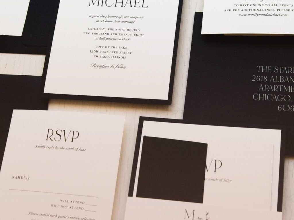
When clients tell me they want plain invitations they usually mean one of these things: no florals, no colors, minimal design, simple typography, or just clean lines. But you need to get specific because plain to one person might mean stark white with black text and plain to another person means cream cardstock with subtle letterpress.
I had this bride in spring 2023 who kept saying she wanted “plain and simple” and we went through like four rounds of samples before I realized she actually wanted textured paper with blind embossing which is… not simple to produce at all. Cost her way more than if she’d just gone with a floral design printed digitally.
The Main Categories of Plain
- Minimalist modern (think stark white, sans-serif fonts, lots of white space)
- Classic formal (ecru or cream, traditional serif fonts, centered text)
- Textured plain (white or neutral with paper texture doing the visual work)
- Monochrome (black and white only, can be graphic or subtle)
Paper Quality Is Everything Here
Okay so when you don’t have design elements to distract people, the paper quality becomes like 80% of the impression. I’ve seen couples spend $200 on fancy designer invitations with mediocre paper and they look cheaper than $50 invitations on really good cardstock.
You want at least 100lb cardstock. Preferably 110lb or higher. The weight matters because thin invitations feel like… well like you printed them at home even if you didn’t. For plain designs I usually push clients toward 120lb because you can feel the quality immediately when you pick it up.
Paper Finishes That Work for Plain Designs
Matte is gonna be your most versatile option. It’s sophisticated, doesn’t show fingerprints, photographs well. I use matte probably 60% of the time for plain invitations.
Textured papers like cotton or linen finish add visual interest without adding design elements. This is honestly my favorite cheat for plain invitations because the texture does the work. You get that luxury feel without needing to add colors or graphics or… my cat just knocked over my coffee cup, hang on.
Okay back. So smooth finishes work too but they’re riskier because they show every imperfection. Any slight misalignment in printing will be super obvious on smooth white paper.
Typography Is Where Plain Invitations Live or Die
This is the part that annoyed me so much when I first started doing stationery consulting because couples would pick these awful fonts and wonder why their invitations looked homemade. Typography is a whole skill and when it’s the only design element you have, you really gotta get it right.
Font Selection Guidelines
For formal plain invitations stick with classic serifs: Garamond, Caslon, Baskerville, Mrs Eaves. These have been used for centuries for a reason. They’re readable and elegant and they don’t compete with the message.
For modern plain invitations try clean sans-serifs: Futura, Helvetica, Montserrat, Avenir. Keep the weight light to medium usually, heavy fonts can look too bold on plain designs.
Script fonts are tricky with plain designs. You can use them but keep them minimal, maybe just for names or a single line. Too much script on a plain invitation starts looking like a birthday party invite from 1997.
Here’s the thing nobody tells you: you probably need two fonts maximum. One for headers or names, one for body text. Three fonts and it starts looking messy. I see this mistake constantly and it drives me nuts.
Sizing and Spacing
White space is your friend with plain invitations. Don’t try to fill every inch of the card. I usually aim for at least a half-inch margin on all sides, sometimes more.
Body text should be like 10-12pt depending on the font. Names can be bigger, 14-18pt. Date and venue info somewhere in between. But test it at actual size because what looks good on your computer screen might be too small or too large when printed.
Leading (that’s the space between lines) matters more than you think. Tight leading looks cramped. Too loose looks disconnected. I usually go with 1.2 to 1.5 times the font size.
Layout Options That Keep Things Simple
Centered text is the most classic and formal option. Everything aligned down the middle, symmetrical, balanced. This works great for traditional weddings.
Left-aligned text looks more modern and casual. It’s easier to read actually, but some people think it looks less formal so know your audience.
Asymmetrical layouts can work for plain invitations if you’re going for that modern minimalist vibe, but they’re harder to execute well. You need a good eye for balance or—
Printing Methods and What They Cost
Digital printing is the most affordable and it’s gotten really good in the past few years. For plain designs with just black or dark text on white or light paper, digital printing can look basically perfect. You’re looking at maybe $2-4 per invitation depending on quantity and vendor.
Letterpress is gorgeous for plain invitations because the impression in the paper adds that tactile dimension. But it’s expensive, usually $8-15+ per invitation. And you need soft paper that can take the impression which limits your options somewhat.
Thermography creates raised text and it’s a middle ground cost-wise, maybe $4-7 per invitation. It looks formal and traditional. Some people love it, some people think it looks dated. I’m kinda neutral on it honestly.
Engraving is the most expensive and most formal option. We’re talking $15-25+ per invitation easily. The text is pressed into the paper from behind so it’s raised on one side and you can feel the indentation on the back. Very traditional, very luxe.
What I Actually Recommend for Most Couples
If your budget is under $500 for invitations, go with digital printing on high-quality cardstock. Spend the money on good paper rather than fancy printing techniques.
If your budget is $500-1000, consider letterpress on cotton paper. It’s worth it for plain designs because that impression really makes an impact.
If budget isn’t a concern, engraving on heavy ecru stock is the most traditional formal option that will never go out of style.
Where to Actually Order These Things
Minted and Paperless Post have decent plain invitation options and they’re easy to customize online. The quality is fine, not amazing but fine. Good if you’re on a tight timeline or budget.
Artifact Uprising and Artifact Uprising… wait I already said that. Anyway they have really nice minimalist options with good paper quality. Mid-range pricing.
For letterpress, I usually send clients to smaller studios. Look for letterpress studios in your area or check Etsy for established sellers with good reviews. You’ll get better customization and usually better quality than the big online retailers.
Local print shops can be surprisingly good for plain invitations if you provide them with the design files. I worked with a couple in summer 2021 who used a local printer and got beautiful invitations for like half what the online places quoted them. Just make sure you see samples first.
The Design Process Step by Step
Start with your wording. Get this finalized before you think about design because the amount of text affects everything else. Include: your names, the request line (like “request the pleasure of your company”), date, time, venue name and address, and RSVP info.
Choose your invitation size. Standard is 5×7 inches. It’s classic, it fits standard envelopes, everyone has envelope liners that fit it. You can do 4×6 for a more compact look or 5.5×8.5 for something more formal and tall. Square invitations look modern but they cost more to mail.
Pick your paper and finish based on the guidelines above. Order samples if you can because paper looks different in person than online.
Layout your text in a word processor or design program. Play with alignment, sizing, spacing. Print it out at actual size on regular paper to see how it feels. This step takes longer than you think it will.
Choose your fonts. Test different combinations. Show them to a few people whose taste you trust because you’re gonna be staring at these invitations so long you’ll lose perspective.
Order a proof before you order the full quantity. Always. Even if it costs extra. I’ve seen so many disasters from couples who skipped this step and then realized there was a typo or the spacing looked weird or…
Common Mistakes I See All the Time
Using too many font sizes. Pick three sizes max: one for main text, one for emphasis, one for small details.
Not leaving enough margin space. Your text should not go closer than half an inch from the edge unless you really know what you’re doing design-wise.
Choosing trendy fonts that will look dated in photos years later. Stick with classics for plain invitations.
Forgetting about the envelope. Your envelope is part of the overall impression. For plain invitations I usually recommend matching the envelope to the paper color and using either calligraphy or a nice printed font for addressing.
Not considering the full suite. You need RSVP cards, details cards, maybe a weekend events card. These should all match in style and paper quality.
Envelope Addressing for Plain Invitations
Hand calligraphy is beautiful but expensive, usually $3-5 per envelope. It adds a personal touch that works really well with plain invitations though.
Digital calligraphy fonts printed directly on envelopes look nice and cost way less. Most print shops can do this for under $1 per envelope.
You can also just use a nice typed font that matches your invitation. This looks clean and modern. Some people think it’s too casual but honestly I think it’s fine for most weddings.
Whatever you do, don’t hand-write addresses in your regular handwriting unless your handwriting is actually nice. I had a bride do this to save money and the invitations looked gorgeous but the envelopes looked like bills.
Timing and Quantities
Order your invitations at least 3-4 months before your wedding. This gives you time for design, proofing, printing, and addressing. Rush fees are expensive and stressful.
Order about 10-15% extra invitations as backups. You’ll need them for last-minute guest adds, mistakes in addressing, or keeping as keepsakes. They’re cheaper to order now than to reorder later.
Send invitations 6-8 weeks before your wedding for local guests, 8-12 weeks for destination weddings.
Budget Breakdown
For 100 plain invitations you’re looking at roughly: $200-400 for digital printing, $500-800 for thermography, $800-1500 for letterpress, $1500+ for engraving. This includes the invitation card, RSVP card, and envelopes but not usually addressing or extras like envelope liners.
You can DIY plain invitations if you have design skills and a good printer, but honestly the time investment is huge and you might not save that much money once you factor in paper, printing tests, and your time. I usually only recommend DIY if you genuinely enjoy design work or have a really tight budget.
My Actual Favorite Plain Invitation Setup
If someone asks me what I’d do for my own wedding (well, for my renewal vows since I’m already married), I’d go with 120lb cotton cardstock in soft white, letterpress printing in charcoal gray ink, Caslon font for names and Futura for details, centered layout with lots of white space. Simple, classic, expensive-looking without being flashy. That’s the sweet spot for plain invitations honestly.