Planning Guides, Style Guide
Print Seating Chart Wedding: Complete Guide
May
Okay so first things first – sizing and format
You gotta decide what size you’re actually printing this thing at. Most couples go with either 18×24 inches or 24×36 inches because those are standard poster sizes and literally any print shop can handle them without custom pricing. I had this couple in spring 2023 who insisted on a 22×28 size because it “looked better in their mock-up” and then got annoyed when three different print shops charged them extra for custom dimensions. Just stick with standard sizes, trust me.
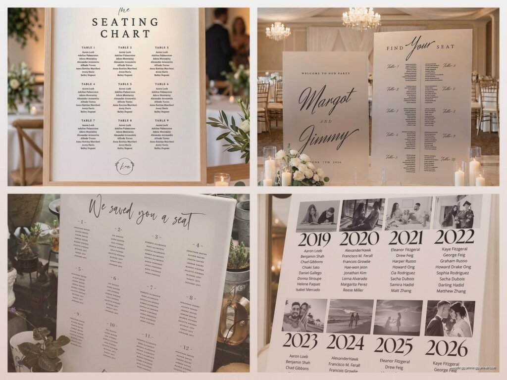
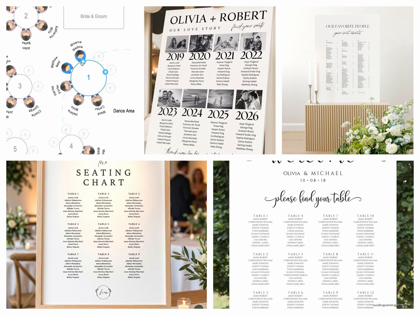
The format matters too – are you doing alphabetical by last name, grouped by table number, or sorted by table with names listed under each table? Alphabetical is easiest for guests to find themselves but table-grouping looks prettier and more organized visually. I usually recommend alphabetical for weddings over 100 people because nobody wants to scan through 15 table listings to find their name.
Design software options (from someone who’s tried them all)
Canva is gonna be your best friend here if you’re not a designer. They have templates specifically for seating charts and you can resize everything easily. The free version works fine but the Pro version ($13/month) gives you way more font options and you can remove backgrounds from photos if you want to add like… I dunno, a picture of the venue or whatever.
If you’re more design-savvy, Adobe Illustrator or InDesign are better because you have more control over spacing and alignment. But honestly? For most couples, that’s overkill. Canva does the job.
PowerPoint actually works too, weirdly enough. You can set custom slide dimensions and it’s something most people already have and know how to use. Not gonna lie, I’ve designed probably 15 seating charts in PowerPoint because the couple was already working in it and didn’t want to learn a new platform.
Content and what actually needs to be on there
At minimum you need:
- Guest names (obviously)
- Table numbers or names
- Some kind of header that says “seating chart” or “find your seat” or whatever
What you DON’T need: meal choices, plus-one indicators, relationship to bride or groom, or any other extra info. Keep it simple. The seating chart has one job.
For the names, use first and last names unless you have multiple people with the same first name at a table, then you might need to specify. Like if you have “John Smith at Table 5” and “John Davis at Table 5” that’s fine, but “John and Sarah” is too vague if there are multiple Johns and Sarahs.
Oh and this drives me crazy – couples who put “Mr. and Mrs. Johnson” on the seating chart. Nah. Put both first names. “Robert and Linda Johnson” or even just “Robert Johnson” and “Linda Johnson” on separate lines. Your guests aren’t living in 1952 and also it’s way easier for people to find their actual names.
Font size reality check
This is where everyone messes up. You’re designing on a laptop screen and everything looks readable, but then you print it at actual size and half your guests need reading glasses to find their names.
Minimum font sizes:
- Guest names: 14pt minimum, 16pt is better
- Table numbers/names: 18-24pt
- Header: 36pt or larger
And before you print the final version, I always tell people to do this test – zoom out on your design until it’s roughly the size it’ll be when someone’s standing 2-3 feet away from it. Can you still read the names easily? If you’re squinting, the font’s too small.
Printing options and why I have opinions about all of them
Local print shops are usually your best bet. FedEx Office, Staples, local printers – they all do poster printing. You can typically get same-day or next-day service, and if there’s a problem with the file, they’ll tell you immediately so you can fix it.
The thing that annoyed me most was this one couple who printed their seating chart at a FedEx Office at like 9pm the night before their wedding and didn’t realize until they got to the venue that the colors printed way darker than they looked on screen. Always do a test print if you’re using specific colors that need to match your wedding palette.
Online printing services like Vistaprint or Printful give you more paper options and finishes. You can get foam board backing, which is sturdy and doesn’t need a frame or easel necessarily. But you gotta order at least a week in advance, sometimes two weeks to be safe.
My cat literally knocked over a framed seating chart once while I was photographing it for a blog post and the glass shattered everywhere, so now I always recommend foam board mounting instead of framing if the chart’s gonna be transported to a venue. Less things to break, weighs less, easier to prop up.
Paper type matters more than you think
Standard poster paper is fine but it can look kinda cheap in photos. If your photographer is gonna capture detail shots (and they probably will), consider:
- Matte cardstock – no glare, looks crisp, doesn’t feel flimsy
- Foam board – sturdy, professional, easy to display
- Acrylic printing – expensive but looks SO good, very modern
Glossy paper is cheaper but you’ll get glare in photos and if there’s any lighting near it, guests might struggle to read it. I don’t usually recommend glossy unless budget is really tight.
Actually organizing the information (this is the tedious part)
Start with your final guest list in a spreadsheet. You need columns for first name, last name, and table assignment. Double-check this like five times because I’ve seen couples print a beautiful seating chart and then realize they forgot to include the groom’s parents or something equally awful.
Alphabetize by last name in the spreadsheet first, that way you’re just copying and pasting into your design in the right order. Way easier than trying to alphabetize while you’re designing.
If you’re doing table groupings instead, sort by table number first, then alphabetize within each table. Looks cleaner and guests can scan more easily.
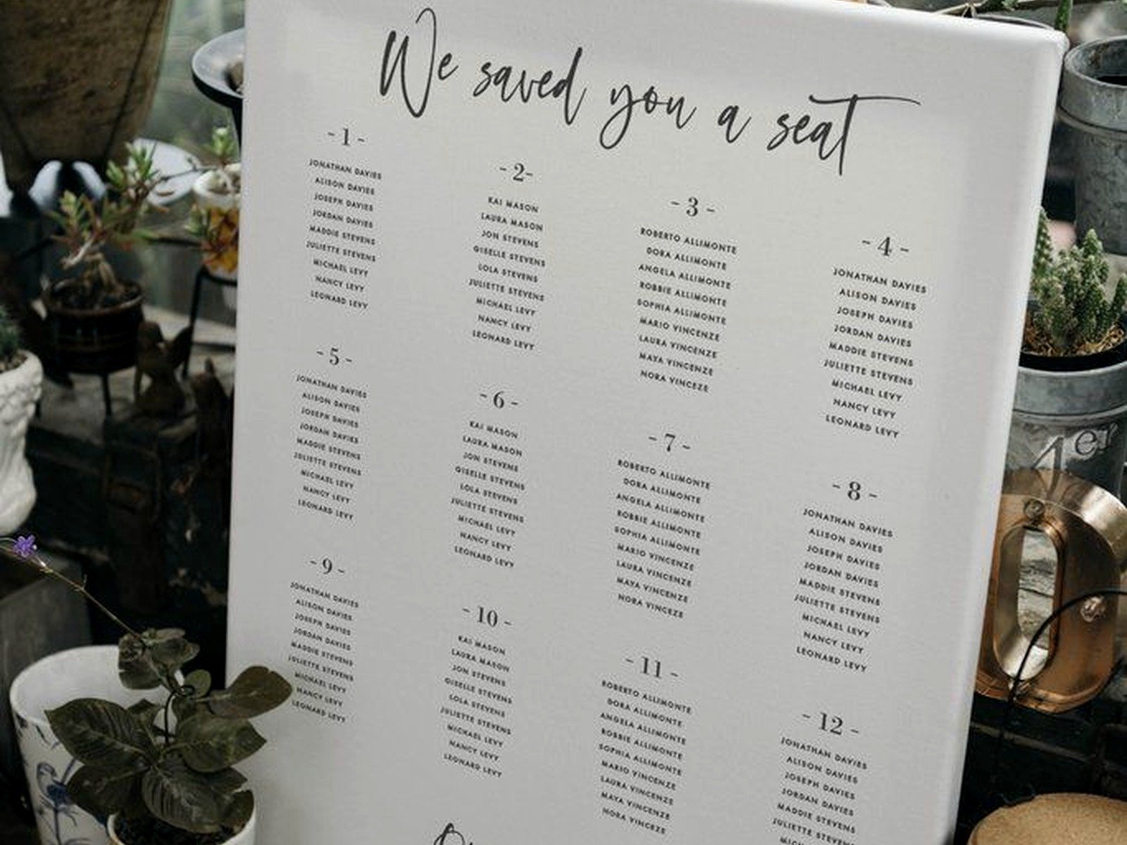
Layout strategies that actually work
Two-column or three-column layouts work best for most guest counts. Single column looks too sparse unless you have under 50 guests, and four columns starts getting hard to read.
Leave enough white space between sections. If you’re going alphabetical, break it up by letter ranges – like “A-F” in one section, “G-L” in another. Makes it way faster for guests to navigate.
For table groupings, use visual hierarchy – make the table number bigger and bolder, then list names underneath in a slightly smaller font. Something like:
Table 1
John Smith
Sarah Davis
Michael Chen
That kind of formatting. Clear and scannable.
The technical stuff that can screw you over
File format: Save your final design as a PDF, not a JPEG or PNG. PDFs maintain quality at any size and print shops prefer them. When you export the PDF, make sure it’s high resolution – at least 300 DPI.
Color mode: Design in CMYK if your software allows it, not RGB. RGB looks great on screens but prints differently. If you’re stuck with RGB, just know that your colors might shift slightly when printed, so don’t freak out if your blush pink looks a bit more mauve.
Bleed: If your design goes all the way to the edges (like a colored background), you need to add bleed – usually 0.125 inches on all sides. This means your design extends slightly beyond the cut line so you don’t get white edges if the cut is slightly off. Most print shops will tell you if you need this, but it’s good to know ahead of time.
Display methods at the venue
You need something to actually hold up your seating chart, which seems obvious but couples forget this all the time.
Easels are the most common – you can rent them from your venue, buy a cheap one from Michael’s or Amazon, or borrow one. Make sure it’s tall enough that the chart sits at eye level (roughly 5-6 feet off the ground for the center of the chart).
If you’re doing foam board, you can prop it on a table against the wall or another sturdy surface. This works fine for cocktail hour setups where space is tight.
Acrylic charts can lean against a wall or sit on a small stand, and they look really elegant. Just make sure there’s no direct sunlight hitting them or you’ll get major glare.
Hanging it is another option if your venue allows it – you can use a decorative ribbon or frame and hang it from a hook or command strip. Just test the weight first because I had a chart fall mid-reception once and it was… not great.
Backup plans because things happen
Print two copies. Seriously. One for display and one backup in case someone spills a drink on it, it blows away if you’re outdoors, or it gets damaged in transport. The backup can be smaller or on regular paper, doesn’t matter – just have something.
Also bring the file on a USB drive or have it saved in your email. If you need to reprint last-minute, you want to be able to walk into any print shop and get it done quickly. I learned this the hard way during a wedding in summer 2021 when a chart got left at the hotel and we had to sprint to a FedEx Office 20 minutes before the ceremony.
Last-minute changes
If someone cancels or you need to adjust seating after you’ve printed, you can do small fixes with matching cardstock and a good printer. Print the updated names, cut them out, and tape or glue them over the old information. Not ideal, but it works in a pinch.
Or honestly? Sometimes it’s easier to just reprint the whole thing if you have time. Depends on how many changes you’re dealing with.
Timeline for getting this done
Finalize your seating assignments at least two weeks before the wedding. You’ll probably still have a few stragglers RSVP-ing late, but you need a mostly complete list to design from.
Design the chart one week out. This gives you time to get feedback from your partner or planner, make adjustments, and not feel rushed.
Print it 3-5 days before the wedding. This leaves room for reprints if needed but isn’t so early that you’ll definitely have more changes.
If you’re ordering online with shipping, add a full week to these timelines just to be safe.
Cost expectations
Local print shop poster printing: $15-40 depending on size and paper type
Foam board mounting: Add $20-30
Acrylic printing: $80-150 depending on size
Easel rental: $10-25 or buy one for $20-40
So you’re looking at anywhere from $30 to $200 total depending on how fancy you wanna go. It’s not the biggest wedding expense but it’s also not nothing, so plan accordingly.
Common mistakes I see constantly
Using table names instead of numbers without a corresponding map. If you’re doing “Tuscany Table” and “Paris Table” that’s cute, but guests need to know where those tables actually are in the room or you’ll have 150 people wandering around confused.
Making the design too busy. Your seating chart doesn’t need florals and swirls and five different fonts. Clean and readable beats pretty every time.
Forgetting about lighting at the venue. If your chart’s gonna be in a dark corner, it doesn’t matter how beautiful it is because nobody can read it. Ask your venue coordinator where the best-lit spot is for guest information.
Not securing it properly. Outdoor weddings especially – if there’s any wind, that chart’s gonna blow over unless it’s weighted or secured. I’ve seen it happen more times than I can count.
Also spelling errors, which sounds dumb but you’d be surprised how many seating charts I’ve seen with misspelled guest names. Proofread it, then have someone else proofread it, then proofread it again.