
Planning Guides, Style Guide
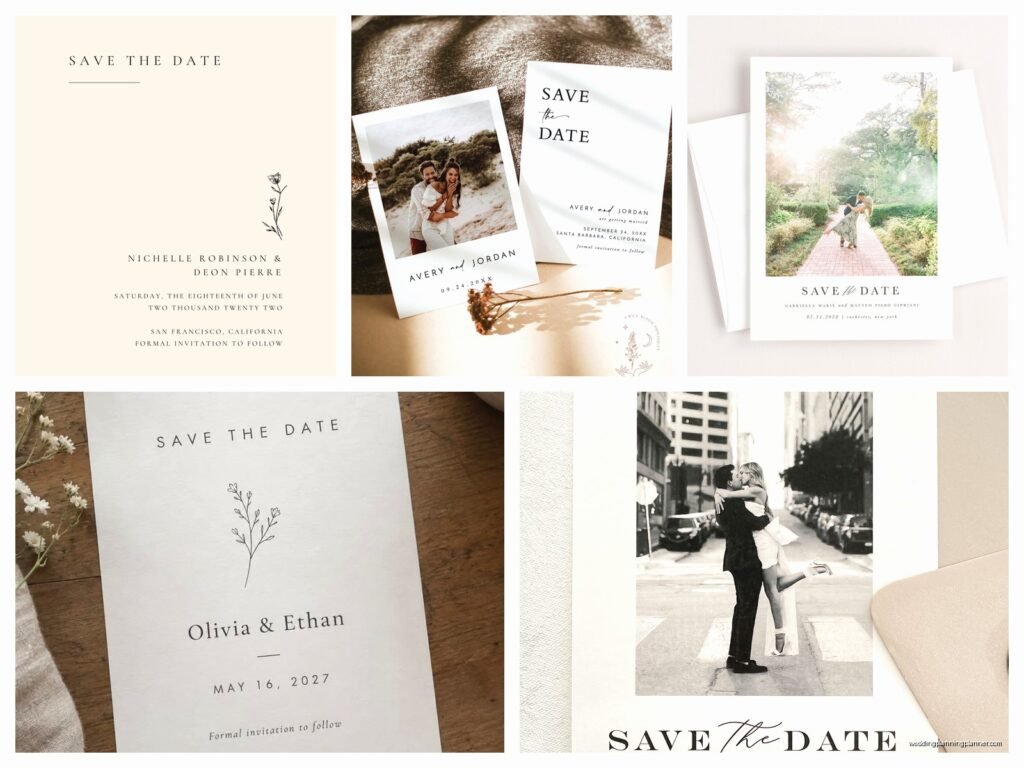
Simple Save the Dates: Minimalist Clean Announcements
Nov
Why Minimalist Save the Dates Actually Work Better
So minimalist save the dates are basically the opposite of what a lot of couples think they need to do. You know that whole “our wedding has to make a STATEMENT” mentality? Yeah, simple announcements do the opposite and they’re kinda brilliant for it. I had this couple back in spring 2023 who were stressing about their save the dates for like three months straight, looking at every fancy design with wax seals and vellum overlays and custom illustrations, and I finally just showed them a clean white card with black typography and their wedding date. They looked at me like I’d lost my mind but then something clicked.
The thing about minimalist design is it’s not about being boring or cheap—it’s about being intentional. Every element you include actually matters because there’s nothing else competing for attention. When you strip away all the decorative stuff, what you’re left with is the actual information people need: your names, the date, the location (city at least), and maybe a website.
What Makes a Save the Date Actually Minimalist
Okay so there’s minimalist and then there’s just… blank. Here’s what I mean. A true minimalist save the date has:
- Lots of white space (or negative space if you’re getting technical)
- One or two fonts maximum—and I mean it, not three “because they look good together”
- A limited color palette, usually one or two colors
- Clean typography that’s easy to read
- No unnecessary graphics or flourishes
- High quality paper stock because when your design is simple, the paper quality really shows
What really annoys me is when people think minimalist means you just delete everything from a template and call it done. Nah. Minimalist design is actually harder because every choice is visible. You can’t hide behind busyness.
Picking Your Typography
This is where most people either nail it or completely miss. For minimalist save the dates, your font choice is doing like 80% of the heavy lifting. I usually tell clients to pick one serif and one sans serif, or just go with one really good sans serif for everything.
Sans serif fonts (the ones without the little feet on the letters) tend to read as more modern and clean. Think Helvetica, Futura, Brandon Grotesque, or Proxima Nova. Serif fonts can work too but you gotta be careful they don’t read as too traditional or fussy—something like a clean Didot or a simple Garamond can be gorgeous.
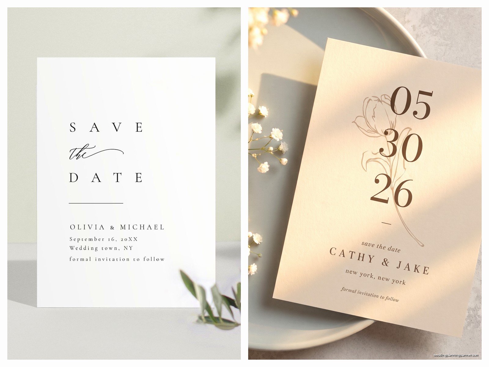
Here’s my basic hierarchy that works every time:
- Names: Larger, can be the serif if you’re mixing
- Date: Biggest element usually, this is the whole point
- Location/city: Medium size
- Website or additional info: Smallest
You want people’s eyes to go right to the date first, then your names, then everything else. If you find yourself squinting to figure out what’s important, the hierarchy isn’t working.
Color Choices That Don’t Suck
Black and white is the obvious choice and honestly? It works. Clean, classic, impossible to mess up. But if you want some color, keep it to one or maybe two.
Some combinations I’ve seen work really well:
- Navy text on cream cardstock
- Charcoal gray on bright white
- Terracotta or rust on ivory
- Forest green on white
- One color for text, same color in a lighter shade for a simple border or background block
What you’re avoiding is anything that feels too cutesy or trendy. Minimalist design should feel somewhat timeless—you don’t want to look back in five years and cringe because you used that millennial pink that was everywhere in 2017.
Layout Options That Keep Things Clean
The layout is where you can actually get kinda creative while still keeping things simple. Here are formats I use all the time:
Centered alignment: Everything stacked in the middle of the card. This is the most classic minimalist approach. It’s symmetrical and calm and works for basically everyone.
Left-aligned with lots of right-side white space: This feels more modern and editorial, like something you’d see in a design magazine. All your text hangs on the left side and you’ve got this big breathing room on the right.
The simple border: Thin border around the edge of the card (like maybe 1/4 inch from the edge), all text centered inside. Clean and contained.
Horizontal divide: Date on top half, names and details on bottom half, maybe separated by a thin line or just white space. This works especially well for landscape-oriented cards.
My cat literally just knocked over my coffee while I’m writing this, which is probably a sign I need to wrap up this section anyway.
Paper and Printing Considerations
Okay so when your design is stripped down, the physical quality of the card becomes way more important. You can’t get away with flimsy paper when there’s nothing else to distract from it.
I always recommend at least 120lb cardstock for save the dates. It should feel substantial in your hand. The paper texture matters too—a nice cotton paper with a subtle texture reads as way more expensive than glossy cardstock, even if the price difference isn’t huge.
Printing methods to consider:
- Digital printing: Most affordable, great for simple designs, perfect for minimalist stuff honestly
- Letterpress: If you want to splurge on one thing, this is it. That impression in the paper is gorgeous and very tactile. Works beautifully with minimalist designs because you can feel the text
- Flat printing with premium paper: Good middle ground. The paper quality does the talking
What I wouldn’t do for minimalist save the dates: foil stamping (too fancy), embossing (unless it’s super subtle), or anything with layers and overlays. Those techniques fight against the simplicity you’re going for.
Information Hierarchy and What to Actually Include
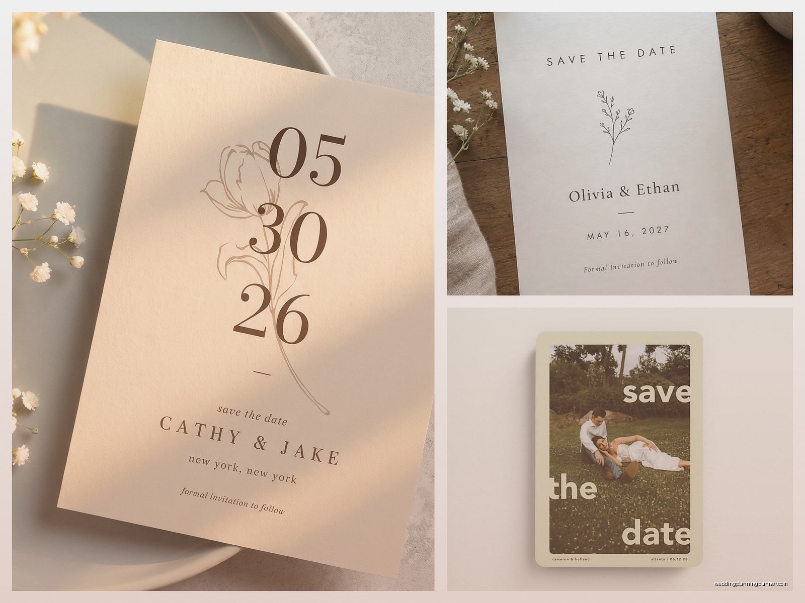
Here’s what goes on a minimalist save the date, in order of importance:
- The date (obviously)
- Your names
- City and state
- Wedding website if you have one
- Maybe “formal invitation to follow” if you want
What you’re NOT including: the venue name (save that for the actual invitation), the full address, start time, dress code, hotel blocks, your engagement story, a photo of you guys, or decorative elements just for the sake of decoration.
I had this situation during a super stressful client meeting in summer 2021 where the groom kept insisting they needed to include the ceremony start time on the save the date because “people need to plan.” But like… no they don’t? They need to know the DATE so they can block their calendar. Everything else comes later with the actual invitation. The save the date literally has one job and it’s in the name.
Size and Format Options
Standard postcard size (4×6 or 5×7) works great for minimalist designs. You’ve got enough space to make your typography big and readable without the card feeling empty. Plus postcards are cheaper to mail because you don’t need envelopes.
But if you want to do something slightly different:
- Square cards (5×5 or 5.5×5.5): Feel modern and a tiny bit unexpected. They do cost more to mail though because they’re not standard size
- Slim cards (4×9 or similar): Elegant and architectural feeling. Great for a really simple vertical layout
- A6 cards with envelopes (4.5×6.25): If you want that traditional feel but still keep the design minimal
Honestly the format matters less than the design itself, but it’s something to think about based on your budget and whether you wanna deal with envelope liners and all that… or wait, do minimalist people even do envelope liners? That’s kinda against the whole concept isn’t it.
Digital vs. Physical Minimalist Save the Dates
So here’s where I might lose some traditional wedding people, but digital save the dates can be incredibly minimalist and effective. A simple email with clean typography, or a basic wedding website announcement, or even a well-designed digital card sent via one of those e-vite platforms.
The advantages: immediate delivery, zero printing costs, easier to include your website link (it’s clickable), better for the environment if that’s your thing, and you can track who’s opened it.
The disadvantages: some older relatives might not engage with digital stuff, it doesn’t feel as formal or special, and you don’t get that physical reminder sitting on someone’s fridge.
I usually suggest doing digital for like 80% of your list (friends, coworkers, younger family) and printing a small batch of physical cards for grandparents and anyone else who’d appreciate the tangible version. Best of both worlds and you’re not spending a fortune on printing.
Common Mistakes People Make
Even with something as straightforward as minimalist design, people find ways to overcomplicate it:
Too many fonts: I said this already but I’m gonna say it again because someone always tries to use three or four fonts “to add interest.” One or two. That’s it.
Not enough contrast: Light gray text on white paper might look sophisticated in your head but it’s just hard to read. You need actual contrast.
Forgetting about white space: Cramming all your text together to “use the space” defeats the entire purpose. White space IS the design.
Choosing trendy over timeless: That super modern geometric font might be cool right now but will it feel dated in two years? Probably.
Skimping on paper quality: This is where you should spend your money. Good paper makes a simple design feel expensive.
Coordinating with the Rest of Your Stationery
If you’re going minimalist with your save the dates, you’ll probably want to carry that through to your invitations, programs, menus, whatever else you’re printing. The good news is that minimalist design is super easy to keep consistent.
You’re basically just using the same fonts, same color palette, same layout principles across everything. It creates this cohesive look without being matchy-matchy or boring. Each piece can have slight variations in layout while still feeling like part of the same family.
And honestly this is where minimalist design saves you money too—you’re not paying for elaborate printing techniques or special materials for every single piece of paper. You’re investing in good design and good paper, and that’s it.
Working with Designers or DIY
You can absolutely DIY minimalist save the dates. They’re probably the easiest style to design yourself because you’re not dealing with complicated graphics or intricate layouts. Canva has some decent minimalist templates, or you can use Adobe Spark if you want something free and simple.
But if you’re gonna hire a designer, make sure you look at their portfolio and confirm they actually understand minimalist design. Some designers can’t help but add elements because they feel like the space looks “empty” otherwise. You want someone who gets that the emptiness is intentional.
When I work with clients on minimalist designs, we usually nail it in like one or two rounds of revisions because there’s just less to argue about. You’re making fewer decisions overall, which sounds limiting but is actually super freeing.
The key is being confident in your choices. Pick your font, pick your color, pick your layout, and commit. Don’t second-guess it to death or start adding elements because you’re worried it’s too plain. Simple is the whole point and simple is enough.

Canva
Wedding Memories Hardcover Template Canva Editable For Notebook, Journal, Novel, Hard Covers, Canva template For KDP Cover 6×9″ 120 pages
Canva
The Ultimate Wedding Planning Bundle, Canva Editable.
Canva
Customizable Wedding Video Invitations templates, Canva Editable Digital Wedding invitation Minimalist, Animated Custom Invitation
Digital Planning Templates
Wine Wedding Planner Bundle – 200-Page Printable PDF + 10 Editable Wedding Invitations | Instant Digital Download
Canva
Orange Wedding Planner Bundle – 200-Page Editable Canva Templates + 10 Editable Wedding Invitations | Instant Digital Download
Digital Planning Templates
Champagne Wedding Planner Bundle – 200-Page Printable PDF + 10 Editable Wedding Invitations | Instant Digital Download
Canva
Wedding Memories Hardcover Template Canva Editable For Notebook, Journal, Novel, Hard Covers, Canva template For KDP Cover 6×9″ 120 pages
Digital Planning Templates
Yellow Wedding Planner Bundle – 200-Page Printable PDF + 10 Editable Wedding Invitations | Instant Digital Download
Canva
Dusty Blue Wedding Planner Bundle – 200-Page Editable Canva Templates + 10 Editable Wedding Invitations | Instant Digital Download