Planning Guides, Style Guide
Wedding Menu Designs: Complete Guide
Apr
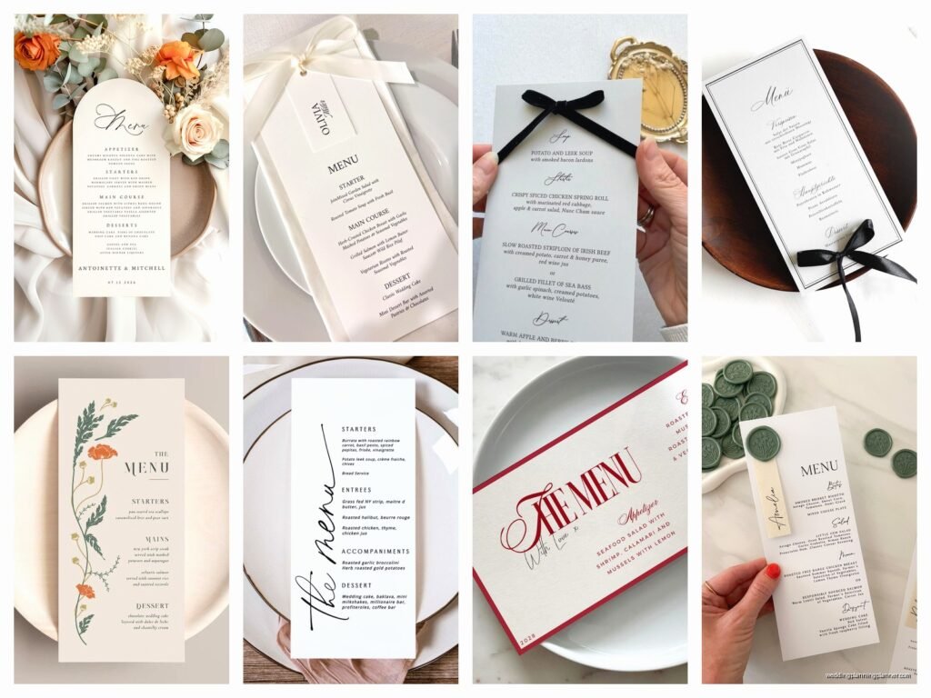
Menu Design Basics That Actually Matter
Okay so wedding menu design is one of those things couples either obsess over or completely forget about until like three weeks before the wedding. I had this bride in spring 2023 who wanted her menus to match the exact Pantone color of her bridesmaids’ dresses and honestly it became this whole thing because the printer kept getting it wrong and she’d hold the menu card up next to fabric swatches under different lighting and… anyway, menus matter more than you think but also they’re kinda straightforward once you know what you’re doing.
First thing—you gotta decide if you even need printed menus. For a buffet or family-style service, sometimes you don’t. But for plated dinners, they’re pretty essential because guests need to know what they ordered three months ago when they filled out that response card. Also they give people something to look at during those awkward moments when they’re seated but dinner hasn’t started yet.
The Basic Format Options
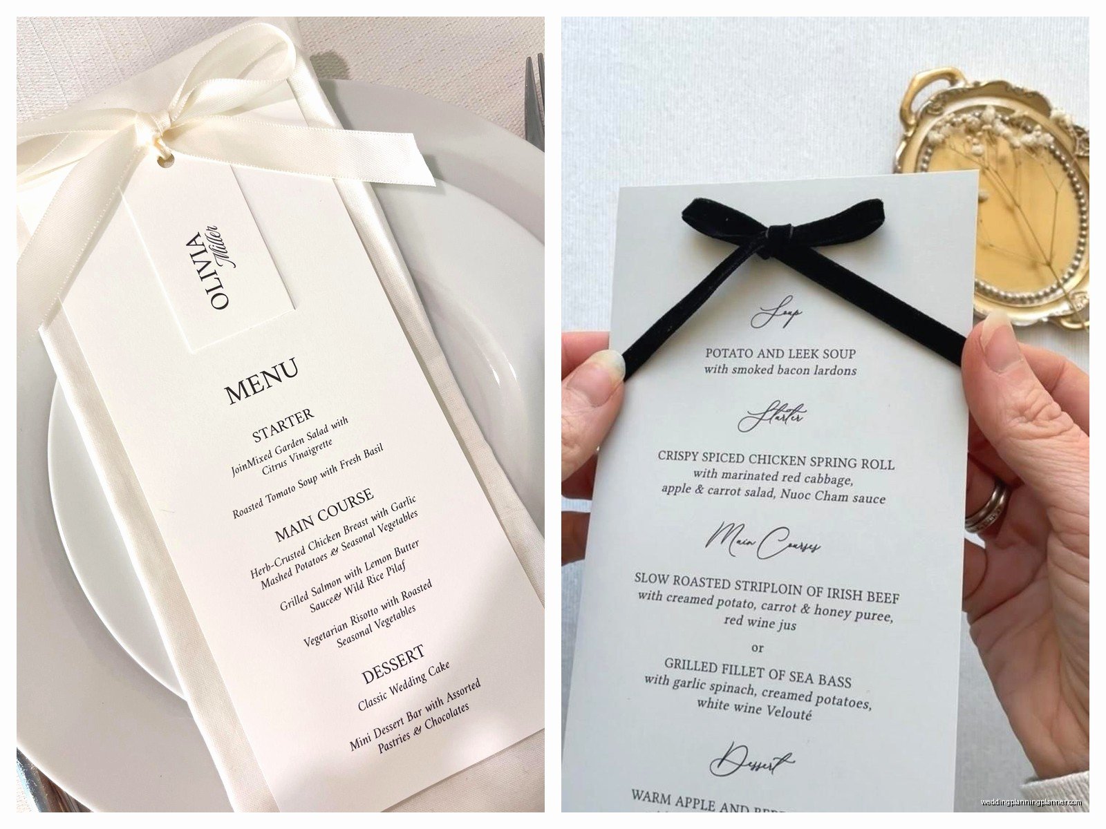
There are like five main styles I see over and over. The classic single card that sits at each place setting—usually 5×7 inches. The menu that doubles as a place card which I actually love because it’s one less thing to design. The table tent style that stands up in the center of the table so one menu serves the whole table (saves money but looks less fancy). Then there’s the menu printed directly on the table number card, and finally the menu tucked into the napkin fold which looks elegant but half the guests don’t notice it.
You can also do that thing where the menu is printed on the back of the ceremony program if your ceremony and reception are in the same venue, but honestly I find that gets confusing because people leave their programs at their ceremony seats or stuff them in their bags.
What Actually Goes On The Menu
This is where people overthink it. You need the couple’s names somewhere—usually at the top but sometimes at the bottom. The date is optional but nice to include. Then you list the courses in order. That’s literally it.
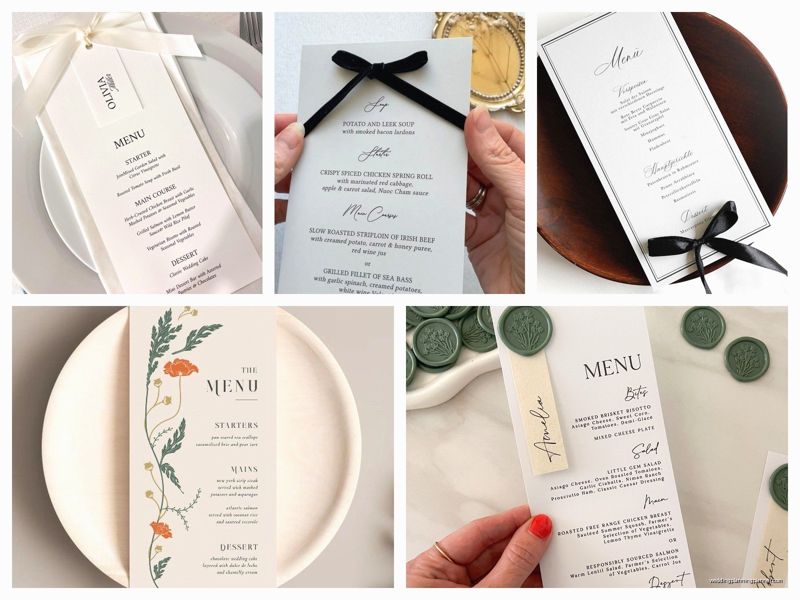
For the food descriptions, you have options. Super formal weddings do the full French or Italian names with fancy descriptions like “Pan-Seared Atlantic Halibut with Saffron Beurre Blanc, Haricots Verts, and Fingerling Potatoes.” Casual weddings might just say “Fish, Green Beans, Potatoes.” Most weddings fall somewhere in between.
What drives me absolutely crazy is when couples don’t include allergen information or at least some kind of indicator for vegetarian/vegan/gluten-free options. You’re gonna have guests with dietary restrictions and they shouldn’t have to flag down a server mid-dinner to ask if there’s dairy in something. Just add a little note at the bottom like “Please alert your server to any dietary restrictions” or use symbols next to dishes.
Typography Decisions That Make Or Break It
The font situation is where things get real. You want readability but also style. I usually tell couples to pick two fonts max—one fancy script or serif for names and headers, one clean sans-serif or simple serif for the actual menu items. When you use three or four different fonts it starts looking like a ransom note.
Size matters too. If you’re doing individual menus, the text can be smaller—maybe 10-11pt for the menu items. But if it’s a table tent that people are reading from a foot away, you need 14pt minimum. I’ve seen so many menus where the font is so tiny or so swirly that guests literally cannot read what they’re eating. My cat knocked over my coffee while I was working on a menu design last month and honestly the coffee stain looked better than some of the font choices I’ve seen.
Paper And Printing Considerations
Cardstock weight is something nobody thinks about until they’re holding a flimsy menu that keeps falling over. For standard flat menus, you want 80lb cover stock minimum. For tent cards, go heavier—100lb or 110lb. The paper color matters too—ivory and cream look more formal, white is crisp and modern, colored paper can be gorgeous but make sure your text is still readable.
Printing methods: digital printing is cheapest and fine for most weddings. Letterpress is stunning but expensive and requires thick paper. Foil stamping looks luxe but adds cost. I had a couple once who wanted gold foil on navy paper and it was absolutely gorgeous but their budget was… well let’s just say they had to cut the foil from some other stationery items to make it work.
You can DIY print menus at home if you’re crafty and have a good printer, but please do test prints first. I’ve seen too many couples print 150 menus the night before the wedding only to realize their home printer makes everything look slightly green or cuts off the edges.
Design Elements Beyond Just Text
Borders, illustrations, monograms—these are the extras that make a menu feel custom. A simple border can elevate a basic design. If you’re having a garden wedding, maybe add some botanical line drawings. Beach wedding could have a subtle watercolor wash. But here’s the thing… sometimes less is more and a clean, text-only menu with good typography looks more expensive than something with too many design elements.
Monograms are having a moment again. You can put them at the top of the menu, or as a small element in the corner, or as a watermark behind the text. Just make sure it doesn’t overpower the actual information people need to read.
Matching Your Wedding Style
The menu should feel cohesive with your other paper goods—invitations, programs, place cards, table numbers. That doesn’t mean everything has to be identical, but there should be a visual connection. Maybe it’s the same color palette, or the same font for the couple’s names, or similar design elements.
For a formal black-tie wedding, you’re looking at traditional fonts, possibly engraved or letterpress printing, formal language for the food descriptions. For a rustic barn wedding, maybe kraft paper with casual fonts and simple descriptions. A modern minimalist wedding might have a stark black and white menu with lots of white space. A bohemian wedding could have flowing script and watercolor details.
But also like… you can break these rules if you want. I’ve seen ultra-formal weddings with playful menu designs and casual weddings with elegant menus. Your wedding, your choice, whatever.
Practical Stuff Nobody Tells You
Order extras. Always. You’ll need extras for your planner, photographer, venue coordinator, maybe the band leader, plus a few backup copies in case some get damaged or guests want to take theirs home as a keepsake. I usually tell couples to order 10-15% more than their guest count.
Timing-wise, you can’t finalize your menus until you’ve confirmed your menu with your caterer, which usually happens about 2-3 months before the wedding. But you can work on the design earlier. Then you need to allow 2-3 weeks for printing, maybe 4-6 weeks if you’re doing letterpress or foil stamping. Rush fees are real and they’re expensive.
If guests had meal choices, make sure your caterer has a system for knowing who gets what. Some couples print a small symbol on the back of the menu or place card—like a tiny fish icon for the fish entree, a leaf for vegetarian. Or the caterer uses different colored stickers. Work this out in advance or it becomes chaos during service.
Budget-Friendly Alternatives
Look, not everyone has $500 to spend on menu cards. I get it. Here are cheaper options that still look good: print them yourself on nice paper from a craft store. Use a template from Etsy or Canva—there are thousands for like $8-15. Do one menu per table instead of per person. Skip the menus entirely and have your DJ or officiant announce the menu before dinner service starts.
You can also do a menu displayed on a sign or chalkboard at the entrance to the reception. Guests can check it when they arrive. Not as fancy but totally acceptable, especially for casual weddings.
Common Mistakes I Keep Seeing
Okay rapid-fire list of things that go wrong: forgetting to include what the default meal is for kids, not proofreading and having typos (I once saw “chicken breast” spelled as “chicken beast” which honestly made me laugh), making the menu so design-heavy you can’t read it, not accounting for the napkin fold covering half the menu, printing menus before confirming final headcount and then not having enough, using fonts that are too similar so everything blends together…
Oh and another thing that bugs me—when couples list alcohol on the menu. Like, you don’t need to tell people what wine is being served unless it’s a wine pairing dinner. The bar is self-explanatory. Focus the menu on the food.
Special Considerations For Different Service Styles
Plated dinners need the most detailed menus since guests chose their meals in advance. Buffets can have simpler menus or even just signs at each buffet station. Family-style service can go either way—some couples do menus, some don’t. Cocktail-style receptions with just appetizers usually don’t need printed menus but could have a display board listing the passed and stationed items.
If you’re doing a tasting menu with multiple courses, your menu might need to be double-sided or a folded card to fit everything. Wine pairing dinners definitely need detailed menus with each wine listed next to its corresponding course.
I worked with a couple doing a brunch wedding and their menu was so cute—it listed the mimosa bar options and the waffle station toppings. It felt appropriate for the vibe and gave guests useful information.
Digital Menus Are A Thing Now
Post-pandemic, some couples are doing QR codes that link to a digital menu. Personally I think this works better for the bar menu than the dinner menu because people like having something physical to look at during dinner. But for a super tech-forward couple or a very casual wedding, sure, it could work. Just make sure you have printed backups because someone’s phone will be dead or they won’t want to scan something or they’re elderly and don’t do QR codes or… you get the idea.
Some venues now have screens that display the menu, which is kinda cool actually. Saw this at a modern art museum wedding and it fit the vibe perfectly.
Working With Designers And Printers
If you’re hiring a stationer or designer, bring them photos of menus you like, your wedding colors, your invitation suite, and your venue photos. The more context they have, the better. Be clear about your budget upfront. Ask to see a proof before they print everything—seriously, always get a proof.
If you’re using an online printing service like Minted or Shutterfly or Zazzle, read reviews about their color accuracy and shipping times. Order a sample if possible. Check their return policy in case something goes wrong.
For DIY projects, use templates designed for your specific paper size. Nothing worse than designing something for 5×7 and then realizing your paper is 5.5×8.5 and now nothing fits right. Been there, fixed that for clients, it’s annoying for everyone involved.
Also confirm with your printer what file format they need—usually PDF, sometimes specific resolution requirements for images. Blurry menus look terrible and there’s no fixing them once they’re printed, you just gotta reprint which costs more money and time you probably don’t have.