Planning Guides, Style Guide
Flower Design For Invitation: Design & Ordering Guide
Apr
Okay so flower design on invitations is literally one of those things that can make or break your whole aesthetic
The first thing you gotta understand is that floral designs aren’t just pretty pictures you slap onto cardstock. They’re actually doing specific work in your invitation suite. Like, they’re setting the tone, they’re telegraphing your wedding style, and honestly they’re also filling space in a way that needs to look intentional and not like you just panicked and added clipart.
I had this bride in spring 2023 who came to me with a Pinterest board that was literally 400 pins of different floral styles and she was like “I want all of these” and I had to sit her down and explain that peonies and succulents and wildflowers and orchids do NOT belong on the same invitation unless you’re going for some kind of botanical chaos vibe which… nah.
Choosing Your Actual Flowers
So here’s where I start with clients. What flowers are you actually using in your wedding? Because there’s this thing that drives me absolutely bonkers where couples pick invitation florals that have nothing to do with their actual wedding flowers and then everything looks disjointed in photos. Your stationery should echo your real florals, not compete with them.
If you’re doing garden roses and eucalyptus for your centerpieces, your invitations should feature garden roses and eucalyptus. Revolutionary concept, I know. But you’d be surprised how many people want tropical monstera leaves on their invites and then they’re getting married in a barn in Vermont with dahlias everywhere.
That said, if you’re still in the early planning stages and haven’t picked your florist yet, you can absolutely let your invitation design inform your flower choices. I’ve seen it go both ways. Just make sure there’s gonna be consistency somewhere down the line.
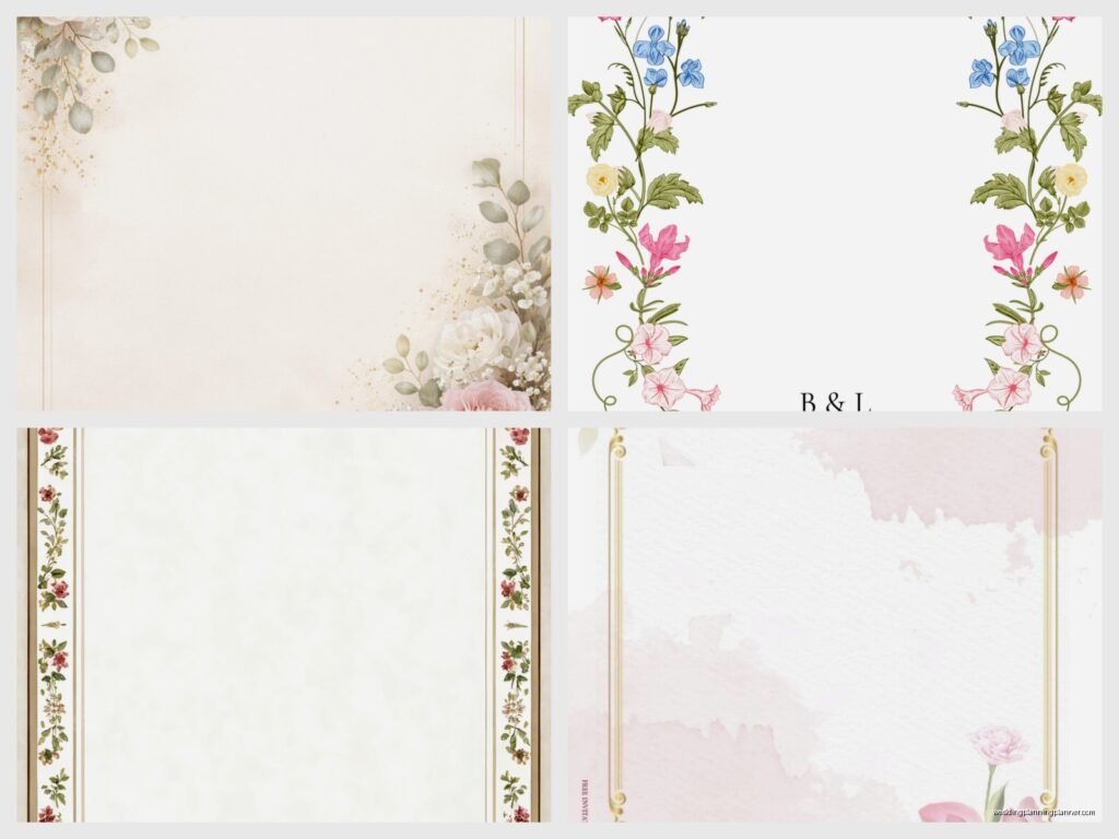
Design Styles and What They Actually Mean
Watercolor florals are still super popular even though we’re like several years into this trend. They give you that romantic, soft, slightly artistic vibe. They work really well for garden weddings, spring weddings, anything where you want that ethereal feel. The thing about watercolor is that it can look cheap if it’s not done well, so you need to either hire an actual artist or buy from a designer who knows what they’re doing with digital watercolors.
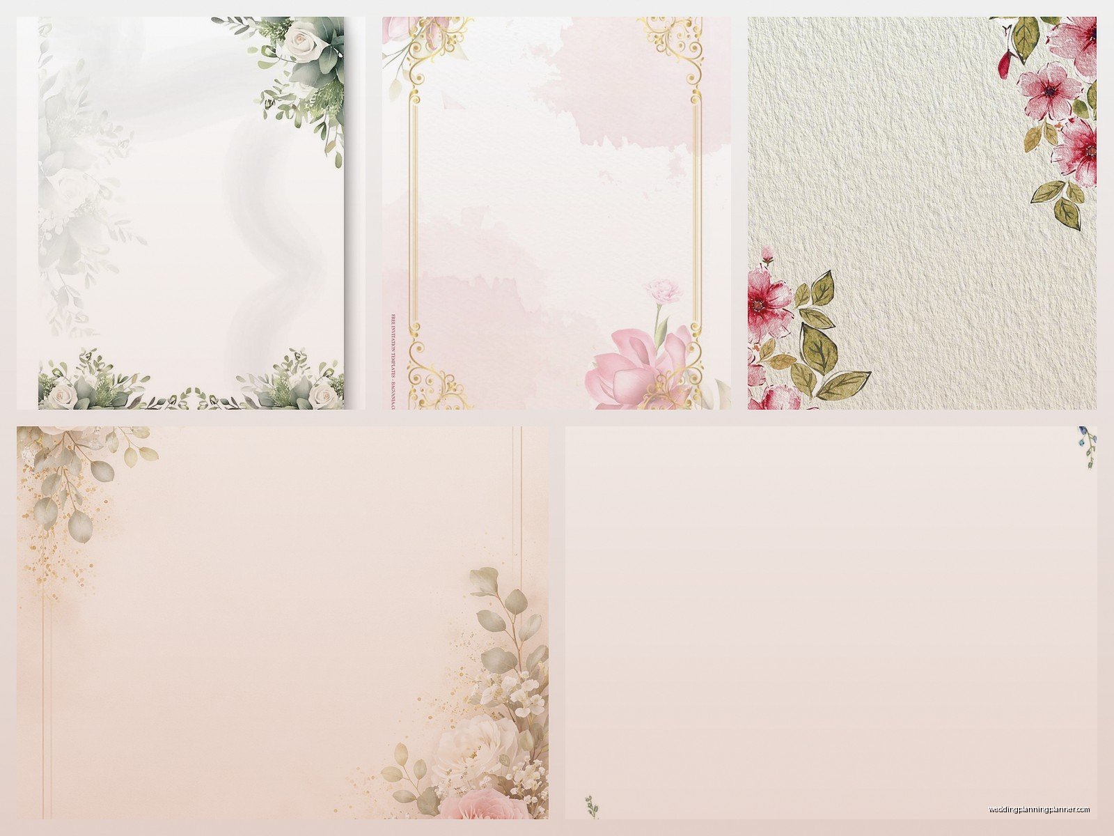
Botanical illustrations are more detailed and precise. Think vintage science textbook vibes. These are great for couples who want something elegant but not too frilly. They work for almost any season honestly and they photograph really well. I used botanical line drawings for my own… wait, I’m getting off track.
Pressed flower designs are having a moment right now. These can be actual pressed flowers (which gets expensive and time-consuming) or digital designs that look like pressed flowers (way more practical). They’re very cottagecore, very whimsical.
Then you’ve got your bold graphic florals which are more modern and stylized. Less realistic, more artistic interpretation. These are good if your wedding has a contemporary feel or if you’re doing something at a modern venue like a museum or an industrial space.
Placement Is Everything
Okay so WHERE you put the flowers on your invitation matters just as much as which flowers you pick. I see people make this mistake constantly where they just center a flower bunch at the top and call it a day, but there are so many other options.
Corner arrangements are classic and they don’t interfere with your text. You can do one corner or opposite corners. Bottom corners tend to look more grounded, top corners feel more delicate.
Border designs wrap around your text and create a frame. These work best when you have a simple text layout because otherwise it gets too busy. Like, if you’re doing elaborate calligraphy AND a full floral border, it’s gonna look like a Victorian wallpaper sample.
Scattered florals are trickier than they look. You want them to feel random but balanced, which is actually really hard to achieve. This is where working with a professional designer pays off because they understand visual weight and negative space and all that stuff.
Monogram integration is where you incorporate flowers into your initials or wedding monogram. This can look really sophisticated but it can also look like a high school yearbook page if it’s not executed properly, so… be careful there.
Color Considerations That Nobody Talks About
The color of your invitation florals needs to work with your paper color AND your ink color AND ideally your wedding color palette. That’s a lot of coordination. I usually recommend picking 2-3 main colors for your floral design and keeping it there.
If you’re printing on white or cream paper, you have the most flexibility. Colored paper is beautiful but it limits your options because you need florals that’ll show up against that background. I had a client who wanted navy paper with purple flowers and it just… it didn’t read well. We ended up adding white and gold accents to make the flowers pop.
Also think about whether you want realistic color or stylized color. Realistic means your roses are actually rose-colored, your eucalyptus is actually green. Stylized means maybe everything is in shades of blue, or you’re doing a monochromatic look, or you’re using unexpected colors for creative effect.
Working With Designers vs DIY Templates
Look, I’m gonna be honest with you. Custom floral design from an illustrator is expensive. Like $500-2000 just for the artwork expensive. But you own it, it’s unique to you, and it can be used across your entire suite plus day-of materials.
Semi-custom design through a stationer (that’s me, hi) is the middle ground. We take existing floral elements and arrange them specifically for your invitation, adjust colors, maybe add or remove elements. This usually runs $300-800 depending on complexity.
DIY templates from places like Etsy or Minted or Zola are the budget option and honestly they’ve gotten really good. You can find beautiful floral designs for like $20-50. The trade-off is that other people will have the same flowers on their invitations, and you’re limited in how much you can customize.

My cat just knocked over my coffee while I’m writing this, so that’s fun. Anyway.
The Ordering Process (This Is Where It Gets Real)
Once you’ve got your design figured out, you need to think about printing method because different florals look different depending on how they’re printed.
Digital printing is the most affordable and it handles color really well. Your florals will look vibrant and detailed. This is what most online invitation companies use. The downside is it can look a little flat, and certain colors (especially metallics) don’t print true.
Letterpress is gorgeous for floral designs but only if you’re doing line art or very simple florals. You can’t really do full-color watercolor florals in letterpress. It’s a relief printing method so it works with impressions and texture. If your design has fine details and lots of colors, letterpress isn’t gonna work.
Foil stamping is beautiful for accent florals. Like if you have a simple design and you want certain flowers to be in rose gold foil or something. But foiling an entire elaborate floral design gets prohibitively expensive really fast.
Thermography gives you raised printing which adds texture. It works okay with florals but I think it looks a bit dated honestly, though some people love that traditional feel.
Sizing and Scale Issues
This is something people don’t think about until they see their first proof and then they’re like “why do the flowers look weird?” It’s because scale matters enormously.
If your flowers are too large, they overwhelm the text and your invitation looks like a garden catalog. If they’re too small, they look like an afterthought or they lose all their detail when printed.
For a standard 5×7 invitation, your main floral elements should probably be… I mean this varies so much depending on style, but generally you don’t want any single flower to be more than like 2 inches across unless it’s a deliberate focal point. And your smallest details shouldn’t be tinier than maybe a quarter inch or they’ll just blob together when printed.
Always ask for a printed proof before you order your full quantity. I cannot stress this enough. What looks good on a screen does NOT always translate to paper. I’ve seen florals that looked beautiful digitally but when printed, all the subtle shading disappeared and they looked flat and muddy.
Matching Your Suite
Okay so if you’re doing a full invitation suite (which includes like save the dates, invitations, RSVP cards, details cards, maybe menus and programs and thank you cards), your florals need to be consistent but not identical across everything.
What I usually do is create a main floral arrangement for the invitation, then pull individual elements from that arrangement for the other pieces. So maybe your RSVP card just has a single stem from your main design. Your details card has a small corner cluster. Your menu has a different arrangement using the same flowers.
This keeps everything cohesive without being boring and repetitive. Because if every single piece has the exact same floral arrangement, it starts to feel less special and more like you just copied and pasted, even if that’s literally what you did.
Seasonal Appropriateness
I know I mentioned this earlier but it deserves its own section because people GET THIS WRONG so often and it bothers me. If you’re getting married in December, maybe don’t put sunflowers all over your invitations? Use winter flowers like amaryllis, hellebores, winter berries, evergreen branches, maybe some dusty miller for texture.
Spring weddings can do tulips, peonies, cherry blossoms, ranunculus, anemones. Summer is garden roses, dahlias, zinnias, wildflowers, sunflowers sure. Fall is obviously dahliasagain, chrysanthemums, marigolds, fall foliage, dried grasses.
Or you can go with flowers that are available year-round like roses, eucalyptus, calla lilies, orchids. These are “safe” choices that won’t look seasonally weird no matter when your wedding is.
File Formats and Technical Stuff
If you’re working with a designer or ordering custom, you need to understand what file formats you’re getting. For print, you want high-resolution files, usually 300 DPI minimum. Vector files (AI, EPS, SVG) are ideal because they can be scaled without losing quality.
If you’re getting PNG or JPG files, make sure they’re large enough for your final print size. A floral design that looks crisp on your phone screen might be pixelated when blown up to invitation size.
Also make sure you’re getting files in CMYK color mode for printing, not RGB. RGB is for screens, CMYK is for print, and colors can shift dramatically between the two. That gorgeous bright coral flower might print as a muddy orange if the files aren’t set up correctly.
Timeline Considerations
Start thinking about your invitation florals like 6-8 months before your wedding. That gives you time to work with designers, get proofs, make revisions, and actually order and receive your invitations in time to mail them 6-8 weeks before the wedding.
If you’re doing custom illustration, add even more time. Good illustrators are booked out weeks or months in advance, and the actual illustration process can take 2-4 weeks depending on complexity.
Rush orders are possible but they cost more and limit your options. You might not get your first choice of designer or printing method if you’re in a time crunch.
Budget Real Talk
Floral invitation designs can range from basically free (using Canva templates) to several thousand dollars (custom illustration plus letterpress printing). Most couples spend somewhere in the $300-800 range for design and printing of invitations for 100 guests.
Ways to save money: use templates, limit your colors, choose digital printing, skip envelope liners with floral designs (these add up fast), do a simpler floral design that requires less printing complexity.
Ways to splurge if you want: custom illustration, multiple printing methods on one piece (like letterpress plus foil), hand-painted elements, real pressed flowers, elaborate die-cut shapes that follow your floral design.
Just remember that your invitations get looked at for like 30 seconds and then most people throw them away or stick them on their fridge where they get covered by grocery lists. I’m not saying don’t invest in beautiful invitations, I’m just saying keep perspective on where this falls in your overall budget priorities.
Common Mistakes I See Literally All The Time
Mixing too many flower types. Pick 3-5 max. More than that and it looks chaotic.
Choosing trendy flowers that’ll look dated in photos. Remember when everyone did succulents in like 2016? Those invitations look so dated now.
Not considering how the florals work with your venue aesthetic. Modern geometric venue with vintage rose invitations? That’s a disconnect.
Forgetting about your envelope design. The envelope is the first thing people see and if it’s just plain white with a floral explosion inside, that’s a missed opportunity for building anticipation.
Assuming you can just screenshot Pinterest images and use those. That’s copyright infringement and also those images are usually low-resolution and won’t print well.
Not ordering enough extras. You will mess up addressing some envelopes. You will want to keep some for your scrapbook. You’ll remember three more people who need invitations. Order at least 10-15 extra.