
Planning Guides, Style Guide
Wedding Paper: Stationery Card Stock Material Guide
May
Okay so card stock is actually way more complicated than people think
Everyone walks into their first stationer meeting thinking paper is just paper and I’m gonna tell you right now that’s where couples get themselves into trouble. The material you pick for your wedding invitations affects literally everything—how it prints, how it feels, whether your envelopes seal properly, and honestly whether your guests think you spent $2 or $200 per invite.
I had this bride in spring 2023 who insisted on the cheapest card stock possible because “nobody cares about the paper” and then had a complete meltdown when her letterpress looked terrible because the stock was too thin. We had to reorder everything. So yeah, this stuff matters.
The basic weights you need to know
Card stock weight is measured in pounds (lb) or sometimes GSM (grams per square meter) if you’re working with European suppliers. Standard copy paper is 20lb or around 75gsm. You don’t want that for wedding invitations unless you’re going for a very specific minimalist vibe or… I don’t know, actually no, just don’t use copy paper.
For invitation suites, I usually recommend:
- 80lb cover stock (216gsm) – This is the minimum for invitations. It feels substantial but not crazy thick. Good for flat printing, digital printing, some letterpress if the design isn’t too deep.
- 100lb cover stock (271gsm) – My go-to recommendation. Feels quality, works with almost every printing method, doesn’t cost a fortune.
- 110-130lb cover stock (298-350gsm) – Premium territory. This is what you want for letterpress, foil stamping, or when you really want people to notice the paper quality.
- 14pt to 18pt card stock – Sometimes thickness is measured in points instead of pounds which is honestly super annoying. 14pt is similar to 100lb cover, 18pt is thicer and more rigid.
For enclosure cards (like reception cards, accommodation info, etc.), you can go lighter—like 80lb text weight or even 70lb. They’re tucked inside anyway so they don’t need to feel as substantial.
Cotton vs wood pulp and why it actually matters
This is where people’s eyes glaze over but stay with me because cotton card stock is genuinely different.
Most card stock is made from wood pulp—it’s what you’re used to, it’s affordable, it prints well. Brands like Neenah, Mohawk, and Strathmore make excellent wood pulp stocks. They’re smooth, consistent, and come in a million colors.
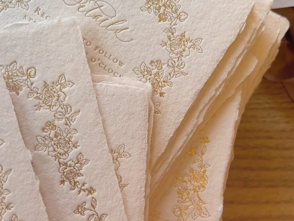
Cotton card stock (like Crane’s Lettra or some options from Legion Paper) is made from cotton fibers—sometimes 100% cotton, sometimes a blend. It has this soft, almost fabric-like texture. The edges are usually a bit softer, it’s more absorbent, and it has what people call “tooth” which means a slight texture that grabs ink beautifully.
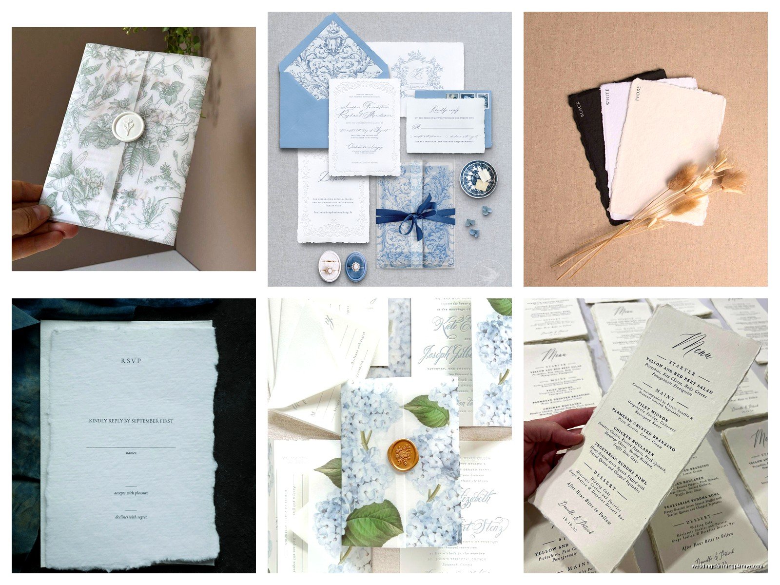
Here’s what I tell clients: if you’re doing letterpress, you want cotton. The fibers compress differently and you get that gorgeous deep impression. For digital printing or flat printing, cotton can work but sometimes the ink sits differently and colors might look less vibrant. My cat knocked over my coffee on a cotton sample once and it absorbed instantly whereas the wood pulp stock just kind of… pooled on top. Not relevant to your invitations but shows you the difference.
Cotton is also more expensive. Like, significantly. A sheet of Crane’s Lettra costs maybe 3-4 times what basic card stock costs. So if budget is tight, don’t feel bad about skipping it.
Finish options because apparently paper needs a personality
The finish is the surface texture or coating on your card stock and it changes everything about how your invites look and feel.
Smooth/Uncoated: No coating, just the natural paper surface. Works with every printing method. Feels organic and high-quality. This is what I use most often because it’s versatile and doesn’t fight with your design.
Matte: Has a slight coating that reduces shine but isn’t glossy. Good for digital printing because it prevents ink from soaking in too much. Colors look crisp. Some matte finishes can feel a tiny bit plasticky though, so touch samples before ordering.
Glossy: Shiny, reflective coating. Makes colors super vibrant and photos look amazing. But—and this is important—you can’t write on it easily with most pens, and it can look kinda cheap if you’re not careful with your design. I rarely recommend glossy for traditional wedding invitations unless someone’s doing a very modern, photo-heavy style.
Linen: Has a subtle crosshatch texture that looks like fabric. Classic, traditional, works beautifully with formal wording. Can be harder to read if your font is too small or thin though.
Laid: Shows fine horizontal lines in the paper, like old-fashioned writing paper. Very elegant, very classic. Some people think it looks dated but I think it depends on the overall design.
Textured/Felt: Has a soft, almost fuzzy texture. Luxurious feeling, expensive looking. Can be challenging for some printing methods—especially if the texture is very pronounced.
Printing methods and which papers they actually like
This is where I see the most mistakes because people fall in love with a printing technique without thinking about whether their chosen paper works with it.
Digital printing
Most invitations today are digital printed (using fancy laser or inkjet printers, not your home printer obviously). Digital printing is affordable, offers full color, and has quick turnaround. It works on pretty much any uncoated or matte card stock between 80-130lb.
What doesn’t work great: heavily textured papers can cause ink coverage issues, and super thick stock (over 130lb) might not feed through the printer properly. Also cotton paper sometimes makes colors look less vibrant because the fibers absorb ink differently.
Letterpress
Letterpress is where metal or polymer plates press into the paper, creating that beautiful debossed impression everyone loves. For letterpress, you want soft, thick cotton paper—at least 110lb, preferably something like Crane’s Lettra 220lb or Bella Cotton.
You can technically letterpress on wood pulp card stock but the impression won’t be as dramatic and the paper might crack if it’s too stiff. During that stressful situation in spring 2023 I mentioned earlier, my bride had picked 100lb wood pulp and the letterpress just looked… flat. No depth. We switched to cotton and the difference was incredible.
Foil stamping
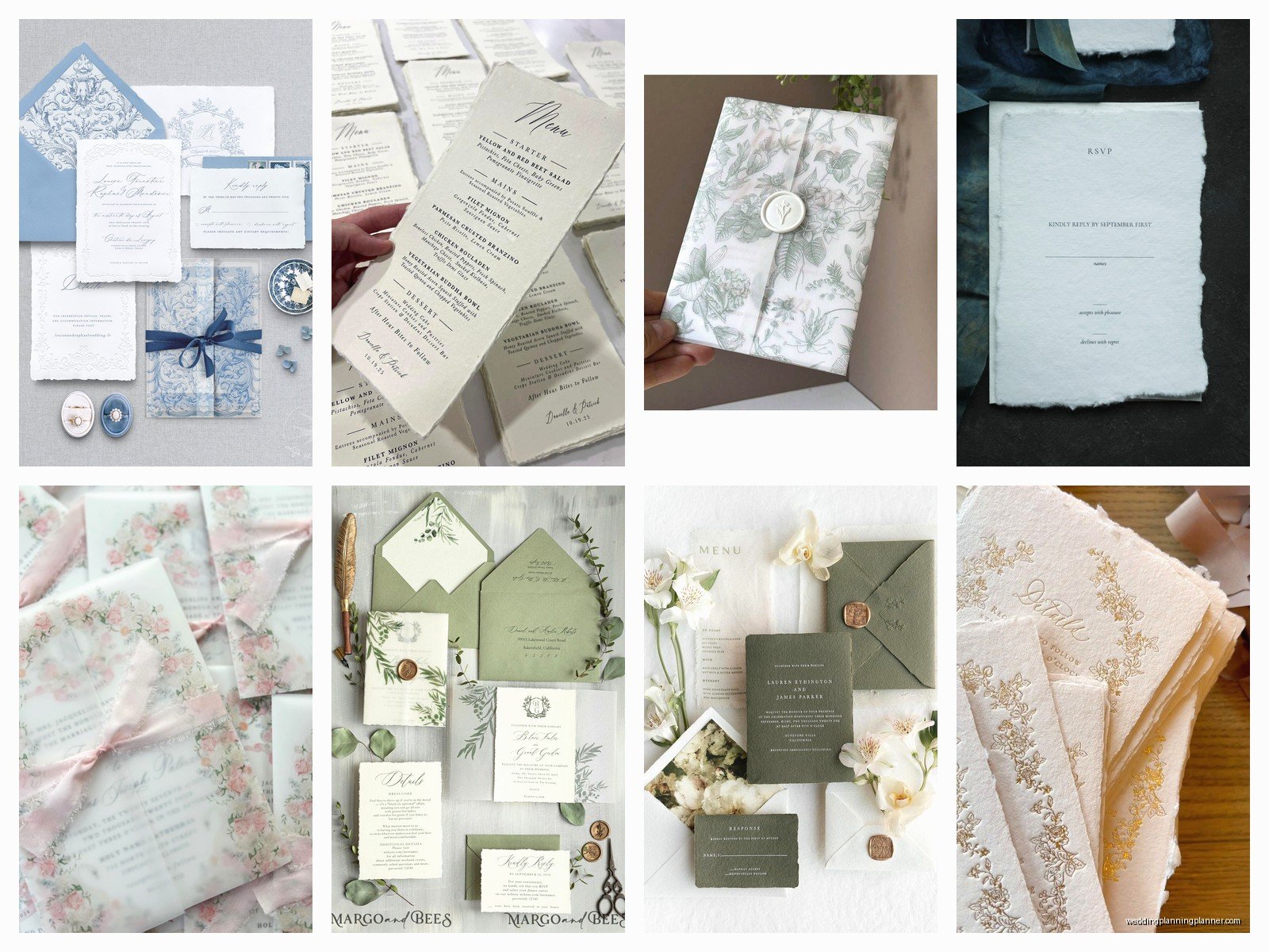
Foil uses heat and pressure to apply metallic or colored foil to paper. It works on both smooth and textured stocks, but you want something thick enough to handle the pressure—at least 100lb. Smooth or linen finishes work best because the foil needs a relatively even surface to adhere properly.
Super textured papers can cause patchy foil coverage which looks bad.
Thermography
This is the raised printing technique that’s cheaper than letterpress or engraving. It works best on smooth, uncoated card stock. Textured papers don’t let the powder adhere evenly so you get weird results.
Colors and why white isn’t just white
Okay so this annoyed me for years until I just accepted that paper companies are gonna do whatever they want with color names.
White card stock comes in like forty different shades. Bright white (very crisp, almost bluish), natural white (softer, slightly warm), ecru (creamy beige), and ivory (warmer, more yellow). Then you have specialty whites like pearl or metallic.
When you’re ordering paper, always get samples of the actual white shade because “white” from one company looks completely different from another company’s “white.” And if you’re ordering invitations, reply cards, and envelopes from different sources, you need to make sure the whites match or at least coordinate.
For colored card stock, the options are endless but make sure you’re thinking about readability. Dark card stock with dark ink is hard to read. Light text on light card stock same problem.
Specialty papers that might be worth it
Pearl or shimmer: Has a subtle iridescent sheen. Gorgeous for formal weddings, photographs beautifully. Can be tricky with some printing methods though—test first.
Metallic: Actual metallic finish, very dramatic. Usually works best as an accent (like a backing layer) rather than the main invitation because it’s hard to print on directly.
Vellum: Translucent paper, often used as an overlay. Comes in different weights—I recommend at least 30lb for overlays so it doesn’t wrinkle. You can print on vellum but it requires special techniques and the ink can smudge.
Kraft: Brown paper, rustic vibe. Great for casual or outdoor weddings. Make sure you use darker inks because light colors disappear on kraft.
Recycled: Eco-friendly option, often has visible fibers or specks. Can be beautiful but sometimes looks uneven or… I mean it depends on the quality. Some recycled papers are gorgeous, others look like cardboard.
Envelopes are their own nightmare
People forget about envelopes until the last minute and then realize their beautiful thick invitations need envelopes that actually fit and seal properly.
Envelope paper is usually lighter than card stock—like 70-80lb text weight. If you go too thick, they won’t fold properly at the seams. If you go too thin, you can see the invitation through the envelope which looks unprofessional.
Make sure your envelope color coordinates with your invitation. You don’t need an exact match but they should look intentional together. And if you’re doing any envelope liners, those are usually 70lb text weight or lighter so they don’t add too much bulk.
The adhesive on envelopes matters too—some are peel-and-stick, some are moistenable (the ones you lick or use a sponge on), and some need glue. For large mailings I always recommend peel-and-stick because nobody wants to lick 150 envelopes.
Testing before you commit to 200 invitations
Always, always, ALWAYS order samples before you order your full quantity. And I don’t mean just looking at a paper swatch—actually order a few sheets and test your complete process.
Print a test invitation with your actual design. Does the ink look how you expected? Does it smudge? How does it feel? Put it in the envelope. Does it fit? Is it too tight? Too loose? Add all your enclosures. Does everything fit without bulging?
Mail a complete test suite to yourself. Seriously. I had a bride whose invitations were so thick they required extra postage and she didn’t realize until she’d already sent half of them with regular stamps and they all got returned. Take your assembled invite to the post office and have them weigh it.
Where to actually buy card stock
If you’re DIY-ing your invitations, you have options. Paper Source and Michael’s carry decent card stock for small quantities. For larger orders or specialty papers, check out:
- Cards & Pockets – huge selection, good prices, can order by the sheet
- LCI Paper – wholesale supplier, requires business account but worth it
- Paper-Papers – specialty and imported papers
- Neenah Direct – order directly from the manufacturer
Most online stationers (like Minted or Paperless Post’s print options) include paper selection in their packages so you don’t have to source separately, but you’re limited to their options.
Quick troubleshooting for common paper problems
Ink is smudging: Paper might be too absorbent or coated wrong for your printing method. Try a different finish or let it dry longer.
Paper is jamming in the printer: Too thick or too textured. Check your printer’s maximum weight specifications.
Colors look different than on screen: This is normal but can be worse with certain papers. Cotton absorbs ink differently than coated stock. Always do a test print.
Envelopes won’t seal: Humidity affects adhesive. Store them somewhere dry and if all else fails, use a glue stick or double-sided tape.
Paper feels cheap even though you paid for good stuff: Weight matters. If you went with 80lb when you should’ve used 100lb+, it’s gonna feel flimsy no matter what.
The paper you choose sets the tone before anyone even reads your invitation wording, so it’s worth spending time on this decision even though there are like seven thousand other wedding decisions demanding your attention right now. Just remember that nobody’s wedding got ruined because they picked smooth instead of linen texture—pick something that fits your budget and style and then move on to worrying about whether your aunt and your mom can sit at the same table