Planning Guides, Style Guide
Blue Invitations: Design & Ordering Guide
Jun
Okay So Blue Invitations Are Actually More Complicated Than You’d Think
Blue is one of those colors everyone says they want for their wedding and then you get into the actual design process and suddenly there are like forty-seven different blues and half of them look terrible on paper. I learned this the hard way back in spring 2023 when I had a bride who kept sending me Pinterest boards with “dusty blue” invitations that were actually periwinkle, slate, powder blue, AND navy all mixed together. We ordered three sample rounds before getting it right.
The thing is, blue invitations can be absolutely stunning when done correctly, but you gotta understand what you’re working with from the start. Let me just walk you through the whole process because there’s a specific order you need to follow or you’ll waste money on samples that don’t match your vision.
First Things First: Which Blue Are We Actually Talking About
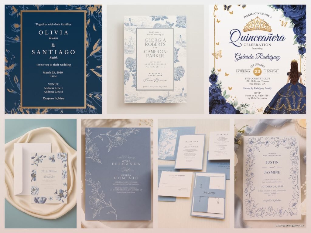
You need to pick your exact shade before you do anything else. And I mean EXACT. Here’s what’s out there:
- Navy – classic, formal, works year-round but especially good for fall/winter weddings
- Royal blue – bold, makes a statement, can overwhelm if you’re not careful
- Dusty blue – super popular right now, romantic, pairs well with blush and gold
- Slate blue – more muted, sophisticated, great for modern weddings
- Powder blue – soft, delicate, very spring/summer vibes
- Teal – technically blue-green but people always put it in the blue category
- Periwinkle – that purplish-blue that’s kinda making a comeback
- Ice blue – very pale, almost white-blue, winter wonderland territory
The problem is that everyone has different names for these shades. What Minted calls “dusty blue” might be different from what Zola calls “dusty blue.” This is gonna sound obsessive but I literally keep a physical swatch book of blues from different printers and I still get surprised sometimes.
Matching Your Blue to Everything Else
Once you’ve picked your shade, you need to think about how it works with your other wedding colors. Blue is super versatile but it’s not foolproof. Navy pairs beautifully with gold, blush, burgundy, or white. Dusty blue works with mauve, sage green, champagne, copper. But if you’re trying to do like… powder blue with orange? That’s gonna be rough.
Also consider your venue. If you’re getting married in a space with a lot of warm wood tones, a cool-toned blue might clash. I had this issue with a barn wedding where the bride wanted ice blue invitations and the whole venue was honey-colored wood and it just… anyway, we ended up going with a warmer slate blue instead.
Design Elements You Need to Decide On
Alright so now you know your shade. Here’s what actually goes into designing these things:
Typography and Font Choices
The font you choose completely changes the vibe. Script fonts give you romantic and elegant. Sans-serif fonts are modern and clean. Serif fonts are traditional and formal. For blue invitations specifically, I usually recommend:
- Navy = classic serif or elegant script
- Dusty blue = mix of script and sans-serif
- Powder blue = delicate script or thin serif
- Royal blue = bold sans-serif or modern serif
Don’t use more than two or three fonts on one invitation or it starts looking like a ransom note. Trust me on this.
How Much Blue Are We Using
This is critical. You can do:
- Full blue background – dramatic, requires white or light text, uses more ink so it’s pricier
- Blue text on white/cream – classic, easy to read, cost-effective
- Blue accents – borders, corner designs, small graphic elements
- Blue envelope with white insert – gives you the color impact without printing costs
- Watercolor blue wash – soft and artistic but harder to print consistently
The thing that annoyed me for YEARS was clients who wanted a full navy background and then complained about the printing cost. Dark, saturated colors use more ink. That’s just physics or chemistry or whatever. You can’t get around it.
Paper Stock Matters More Than You Think
Blue looks completely different on different papers. On matte paper, it looks softer and more muted. On glossy, it’s more vibrant and saturated. On textured paper like linen or felt, it absorbs differently and can look darker.
My go-to recommendations:
- Navy – looks amazing on white matte or smooth cotton paper
- Dusty blue – beautiful on textured paper, also good on vellum overlays
- Powder blue – needs a bright white background to not look washed out
- Royal blue – can handle texture, also looks great on glossy if you want modern
Always, ALWAYS order paper samples before committing. Most online printers will send you samples for free or like five bucks. Do it.
Printing Methods and What They Mean for Blue
Okay this is where it gets technical but you need to understand this or you’ll be disappointed with your final product.
Digital Printing
This is what most online services use (Minted, Zola, Shutterfly, etc.). It’s cost-effective, fast, and works well for most blues. The color consistency is pretty good but not perfect – you might see slight variations between different print runs. For lighter blues like powder or ice blue, digital is usually fine. For navy or royal blue where you want deep saturation, it can sometimes look a bit flat.
Letterpress
Gorgeous for blue invitations. The impression in the paper adds texture and dimension. But here’s the thing – letterpress blues tend to print lighter than you expect because you’re literally pressing ink into paper rather than laying it on top. If you want navy letterpress, be prepared for it to look more like a dark slate blue. I learned this in summer 2021 when a client almost had a meltdown because her “navy” letterpress invites looked grey in certain lighting.
Thermography
This raises the ink so it’s shiny and dimensional. Works beautifully with darker blues like navy or royal. The raised effect makes the color look richer. Not great for very pale blues because the raising doesn’t show up as well.
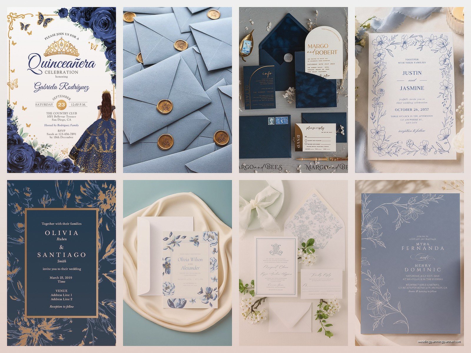
Foil Stamping
If you want metallic blue, this is your method. Foil comes in different blue shades and it’s stunning but expensive. You can also do regular blue printing with gold or silver foil accents which is a nice compromise.
Ordering Process Step by Step
Here’s how I walk my clients through actually placing the order:
Step 1: Order samples from multiple companies. Get at least three different vendors’ samples in your blue shade. They’ll all look different. Pick the one that matches your vision best.
Step 2: Customize your design. Most online platforms have templates you can customize. If you’re doing custom design, work with a designer who understands printing (not all graphic designers do – and that’s a whole other rant).
Step 3: Order a printed proof. This is NOT optional. Your screen shows colors differently than printed paper. That dusty blue might look perfect on your laptop and then arrive looking like… I don’t even know, like a weird grey-purple situation.
Step 4: Check the proof in different lighting. Natural daylight, indoor lighting, evening light. Blue is one of those colors that shifts a lot depending on light source.
Step 5: Adjust if needed. Don’t be afraid to request changes. You’re paying for these, they should be right.
Step 6: Place your full order with a buffer. Order 10-15% more than you need for mistakes, last-minute additions, keepsakes.
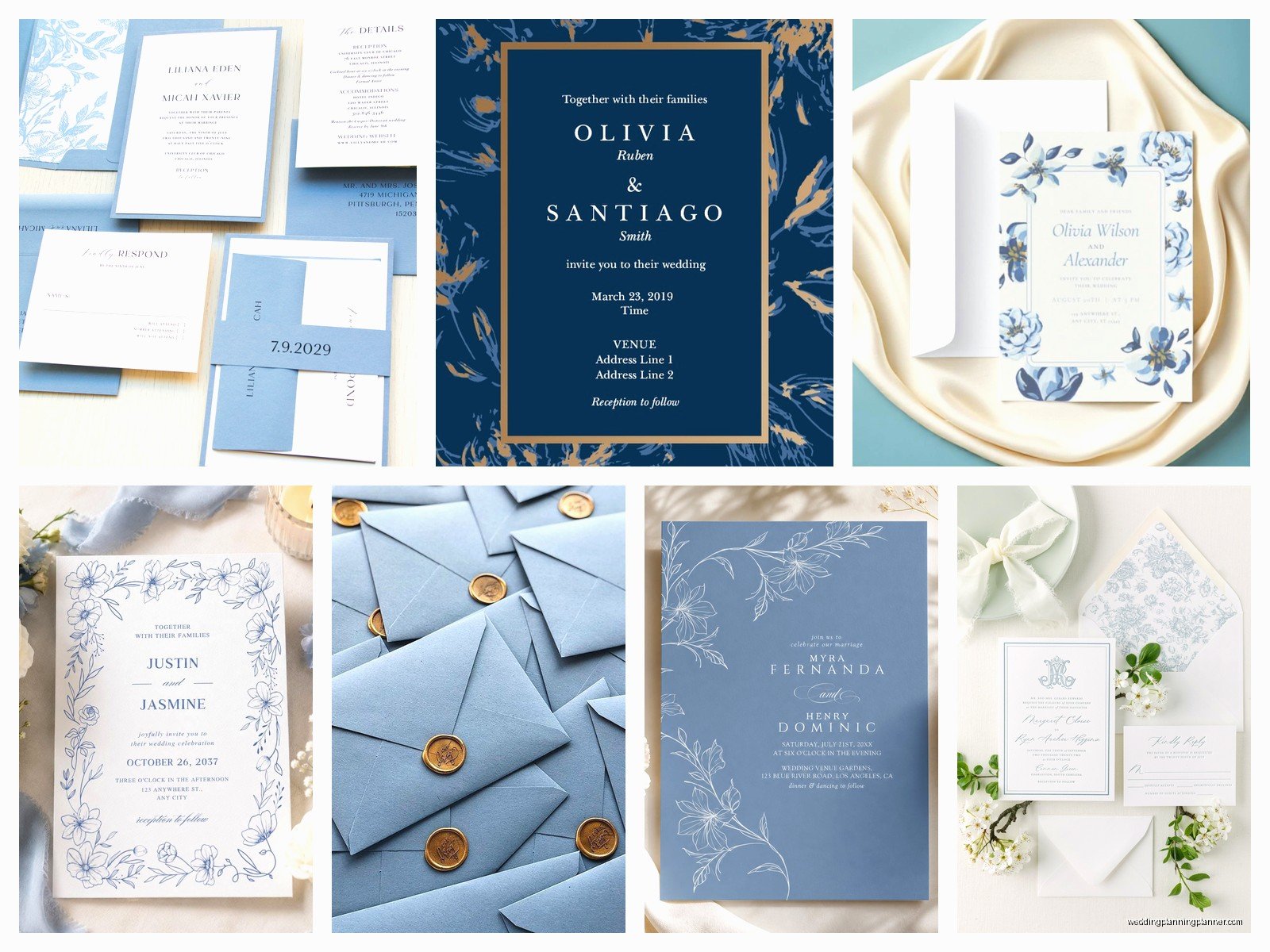
Envelope Situations
The envelope is half the impact of a blue invitation suite, honestly. You’ve got options:
- White envelopes with blue liner – classic and cost-effective
- Blue envelopes that match your invitation – cohesive but can be hard to match exactly
- Contrasting envelope (like navy invite with cream envelope) – sophisticated
- Patterned liner in blue – adds visual interest without overwhelming
Pro tip: if you’re doing blue envelopes, get extras. They get damaged, you mess up addressing, your cat knocks over your coffee onto a stack of them (just me? okay cool). I always order 25% extra envelopes because I’m paranoid but also because it’s happened.
Addressing in Blue
You can do blue calligraphy or printing on your envelopes which looks gorgeous. White ink on navy envelopes is stunning. Navy ink on white envelopes is classic. Gold on dusty blue is very popular right now. Just make sure whatever you choose is legible – the postal service doesn’t care how pretty it is if they can’t read the address.
Online Vendors vs. Local Printers
I use both depending on the client’s needs and budget. Here’s the breakdown:
Online Vendors (Minted, Zola, Shutterfly, Etsy)
Pros: Convenient, tons of templates, customer reviews, usually have sales, easy customization tools, fast turnaround
Cons: Less control over exact color matching, can’t always get paper samples before ordering, customer service is hit or miss, everyone else might have the same design
Local Print Shops or Stationery Boutiques
Pros: Personal service, can see and touch samples in person, more customization options, better color matching, supports local business
Cons: Usually more expensive, longer lead times sometimes, smaller selection of pre-made designs
For blue specifically, I lean toward local if the budget allows because color matching is so important and it’s easier to work through in person. But I’ve had plenty of clients get beautiful blue invitations from Minted or similar and be totally happy.
Timing and When to Order
Invitations should go out 6-8 weeks before your wedding. But you need to order them way before that. Here’s my timeline:
- 6-7 months before wedding: start browsing designs, order samples
- 5-6 months before: finalize design, order proof
- 4-5 months before: approve proof, place full order
- 3-4 months before: receive invitations, start addressing
- 6-8 weeks before: mail them out
This gives you buffer room for delays, mistakes, changes of heart. I’ve seen people try to rush this process and it never ends well. Or it ends with me getting panicked phone calls at 9 PM which is… not ideal.
Cost Expectations
Blue invitations don’t inherently cost more than other colors (except for full-bleed dark blue which uses more ink). Here’s roughly what you’re looking at:
- Budget option (digital printing, online vendor): $1.50-3.00 per suite
- Mid-range (better paper, some customization): $3.00-6.00 per suite
- High-end (letterpress, custom design, premium paper): $8.00-15.00+ per suite
A “suite” usually includes the invitation, RSVP card, and envelopes. Add-ons like reception cards, direction cards, belly bands, wax seals, envelope liners – those all cost extra.
Common Mistakes I See All the Time
Not ordering samples first. I can’t stress this enough. The color on your screen is not accurate.
Choosing a blue that doesn’t photograph well. Really pale blues can wash out in photos, really dark blues can look black in dim lighting. Think about your wedding photographer when picking your shade.
Forgetting about the RSVP deadline. If your wedding is June 15th and invites go out May 1st, you need an RSVP deadline of like June 1st, which means people have less than a month to respond. That’s tight. This is sorta unrelated but it drives me crazy when couples don’t think through the timeline.
Not proofreading. I had a client once who ordered 150 navy invitations with their venue address spelled wrong. That was an expensive fix. Read everything seventeen times. Have other people read it. Check dates, times, addresses, names, spelling.
Coordinating the Rest of Your Stationery
Your invitations are just the start. You’ll probably also need:
- Save the dates (can be a different blue shade, actually – lighter for save the dates, darker for invites works well)
- Programs
- Menu cards
- Place cards
- Thank you cards
- Table numbers
You don’t have to order everything from the same place, but you should keep color swatches so you can match. Navy is easier to match across vendors than something like dusty blue which varies wildly.
DIY vs. Professional Design
Look, I’m gonna be honest – some people can DIY beautiful invitations and some people absolutely cannot. If you have design skills and understand printing specs (bleed, resolution, CMYK vs. RGB color modes), go for it. You’ll save money.
But if you’re planning to design something in Canva and send it to a printer expecting it to look professional… maybe reconsider. I’ve seen some rough DIY attempts. The blue doesn’t print right, the text is positioned weird, the quality is just off.
There’s a middle ground: buy a template from Etsy or Creative Market, customize it yourself, then have it professionally printed. This gives you some creative control without requiring expert design skills.
Sustainability Considerations
If eco-friendliness matters to you, look for:
- Recycled paper options (blue prints beautifully on recycled paper actually)
- Soy-based inks
- Tree-free paper like cotton or bamboo
- Digital RSVPs instead of printed cards
- Plantable seed paper (though blue seed paper has limited shade options)
Some printers specialize in sustainable wedding stationery. They’re usually a bit pricier but not dramatically so.
What to Do If Something Goes Wrong
It happens. You order navy and get royal blue. The paper quality is worse than the sample. There’s a typo you didn’t catch. Here’s how to handle it:
Contact the vendor immediately with photos. Most reputable companies will reprint if it’s their error. If it’s your error (like the typo situation), you’ll probably have to pay for a reprint but sometimes they’ll offer a discount.
If you’re close to your mail date and don’t have time for a reprint, consider whether the issue is actually noticeable to anyone but you. That slightly-off blue shade? Your guests probably won’t notice or care. The misspelled venue name? Yeah, that needs fixing.
Build buffer time into your timeline so you can handle problems without completely panicking. This is why I tell people to order 4-5 months before the wedding, not 2 months.