Planning Guides, Style Guide
Digital Marriage Card: Design & Ordering Guide
Jun
Okay So Digital Marriage Cards Are Actually Way More Complicated Than People Think
Right so you’re gonna need a digital marriage card and honestly this is where like 60% of my couples get totally overwhelmed because they think “oh it’s just digital, how hard can it be?” and then they end up sending me panic texts at 11pm. I had this bride in spring 2023 who literally designed seven different versions because she kept changing her mind about fonts and I was like… we gotta draw a line somewhere.
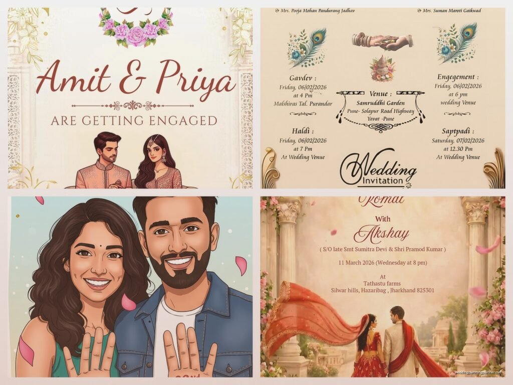
First thing first – you need to figure out what you’re actually making here. A digital marriage card isn’t just one thing anymore. It could be a PDF invitation you’re emailing, an Instagram story announcement, a WhatsApp-friendly image, an animated video thing, or even one of those fancy interactive website invites. Each format needs different specs and honestly different design approaches entirely.
Figure Out Your Distribution Method Before You Design Anything
This is where people mess up constantly. They design this gorgeous vertical card and then realize they’re sending it via email where everyone’s reading on a laptop and vertical looks weird. Or they make something super detailed and then compress it for WhatsApp and it looks like a blurry mess.
If you’re sending via email, you want a landscape or square format, around 1200×800 pixels or 1080×1080. For Instagram stories, you need 1080×1920 (vertical). For WhatsApp, keep it under 1MB or it’s gonna compress badly and lose all that pretty detail you spent hours on.
I usually tell couples to decide: are you doing this INSTEAD of paper invites or IN ADDITION to paper? Because if it’s instead of, you need way more information on there. If it’s just a save-the-date or a casual announcement, you can keep it simpler.
Design Platforms That Actually Work
Alright so Canva is obviously the big one everyone knows about. It’s got templates specifically for wedding invitations and honestly some of them are pretty decent? The pro version gives you access to better fonts and you can remove backgrounds which is super helpful. I use it for quick mockups all the time.
But here’s what annoys me about Canva – everyone and their cousin is using the same templates. I’ve seen the same floral border design on like twelve different weddings. If you want something that actually looks custom, you gotta modify it significantly or start from scratch.
Adobe Spark is another option, kinda similar vibes to Canva but with different templates. Easier animations if you want something moving. Adobe Express they call it now? They keep changing the name which is confusing.
If you want to get fancy and you have some design skills or you’re willing to learn, Adobe Illustrator or Photoshop are obviously the professional route. But that’s a steep learning curve if you’ve never used them. I wouldn’t recommend starting there two months before your wedding unless you really love stress.
For animated invites or video cards, Animoto or Ripl work pretty well. You upload your photos, pick a template, add text, and it creates a video. Takes maybe 30 minutes once you know what you’re doing.
The Design Elements You Actually Need To Think About
Typography is where I see people go totally off the rails. You do not need seven different fonts on one invitation. Two fonts max, maybe three if one is just for a small detail. One decorative font for names or the main title, one readable font for all the actual information.
And please please please make sure your fonts are readable at small sizes. What looks elegant and delicate on your laptop screen might be completely illegible when someone opens it on their phone while sitting in traffic or whatever. I always zoom out or look at designs on my phone before approving them.
Color Schemes That Won’t Look Terrible On Every Screen
Here’s the thing about digital – colors look different on every single device. What looks like a soft blush pink on your MacBook might look straight-up hot pink on your aunt’s Android phone. I learned this the hard way with a client who designed everything on her calibrated monitor and then everyone’s phones showed this completely different color palette.
Stick with colors that have enough contrast. If you’re doing text on a colored background, make sure there’s significant difference between them. Light text on light backgrounds might look “aesthetic” but nobody can read it.
Jewel tones work really well for digital – emerald, sapphire, burgundy, that kind of thing. Pastels can work but they need to be saturated enough that they don’t wash out. Pure white backgrounds are safe but kinda boring… my cat just knocked over my coffee cup, hang on.
Okay back. Anyway, if you’re doing a photo background, add a semi-transparent overlay or put text in a solid box so it’s readable. Nothing worse than beautiful script font over a busy floral photo where you literally cannot read the venue address.
Information Hierarchy Is Not Optional
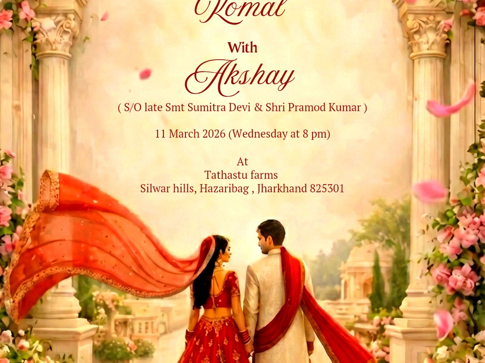
People need to know: who’s getting married, when, where, and how to RSVP. In that order of importance, usually. Your names should be the biggest text. Date and time next. Venue information has to be clear. RSVP details need to be obvious.
I see so many designs where the couple’s names are tiny and there’s this huge decorative element taking up half the card and I’m like… why? This isn’t abstract art, it’s functional communication that also happens to be pretty.
Think about someone glancing at this for five seconds. Can they immediately understand what it is and what they need to do? If not, rearrange.
File Formats And Technical Stuff You Can’t Ignore
Export as PDF if you’re emailing as an attachment. PDF keeps everything looking consistent across devices and it’s easy to print if someone wants a physical copy. Make sure it’s not a huge file though – under 2MB is good, under 1MB is better.
For social media sharing, use PNG for graphics with text or solid colors. PNG keeps things sharp and doesn’t get weird compression artifacts like JPEG does. But PNG files are bigger, so for photos or complex images, JPEG is fine at high quality settings (90% or above).
If you’re doing an animated invite, MP4 is your standard video format. Keep it under 30 seconds because nobody’s watching a two-minute wedding invitation video, I don’t care how beautiful your transitions are.
Resolution matters way more than people think. For anything going on Instagram or being viewed on phones, 72 DPI is fine. But if there’s ANY chance someone might print it, you need 300 DPI. I always design at 300 DPI just to be safe because inevitably someone’s gonna want to print it.
The Whole RSVP Situation
Digital invites need digital RSVP options or you’re gonna be getting responses via text, email, Instagram DM, phone calls, and carrier pigeon. Pick ONE method and make it super clear.
Google Forms is free and works great. You can customize the questions, collect dietary restrictions, song requests, whatever. You get all responses in a spreadsheet which makes tracking easy. The downside is it looks kinda corporate and basic.
Wedding websites like Zola, The Knot, or Withjoy have RSVP features built in and they look nicer. They integrate with your guest list and can send reminders. But you have to set up the whole website which is extra work.
Some couples just put their phone number or email and ask people to respond directly. This works for small weddings (under 30 people) but gets chaotic fast with larger groups. You’ll forget who said yes, people will forget to respond, it’s a mess.
Whatever you choose, include the RSVP deadline prominently on the invitation. And make it earlier than you think – people are gonna respond late anyway so build in buffer time.
Ordering vs DIY: The Real Cost Breakdown
Okay so technically with digital you’re not “ordering” anything but you might hire a designer or use a paid service, so let’s talk money.
Full DIY using free Canva: $0 but takes time and your design skills matter a lot. Canva Pro: $13/month, worth it for the extra features if you’re doing multiple wedding graphics (save the dates, invites, programs, menus, etc). You can do the free trial and cancel after you’re done if it’s just for one project.
Hiring a designer on Etsy for a custom digital invitation: $50-$300 depending on complexity. They’ll usually give you the final files in multiple formats. Mid-range option that gets you something unique without learning design software.
Professional stationery designer creating custom digital invites: $300-$800+. This is what you’re paying me for basically, and you get custom illustrations, specific branding, multiple rounds of revisions, and all the technical specs handled correctly. Worth it if you want something really special or if you’re doing a whole suite of matching materials.
Template marketplaces like Creative Market or Etsy templates: $15-$50 for a template you customize yourself. Good middle ground – you get a professional design structure but can personalize it. You need basic software skills to edit them though.
Things That Will Cost Extra You Might Not Think About
Custom illustrations or monograms – if you want an illustrated venue or custom crest, that’s additional design work. Stock photos are cheaper but less personal. Your own photos are free but might need editing to work with the design.
Fonts – some fancy fonts cost money to license, especially for commercial use. Free fonts exist but the really gorgeous ones often aren’t free. Google Fonts has decent free options though.
Video or animation – this takes way more time than static designs so it costs more. Expect to add $200-500 if you’re hiring someone to animate your invitation.
Multiple format versions – if you need the same design formatted for email, Instagram, WhatsApp, and print, that’s technically four different files with different specs. Some designers charge per format.
Testing Before You Send Is Not Paranoid It’s Smart
Send test versions to yourself and like three other people with different devices. iPhone, Android, computer, iPad – check how it looks everywhere. I had a situation once where an invite looked perfect on iPhones but the text was cut off on Android phones because of how the email client rendered it and we only caught it because someone tested it.
Check the file size. If it’s over 5MB, most email providers are gonna have issues with it. Compress it or reduce the resolution.
Click any links to make sure they work. Spell check everything twice. Then have someone else spell check it because you’ve been staring at it too long and you’ll miss obvious typos. The number of times I’ve caught “Saterday” or wrong venue addresses in final versions…
If you’re doing a video, watch it with sound off to make sure any text is readable without audio. Most people watch videos on their phones with sound off.
Sending Strategy That Actually Gets Opened
Email subject lines matter more than you think. “Wedding Invitation” is boring and might get filtered to spam. “You’re Invited to Sarah & Mike’s Wedding – June 15th” is better. Including the date helps people prioritize opening it.
Send during normal waking hours, like Tuesday-Thursday between 10am-2pm. Not Sunday night when everyone’s ignoring their inbox. Not Friday afternoon when people are checked out.
For WhatsApp or text invites, send during similar times. Nobody wants a wedding invite notification at 6am or 11pm.
Follow up with people who don’t RSVP. With paper invites people kinda feel obligated to respond but digital invites people forget about or think “I’ll do that later” and never do. Two weeks before your RSVP deadline, send a friendly reminder to non-responders.
Accessibility Stuff Nobody Talks About
If you have elderly relatives or people who aren’t tech-savvy, digital-only invites might not work. Have a backup plan – maybe print a few copies to mail, or call them directly with the information. My grandmother still doesn’t really understand email and she’s not alone in that.
Alt text for images if you’re posting on social media. Screen readers need this for visually impaired people. Just describe what’s in the image basically.
Contrast ratios for text – there are free checkers online that tell you if your color combo is readable for people with vision issues. Light gray text on white background fails this hard.
Keep language clear and direct. Overly flowery or poetic wording might be pretty but if English isn’t someone’s first language or they process information differently, simple and clear is better. You can be elegant and still straightforward.
The thing about digital invitations is they’re simultaneously easier and harder than paper ones? Like you don’t have to worry about printing costs or postage, but you do have to think about file formats and screen sizes and… anyway, I feel like I’m rambling at this point but hopefully this helps you figure out what you actually need to do. Start with deciding your format and distribution method, then design for that specific use, test it properly, and send it at a reasonable time. That’s really the whole process even though there’s a million little details in between.