Planning Guides, Style Guide
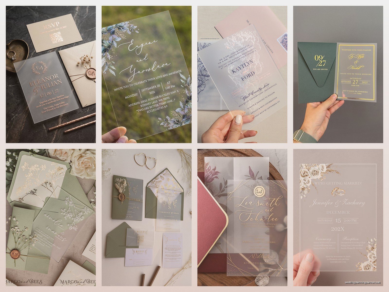
Frosted Acrylic Wedding Invitations: Matte Clear Modern

Jun
Okay So Frosted Acrylic Invitations Are Actually Kind of Tricky
Look, frosted acrylic invitations are gorgeous but they’re not as straightforward as you’d think. I had this bride back in summer 2021 who was OBSESSED with the matte clear look and we went through like three rounds of samples before getting it right. The thing is, frosted acrylic sits in this weird space between fully transparent and completely opaque, and that affects literally everything about how you design and print them.
First thing you gotta know is that “frosted” and “matte clear” are basically the same thing in the acrylic world. Some suppliers call it frosted, some say matte, some say etched—it’s all referring to that translucent, slightly cloudy finish that diffuses light instead of being crystal clear. The technical process involves either sandblasting or acid-etching the acrylic surface, which creates microscopic texture that scatters light. But honestly you don’t need to know that to order them, I just find it kinda interesting.
Thickness Matters More Than You Think
You’ve got options ranging from 1/16 inch (super thin, almost flimsy) up to 1/4 inch (heavy, luxe, expensive). Most wedding invitations fall in the 1/8 inch range because it’s substantial enough to feel expensive but not so thick that mailing becomes a nightmare. I usually tell my couples to go with 1/8 inch for the main invitation and if they want save-the-dates or ceremony programs in acrylic too, those can be thinner since they’re less critical.
Here’s what annoyed me though—suppliers almost never mention that thicker acrylic actually looks MORE frosted. Like, a 1/4 inch piece has more material for light to travel through, so it appears cloudier than a thin piece of the exact same frosted acrylic. Found this out the hard way when a client approved a thin sample but ordered thick invitations and then was confused why they looked different. Now I always send samples in the actual thickness we’re ordering.
Printing Methods and Why Some Look Terrible
Alright so there are basically three ways to get text and designs onto frosted acrylic and they all look completely different.
UV printing is the most common and probably what you‘ll get unless you specify otherwise. The printer shoots UV-cured ink directly onto the acrylic surface. You can do full color, photographs, whatever. The ink sits ON TOP of the acrylic, which means you can feel it if you run your finger over it. For frosted acrylic specifically, white ink is your best friend because it shows up crisp and clean against that cloudy background. Black ink works too but it’s not quite as striking. I remember my cat knocked over a whole stack of UV-printed samples once and the ink scratched on like half of them, so just know they’re not indestructible.
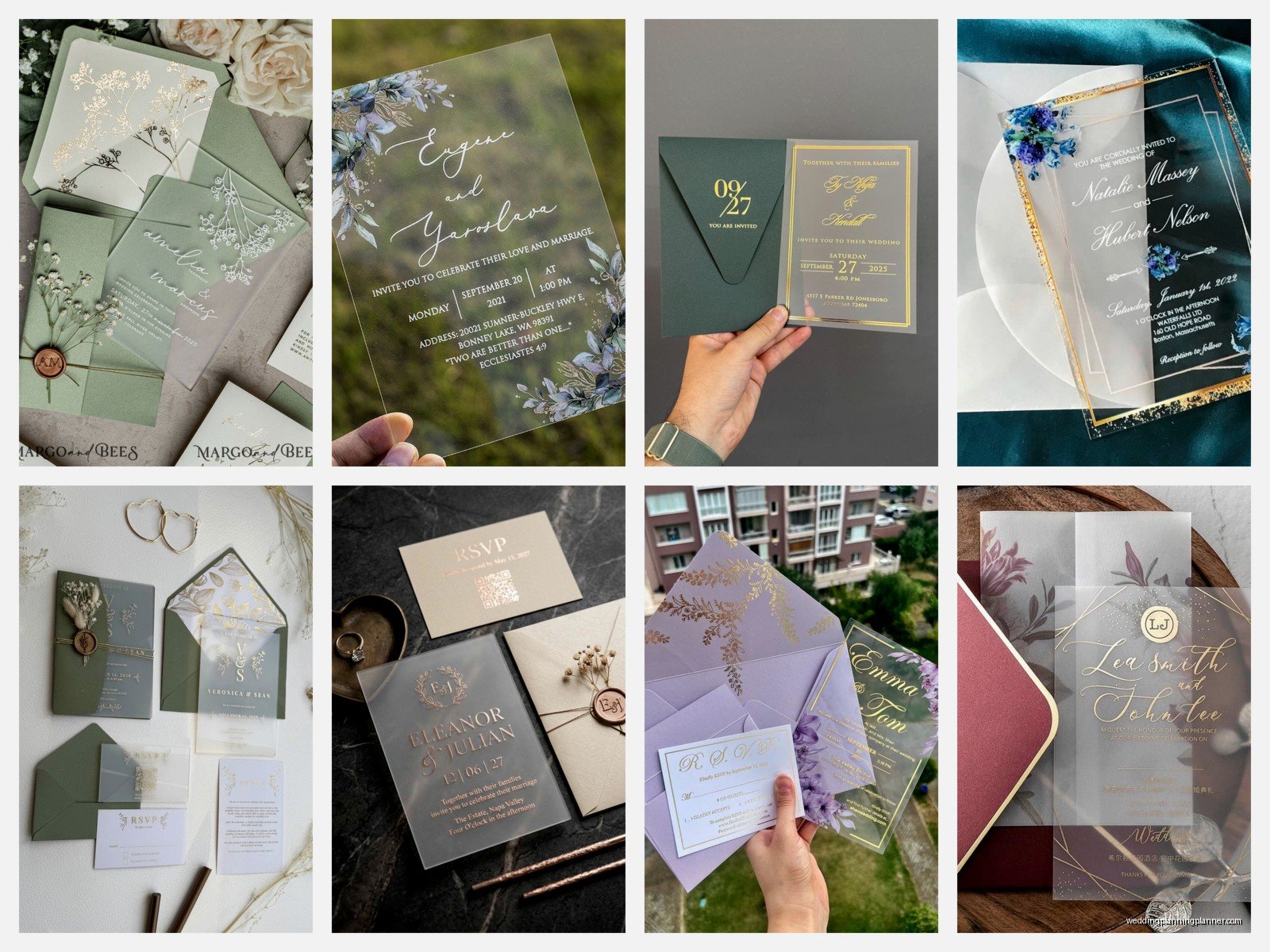
Laser engraving is where you actually burn/etch the design into the acrylic itself. This removes the frosted coating in the engraved areas, so you get clear letters on a frosted background (or vice versa if you engrave the background). It’s super modern and minimal but here’s the thing… it only works in one “color” which is really just clear vs frosted. No photographs, no multiple colors, just clean line work and text. Some couples love this aesthetic, some think it’s too subtle.
Vinyl application is when you cut vinyl (like a sticker basically) and apply it to the acrylic. This is the budget option and honestly it can look really good if done well, but it can also look cheap if the vinyl isn’t applied perfectly or if there are air bubbles. I don’t usually recommend this for formal wedding invitations but for like, welcome signs or table numbers? Sure, go for it.
Design Considerations That Nobody Tells You
The frosted texture completely changes how colors appear compared to regular clear acrylic or paper. White ink on frosted acrylic looks AMAZING—crisp, modern, almost glowing. Metallic inks (gold, rose gold, silver) also look gorgeous because the matte background makes them pop. But here’s where it gets weird… pastel colors and light colors kinda disappear into the frosted background. I had a bride who wanted blush pink text and we did a sample and you literally could barely read it unless you held it at a specific angle in good lighting.
You also need way more contrast than you think. Designs that look perfect on paper can look washed out on frosted acrylic because the material itself has visual texture. I usually recommend bold, clean fonts—nothing too thin or delicate. Script fonts can work but they need to be thick enough that the frosted background doesn’t overwhelm them.
The Backing Situation
Okay so this is something that trips people up constantly. Frosted acrylic invitations almost always look better with some kind of backing or backer card. Just the acrylic alone can be hard to read depending on lighting and what’s behind it. Your options are:
- Colored cardstock backer that slides behind the acrylic (most popular)
- Printed directly on both sides of the acrylic (expensive, complicated)
- No backer at all, just the acrylic (very modern, very minimal, not super readable)
- Vellum or translucent paper behind it (adds softness)
The backer card thing is actually genius from a practical standpoint because you can print all your detail information on the backer (like accommodations, registry, dress code) and keep the acrylic piece just for the main invitation wording. Looks expensive, is actually kinda cost-effective because you’re only doing the pricey acrylic printing for one element.
I usually do white or cream backers because they make the text on the acrylic super readable, but I’ve done navy, black, sage green, terracotta—pretty much any color that fits the wedding palette. Just make sure there’s enough contrast or you’re gonna have 150 guests squinting at their invitations.
Mailing These Things Is Its Own Adventure
So here’s where it gets fun (sarcasm). Acrylic is fragile. Not like, shatter-if-you-breathe-on-it fragile, but definitely can-crack-in-transit fragile. You absolutely cannot just stick these in a regular envelope and hope for the best.
You need rigid mailers—those cardboard envelopes that don’t bend. I usually do a setup where the acrylic invitation goes in a protective sleeve (glassine or cellophane), then into a pocket or folder with the backer card and any other inserts, and THEN into the rigid mailer. Some couples also add a “Do Not Bend” stamp but honestly I don’t think mail carriers care.
Weight is another issue. A 5×7 frosted acrylic invitation with backer and envelope is gonna weigh around 2-3 ounces, which means you’re paying extra postage. Not a huge deal but it adds up when you’re mailing 200 invitations. I always tell couples to bring a fully assembled invitation suite to the post office and have them weigh it before you buy all your stamps.
Oh and speaking of envelopes… you’re gonna want something substantial. Those flimsy cheap envelopes look ridiculous with a luxury acrylic invitation. I usually go with A7 (5.25 x 7.25) pockets in a heavy cardstock, at least 100lb. Vellum envelopes look gorgeous too but they’re harder to work with for addressing.
Printing Logistics and Lead Times
This is where I get into the weeds but it’s important. Most acrylic invitation suppliers need AT LEAST 2-3 weeks for production, sometimes longer during wedding season (spring and early summer). You can’t rush acrylic printing the way you can rush paper printing. The UV curing process takes time, laser engraving is done piece by piece, and quality control is more intensive because you’re checking for scratches, uneven frosting, printing errors…
Always, ALWAYS order samples before you commit to the full quantity. And I don’t mean just looking at the supplier’s sample—get a sample with YOUR actual wording and design. I cannot stress this enough. The sample might look perfect with their generic text but then your specific font or layout might not work the same way.
Also you need to factor in assembly time if you’re doing the backer card situation. It’s not hard but it’s tedious when you’re doing 150+ invitations. Spring 2023 I had a couple who insisted on assembling everything themselves to save money and they literally spent an entire weekend just putting invitations together. They were so tired of looking at them by the end.
Cost Breakdown Because Everyone Asks
Real talk—frosted acrylic invitations are expensive. You’re looking at anywhere from $8-20 PER INVITATION depending on size, thickness, printing method, and quantity. That doesn’t include backer cards, envelopes, or assembly. A full suite (invitation, RSVP card, details card, all the envelopes and postage) can easily hit $25-35 per guest.
For a 150-person wedding, that’s $3,750-5,250 just for invitations. I always make sure couples understand this upfront because sticker shock is real. Some ways to make it more affordable:
- Only do acrylic for the main invitation, everything else in paper
- Go smaller—5×5 instead of 5×7
- Skip the backer card and just do white ink on frosted acrylic (minimal but can work)
- Use vinyl instead of UV printing (looks good if done well)
- Order a smaller quantity and only send acrylic to VIPs, paper to everyone else (kinda weird but I’ve seen it done)
What Actually Works in Terms of Design
After doing these for years I’ve noticed some patterns in what actually looks good versus what people THINK will look good. Minimalist designs absolutely shine on frosted acrylic—lots of white space, clean typography, maybe one graphic element. The material itself is the star so you don’t need to overdesign.
Modern sans-serif fonts look incredible. Think Montserrat, Futura, Gotham, that kind of thing. Classic serif fonts can work too but they need to be substantial—Playfair Display works, some delicate Didot situation… not so much. Script fonts are hit or miss. Thick, flowing scripts like Blackstone or Freestyle Script can be beautiful, but thin spindly scripts just disappear into the frosted texture.
Geometric shapes and line work translate really well. I’ve done invitations with minimal line borders, circular frames, art deco corner elements—all gorgeous on frosted acrylic. Watercolor or soft gradients? Nah, doesn’t work. The frosted texture fights with that kind of soft imagery.
One design trick I love is using the frosted acrylic as a layering element over a printed backer. So like, you might have a full-color floral design printed on the cardstock backer, and then the frosted acrylic invitation sits on top with white text. The florals show through softly beneath the acrylic, creating this really dimensional look. Sounds complicated but it’s actually pretty straightforward to execute.
Common Mistakes I See Constantly
People try to cram too much information onto the acrylic piece. Remember that reading acrylic takes more effort than reading paper, so keep the text minimal. Just the essential invitation wording—who, what, when, where. Everything else goes on inserts or the backer.
Choosing fonts that are too small. I never go below 10pt for body text on acrylic, and honestly 12pt is safer. Invitation wording can be larger, obviously, but those little details like dress code or website URLs need to be readable without squinting.
Not considering how the invitation looks from the back. If you’re not using a backer, whatever’s behind the acrylic affects how it reads. I’ve had couples send me photos like “why does my invitation look weird?” and it’s because they’re holding it in front of a busy patterned background or… actually I think one couple was holding it in front of their TV while watching something and they couldn’t figure out why the text was hard to read.
Forgetting about the corners. Acrylic can have sharp corners that can scratch or poke through envelopes if you’re not careful. Most suppliers offer rounded corners as an option and honestly it’s worth it for the safety factor alone.
Working With Suppliers
Not all acrylic suppliers are created equal and this is somewhere you don’t wanna cheap out. I’ve worked with probably a dozen different companies over the years and the quality variation is wild. Some produce perfectly smooth, evenly frosted pieces every time. Others… you get inconsistent frosting, scratches, weird marks in the acrylic.
Ask for references and reviews specific to frosted acrylic, not just general acrylic printing. The frosting process is where a lot of quality issues come up. Also ask about their return/reprint policy because occasionally you’ll get a batch with problems and you need to know they’ll fix it without charging you again.
Communication is key—give them high-resolution files (300 DPI minimum), specify EXACTLY what you want in terms of ink colors, and ask for a proof before they print the full quantity. Digital proofs are helpful but a physical proof is better because you can see how the actual material looks.
Timeline-wise, start shopping for suppliers at least 4-5 months before you need to mail invitations. That gives you time for samples, revisions, production, potential reprints if needed, and assembly. Cutting it closer than that and you’re gonna be stressed.
I’ve found that smaller specialty suppliers often do better work than big online retailers, but they’re also more expensive and have longer lead times. It’s a tradeoff between cost, quality, and convenience. For a couple who’s really invested in having perfect invitations, I’ll recommend the specialty supplier. For someone who wants the acrylic look but isn’t super particular about every detail, the big online places work fine.
Umm, one more thing about proofing—check your wording like seventeen times because mistakes on acrylic are expensive to fix. Unlike paper where you might be able to reprint just the messed-up pieces relatively cheaply, acrylic reprints are gonna cost you. Date errors, misspelled names, wrong venue addresses… I’ve seen all of it and it’s always painful when it’s on acrylic