
Planning Guides, Style Guide
Rustic Bridal Shower Invitations: Country Farmhouse Party
Nov
Getting the Farmhouse Look Right on Your Invitations
Okay so rustic bridal shower invitations are having this massive moment and honestly they’re not going anywhere because people are obsessed with that whole country farmhouse aesthetic. I had this bride back in spring 2023 who wanted everything to look like she lived in a Magnolia Market catalog and I’m not gonna lie, the invitation process taught me SO much about what actually works versus what just looks cheap.
The first thing you gotta understand is that rustic doesn’t mean sloppy. That’s what drives me absolutely crazy when people think they can just slap some burlap on cardstock and call it done. Like nah, there’s a whole art to making it look intentionally country without looking like you grabbed supplies from a craft store clearance bin in 2015.
Paper Stock Makes or Breaks Everything
Start with your paper choice because this is foundational. You want something that feels substantial in your hands. I always tell clients to go for kraft paper as the base or backing—it’s that brown recycled-looking paper that immediately screams farmhouse. But here’s the thing, you can also do a nice cream or ivory cardstock for the actual invitation text and then mount it on kraft paper for layers.
Texture matters more than you think. Linen textured paper works beautifully for rustic themes. So does cotton paper if you can find it at a decent price point. The goal is that when someone picks up the invitation, it doesn’t feel like regular printer paper. It should have some weight to it, some tooth, some character.
For budget-conscious showers, you can get away with 110lb cardstock minimum. Anything lighter and it feels flimsy. I prefer 130lb when the budget allows because it just feels more premium and special.
Color Palettes That Actually Work
This is where people get it wrong all the time and I have to redirect them. The rustic farmhouse palette isn’t just brown and white—though that’s a classic combo that never fails. You’ve got options here.
Sage green with cream and kraft brown is gorgeous right now. Dusty blue with burlap accents. Terracotta tones mixed with ivory. Lavender and grey if you want something slightly more feminine but still country. Even blush pink can work if you balance it with enough neutral earthy tones.
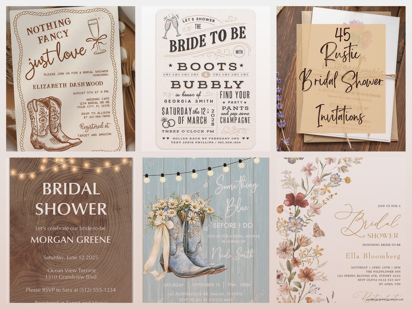
What you want to avoid is anything too bright or saturated. No hot pink, no electric blue, no fire engine red unless you’re doing like a barn wedding and even then… I’d be careful. The whole vibe is muted, natural, soft.
My cat knocked over my coffee while I was designing a color palette mock-up once and honestly the coffee stain looked so good on the kraft paper that I almost incorporated it into the design aesthetic. Obviously didn’t, but it made me think about how imperfection kinda works with this style.
Typography Choices
Font selection is huge and this is where you can really nail the rustic feel or completely miss it. You want a mix of fonts—usually two, sometimes three if you’re feeling adventurous.
For the main event details, I love a clean serif font. Something like a modern take on a typewriter font works great. Or even a simple sans-serif that’s easy to read. The farmhouse style is about simplicity and function, so you don’t want anything too fussy for the important information.
Then for headers or the bride’s name, you can go with a script font. But—and this is important—make sure it’s actually readable. I’ve seen so many invitations where the script is so elaborate that you can’t tell if it says “Sarah” or “Sadie” and that defeats the whole purpose. A simple hand-lettered style script works perfectly.
You could also throw in a rustic all-caps sans-serif for things like “BRIDAL SHOWER” or section headers. Just keep it clean and don’t use more than three fonts total or it starts looking chaotic.
Design Elements and Embellishments
Graphics and Illustrations
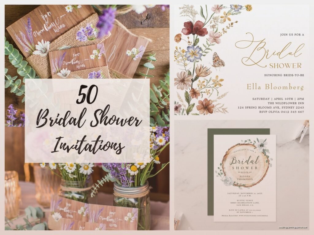
Okay so this is fun because you have tons of options. Wildflower illustrations are perfect for rustic invitations—think daisies, lavender sprigs, wheat stalks, cotton branches. You can do watercolor style or line drawings, both work.
Mason jar graphics are classic but honestly they’re getting a bit overdone. If you use them, make them subtle. Same with burlap textures in the background—yes they work, but don’t let them overpower the actual text.
I really love incorporating wood grain textures or weathered wood backgrounds. You can find these as digital papers and they add so much depth without being too literal. Lace borders can work too if you want something slightly more feminine, just keep them simple.
Farm animal silhouettes are cute if the shower has a specific farm theme. Little chickens, cows, horses—but use them sparingly as accent elements, not the main focus.
The Burlap and Lace Situation
Everyone wants to add actual burlap and lace to their invitations and I get it, the texture is beautiful. But here’s what nobody tells you: burlap sheds everywhere and it’s annoying as hell to work with. It frays, it’s rough, and if you’re mailing these invitations, little burlap fibers get all over everything.
If you’re gonna use real burlap, here’s what works: cut it slightly smaller than your backing card so the edges are contained. Use a really good adhesive—I like Tombow multi adhesive or a hot glue gun for burlap. You can also use burlap ribbon as a belly band around the invitation suite, which is easier to manage than trying to glue down a whole burlap sheet.
For lace, you can use actual lace trim or lace ribbon. White or ivory lace on kraft paper is stunning. You can create a border, use it as a wrap, or even create a lace doily effect as a layer. Just make sure it’s secured well because lace can shift during mailing.
Honestly though? Sometimes printed lace or burlap textures work just as well and they’re way less messy. There’s no shame in using digital versions of these textures if it makes your life easier.
Twine, Ribbon, and Other Ties
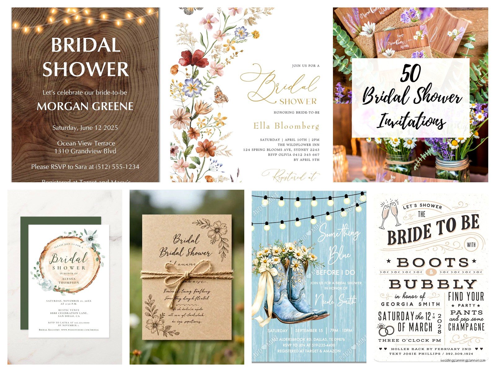
Natural jute twine is your best friend for rustic invitations. You can tie it in a simple bow, wrap it around the invitation suite, or use it to attach tags or embellishments. It’s cheap, it looks great, and it’s very on-theme.
Other ribbon options: grosgrain ribbon in neutral colors, burlap ribbon (which is softer than actual burlap fabric), or even leather cord for a more masculine rustic feel if the shower is co-ed.
I had a client who wanted to attach tiny dried flowers to each invitation with twine and while it looked beautiful, it added like an hour per invitation in assembly time and… let’s just say she quickly changed her mind when she realized she was doing 60 invitations.
Wording and Layout
The actual text on your invitation should match the casual, warm vibe of the farmhouse aesthetic. You don’t need super formal language. Something like:
“Join us for a rustic bridal shower celebrating [Bride’s Name]”
Or “Let’s shower [Bride’s Name] with love at a country farmhouse gathering”
You want the tone to feel welcoming and relaxed, not stuffy. Include all the important details obviously—date, time, location, RSVP information, registry details if applicable. But you can present them in a way that feels more conversational.
Layout-wise, centered text works great for rustic designs. It feels balanced and classic. But you can also do asymmetrical layouts if you’re incorporating floral graphics on one side or creating a more modern farmhouse look.
Leave enough white space—or in this case, kraft space. Don’t cram everything together. The farmhouse aesthetic is about breathing room and simplicity, so let your design breathe.
Adding Personal Touches
This is where you can get creative and make the invitations feel special. Custom stamps with the bride’s initials or the wedding date work beautifully on rustic invitations. Wax seals in neutral colors like cream, sage, or terracotta are gorgeous and add a handmade feel.
You could include a small tag tied with twine that has additional information like directions to the venue or a sweet quote. Belly bands with the bride and groom’s names printed on them are another nice touch.
Hand-addressing the envelopes makes a huge difference. If you don’t have nice handwriting, you can hire a calligrapher or use a calligraphy-style font and print directly on the envelopes. Either way, it adds to that personal, handcrafted vibe.
DIY Versus Ordering
Look, I’m gonna be real with you. DIY can save money but it’s also time-consuming and you need to be honest with yourself about your skill level and available time. That spring 2023 bride I mentioned? She insisted on DIYing everything and then called me crying two weeks before the shower because she’d only finished 12 out of 50 invitations and they looked kinda rough.
If you’re crafty and you enjoy this stuff, DIY can be really rewarding. You’ll need: paper cutter (don’t use scissors, please), good adhesive, your embellishments, printer access, and patience. Lots of patience.
If you’re ordering, there are tons of Etsy sellers who specialize in rustic farmhouse invitations. You can get templates to print yourself or fully printed invitations. Sites like Minted and Zazzle also have rustic options though they’re sometimes more expensive.
Templates are a middle ground—you buy the design, customize the text yourself, and print. This works great if you have access to a good printer and quality paper. Just make sure you do test prints first because colors can look different on screen versus printed.
Envelope Considerations
Your envelope choice matters more than you might think. Kraft envelopes are perfect and stay on theme. You can also do white or cream envelopes—those work fine too and might be easier to find.
For a really special touch, you can line your envelopes with patterned paper. Floral patterns, gingham, or even a simple kraft paper liner looks beautiful when someone opens the envelope.
If you’re adding a lot of embellishments or using thick cardstock, your invitations might not be standard size and weight. Take one completed invitation to the post office and have them weigh it before you buy stamps. Nothing worse than sending out invitations with insufficient postage and having them all returned.
Vintage stamps or botanical-themed stamps work great for rustic invitations if you can find them. Otherwise, regular Forever stamps are totally fine.
Assembly Tips
Set up an assembly line if you’re doing multiple invitations. Lay out all your materials and work in batches—cut all your paper first, then do all your gluing, then all your ribbon tying, etc. It’s way more efficient than completing one invitation start to finish and then starting the next.
Use a bone folder to create crisp creases if you’re folding anything. It makes such a difference in the final look.
Give yourself way more time than you think you’ll need. Seriously, I thought I could knock out 30 invitations in an afternoon once and it took me two full days. There’s always something that takes longer than expected or you mess one up and have to redo it or—
Quality control is important. Check each invitation before it goes in the envelope. Make sure everything is spelled correctly, glued down properly, and looks clean. One smudged invitation is whatever, but you don’t want to send out a bunch of messy ones.
Budget Breakdown
Just so you have realistic expectations, here’s roughly what you’re looking at cost-wise for DIY rustic invitations:
- Cardstock and kraft paper: $20-40 for enough for 50 invitations
- Envelopes: $15-30
- Twine and ribbon: $10-20
- Embellishments (lace, burlap, etc.): $15-35
- Printing costs: $0 if you print at home, $30-60 if you use a print shop
- Stamps: varies by weight, probably $30-50
So you’re looking at roughly $120-235 for 50 DIY invitations, maybe more if you go fancy with the embellishments. Ordering custom invitations usually runs $200-500+ depending on the complexity and vendor.
The thing is, your time is worth something too. If you spend 20 hours making invitations, that’s gotta factor into your decision-making somehow, you know?
Common Mistakes to Avoid
Don’t use too many design elements. I’ve seen invitations with burlap AND lace AND twine AND dried flowers AND wood grain backgrounds AND three different fonts and it’s just overwhelming. Pick 2-3 elements and stick with them.
Don’t forget to proofread. Have someone else read the invitation before you print 50 of them. Spell check doesn’t catch everything, especially names and addresses.
Don’t skip the test print. Always print one complete invitation on your actual paper stock before committing to the full batch. Colors, alignment, everything can look different than you expect.
Don’t make them too bulky for standard envelopes unless you’re prepared to pay extra postage. Keep practical mailing considerations in mind during the design process.
And honestly, don’t stress too much about perfection. The beauty of rustic farmhouse style is that it’s supposed to feel handmade and authentic. A few imperfections actually add to the charm as long as the overall execution is clean and the information is clear. People are gonna look at it for like 30 seconds, put it on their fridge, and then show up to the party. It doesn’t have to be a museum piece, it just needs to communicate the details and set the right tone for your event.
